Emily Ross recently finished her PhD in health services research and is now as a junior evaluation consultant at Ference & Company Consulting. She enrolled in our Dashboard Design course and is sharing how she used her new skills in her personal life. Thanks for sharing, Emily! –Ann
—
When COVID-19 pushed many events online, I decided to host a virtual Christmas trivia event for my family.
Participants answered questions over four different rounds in teams of three to six people. The rounds each had five questions and all questions were Christmas- or New Year-themed.
Before: Compiling the Data in a Spreadsheet
To support scorekeeping, teams had an individual score sheet where they wrote and marked their own answers.
I had a master score sheet that would automatically pull their scores together so all teams scores were combined into one page.
I’d then show this master score sheet via screen share at half-time and at the end of the event.
The master score sheet looked like this:

While it brought all the scores into one place, it wasn’t very easy for my participants to quickly pull out the key information (i.e., how well their team was doing).
I decided to apply some of the lessons I learned in the Dashboard Design course to make the sheet more accessible.
After: My Trivia Night Dashboard
First, I had to decide what type of dashboard I wanted to make.
In the course, Ann provided a handy Dashboard Cheat Sheet that helped me see different options.
I decided because I had one time point and wanted to compare categories (i.e., teams) that bars would likely be best.
I also decided to convert the numerical scores into percentages because not all rounds had the same number of possible points. Percentages would be a more consistent indicator.
Now it was time to make the dashboard.
It was easy to follow along step by step with Ann’s stacked bar dashboard video tutorial.
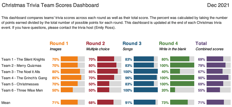
I made the following dashboard using the Data Bars feature in Microsoft Excel:

What I Learned about Dashboards and Excel
Not only were the steps easy to follow, but I also learned about better dashboard and Excel practices.
These tips help make your life easier and your dashboards more editable and readable.
Some of my lessons learned include:
- Always put a title, subtitle, and date on the dashboards.
- If your text is in a colour, make it bold so it is easier to read.
- Add a white border around cells to add white space.
- Use cell styles and Theme Colours to make formatting more consistent and easier to edit (I somehow did not know about this in Excel even though I use it regularly in Word).
- Give yourself a bit of time to do the final editing to make it sure fits on a page
With this dashboard, I found it much easier to see:
- How well teams did in each round (e.g., team 6 struggled with Round 4, but excelled in Round 3).
- How teams compared to each other.
- How hard each round was (e.g., Round 2 was on average harder than Round 3).
Designing a Second Dashboard
Encouraged by my dashboard attempts, I decided to try one more dashboard.
I wanted to know within each round, which questions did teams get right and wrong.
This would help me identify which questions were too easy and which were too hard. It’s a fine balance to get when hosting trivia!
I thought about including it in the same dashboard above, but I then I watched one of Ann’s videos about the four types of dashboards.
This reminded me that it’s okay (and even better) to make different dashboards for different audiences.
I had to do a bit of data cleaning first. I ended up with a table that showed for each question in each round the percent of teams that got that question fully correct:

While it had the information that I needed, I found it hard to identify any patterns or the take home message.
I remembered that in the Dashboard Design course Ann had a video on how to compare categories using heatmaps. (Here’s a blog post tutorial you can read.)
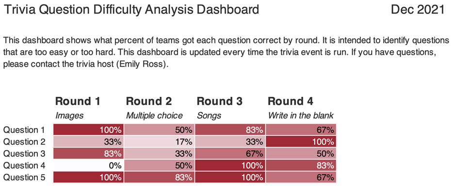
I used the steps to create this:

What I Learned from My Second Dashboard
As with the first dashboard, there were some great tricks.
Essentially, if you’re doing something manually (like changing the text colour to white on the darker cells or individually colouring cells) there is almost always a better way! You can use Excel’s conditional formatting to automatically color-code background fills and/or font colors.
I found it much easier to identify patterns both within round and across rounds.
For example, teams generally had a harder time with questions in Round 2 than they did with Round 3 (there are more lighter cells).
Using this dashboard, I could easily pick out questions which were too hard and too easy.
Questions That Were Too Hard
Round 1 – Question 4: What is the name of this dish and where is it eaten on January 6? (Answer: Rosca de Reyes; Mexico)

Round 2 – Question 2: What is the highest grossing Christmas movie (according to Wikipedia)?
Options: a. The Grinch b. Krampus c. The Polar Express d. Elf
(Answer: The Grinch)
Questions That Were Too Easy
Round 4 – Question 2: What fruit is a traditional stocking stuffer?
(Answer: Citrus fruit like an orange, mandarin, clementine)
Round 3 – Question 4: What performance is this song played in? (Bonus: Who is the composer?)
(Answer: The Nutcracker; Tchaikovsky)
(Sound clip source: Dance of the Sugar Plum Fairy Kevin MacLeod (incompetech.com)
Licensed under Creative Commons: By Attribution 3.0 License, via Wikimedia Commons)
I really enjoyed how approachable and practical the videos in this course were.
I can’t wait to continue to apply the tips and techniques I learned both at work and for fun!
Maybe at next year’s trivia I’ll have to test some of the dashboard designs for comparing change over time.
Connect with Emily
LinkedIn: https://www.linkedin.com/in/emilysross/


1 Comment
As a participant in the the mentioned trivia event I find it a delight how play can challenge us to master new skills. Thanks for the insights Emily.