
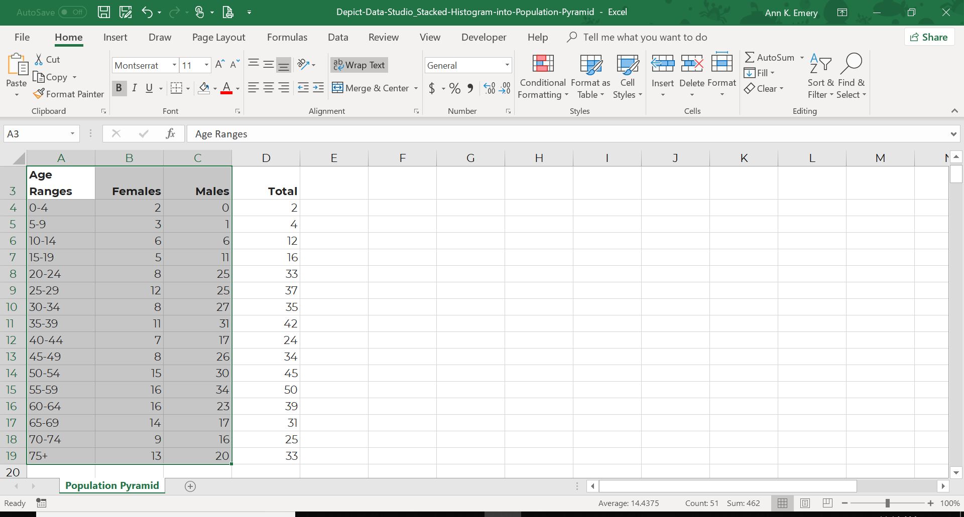
I recently worked with a state public health agency that wanted to depict how many males and females were diagnosed with a disease and the age at which they were diagnosed. In other words, there were just two simple variables: age and sex.
The Dataset: An Ordinal Variable and a Categorical Variable
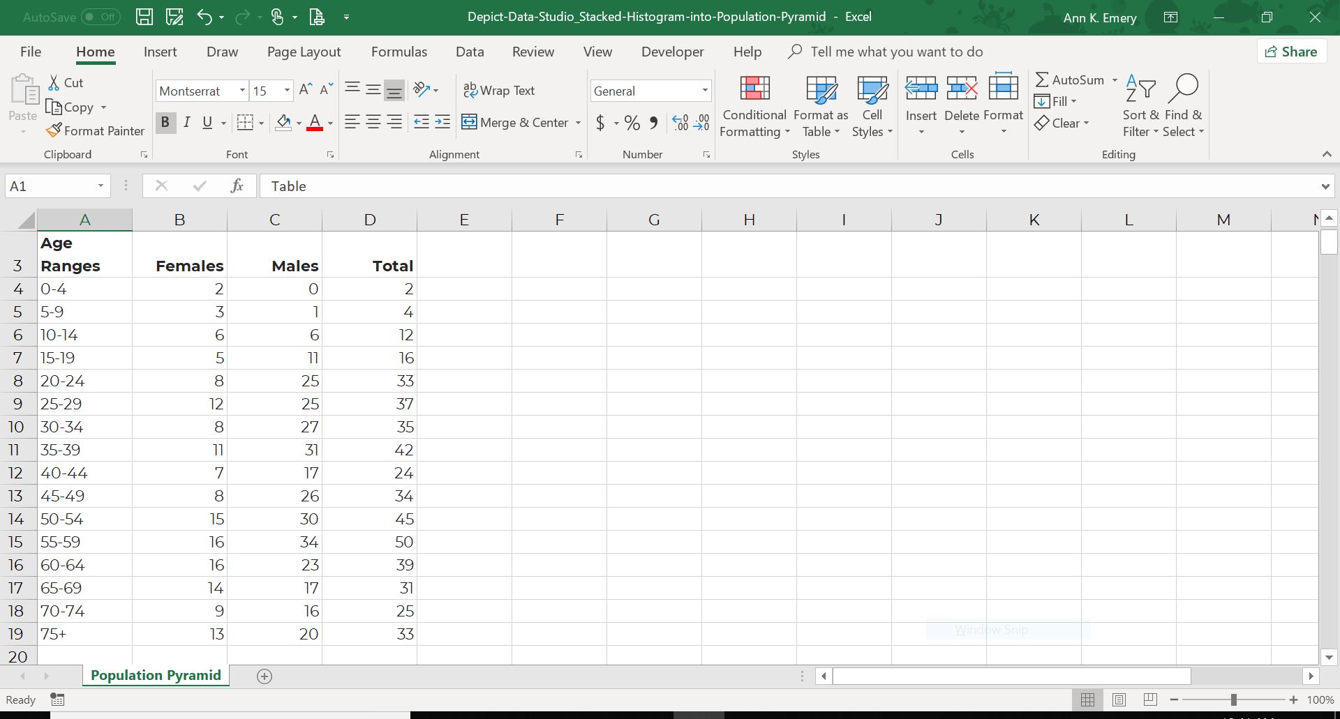
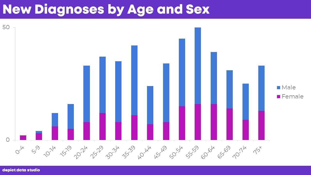
Our dataset looked something like this. We listed the age ranges down the first column and then recorded the number of males and females in the other columns.
Even if you don’t work in public health, you probably have similar datasets—an ordinal variable (like age ranges) along with a categorical variable (like sex).
Before: A Stacked Histogram
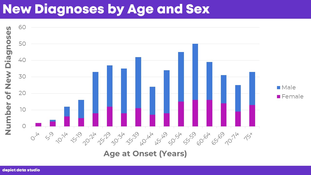
The “before” version of the public health agency’s graph looked like this. They had designed a stacked column chart with one column per age bracket.
After: A Cleaned-Up Stacked Histogram
For starters, we removed the axis titles. I rarely remove axis titles from written products like reports and handouts, but in this case, the speaker would physically be present to explain which variables were on each axis. And, the title makes the axes obvious—the axes literally show new diagnoses by age and sex.

On to the next few edits. Let’s continue deleting unnecessary ink.
We re-sized the graph a bit to fill the slide.
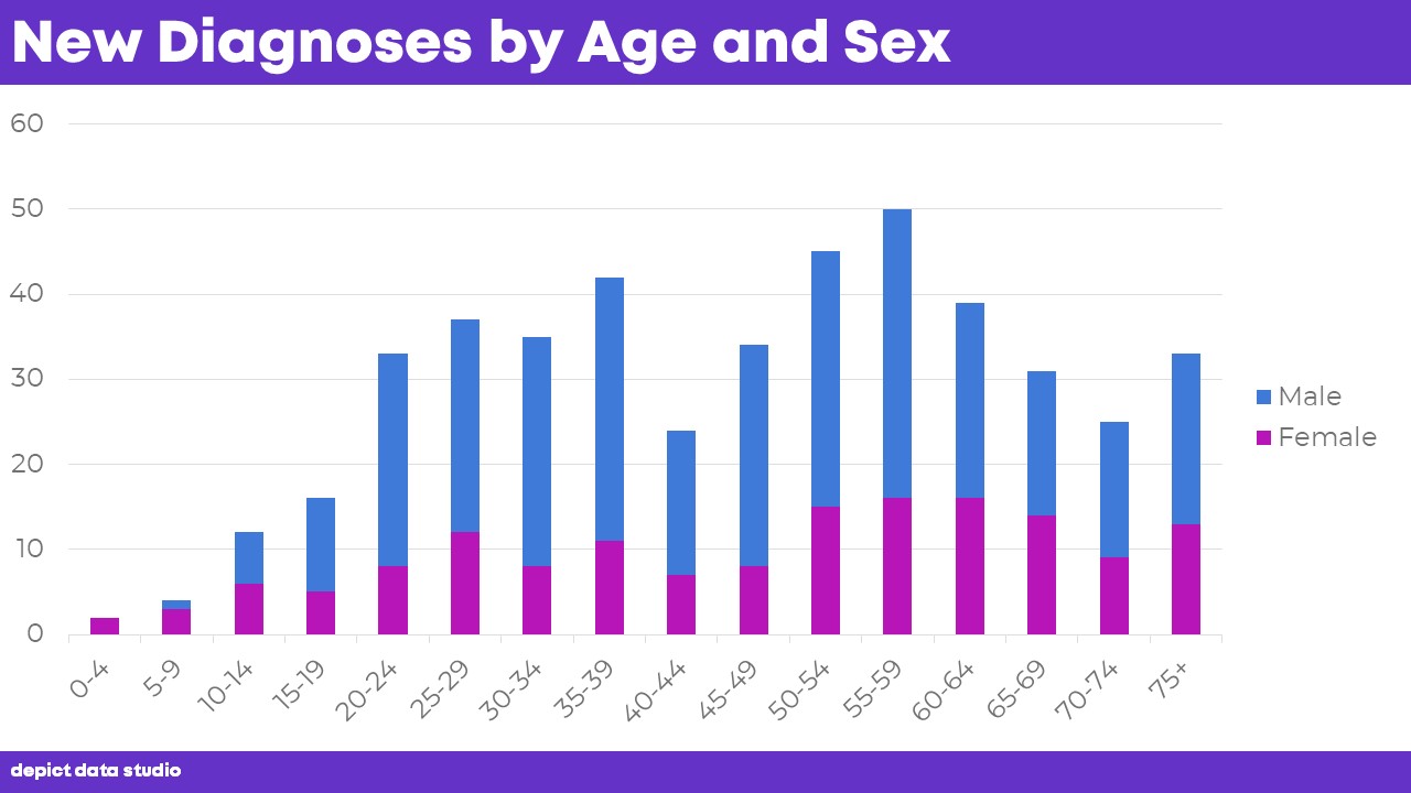
We re-sized the vertical scale (from 0 to 50 instead of from 0 to 60).
We continued decluttering the vertical scale by only labeling the starting and ending points (just 0 and 50). In a moment, we’re going to add values to each of the columns, which means we won’t need an overly-labeled scale.
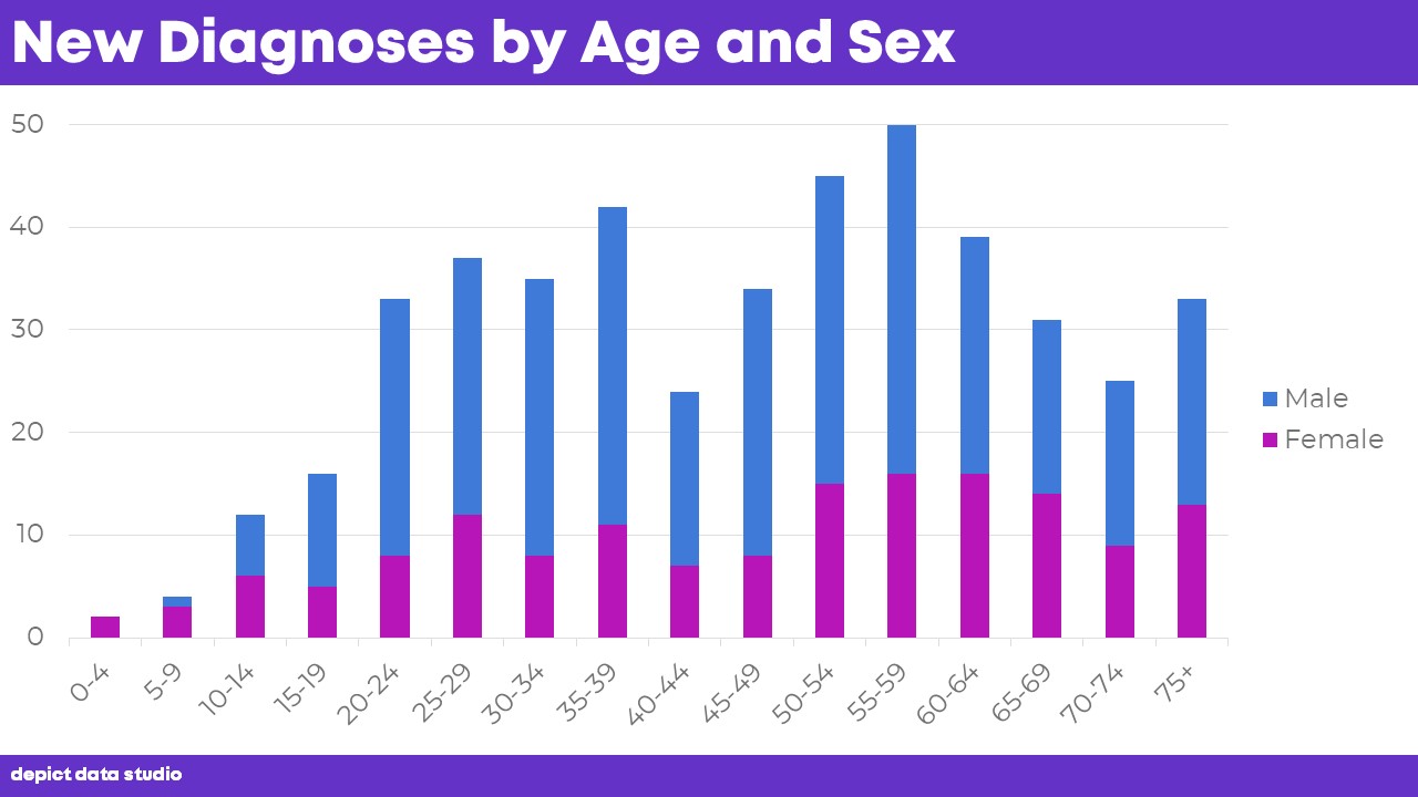
We decided to label each column with the specific number of people who had the disease.
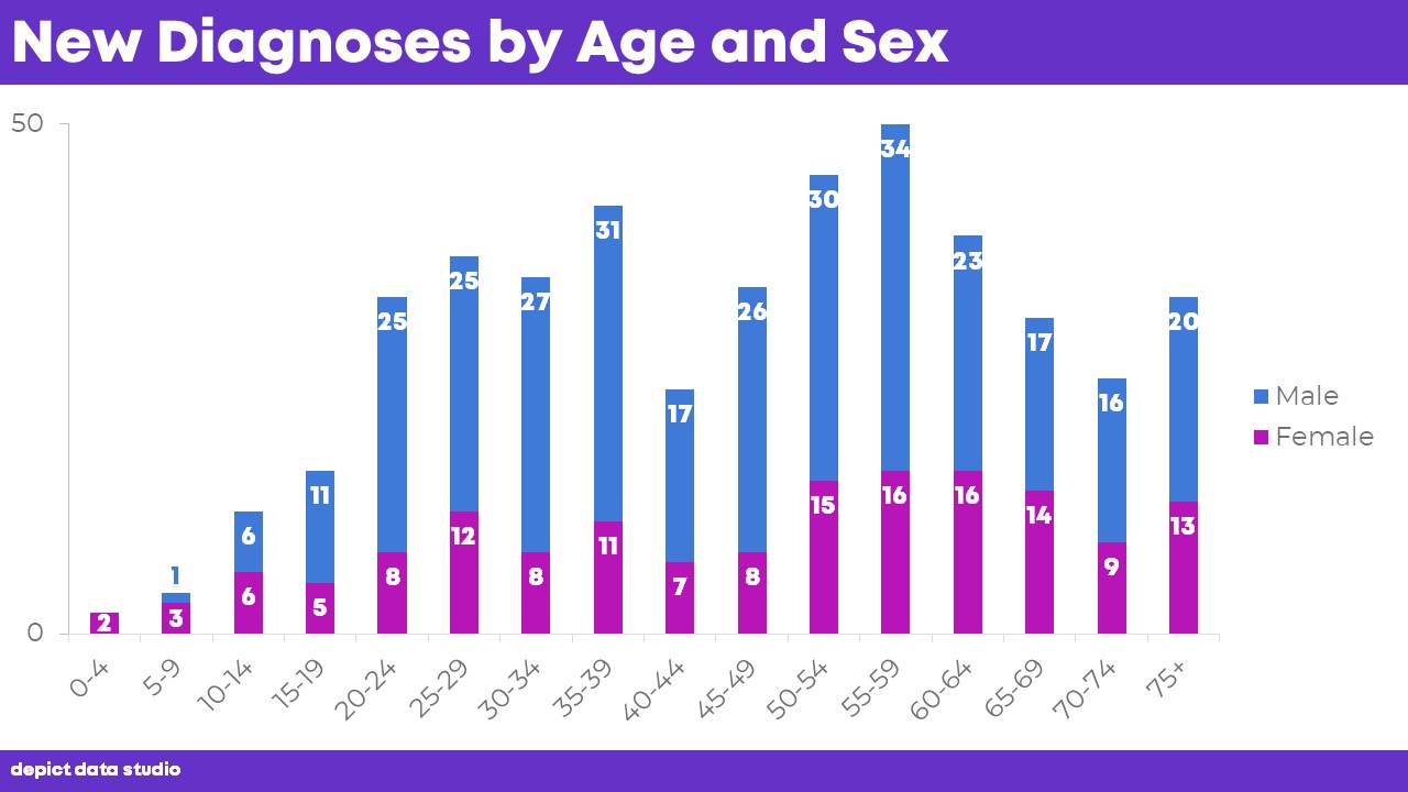
Then, we widened the columns so that the numeric labels were legible. You can follow my tutorial to reduce the Gap Width between the columns.
We outlined each of the columns in white to ensure that the different colors can still be distinguished from one another if someone prints our slideshow in grayscale. In other words, the white outlines around the blue and magenta rectangles make it easier to distinguish the shades of gray from one another.

We removed the gray line along the horizontal x-axis. It’s barely visible, but every bit counts.
Next, we removed the legend…
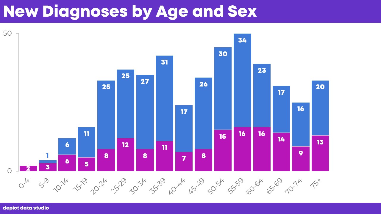
… and directly labeled the categories. The Males and Females words are just text boxes that we dragged over to the right side of the graph. The words are intentionally color-coded to match the graph (blue letters to match the blue section of the graph). You certainly don’t have to use blue for boys and pink for girls. In fact, your color scheme won’t look anything like this. I advise using your viewer’s color palette. For example, if you’re designing visualizations for the higher-ups within your own company, then use the colors from your own company’s logo and branding. If you’re a consultant who’s designing visualizations for your client, then use the colors from your client’s logo and branding.
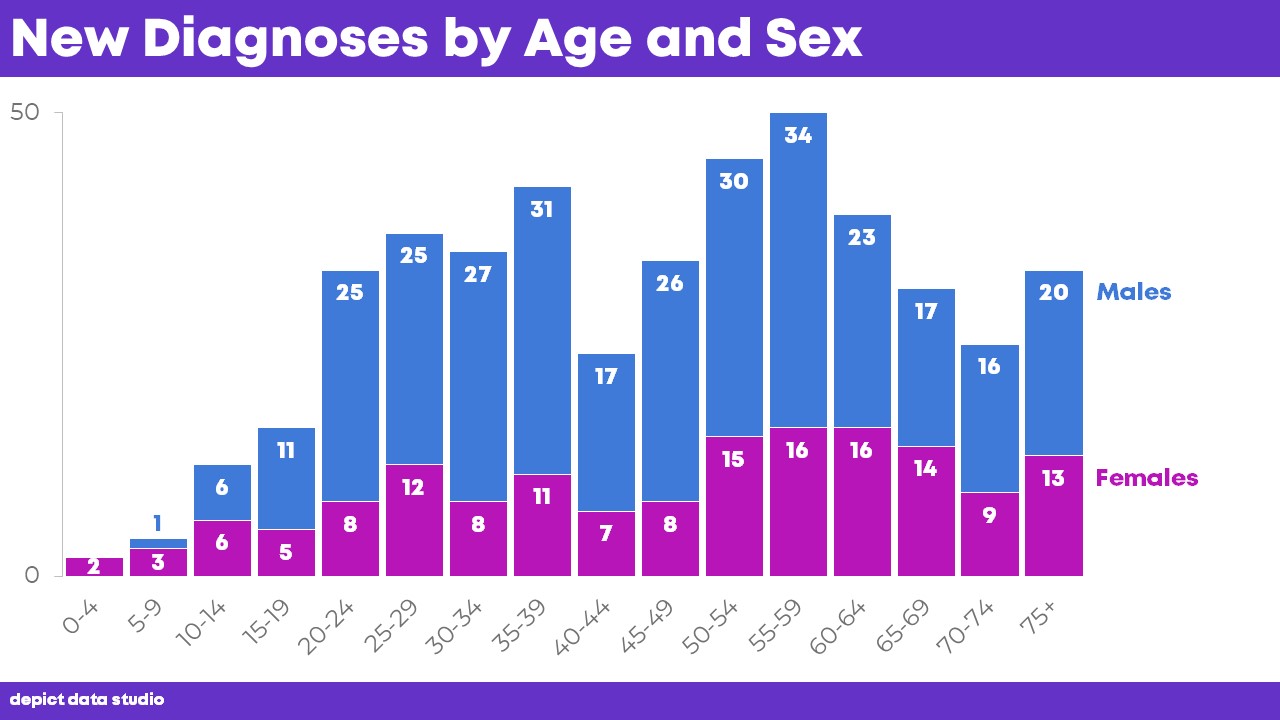
Finally, shrink the age labels until they’re no longer twisted diagonally.

But, now the font is waaaaaay too tiny for a slidedeck (size 14—when I aim for 18+ in slides).
I’m satisfied with every detail of this makeover except the tiny age labels along the bottom. Which brings us to option 2…
After: A Population Pyramid
A second option for this dataset is a population pyramid, in which the age ranges are listed down the center of the graph and the distribution of males and females are displayed on each side.
The graph almost reminds me of a Rorschach ink blot. Or a butterfly. Or two regular ol’ histograms that are tilted on their sides.
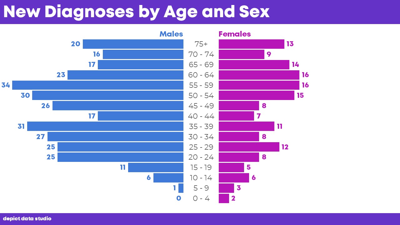
Side note for the #DataNerds: Okay, so I don’t think that this particular graph is a population pyramid in the strictest sense of the term.
A traditional population pyramid would compare the number of people in each age range—the population of your city, state, or country–and their sex.
This population pyramid-esque visualization compares the number of diagnoses in each age group and their sex.
It’s the same general concept though—providing both a categorical variable and an ordinal variable together in one graph to compare distributions. If you have a better name for this specific dataset’s graph, let me know.
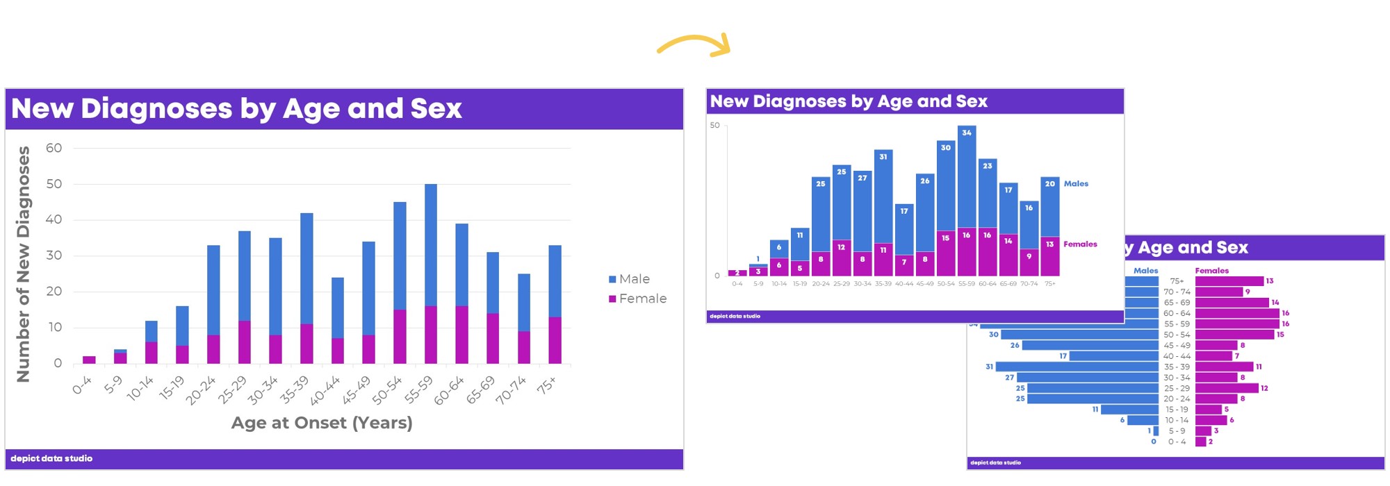
Stacked Histogram vs. Population Pyramid: You Be the Judge
Which approach is better, the stacked histogram or the population pyramid?
It depends.
The stacked histogram allows us to see the total number of people affected by the disease.
The population pyramid allows us to see the age distribution of people affected by the disease.
As always, your choice of graph type will depend entirely on the pattern that you’re trying to get across to your audience.
How to Make a Stacked Histogram in Excel
I know at least a million people are going to email me and ask me how to make these charts, so to avoid jamming my own inbox and banging Future Ann’s head against the wall, I’m going to share the how-to steps in Microsoft Excel here. I’m using the latest version of Excel on a PC, so your screen may look a little different than mine.
The first graph, which I’m calling a stacked histogram, is the easy one.
Type your numbers into a table like this one. Highlight just this section of the table (everything except the total column, which is optional, and added to the table just out of habit anyway).
Go to the Insert tab and click on the Stacked Column icon.
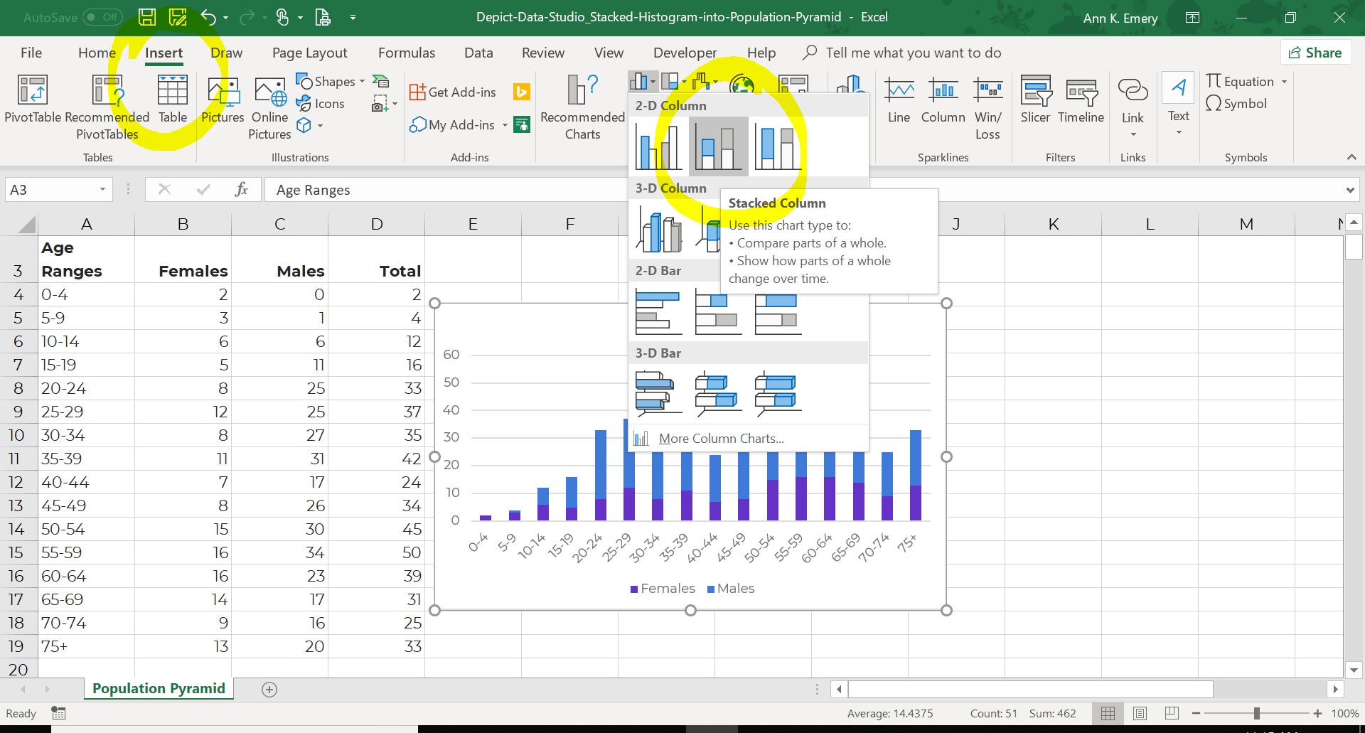
Then, make the cosmetic edits we talked about earlier, like decluttering the graph and adding labels to the columns.
How to Make a Population Pyramid in Excel
The second option, which I’m calling a population pyramid, is much more advanced. Excel Vizardry Level 10,000! Seriously. Once you make it through these steps, comment on the blog post and let me know. You deserve a virtual high five!
You can’t simply go to the Insert tab and click on the population pyramid icon because it doesn’t exist. That’s right. There’s no button that instantly creates a population pyramid for you. But you can create a population pyramid in Excel with my secret strategy.
The secret strategy is going to look crazy at first. This is a counter intuitive (yet amazing) strategy to fool Excel into making the exact chart you want. You’ll have to trust me for the next few minutes. All the pieces will fall into place and the final product will look great. I promise.
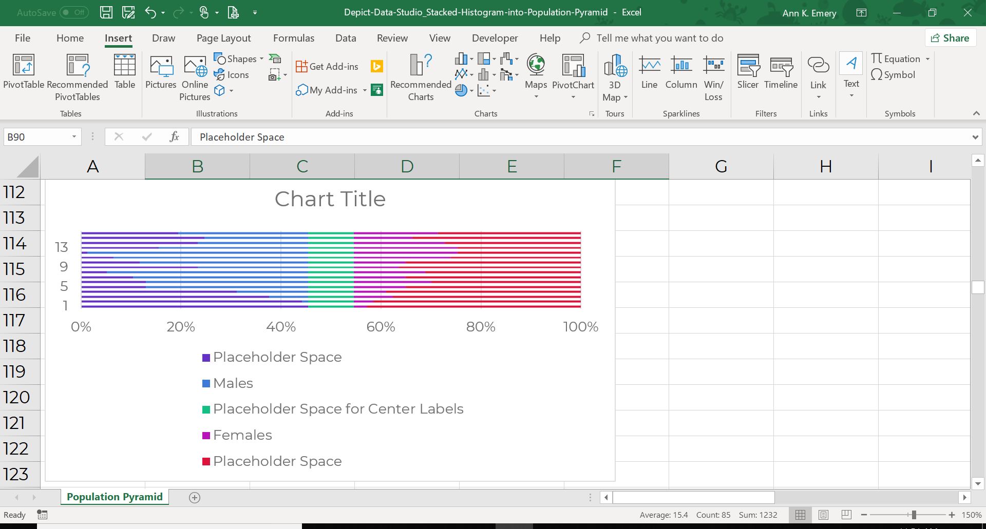
First, you’ll need to transform your Regular Table into a Magic Table. The Magic Table has a few placeholder columns with seemingly random numbers.
How do you know which numbers to type into the placeholder columns? Later, when you’re trying this with your own dataset, just scan your real numbers—like the number of males in Column C—for the biggest number in the batch. In this dataset, the biggest number was a 31. There were 31 males in the 35-39 age range with the disease. Then, choose a number a little bit bigger than the biggest number in the batch. The biggest number in the batch was a 31, so I rounded up and chose a 35. Make your placeholder numbers in Column B and your real numbers in Column C add up to 35.
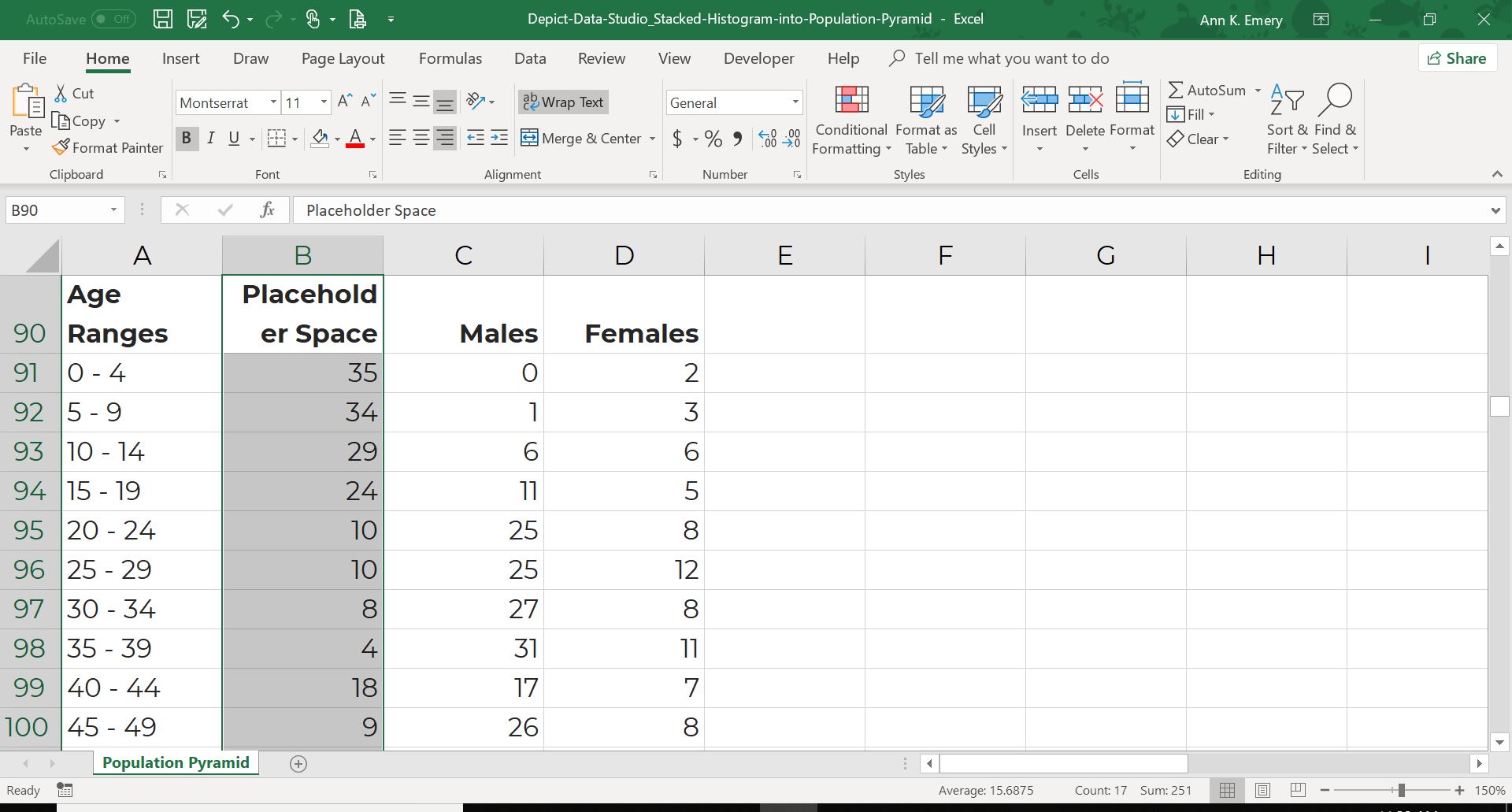
Do the same thing for the number of females. The placeholder numbers and the real numbers should add to 35.
Yes, the columns are a little out of order. The placeholder space for the males goes to the left of the real numbers, and the placeholder space for the females goes to the right of the real numbers. That’s on purpose. It’ll make sense later. You have to trust me.
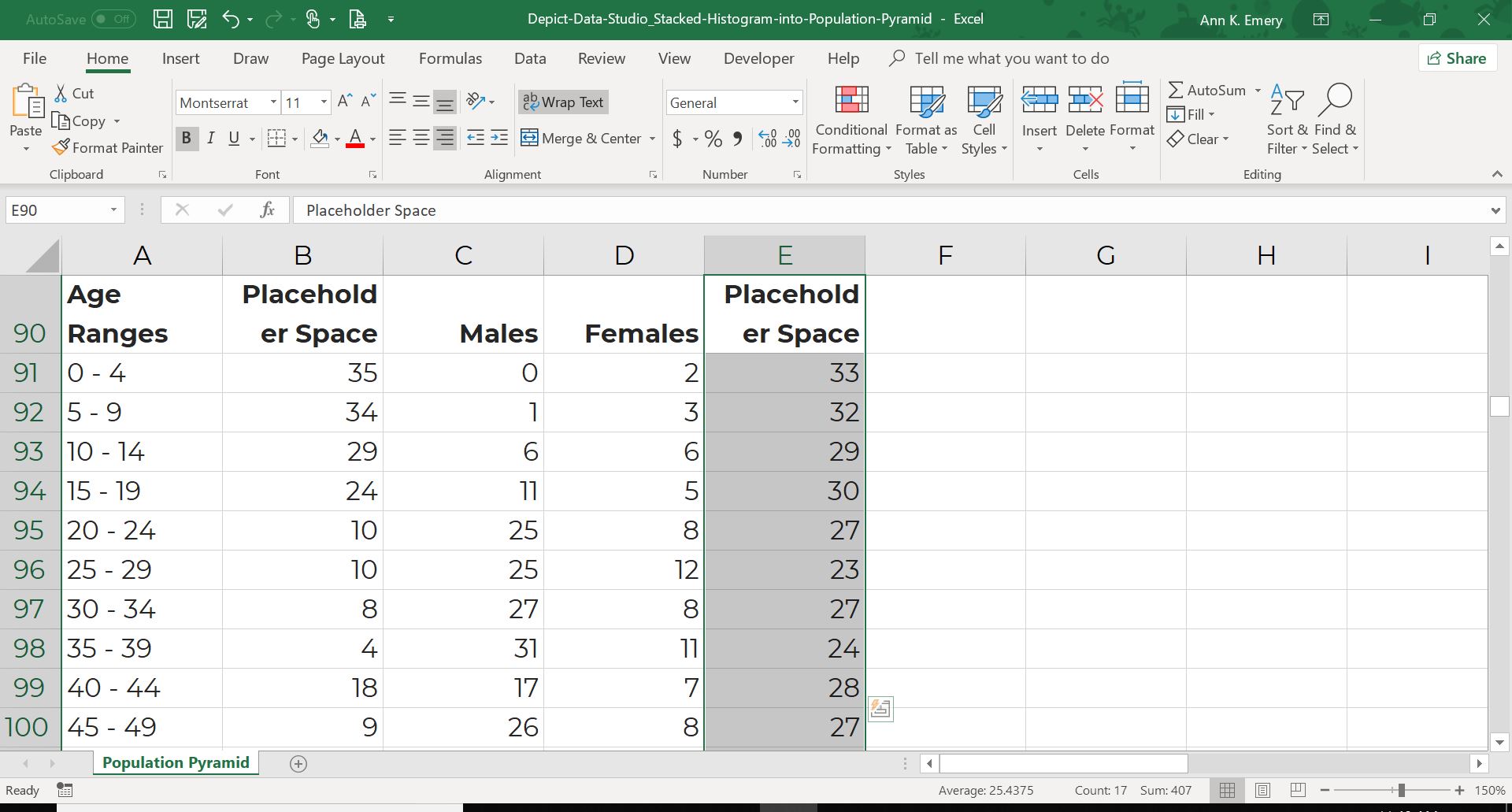
Then, add a third placeholder space down the center. You’re going to have to guess on which numbers to type into that column. That’s right. A total guess. I went with 7s after a few iterations of guess-and-check. Again, you have to trust me. This will make sense later.
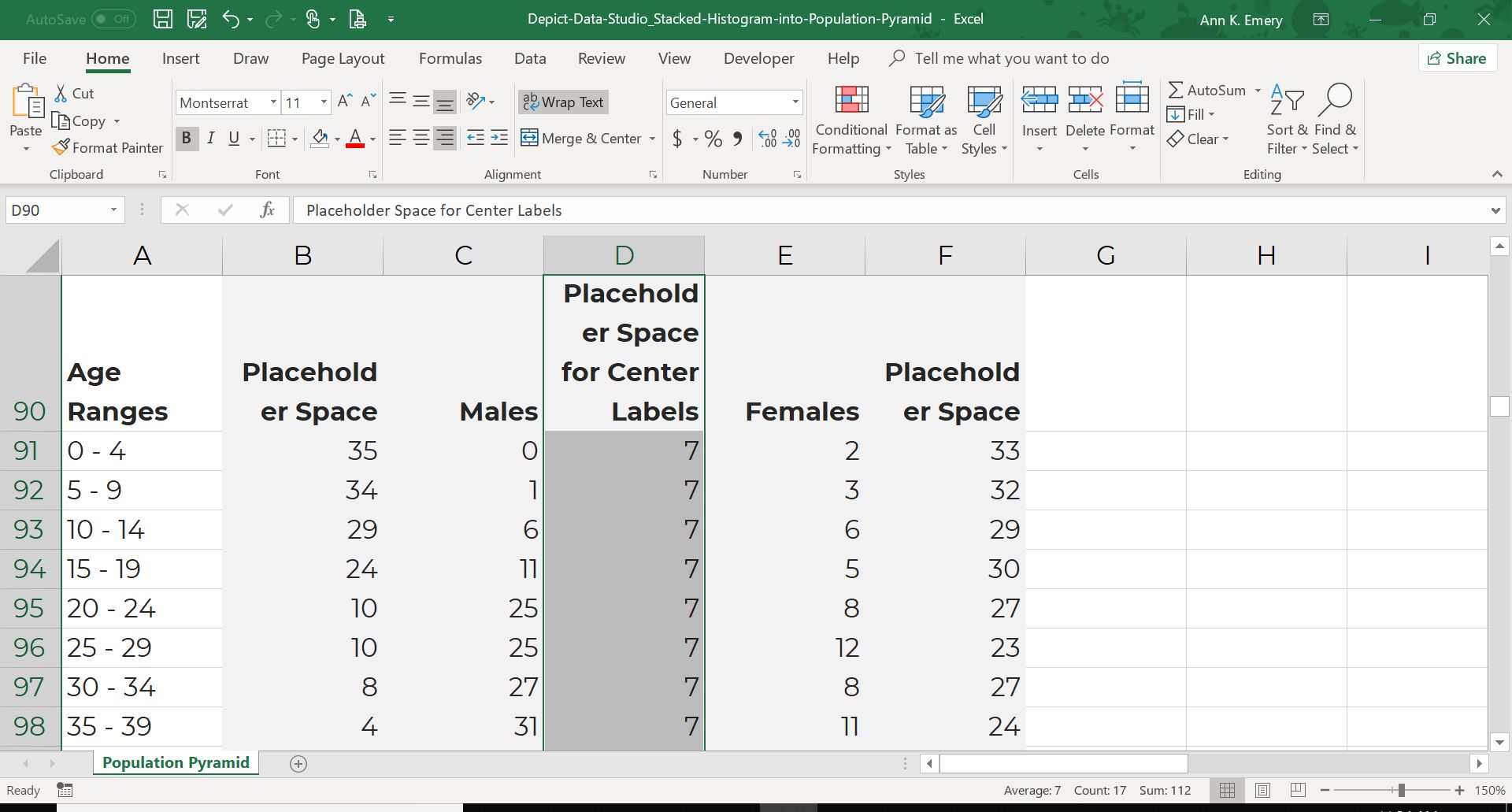
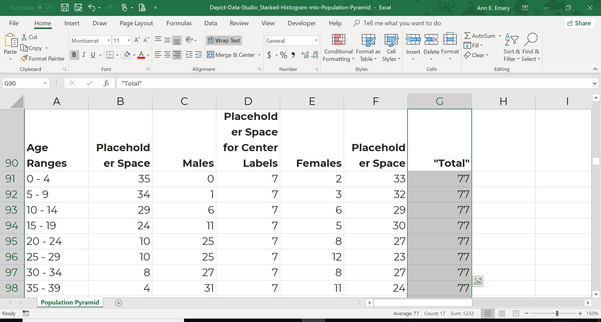
I often add a “Total” column to check my own math. In this example, each row should add to 77 ( because 35 + 7 + 35 = 77).
You’ve got the Magic Table! Now it’s time to insert your chart.
Highlight the middle section of the table (everything except the age ranges and the total column).
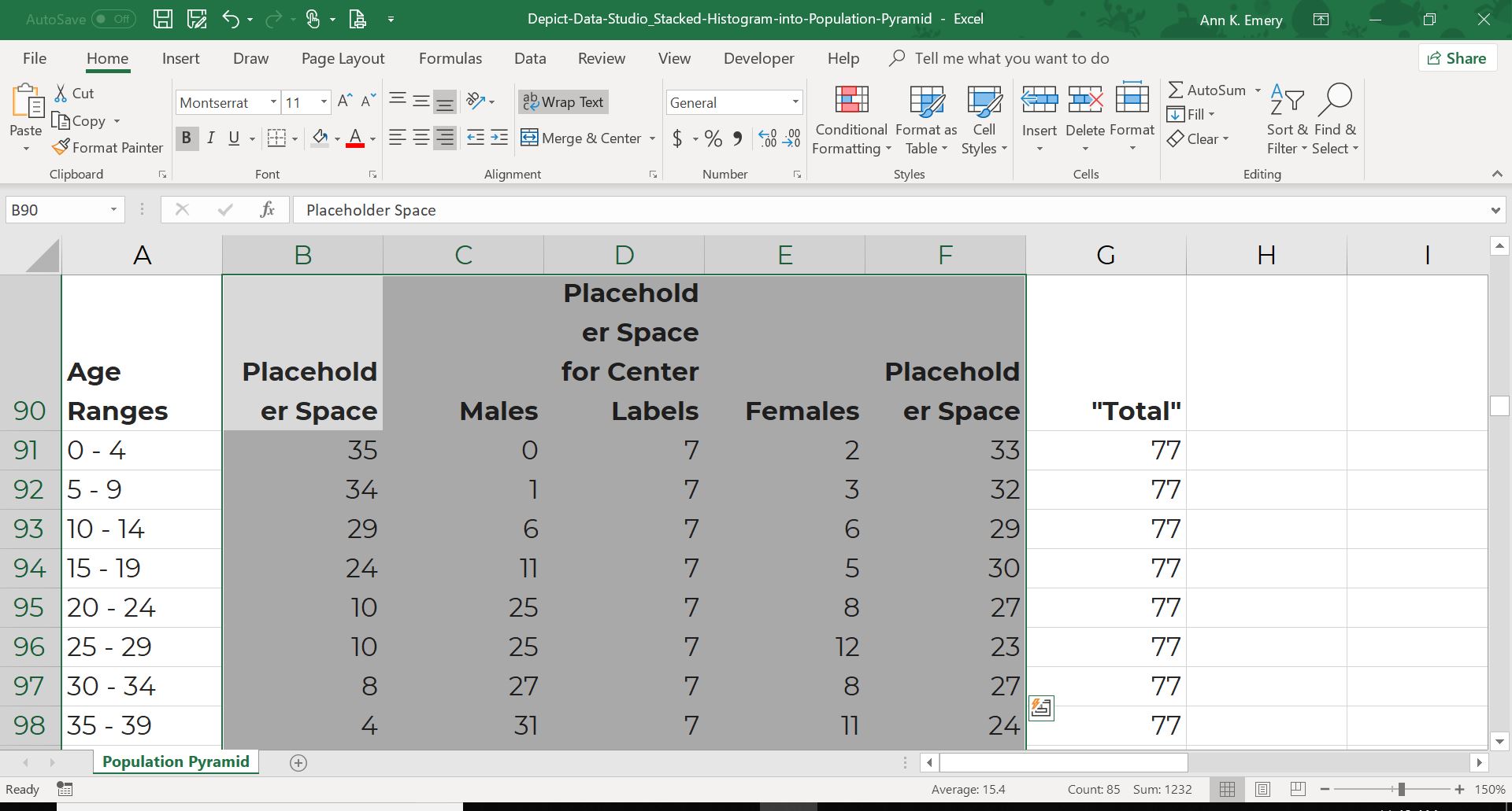
Go to the Insert tab and choose a 100% Stacked Bar Chart. Not a regular stacked bar chart. Not a clustered bar chart. Not a column chart. You want a 100% Stacked Bar Chart.
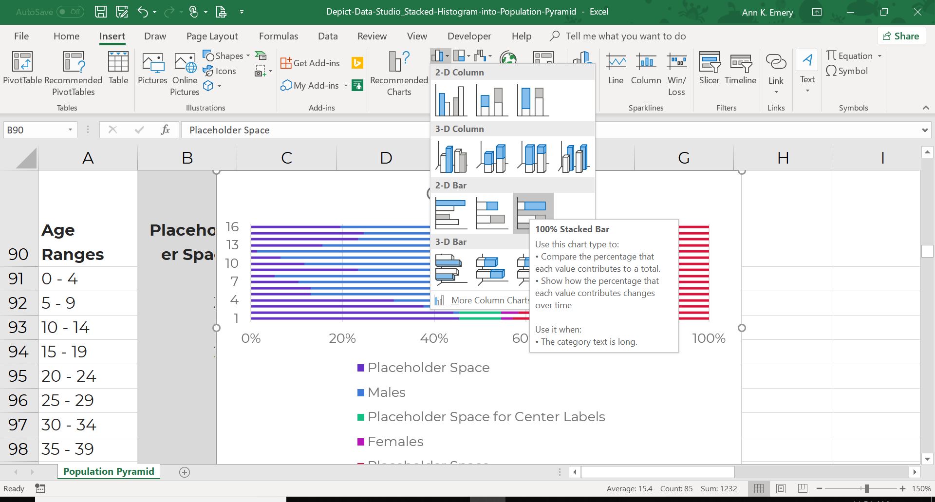
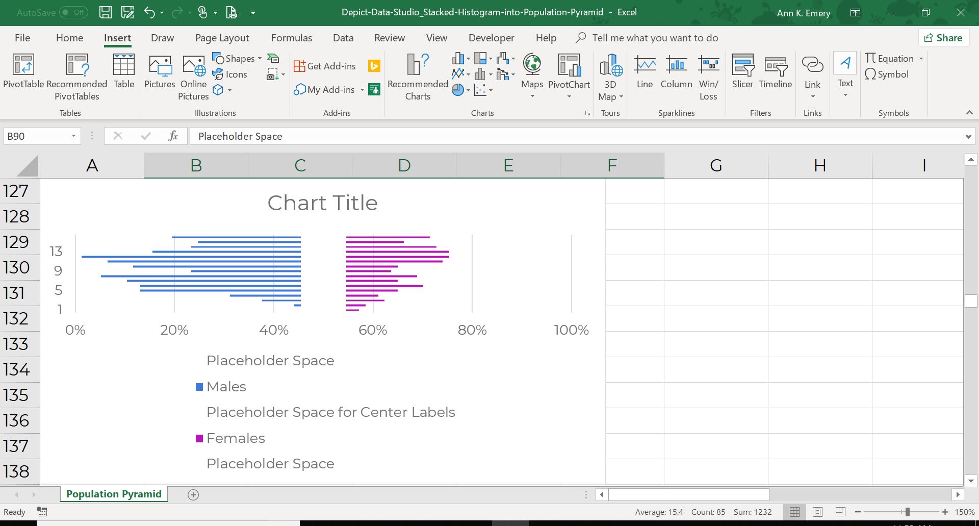
Your chart will look totally busted.
But your population pyramid is there! Can you see it??
Adjust the colors to make the population pyramid pop. I made the placeholder spaces white or transparent. Ah, that’s much better. Can you see the population pyramid now??
Does the placeholder space make sense? If not, sleep on it, and then come back to this blog post again tomorrow. It will click. I promise. We used a stacked bar chart with “invisible” white segments and placeholder data to fool Excel into making a population pyramid. The placeholder values nudge the real numbers into their correct positions.
The rest of the edits are just cosmetic.
Re-size the graph as needed. I made the graph much larger so that it would fill a slide.
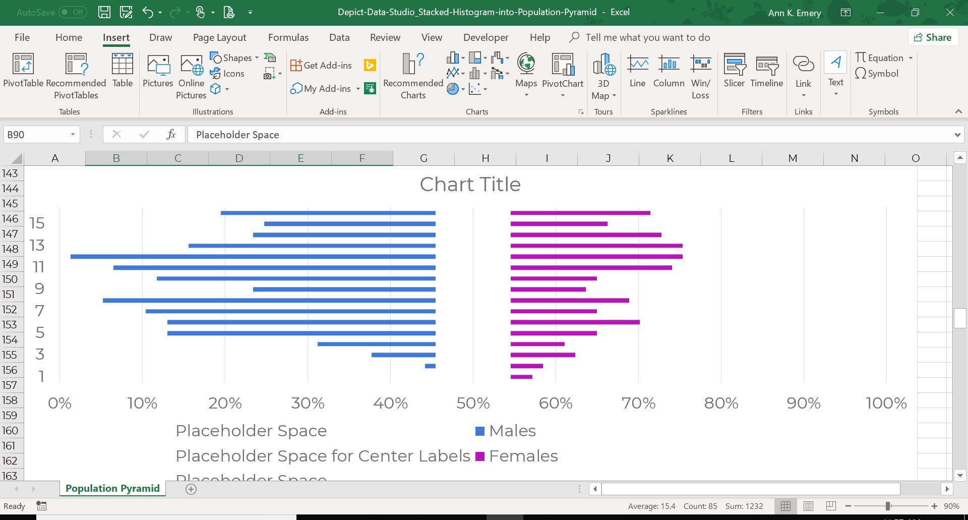
Get rid of all the unnecessary clutter. Delete the built-in title (I suggest writing titles directly into your Word document or adding a brand new text box into your PowerPoint slide). Delete the vertical axis labels (the 1 through 15 along the left side). Delete the horizontal axis labels (the 0% to 100% along the bottom). Delete the legend. Remove the vertical grid lines. Remove the border.
Widen the bars so that your histograms have that smoothed-out shape. I suggest a 10% Gap Width for histograms.
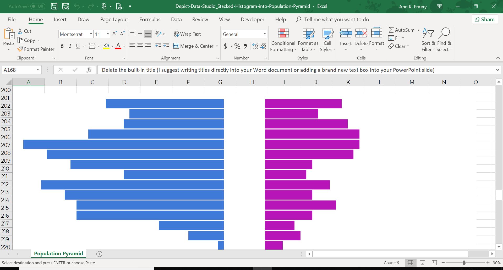
Add numeric labels to the bars. Click on the blue bars to activate them. Then, right-click and select Add Data Labels. Don’t forget to match the text to the graph, i.e., blue font for blue bars. Repeat the same steps for the magenta bars.
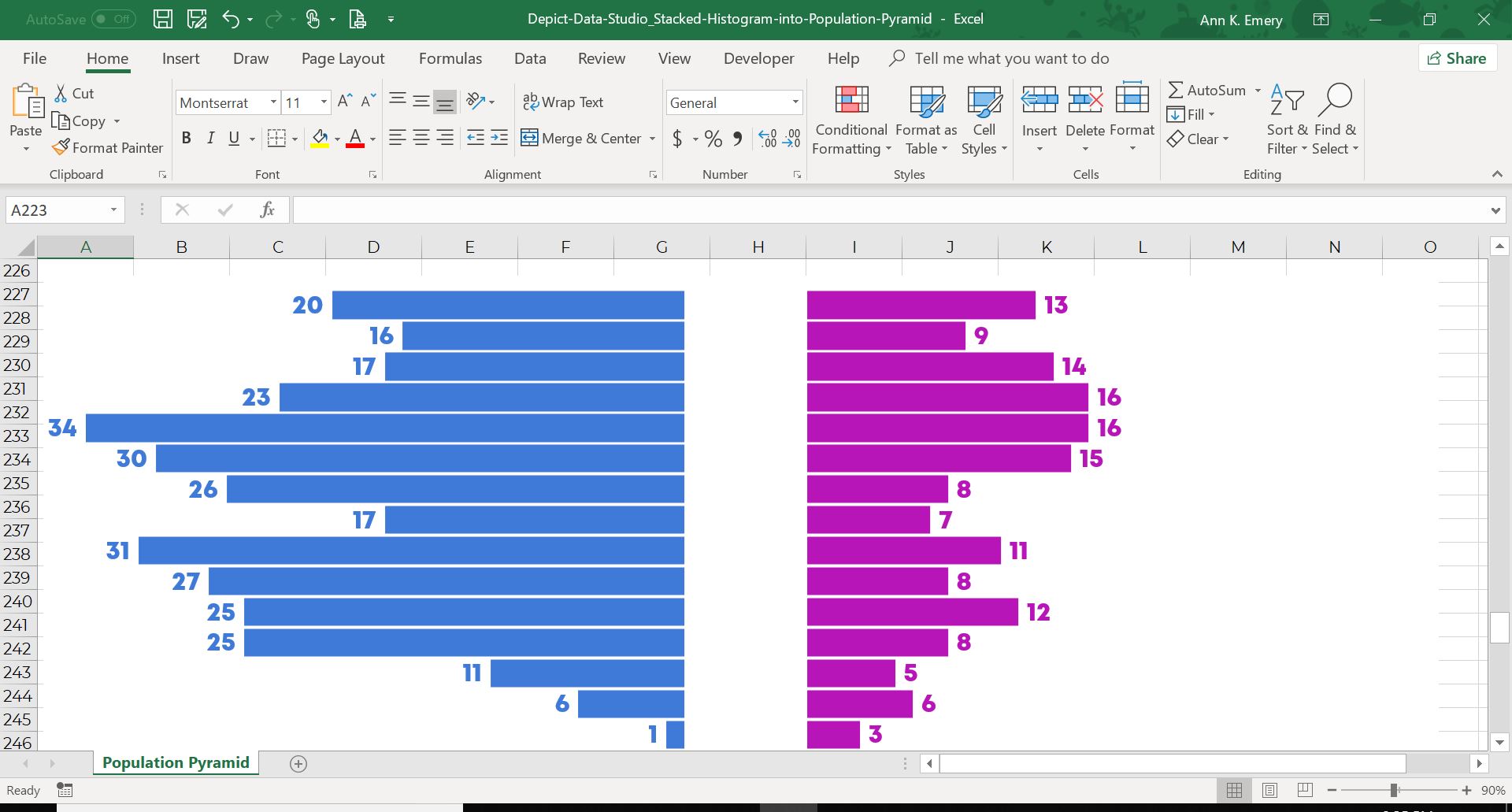
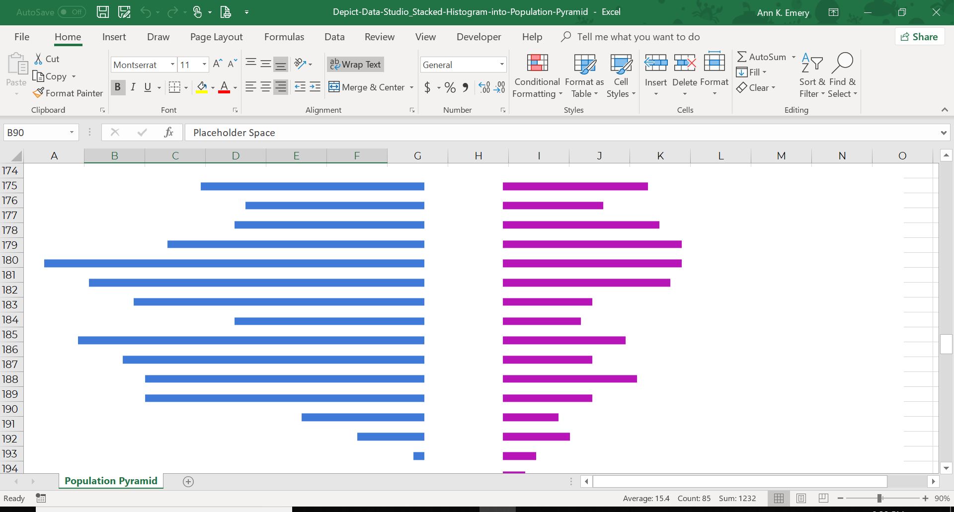
Here comes the fancy part—adding the age ranges down the center without having to painstakingly add fifty million individual text boxes.
Click on the center “bars” to activate them. Remember, there are invisible white segments of a stacked bar chart with a made-up size of 7.

Right-click and Add Data Labels to those invisible bars. By default, you’ll see the made-up 7s.
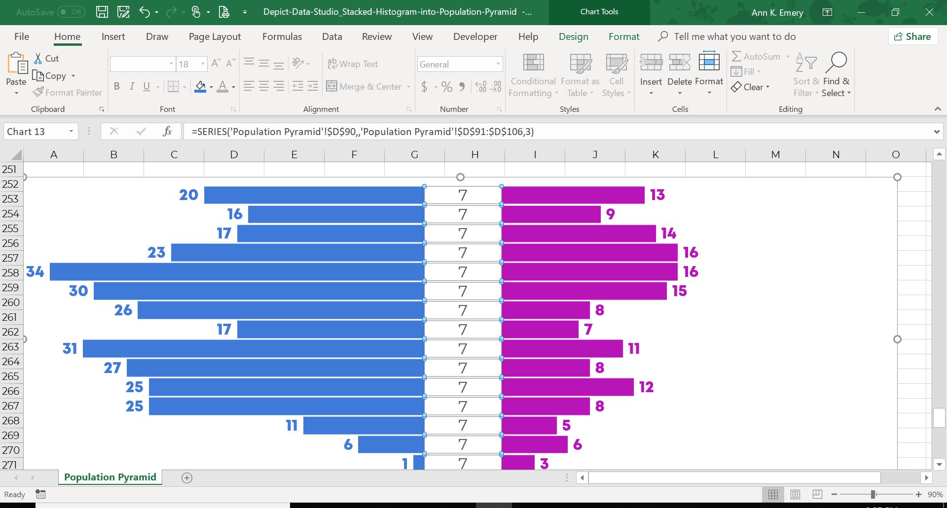
Click on the 7s to activate them. You’ll see little squares surrounding the 7s.
Right-click and select Format Data Labels. The Format Data Labels editing window will appear along the right-side of your screen.
If you’re on a super old version of Excel, then your Format Data Labels editing window will appear in the center of your screen, not on the right side. Bad news—your computer is so decrepit that you’re missing some pretty cool features, like the one we’re about to use. Time to upgrade. I purchase Office 365 for around $75/year and get Excel, Word, PowerPoint, etc. across several different devices.

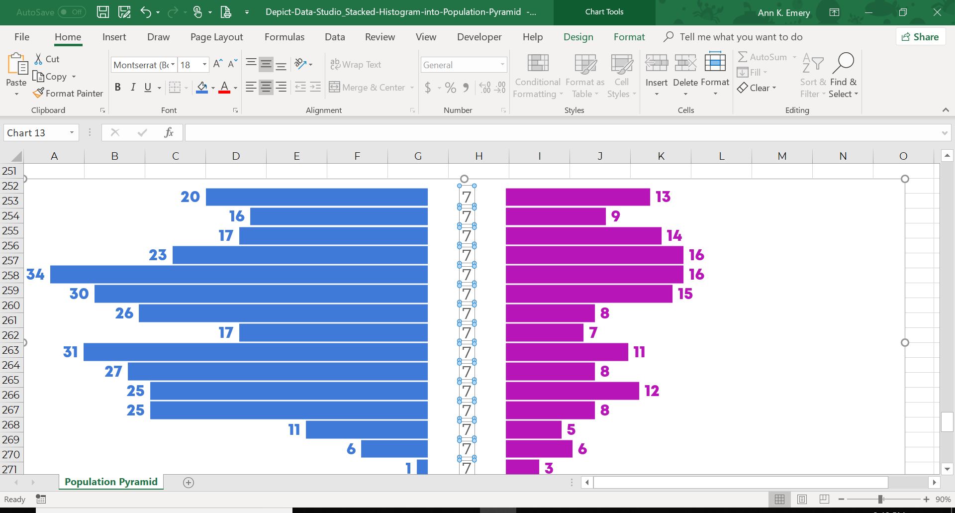
Check out the Label Options section at the top. By default, your computer will display the Value, which is why we see the placeholder 7s.
Click on the Value from Cells checkbox. This little window pops up:
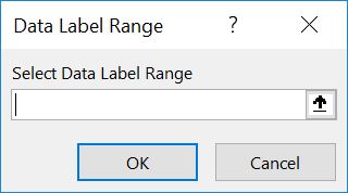
Scroll all the way to the top of your spreadsheet and find the original data table. Highlight the age ranges, like I’ve done here:
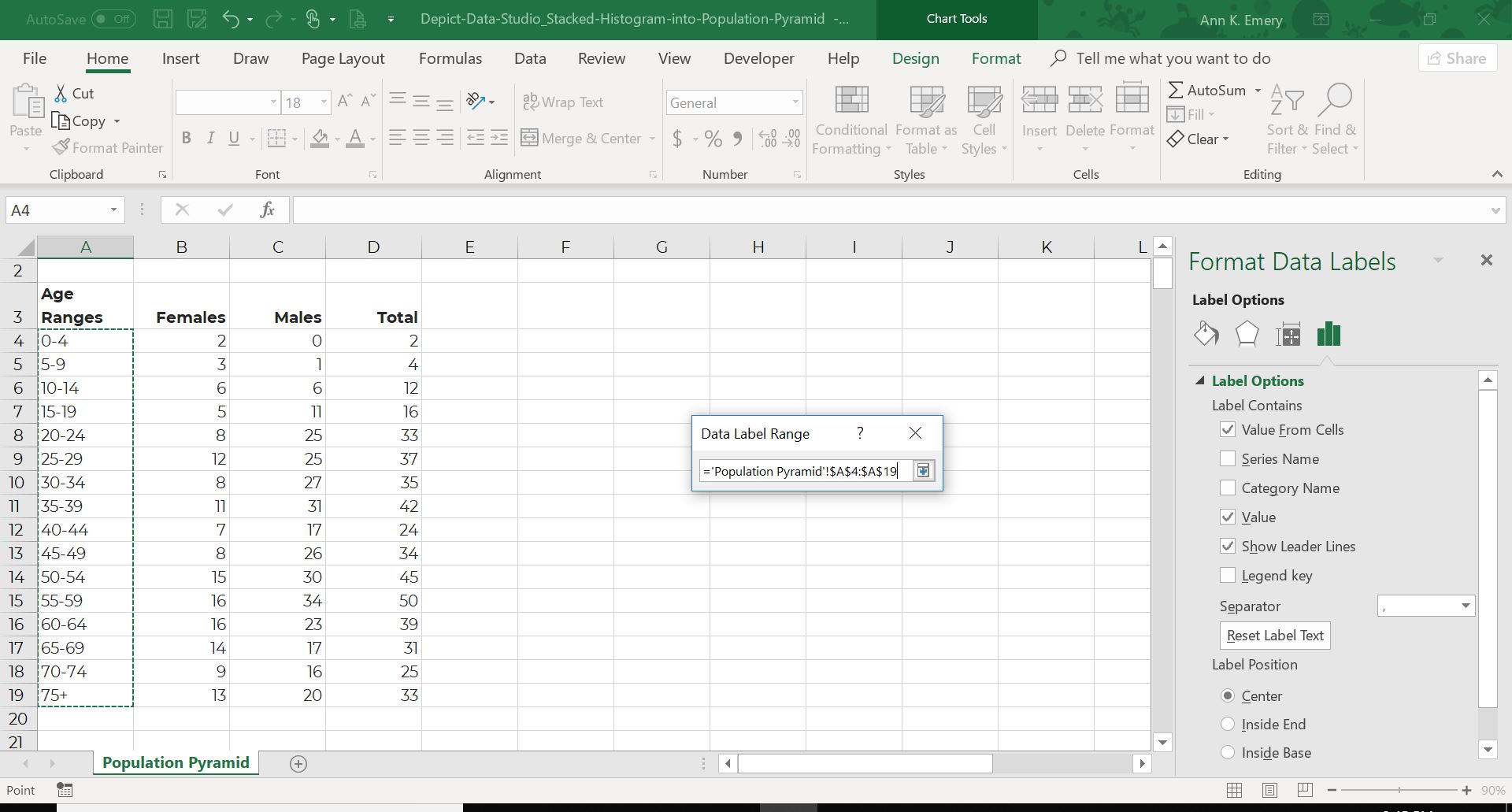
Click Okay on the little window. Scroll down and find your population pyramid again. Now, you’ll see both the age ranges and the placeholder 7s.

We have to get rid of the placeholder 7s. On the Format Data Labels menu at the right, simply un-check the Value box.
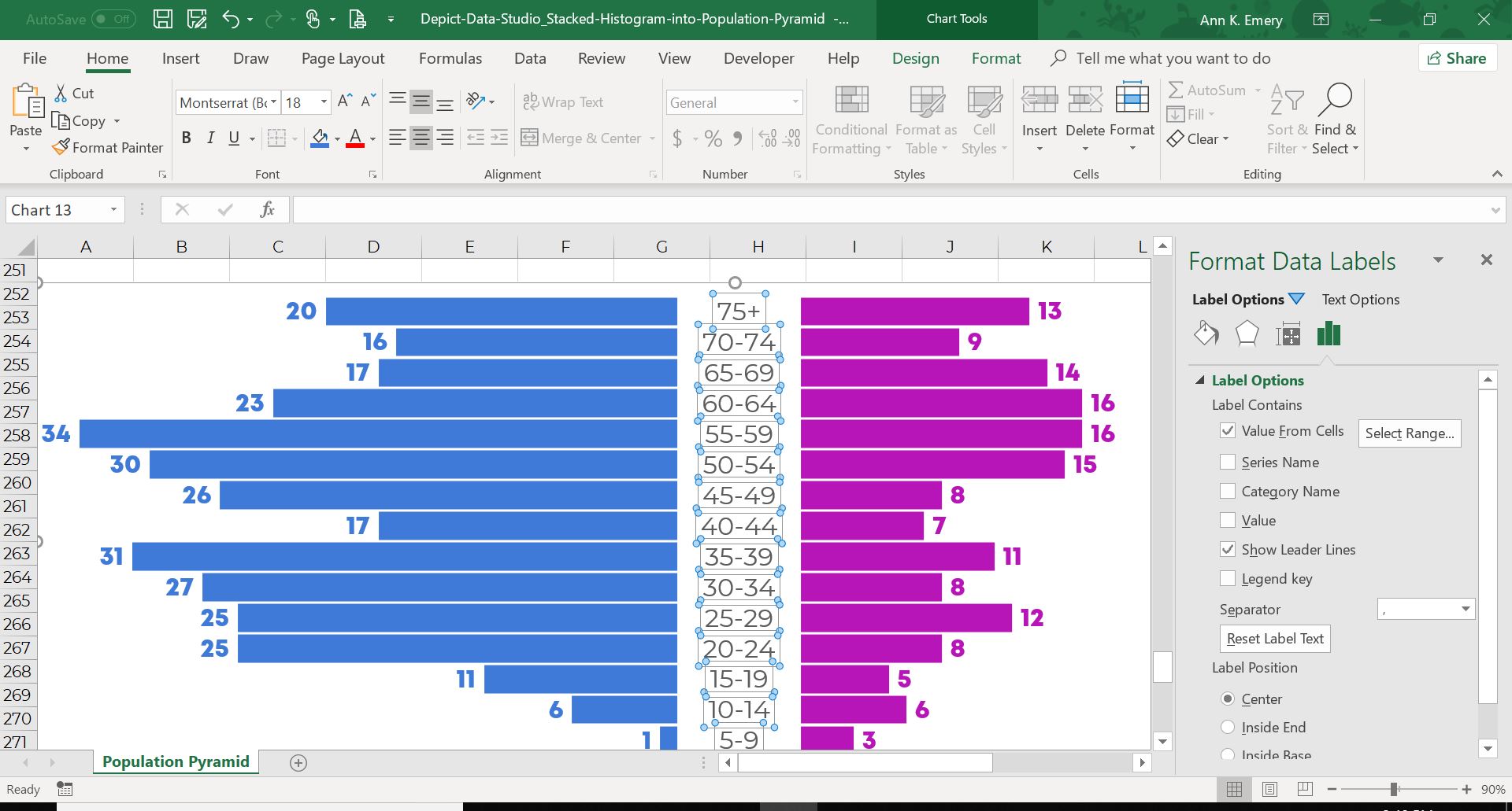
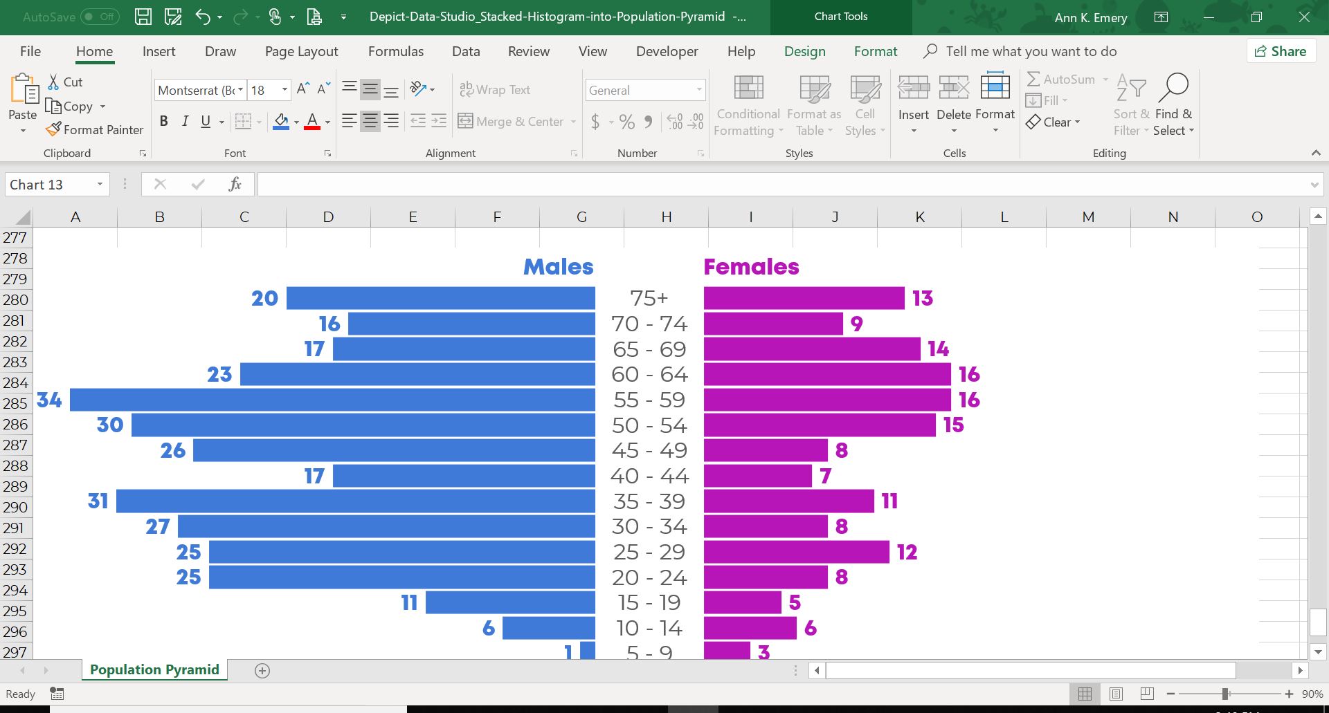
See how the age ranges fit juuuuust right down the center of my graph? I had to experiment with a few different values until I got the width just right. I tried a 5, a 10, and a 20. Every placeholder value will re-size the graph a bit. Sometimes that center space will be too narrow. Sometimes it will be too wide. Experiment until the wording for your labels fits the space well.
FINALLY… Label your categories. I went to the Insert tab and created two new text boxes for the word Males and Females. The words are intentionally color-coded to match their charts (i.e., blue text for a blue section of the chart).
Congrats, you made it! Don’t forget to comment on this blog post and let me know once you’ve created your own stacked histograms or population pyramids.
Bonus: Save Time & Download the Templates
Want to explore how I made the stacked histogram and population pyramid? Purchase my Excel file.
14 Comments
I MADE THIS!!!! YAY! Thanks for your help 🙂
Great work!!!!!!!!!!!!!!!!
The world population is changing: For the first time there are more people over 64 than children younger than 5 What is the age structure of the world population and in countries around the world? How did it change over time and what can we expect for the future? These are the question that this entry focuses on.
Thank you very much for the A to Z instructions. Got it right the first try.
I made it. Thanks for the instructions..
Nice! I made it too 🙂 Thanks a lot for this step-wise instructions. Only thing is that I had to manually move the numeric data labels, one by one, outside the bars. I guess there is no trick for that?
Great work, Tereza! Were you able to add the age ranges down the center, by transforming the “7” into the label? Use that exact same trick to get the labels on the outside of the bars.
Brilliant! Thank you for the step-by-step wizardry. I love how cute the data looks 🙂
Love this! The step-by-step instructions were so helpful! Great way to increase the number of different types of charts on our slide doc all while showing two demographics in one place!
Thanks, Kelsey! Let me know if/when you create a population pyramid of your own. There are lots of ways to apply this. Doesn’t have to be age/sex. It could be any ordinal variable with any two categories.
Loved this article, thanks so much. I appreciated the humour, too!
Amazing thank you!!!
The “population pyramid” is lovely. Any types on how to do it with percentages instead of volume counts? I have both but want the label to represent the percentage of each population. Thanks in advance.
Yes, you’d simply set up your spreadsheet with percentages instead of counts.