Ready to tell a story with data?
Here’s my definition of data storytelling, in case you missed the previous blog post.
Great!
Let’s remove the guesswork from our graphs.
The next step is to figure out which message we’ll highlight.
We can’t visualization everything—that dilutes the power of our graph.
What Makes a Useful Data Story? 5 Questions to Ask
Here are five thought-starter questions to help you uncover useful nuggets in your data.
- What’s Going Well? What’s Not Going Well?
- Did We Reach Our Goals? Why or Why Not?
- What’s Surprising? What Unfolded as Expected?
- Which Information Needs to be Shared with Others? Who Needs to See This Information?
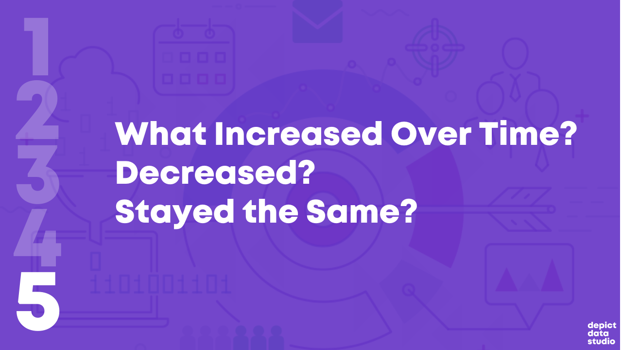
- What Increased Over Time? Decreased? Stayed the Same?
If you analyze data for a living, then I bet you’re already asking yourself these questions. You were probably trained to approach data this way in grad school. Or, it’s become intuitive after years of on-the-job practice.
Dabblers in data, this one’s for you.
Newcomers to data, this one’s for you.
What’s Going Well? And What’s Not?

Everyone loves a success story.
Look through your dataset.
Find the good news and highlight that finding with dark colors and takeaway text.
I often start with positive findings so that my audience can celebrate a small victory right away.
But, facilitating an honest conversation with data visualization requires balance.
After presenting positive news, I present the less-than-positive news.
For example, the next graph in my report might use a darker color to draw attention to something that isn’t going well.
Did We Reach Our Goals? Why or Why Not?
I consult to dozens of grantmakers and grantees each year—Federal, state, and local government agencies, foundations, and nonprofit organizations.
In the grantmaking world, it’s common for funders to ask their grantees to explain whether they are meeting their targets.
For example, one goal of a parenting program for teenage mothers and fathers might be to avoid repeat pregnancies. The health centers and high schools that are running the program might have to report whether there was, in fact, a decrease compared to a control group.
Graphing these goals is an obvious choice.
What’s Surprising? What Unfolded as Expected?

Take off your data nerd hat.
Put on your human hat.
Step outside the math for a bit.
Trust your gut instinct.
I look for numbers that are surprising and unexpected.
What’s surprising to you, personally?
Surprising new facts make for interesting reports.
Nobody wants to read the same old stories over and over and over.
Which Information Needs to be Shared with Others? Who?
This thought-starter question keeps your data actionable.
Examine your numbers.
Who, in particular, needs to see these numbers?
Think about all the different people who are involved in your project.
Are there certain takeaway findings that your boss should probably know about? Or the boss’ boss? Or someone outside the organization?
Who might act differently or make a different decision based on this new information?
What Increased Over Time? Decreased? Stayed the Same?
Most projects have numbers available at multiple points in time.
Examine how your numbers are changing over time, if at all.
Sometimes a number will increase over time. Other times, a number will decrease over time.
And other times, you might not notice any difference whatsoever. Flat lines can be useful, too!
Data Storytelling Example: Highlighting a Flat Line in a Workforce Development Project
I changed around the details, but this example is based loosely on a past project.
Let’s pretend that you’re leading a career coaching program for adults who recently immigrated to the country. I consulted on a project like this a couple years ago.
The purpose of the career coaching program was to get those adults into higher-paying jobs.
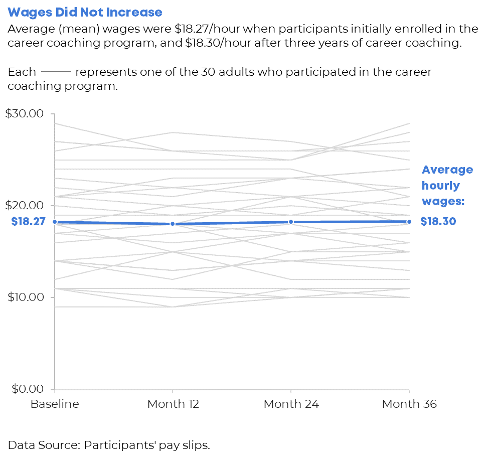
A few times a year, the career counselors collected data on the participants. For example, they asked the participants how much they were being paid. The career counselors might even verify their wages by looking at pay slops or tax forms.
The person responsible for compiling all this data should see whether wages are improving, declining, or staying steady.
Imagine that you uncovered that wages for most program participants were staying steady—despite hundreds of thousands of tax dollars being poured into this program.
That flat line has to be shared and talked about! Something needs to be adjusted ASAP.
Your things-stayed-steady-over-time graph might look like this.
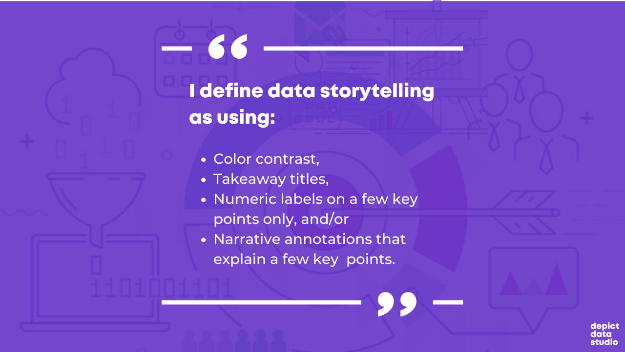
We applied several data storytelling techniques. I bet you recognized them right away:
- We’ve got color contrast (all 30 participants’ individual lines are grayed out, and the average is highlighted in a darker brand color).
- We’ve got a takeaway title (“Wages Did Not Increase”).
- We’ve got numeric labels on a handful of key data points (the $18.27 average wage at the beginning, and the $18.30 average wage at the end).
- We’ve got (light) narrative annotations (“Average hourly wages: $18.30”)
Looking for Useful Stories throughout the Analytical Process
When do you look for possible data stories?
Not the day before your project’s due!!!!!!!!!!!!!!!!!!
Revisit these questions at each stage of your project’s analytical process.
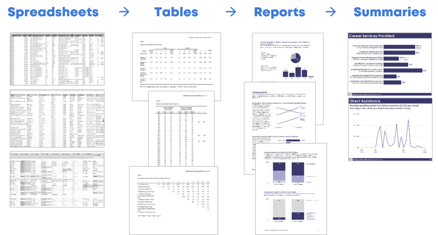
Look for Useful Stories in the Raw Data
I start with my spreadsheets of raw data.
I ask myself, “What’s going well? Did we reach our goals? What increased over time? What’s surprising? Which information needs to be shared with others?”
I keep a running list of interesting nuggets in a notebook.
Look for Useful Stories as You’re Compiling Tables for Your Appendices
Later, I compile my analyses in tables. The tables often go in the appendix of a technical report.
This means that I write the last pages of my report first.
As I’m designing the tables, I ask myself those five questions again, and I add to my running list.
Look for Useful Stories as You’re Designing Your Full Reports or Slideshows
Next, I write my report (or create my slideshow, or whatever the finished product will be).
I look through the tabulated data as I’m designing the report: Which numbers deserve to go into the body of the report?
Look for Useful Stories as You’re Designing Summaries (One-Pagers, Infographics, Briefs, etc.)
Finally, when my full report/slidedeck is complete, I pull out graphs that are so interesting that they deserve to go in a summary.
I’m using the word summary loosely here.
A summary could be a one-page handout, an infographic, a shorter brief, etc.
Yes, this is the place for those stories to shine.
Yes, you should’ve found stories along to way to include in your summaries. Hopefully!!!
This stage gives you one more chance to think carefully about useful gems in your dataset.
Don’t wait until the end of a project to think about the “so what?”
This should be an ongoing, intentional process.
When we think deeply about the data, our audiences will benefit from the added clarity.
Your Turn
What’s your process for uncovering interesting stories in your data?
Do you have more thought-starter questions to add to the list?

2 Comments
This post was so useful and timely!
Would you please consider a suggestion?
The lessons from this post would be more ingrained in our minds, if it were accompanied by a YouTube video of a live/follow-alongwith-me session of you analyzing the data, asking yourself these questions as you go along, and creating charts accordingly. Would you please be able to create such a YouTube video and let us know?
Alternatively, if one already exists, please let me know, or kindly link it to my comment:) Much thanks for the beautiful insights you consistently offer!
You might like our courses! They’re full of start-to-finish case studies.