Every time I scroll through social media, someone’s post is telling me:
“Want to know the secret to great dataviz?! Know your audience!”
“Want to make a great dashboard?! Know your audience!!”
I mean… duh.
“Knowing your audience” is terrible data visualization advice.
What does that even mean?! It’s too broad. It’s too generic. It’s too beginner-level.
What’s the alternative? Not know my audience? Ignore their preferences altogether? Of course not.
In this article, let’s dive deeper. Let’s look at specific, nuanced, advanced ways of “knowing our audience.”
8 Questions to Understand Our Audiences’ Dataviz Preferences
Here are 8 discussion-starter questions that help us better understand the people who’ll be receiving our finished data visualizations.
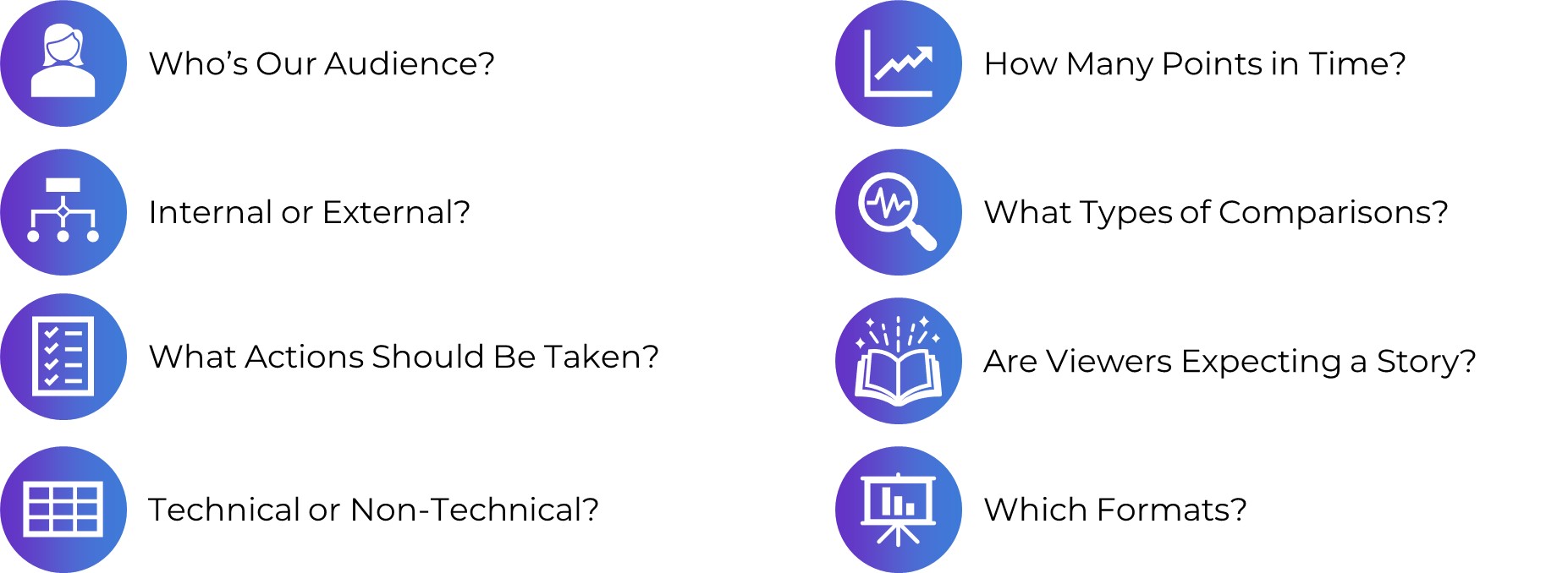
Who’s Our Audience?
First, sit down with your colleagues and list all the audiences for your upcoming project. Who are you trying to reach with your report, slideshow, dashboard, or infographic? List the audiences inside a document, on a whiteboard, etc.
This sounds obvious. It is. Common sense isn’t common practice.
If you have more than 3 audiences, then prioritize them. Put a star next to the 3 highest-priority audiences.
This sounds obvious. It is. Common sense isn’t common practice.
You might have a particular audience in mind… and realize that your coworker has an entirely different audience in mind.
You might assume that Audience A is the top priority. Your coworker might assume that Audience B is the top priority. And so on.
A decade ago, when I was a data analyst inside a large nonprofit organization, my audiences included:
- Board of Directors*
- Executive Director*
- Mid-level managers
- Frontline staff
- Program participants
- Current donors
- Prospective donors*
- Local policymakers
- Grant writers
- My direct supervisor
- Peers at data conferences
Internal or External?
Second, list whether each audience is internal or external (to the organization, project, program, or policy).
For example, our Executive Director was obviously an internal audience. She worked within my same organization. Our Board members didn’t work within our organization, but they were still internal, because they were insiders to our terminology and topic areas. Donors, however, were external.
Figuring out whether audiences are internal or external should be obvious.
It’s the implications that take time to think through: How will you display data differently for internal vs. external audiences?
Here’s one implication: Internal audiences might prefer everyday charts, like bar charts. They’re already bought-into the topic area—they literally work on your same topic area 40+ hours a week alongside you—so they might not care about interesting chart types. External audiences, on the other hand, might prefer xenographs. We can draw them in with interesting chart types, like b’arc charts.

What Actions Should Be Taken?
Third, plan out what types of actions you want your audiences to take based on the dataviz you’re going to share with them.
“I want my audiences to be informed.” Of course. But are they supposed to do based on that information??
At a recent conference presentation, I asked attendees how their data projects had been used to inform decisions. Here are some examples from those conference attendees:
- A committee was formed to address the recommendations – Karla
- We created a “lessons learned” report about System of Care development in our state; to this day, our report is referenced and shared with new staff – Kaela
- Saved funding for a program due to promising findings! – Juliana
- Changed approach to how students asked to participate in services – Christy
- We have had elements incorporated into the statewide health plan – Sharon
- Our evaluation of our state’s response to dementia led to a new dementia program in the Division of Public Health! – Sasha
- “Lessons learned” report invoked lots of thinking, and management changed shelter construction designs that were not working for beneficiaries – Dennis
Planning these actions in advance will help you collect and visualize the data needed to inform those decisions. It keeps our eye on the prize.
Technical or Non-Technical?
Fourth, list whether each audience is technical or non-technical. Technical audiences love spreadsheets. Non-technical audiences would rather be doing something else: managing the people, running the program, or leading the policy initiative.
Recognizing whether each audience is technical or non-technical is the easy part.
The fun part is thinking about the implications. How will you display data differently??
Here’s one example: Technical audiences don’t mind regular tables, while non-technical audiences prefer heat tables.

How Many Points in Time?
Fifth, decide how often you’ll collect and share data with each audience: Daily, weekly, monthly, quarterly, or annually.
Audiences at the top of org charts need strategic information: The big-picture data needed to guide to long-term vision of the work. They don’t need daily updates; they’d get lost in the weeds. For example, a Board of Directors might value seeing data at annual intervals. They need to plan for where the organization is headed over the next 5-10 years, so I often show them the past 5-10 years of data, at annual increments, to help them see the big-picture of what’s taking place.
Audiences who are on the front line, running the day-in and day-out work, need operational information. They need to see data more frequently. They need to come into their office on Monday morning and figure out their priorities for the upcoming week or month. Waiting until the end of the year to give them annual data would be useless.

What Types of Comparisons?
Sixth, discuss what types of comparisons our audiences need to make.
Whoa, beware, I have a lot to say about this one. It probably warrants its own article.
There’s nothing more useless than a big number.

This isn’t data “viz.”
Are these numbers big or small? Compared to what? It’s impossible to know, because no comparisons are provided.
Instead of the useless big numbers approach, compare by:
- Time (How have the numbers changed over time?)
- Subgroup (How are the numbers different for different demographic groups?)
- Location (If your data comes from multiple locations, how do the numbers vary from place to place?)
- Goal (If you’ve got a goal, target, or outcome in mind, did you reach it? Why or why not?
- Spread (What’s the distribution of the numbers? What are some of the individual values?)
Are Viewers Expecting a Story?
Seventh, think about which audiences prefer traditional graphs or storytelling graphs.
We always have to adjust the software program’s default settings (decluttering, applying brand colors and fonts, adding or removing labels, etc.).
You can transform the default settings into a traditional graph or a storytelling graph.
Traditional graphs have topical titles, and none of the colors stand out.
Storytelling graphs have takeaway titles and dark-light contrast. You might even sort the bars to make it easier to spot patterns.

Which Formats Are Best for Each Audience?
Finally, think about which format(s) each of the different audiences needs to receive.
The old way: Shoving allllll the data into a single Dusty Shelf Report. Crossing our fingers. Hoping all our different audiences can find what they’re looking for.
Nowadays: Producing different formats for different audiences. A 15-minute in-person meeting for one group. A one-page PDF for another group. A technical report with appendices for another group.
I’m not anti-report. Some of us will still need reports (I’m thinking of my colleagues who work with government agencies, foundations, universities, and large nonprofits).
At a bare minimum, we should follow the 30-3-1 Approach to Reporting. I’ve written about this approach before, and I’ve got more resources on this approach coming up soon, so I won’t go into detail now. The basic gist is:
- We start with our massive report.
- We limit the report’s body to just 30 pages (or less!).
- We don’t have to delete the rest of the pages. They just get moved to the back of the report and form the appendices.
- We transform those tables into visual appendices.
- We design a separate 3-page summary.
- We design a separate 1-page summary.

Your Turn
Beware: These take time. This isn’t a 15-minute activity from start to finish. You might need to spend 15 minutes on every single question, alongside your colleagues, to talk through each of these items.
The good news: You don’t have to finish all 8. Not doing any of these activities? No worries! Choose one or two. Already doing a handful of these? Great! Try one more.
After you’ve tried an activity or two, post your reflections here. I’d love to learn how you’re customizing your visualizations for each of your different audiences.
1 Comment
THANK YOU for the thumbs down on the big numbers! This is all over annual reports these days, and I agree with you that it frequently lacks context that tells anyone whether it’s good/bad/expected/surprising/etc… Fantastic article all the way through!