I often write about practical software how-tos. But at my core, I’m software-agnostic. I don’t care which software program you choose. I’ve seen stellar visualizations in good ol’ Excel and downright embarrassing visualizations in fancier software programs whose salespeople pretend that their software is a magic bullet for dataviz. I believe that the best data visualization tool of all time is your brain, and the second best is sketching with paper and pencil… or even Play-Doh! When I discovered Amy Cesal’s #DayDohViz approach to data visualization, I swooned. I can’t wait to share her work with you, too. Enjoy! -Ann
This year, one of my many New Year’s resolutions was to participate in The 100 Day Project, a creativity project that requires making one thing, every day for 100 days.
I’m a data visualization designer with a master’s degree in Information Visualization. And I love working with clay. I was a ceramics instructor at a summer camp for six years, and recently finished taking an advanced wheel throwing class. Molding things with my hands comes naturally to me.
I wanted to merge these two seemingly disparate passions of data visualization and ceramics in a playful way. Day-Doh-Viz was born: Data visualizations created out of Play-Doh produced “daily”. #DayDohViz
Play-Doh is a great medium because it’s brightly colored and photogenic. It’s easily moldable; you can pretty much do anything with it. It’s reusable and relatively inexpensive. And taking something from childhood and elevating it for a different use has a playful, nostalgic feel.
Working with Play-Doh also limits precision. It isn’t going to be perfect, but that’s part of the fun. It stops me from being a perfectionist and lets me focus on the bigger theme. It also allows me to visualize things I might not want to show with absolute precision, like my financial data.
My (45 so far!) play-doh visualizations have mostly fallen into 3 categories. Financial, personal data, and remakes of other data visualizations. Here are 6 of my favorite DayDohViz:
Income and Expenditures in April
Talking about money is such a taboo subject. Especially sharing your own financial information. Most of us aren’t great at personal finance, and it doesn’t help that we’re afraid to share this information with others. I like to help destigmatize this by sharing my own information. Play-doh feels like a low risk way to do this. It’s a little imprecise, and I don’t have to label the exact numbers, but the viewer gets the feel of what’s going on, and can maybe relate.


Perceptions of Probability in Play-Doh
What does it mean when something is “probable”? Is it more certain than “highly likely”? I love the original perceptions of probability joyplots, which plotted survey respondents numerical probability estimates for a variety of phrases. It quantifies how people perceive these usually squishy terms. It’s also colorful and fun. Doing a remake of it in Play-Doh was an enjoyable experience.
In doing so, I realized that joyplots are like the side view of violin plots. This Day-Doh-Vis won the most informative #CraftyDataViz Award.


Beverage Enjoyment
I love liquids. When you’re trying to create a whole new visualization every day, sometime you just need to graph something easy with “data” that you know. To me, the chart details make this one especially fun. All the carbonated beverages have a slight bubble texture to them. I added little suggestions of fruit to the drinks that typically come with a lemon, lime or cherry. The size of the sphere is the amount I want to drink and the proximity to the top is my enjoyment level. This was a quick viz to build probably about an hour.

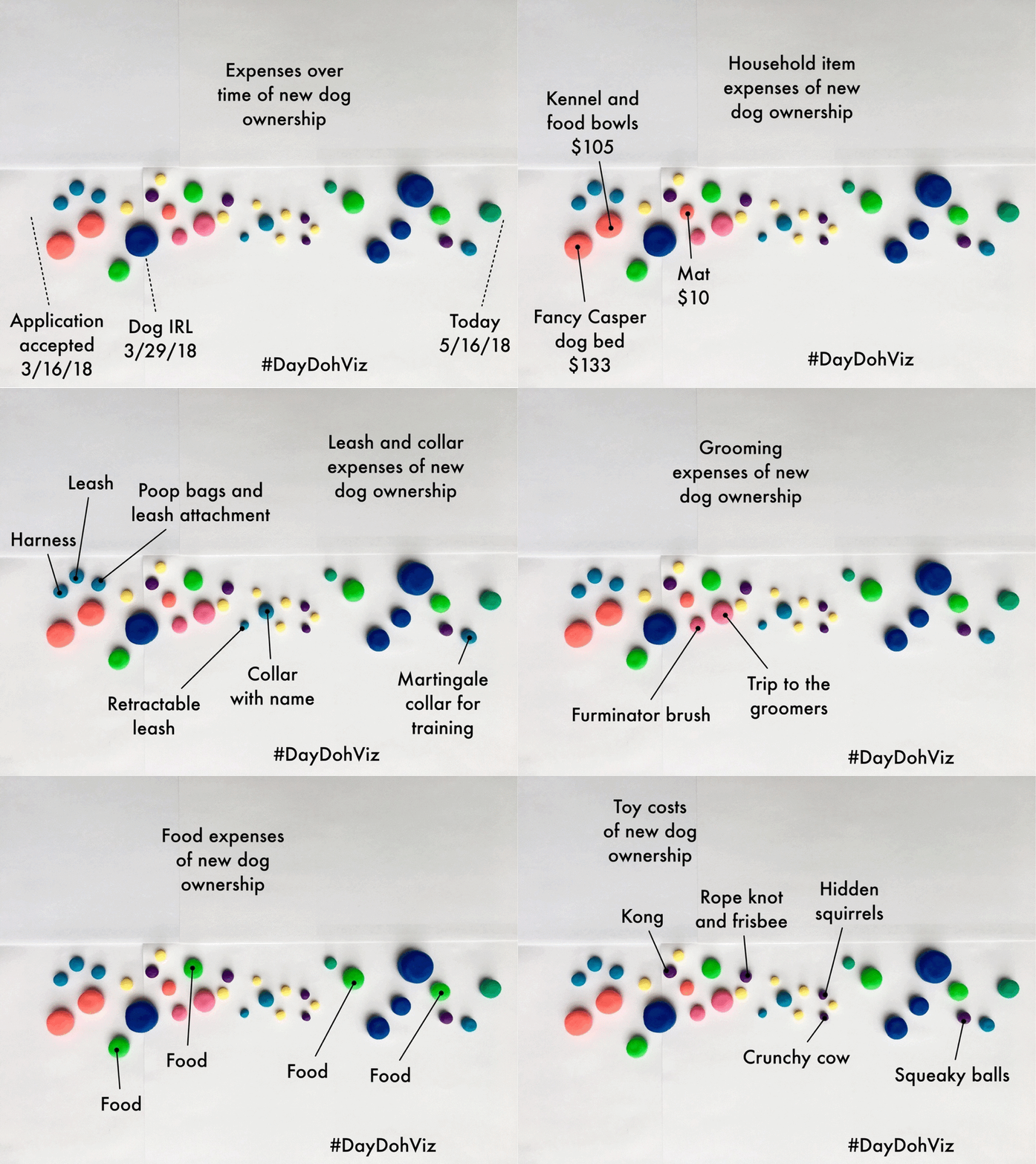
Costs of New Dog Ownership
This one was another way of showing and talking about personal finance using my own experience and data. I knew there were going to be lots of start up costs to adopting a dog. I was surprised at how varied and spread out they were. The gif format helps the labeling not seem overwhelming, and allowed me to try my hand at something different. For just the bar graph, the extruding and assemble portion, took me about 40 minutes.


Birthdays Parties Change with Age
I’m at an age where on a Saturday I can attend a friend’s child’s party and an adult’s birthday. The contrast is quite interesting. When the little ones crash, they crash HARD. It was fun to build and make the numbers out of Play-Doh.

Birth Rate Viz in 3D
Inspired by the popular Scientific America visualization “Why Are so Many Babies Born around 8:00 A.M.” The original visualization has aspects of being 3D but is visualized in two dimensions. I played with that and built it on top of a glass jar. The original chart was so great, I didn’t want to mess with that, just bring out a different aspect that building it in real life could highlight. There was a lot of measuring over three days to create this one and I plastic wrapped it overnight.


Steps of Day-Doh-Viz-ing
- Conceptualize. Have a brilliant idea of what I want to visualize.
- Research. Figure out what data is available for what I want to show and how do I get it.
- Data collection. Find and organize the data. Sometimes I’m tracking my own data over time. Or going through and collecting specific data about a topic.
- Design. Figure out how I want to show it and either sketch or do some test graphs in google sheets.
- Gather materials. I have a bin of play doh, but sometimes you need to find the right jar, or custom tape, or print out a graph to build on top of.
- Color mix. Squish colors together to create colors that will match the visualization or work well being photographed. Warm colors tend to blow out when you don’t add a little black or white to them.
- Build. Create the visual out of play-doh, sometimes this involves rolling balls, extruding bars, or forming mounds.
- Lighting set-up. Sometimes window lighting works nicely, sometime I need to use a ring light.
- Photograph. I always take different angles so it’s usually at least 20+ photos of each visual. Sometimes a video, sometimes a tripod so I can create a gif.
- Image edit. I try to only stick to apps to keep it simple, so I’ve been using the iphone photo app and Facetune for some detail editing.
- Annotate. Again, I’m trying to be simple, so I’m using This app to annotate my viz. It limits the amount of choices I have, like font and style.
- Post. Share on social media and add to my portfolio of creations.
When you’re creating every data point by hand, you get to know your data intimately. As I’ve created more of these visualizations with play-doh, I’ve tried to find and highlight the unique things about this medium. I’m working to push the 3D aspect. And the ability to manipulate data and show different stages, or effects, by just adding elements or building everything and removing parts.
What I’ve Learned
- Most successful = unique form + unique data + well executed
- To remember that I’m doing this for fun
- Play-doh is cheap at TJ Maxx
The project has been highlighted in Andy Kirk’s Best of the Data Visualization for April list, and on Alli Torban’s Data Viz Today podcast. I’ve gotten a few hundred new Twitter followers, and asked to write a couple blog posts. Which is pretty successful for making things out of play-doh.
The best thing, I think, is that I’ve inspired other people to use play-doh for data visualization. Anna Fergusson took play-doh into her class and had her intro stats and data science students make visualizations. I’m not saying that play-doh is the best medium for data viz, but I think there’s something to be said for stepping away from traditional tools, and creating visualizations by hand.
And I think it can be less intimidating and to work with an imperfect medium, rather than pen and paper, or a computer which can feel demandingly precise.
Learn More about #DayDohViz
Follow along on Twitter for more #DayDohViz


4 Comments
This is so fun! Thank you for sharing.
this is great , will have to try
[…] to visualise research and was inspired by Amy Cesal who uses Play-Doh as a data visualisation tool https://depictdatastudio.com/daydohviz/ We sent the group this link along with others to help them to develop their stories and to consider […]
… [Trackback]
[…] Read More: depictdatastudio.com/daydohviz/ […]