
Wondering how to widen the bars in your bar or column chart? Or how to move the bars or columns closer together? This tutorial is for you!
Let’s pretend you’re graphing age distributions for a given county.
You carefully formatted your histogram: you removed the border, lightened the grid lines, wrote a descriptive title and subtitle, selected custom RGB color codes, and called attention to a section of the graph with the saturated action color…
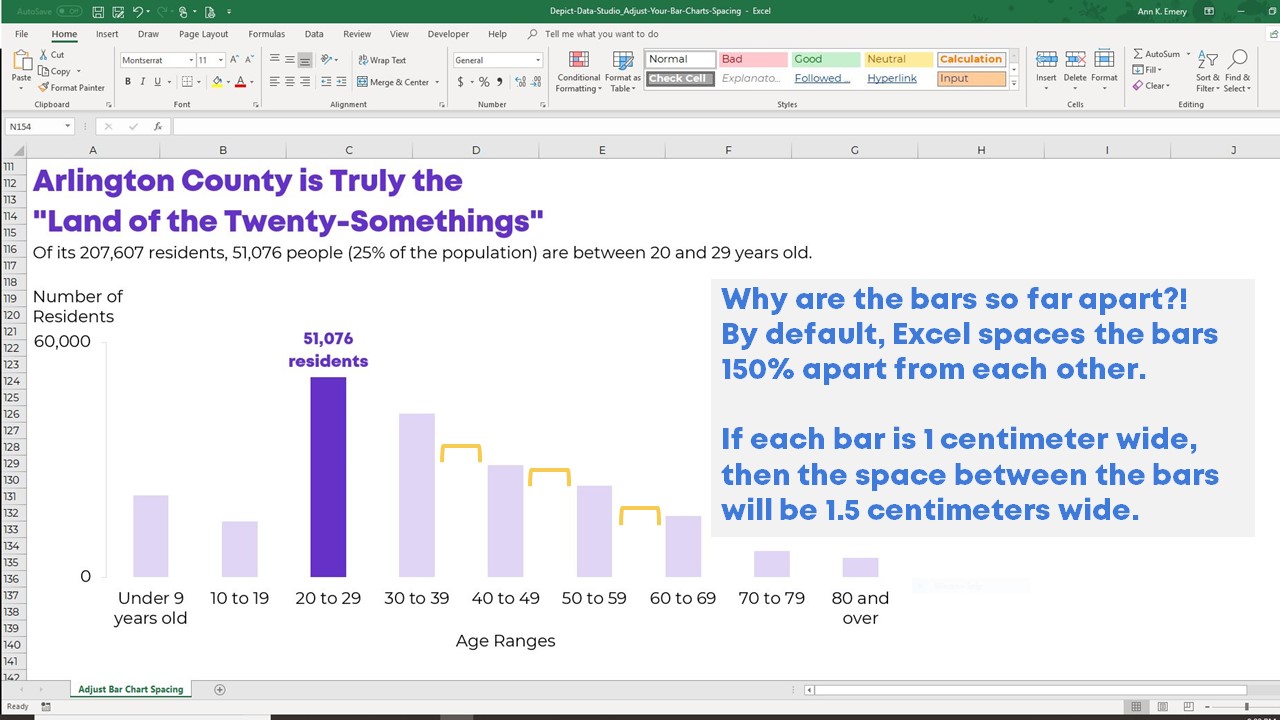
… but your chart still looks weird because the bars are so far apart. What’s with all that empty white space in between the vertical bars?!
By default, Microsoft Excel spaces the bars 150% apart from each other. If each bar is 1 centimeter wide, then the space between the bars will be 1.5 centimeters wide.
This huge space looks odd in a regular bar chart and horrible in a histogram. Histograms, in particular, are supposed to be smushed together. Our eyes are supposed to see the distribution as a seamless, unified shape rather than as a bunch of distinct bars.
How to Widen Your Chart’s Bars
Let’s reduce that spacing! There are only two steps. Follow along; it’s easy.
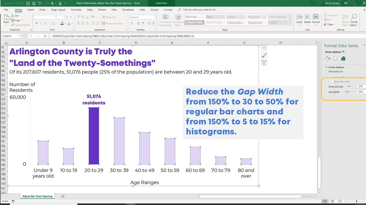
Step 1. Right-click on any of the colored bars. In the drop-down menu, select Format Data Series.

Step 2. Reduce the Gap Width.
Gap Width is a jargony name that simply refers to the size of the spacing or gap in between the columns. Excel’s default setting is typically around 150%.
Reduce the Gap Width from 150% to 30 to 50% for regular bar charts and from 150% to 5 to 15% for histograms.
Try various spacing options and see which one you (and your boss and viewers) like the best. There’s no absolute right answer on this; it’s aesthetic preferences.
Do aim for consistency within the same final product. For instance, you wouldn’t have a Gap Width of 5% for the histogram on the first page of your report and a Gap Width of 15% for the histogram on the second page of your report. Choose one width and make sure everyone on your team formats their graphs accordingly.
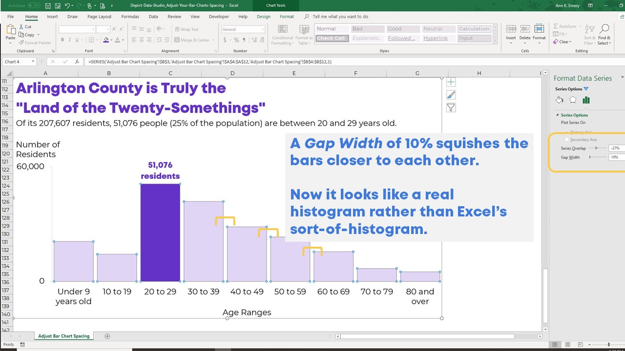
In this example, I reduced the Gap Width to 10%.
Bonus: Download the Materials for Free
Want to explore how I created this histogram? Download the spreadsheet and accompanying slides for free.
16 Comments
Found this blog post in my email today, I am starting to use Excel more for my job and this is exactly what I needed to see. It may sound strange, but I had noticed that the line spacing on charts made it harder to see the relationship between the data, but I hadn’t gotten around to trying to figure out how to fix it. My boss will be surprised the next time we are working with data. Thanks for the timely help!
I would like to create very thin bar graphs with very little gap. But Excel wont allow you to reduce the width of the bars as much as we want. I hope future versions of Excel allow this
[…] K Emery shows how to make columns in a chart closer together. It's a simple step, but can make a big improvement in the chart's […]
Thanks so much for writing this article, this can be very difficult and confusing sometimes.
Thank you the blog .. It helps, but I am here to see if I can decrease the width between two columns at the same time the width size is not changed.
This is really simple to understand but like ‘Protocoder’ on Jan 21 I’s also like to know if there is a way to adjust the distance between two columns without changing the width of the bar. Ideally, if I have 4 bars in my chart how do I move two on the left together and the two on the right together, leaving a large gap in the middle?
I’m not sure if there’s a setting that can be adjusted for this, but one means of forcing it, is to enter an empty row or column (depending on how your data is arranged) between the sets of data you want to separate, then enter ‘blank space’ using the space bar in the appropriate cell to appear as an axis label. Repeat for as many times as you need to separate eg if comparing monthly sales or income for any two years, put the empty row/column after each month (except December where it’s redundant).
[…] Declutter that cluttered graph. Delete the border, grid lines, title, and vertical axis. Label the columns directly. Nudge the columns closer together. […]
[…] the way down to 0%. This is your computer’s funny name for the space between the columns or bars. Follow my tutorial if this technique is new for you. The result is a big […]
[…] Here’s the mostly edited version: reduced clutter; custom color; labels directly beside the data; reduced gap width. […]
[…] Here’s the mostly edited version: reduced clutter; custom color; labels directly beside the data; reduced gap width. […]
Thanks, for Line Chart or Stacked Line chart, how can reduce this space (gap)
Hi Carlos,
In a line chart or a stacked line chart (a.k.a. stacked area chart), you can move the categories closer together by narrowing the graph. By default, Excel graphs are 3 inches tall and 5 inches wide. To nudge the categories closer together, you would adjust your graph so that it’s, let’s say, 3 inches tall and 4 inches wide. To re-size the graph, simply click on the graph to activate it, and then go to Chart Tools –> Format –> Size. Or, click on the border of the graph and drag to border to the right or left.
Another option is to add more categories altogether. For example, let’s say you’re graphing 12 months of data (so 12 categories going across your line or stacked line chart). If you added another 12 months of data (24 categories total), then each category would now be half its original size, hence shrinking the space between them.
Thanks,
Ann
[…] the columns closer together (here’s a tutorial on shrinking the gap width) so that viewers could see the smoothed-out shape of the graph rather than the individual […]
Thank you, this is helpful. I wanted to ask if there is also a way to reduce the gap without altering the widths of the bars? And if this can be done for some categories only? For example, I need to create a chart that has 2 bars for each year from 2016 to 2019. I want the bars in each year to be closer together but don’t want to reduce the gap between the year categories on the horizontal axis.
Hi Suhaib, You’ll need to re-size the outer border of your chart. You can make the chart taller, shorter, wider, or narrower to adjust the bar dimensions.