In a recent consulting project with a foundation, we were tracking their community health initiatives over a 20-year time span.
Like most of us, they’re inundated with tons of data. My job was to make the data easier to “see” and understand. Rather than expecting them to read a 50+ page report prior to the meeting, we’re going to condense a few key facts into a single handout.
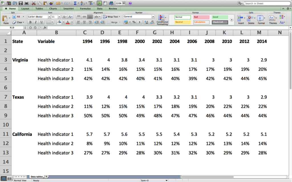
The anonymized data for this blog post:
- These aren’t the exact states.
- These aren’t the exact health indicators.
- These aren’t the exact numbers or percentages.
Pretend that health indicator 1 is something like fertility rate (births per woman). I realize the numbers are too high to represent actual fertility rates. It’s fake data. But you get the gist of what this dataset might show you.
Exploring with Spark Lines
I began exploring the data table with spark lines and spark columns.
Just highlight the row or column you want to visualize (e.g., C3 through M3), and find the icon that says Insert Sparklines.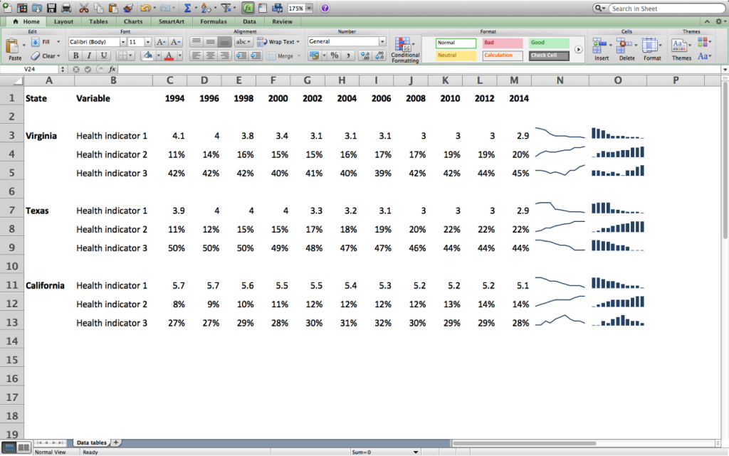
Exploring with Conditional Formatting
Conditional formatting is the 8th World Wonder.
Rather than color-coding cells by hand, you just highlight a row or column (like B3 through M3), click the Conditional Formatting icon (typically in your Home tab), and start clicking on whatever you feel like. You don’t need to know what you’re doing. You won’t break anything.
In this example, I selected Color Scales. (Data Bars are also a personal favorite–I teach you how to make them here). After creating Color Scales, I adjusted the print settings so that the heat table could serve as a one-page meeting handout in itself. I’ve been using heat tables a lot recently, so I’ll post more examples in future posts.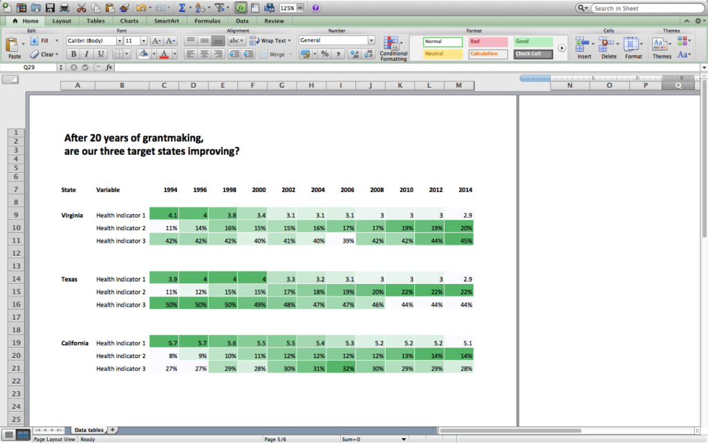
One Chart, Oops
I tried highlighting the entire table and adding a single chart.
The computer instinctually knows this is a bad idea.
Excel gets confused because we’ve got too many different units: years, and numbers, and percentages, all together.
The messed-up graph looks like this: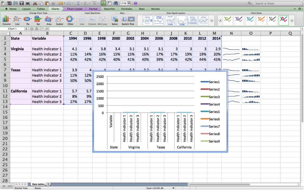
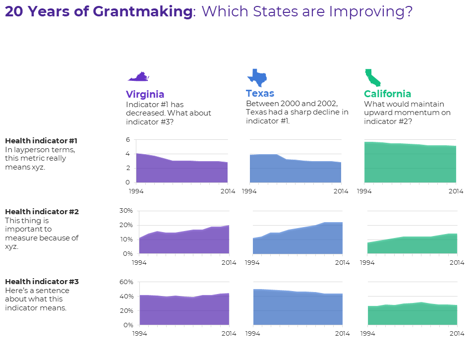
Small Multiples
Since we can’t put everything onto one chart, we’ll need small multiples.
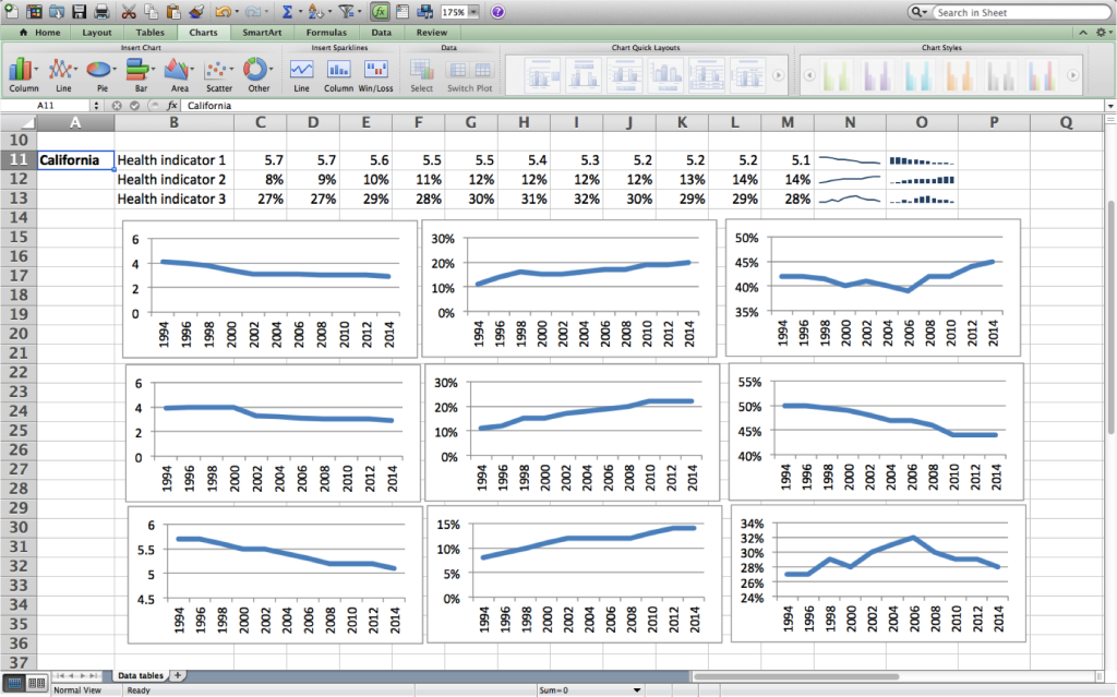
The formatted version would look like this. You might recognize the edits:
- Icons for each state (with the StateFace font; see a tutorial here)
- One color for each state (see color-coding blog posts here)

Download the File
These are Excel charts, pasted into PowerPoint for easier arrangement.
Then, I would Save As a PDF and share that PDF with the audience.
Want to explore the file on your own? You can download it here: https://depictdatastudio.ck.page/SmallMultiplesAreaCharts
3 Comments
[…] The best thing I’ve ever written about, and At-a-Glance Patterns with Area Charts | Ann K. Emery […]
[…] The best thing I’ve ever written about, and At-a-Glance Patterns with Area Charts | Ann K. Emery […]
[…] Swapping out that default color scheme for customized colors that match your stakeholder’s logo doesn’t hurt either. (P.S. Want to make this yourself? I’ve got a tutorial.) […]