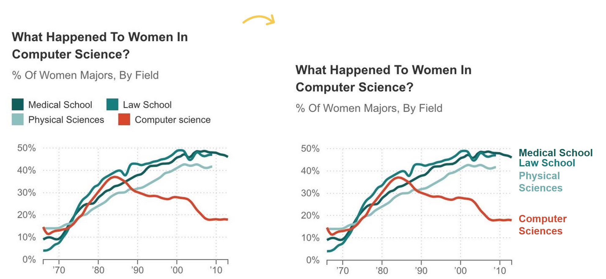
I recently saw this graph at http://www.npr.org/blogs/money/2014/10/21/357629765/when-women-stopped-coding.

The topic caught my attention but the separate legend about the line graph made me cringe.
This graph is challenging to read in color (which turquoise category goes with which line?) and would be impossible to read when printed or photocopied in grayscale.
These data labels and separate legend score a big fat zero on the Data Are Labeled Directly section of the Data Visualization Checklist.

The solution is simple. First, remove the legend.

Then, insert those labels beside their corresponding lines. The goal is to get the labels as close as possible to the actual line so that your viewers aren’t zig-zagging their eyes back and forth between the lines and the legend.
To insert labels next to the lines, you can:
- Format the data labels so that the label contains the category name. In Microsoft Excel, right-click on the data point on the far right side of the line and select Add Data Label. Then, right-click on that same data point again and select Format Data Label. In the Label Contains section, place a check mark in either the Series Name or Category Name box.
- Insert text boxes next to the lines. There’s no magic behind text boxes; insert the as you normally would just like when you’re using Word or PowerPoint. Text boxes take a few seconds longer but give you greater flexibility than traditional data labels in terms of placement.

Finally, for bonus points, color-code the labels so that they match their lines. Use turquoise for medical school, law school, and the physical sciences, and use red for computer sciences.

Direct labeling! A small edit for you and a huge advantage for your viewers.


19 Comments
Ha, and now make a 300px version of this for mobile. Not always as simple as it looks..
This is good stuff. I hate legends. Why add needless complexity as you work for engagement?
Great solution. I think the other thing that would help is if they used a categorical color scheme for the different categories rather than mixing in a sequential color scheme. Four distinct colors would be ideal, encoding with color hue rather than color value.
I suspect the reason for the color choices was to significantly highlight the comp sci downturn which directly aligns with their story/segment. I think it makes more sense this way. If it was a more general chart, perhaps not.
Another visual problem with this graph is the missing data – at the critical point!
What happened in Law School and Physical Sciences for the past few years?
Should Law School actually end up above Medical School – based on presumed trends?
Should your labels be re-ordered to show the latest position (once again, based on presumed trends)?
Please check out Bob Rudis’ post for a tutorial on directly labeling line graphs in R: http://rud.is/b/2015/08/27/coloring-and-drawing-outside-the-lines-in-ggplot/
https://gist.github.com/ramnathv/6ce063236154691e8f30
Hey Ann K. Emery,
Nice write up!!
I must say that the idea of removing the legend is amazing. Thanks you so much for providing the steps to insert labels in the chart. I will surely try them
Looking forward for more posts 🙂
[…] the mostly edited version: reduced clutter; custom color; labels directly beside the data; reduced gap […]
[…] isn’t helping much because it requires zig-zagging eye movements (no worries–solution here). Their eyes would eventually shift over to the right side of the graph. They’d they’d […]
Trillion thanks! It was helpful
Thanks for posting this! Do you know if there’s a way to do it automatically, not manually using text box? I have Office 365 Excel on my laptop.
Hi Lisa, Do you see the paragraph with the instructions in the blog post?
I have the same question. I see the paragraph with #1 & #2, but when I follow your instructions in #1, I don’t get a single label for each line. Instead I get multiple labels per line (one label at each data point in the line) similar to the labels shown in your post “How to Place Labels Directly Through Your Line Graph in Microsoft Excel.” Is there a way to have just one label show to the right of the line, like in your screenshots above?
I think this is an easy fix.
If you click on the line once, all the points will be selected. So, if you add labels, you’ll get labels on allll the points.
If you click on the right-most point on the line, then just the right-most point will be selected, which means you can label that single point.
Let me know if that works! I teach the how-to’s in live and asynchronous courses, but I don’t think I have a public-facing blog post or YouTube video on this exact technique. (Yet! I’ll add it to the list of blog post ideas.)
Yep, it works. Thanks very much! Somehow I had missed the distinction between clicking on the whole line and clicking on a single point, but I get it now. 🙂
Very helpful explanation — I learned several useful techniques.
This really needs to be easier to do. It shouldn’t have to be done for each line in the graph. It should be a one button click (I should be able to set it as a default, as it is the way that makes the most sense!).
I found this post, because half the time when I click, it’s wants to add the label to all the points on the line (and it’s clear I only selected the last data point). Or it wants to use the value of the last data point as the table.
But sometimes it’s just fine, it makes no sense.
AGREE! I have a love-hate relationship with Excel’s default settings.