I worked in several university research centers before transitioning to applied settings. My favorite position was as a researcher in a longitudinal study of adolescent development. We followed the same cohort of ~175 participants from their preteen years through adulthood. This is and was a major initiative funded by the National Institutes of Health, so we were careful and methodical during every step of the data collection, analysis, and reporting process.
In those formal research settings, I was taught to analyze the data first and visualize the data second. We crunched our numbers and poured through dozens of pages of tables during staff meetings (SAS print-outs in tiny font, which was oh-so-readable). Much later on, while prepping for a conference presentation or journal article submission, we designed graphs to showcase key findings.
Although I learned data analysis and data visualization as two distinct phases, nowadays I mix and mingle them a lot. Our brains can spot patterns in a visualization much faster than we can read through pages of numbers in tables.
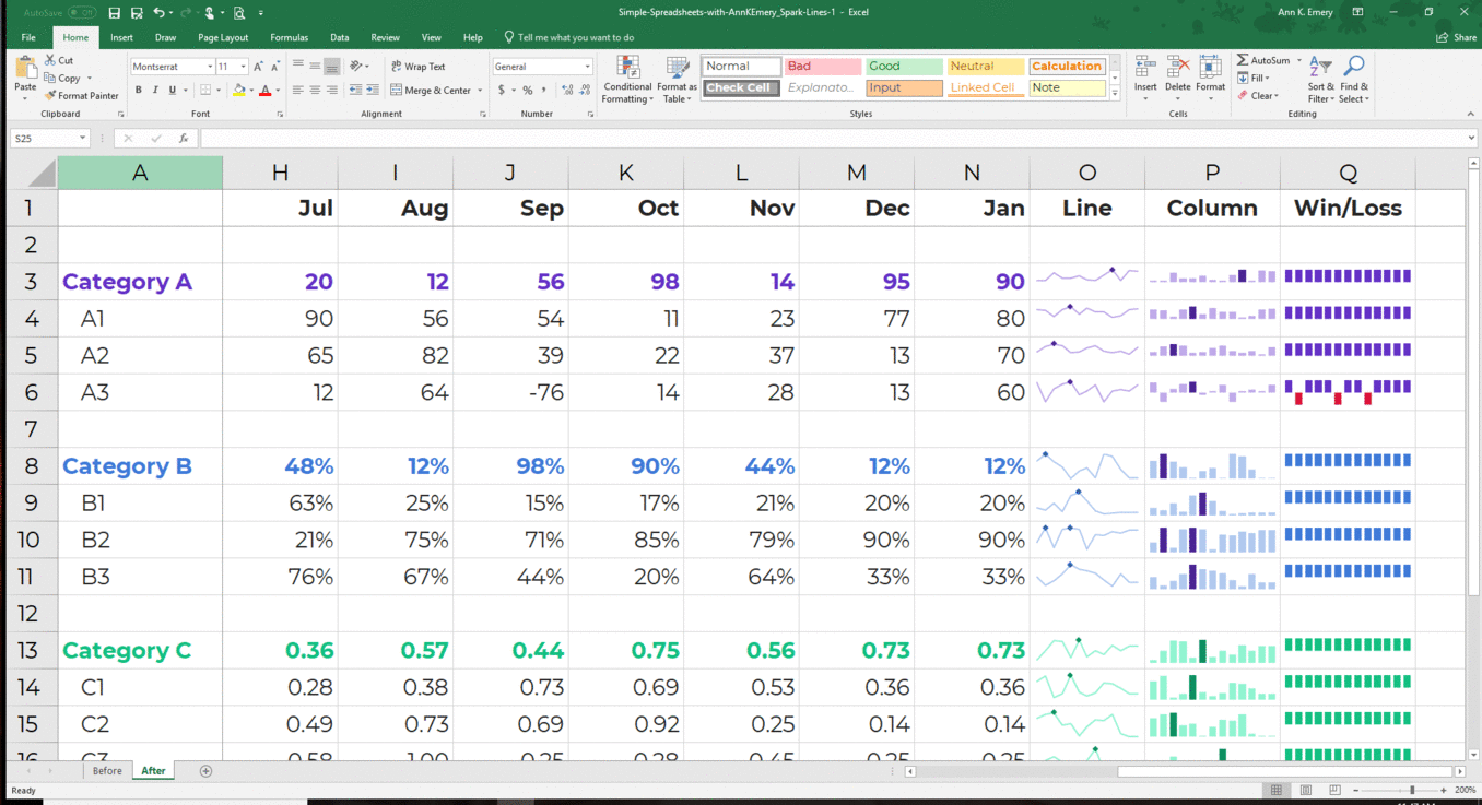
I use exploratory visualization techniques early and often. My favorite exploratory visualization techniques are sparklines and data bars. I use these techniques daily, and I want to share them with you, too.
Sparklines
Here’s a two-minute tutorial about sparklines, which are mini line graphs.
I use sparklines during early exploratory analyses when I’m trying to spot juicy patterns. Are my numbers generally going up? Going down? Are there lots of peaks and valleys? Or are the numbers generally flat? I insert these quickie visuals and then sit back and reflect on the patterns I see.
I also use sparklines in dashboard projects, like when I need a one-pager to show to others.
Here’s how to create sparklines:
Data Bars
Here’s another two-minute tutorial about data bars, which are mini bar charts:
1 Comment
[…] what I learned in the course, I transformed the ugly tables into a dashboard (below). I created data bars to communicate percentage progress towards annual goals and sparklines to show trends over time. I […]