4 Comments

  • Leslie Ayre-Jaschke says:

    I see evaluation (as most things in life) as cyclical. I’m really challenged to see anything as strictly linear, but agree that there are instances where a linear layout may better communicate a process that has a more definite beginning and end (although my brain would still be seeing the iterative, back-and-forth potential within and between each of the steps). Looking forward to your course next week.

  • Is it wrong to answer ‘both’? The whole process is a cycle, made up of several distinct steps. But within those steps, it is linear.
    Using the CDC example above – the first step in the cycle in engage stakeholders. But within that step, there is a linear process.

  • I also see it as both. For a particular set of evaluation questions, you you go through a series of steps to get the information. Then hopefully the results are used in further developing the program and spread to others who are working on similar goals, those results are evaluated, and more is learned. Ideally, as the cycle continues, we get better solutions to the problem.

  • I don’t think there is a right or wrong. I think evaluation is cyclical at times, linear at times, and quite frankly…just plain jumps around at times! I like this collection of eval graphics (makes me want to go searching for even more). I regularly share the CDC and UWEX models with my grad students.

  • Leave a Reply to Wright Evaluation, LLC Cancel reply

    Your email address will not be published. Required fields are marked *

    How Do You Visualize Evaluation?

    Updated on: Jan 8th, 2013
    Data Visualization
    ,
    Graphic showing an ongoing learning cycle with arrows, graphics and text.

    Lately, I’ve been busy designing graphics and diagrams to use in next week’s eStudy with Agata Jose-Ivanina.

    Sometimes the best way to explain a complicated topic is to break it down and display the little pieces and how they relate to each other in a simple graphic.

    Our dashboard automation process is one example where explaining the process through diagrams will (hopefully!) make a big difference for our students.

    Evaluation is another example in which graphics can help evaluators explain the process to stakeholders.

    So how do evaluators visualize evaluation?

    Is evaluation an ongoing cycle or a series of linear steps?

    How do you communicate this evaluation process to the program staff? Is the layout of your graphic connected to the evaluation’s purpose and goals?

    Let’s look at a few examples.
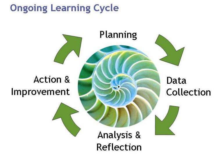
    Evaluation CyclesEvaluation Steps
    Innovation Network’s Ongoing Learning Cycle
    Ongoing learning cycle image with arrows and words in a clockwise pattern.
    Safe Routes to Schools’s Six Steps for Program Evaluation
    List of six step process for SRTS program evaluation.
    Social Research Methods’ Evaluation and Planning Phases
    Image showing the evaluation and planning phases using arrows in a circular pattern.
    The Adam’s 14 Colorado School District’s 6 Steps of Program EvaluationArrow pointing to the right with text boxes listing out steps.
    Centers for Disease Control’s 6 Steps of Evaluation (Although these are called “steps,” they are displayed as a cycle, so I chose to include them here.)
    Arrows and text boxes arranged in a clockwise pattern.
    The University of Wisconsin’s Cooperative Extension’s Evaluation Steps, shown as more of a timeline in which stakeholders are engaged throughout the entire processOutline of the steps in program evaluation using numbers and text boxes.

    Cycles…?

    An evaluation cycle implies that evaluation is an ongoing process where data is continually used for learning and decision making.

    Perhaps displaying evaluation cycles is most appropriate when conducting formative evaluations or evaluations where organizational learning is a high priority.

    … or Steps?

    On the other hand, evaluation steps imply that you’re building towards something.

    Perhaps there’s an end goal or final step.

    In the examples shown above, the final step is to “use results” or “publish.”

    Evaluation steps are probably most appropriate when conducting summative evaluations where there’s a one-time final report.

    In both cases, pictures matter.

    Your Turn

    How do you visualize the evaluation process?

    Do you have additional examples to share?

    More about Ann K. Emery
    Ann K. Emery is a sought-after speaker who is determined to get your data out of spreadsheets and into stakeholders’ hands. Each year, she leads more than 100 workshops, webinars, and keynotes for thousands of people around the globe. Her design consultancy also overhauls graphs, publications, and slideshows with the goal of making technical information easier to understand for non-technical audiences.

    4 Comments

  • Leslie Ayre-Jaschke says:

    I see evaluation (as most things in life) as cyclical. I’m really challenged to see anything as strictly linear, but agree that there are instances where a linear layout may better communicate a process that has a more definite beginning and end (although my brain would still be seeing the iterative, back-and-forth potential within and between each of the steps). Looking forward to your course next week.

  • Is it wrong to answer ‘both’? The whole process is a cycle, made up of several distinct steps. But within those steps, it is linear.
    Using the CDC example above – the first step in the cycle in engage stakeholders. But within that step, there is a linear process.

  • I also see it as both. For a particular set of evaluation questions, you you go through a series of steps to get the information. Then hopefully the results are used in further developing the program and spread to others who are working on similar goals, those results are evaluated, and more is learned. Ideally, as the cycle continues, we get better solutions to the problem.

  • I don’t think there is a right or wrong. I think evaluation is cyclical at times, linear at times, and quite frankly…just plain jumps around at times! I like this collection of eval graphics (makes me want to go searching for even more). I regularly share the CDC and UWEX models with my grad students.

  • Leave a Reply to Wright Evaluation, LLC Cancel reply

    Your email address will not be published. Required fields are marked *

    You Might Like

    Our complimentary mini course for beginners to dataviz. Takes 45 minutes to complete.

    Enroll

    Inside our flagship dataviz course, you’ll learn software-agnostic skills that can (and should!) be applied to every software program. You’ll customize graphs for your audience, go beyond bar charts, and use accessible colors and text.

    Enroll

    Subscribe

    Not another fluffy newsletter. Get actionable tips, videos and strategies from Ann in your inbox.