A couple weeks ago, I led a series of half-day workshops for faculty members and graduate students at the University of South Carolina in Columbia, South Carolina.
The first of two data visualization workshops with @AnnKEmery is underway! #GRADprofdev #GradsDo pic.twitter.com/Dw15UFiFDh
— GradSchoolatUSC (@GradSchoolatUSC) April 5, 2019
Thanks to Heather Brandt and Chelsea Richard for making this learning opportunity possible!
My Rocky Transition from University to Non-University Settings
In the weeks leading up to the workshops, I spent a lot of time reflecting on my own time working in a university.
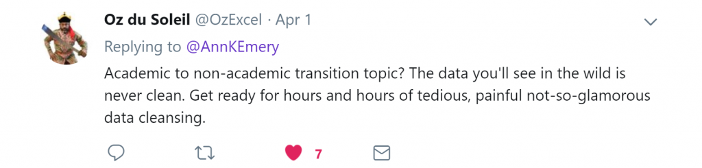
My transition from a university research lab to a non-university consulting job was rocky, to say the least!
Long ago, I had majored in psychology so I could take as many research methods and statistics courses as possible. And learning how we learn–the courses on cognition, memory, perception, and brain biology–are critical in my everyday work as a data visualization designer and speaker. I literally use those concepts every single day to design reports, slideshows, and infographics that translate dense, jargony data into materials that others can understand and learn from.
I had initially planned to become a psychology professor. Because what else would I do? 18-year-olds have a slim understanding of all the career paths available–or the brand new career paths that they can blaze for themselves, as I’ve been doing.
After graduation, I did what all my psychology major friends did: I worked in a university research lab for $10/hour and no benefits.
Well, I actually worked in four different labs, adding up to 60 hours/week, not for fun, but to make ends meet.
I worked on a longitudinal study about adolescent development (scheduling participants to come in for data collection interviews, entering data, transcribing interviews, and playing on SAS). I worked for a law school professor doing policy research (calling residents to see whether they would vote to ban smoking in apartment buildings). I worked for a local government commission (evaluating a community-wide system of children and family agencies and designing graphs for a community report card). I worked on a home visiting evaluation (driving throughout rural Virginia and interviewing parents and children during home visits).
These were the dream jobs that would look great on my resume and boost my chances of getting into a Ph.D. program.
However, less than a year later, I needed to go to the doctor. And I desperately needed to see a dentist. I left those research labs and found a consulting job with health insurance.
And so began the long, hard mental transformation from a university to a non-university researcher.
Communicating Data in University Settings: APA Format
I knew exactly how to write research papers for university settings: Times New Roman, size 12, double-spaced, with 1-inch margins and APA format. The goal was clear: Do amazing research and try to get some of those papers published in peer-reviewed journals.
Sometimes I helped graduate students and professors with conference presentations or posters. The formatting seemed pretty straightforward. For posters, it seemed like all you were supposed to do was copy and paste your APA format paper onto poster paper and then get it printed. I didn’t know how conference attendees were supposed to read the 12-point font from a few feet away. But I also knew not to ask. My, how times have changed!
Communicating Data in Non-University Settings: Whatever Format Is Needed to Get the Message Across
Business writing was a different world. We wrote single-spaced reports! And sometimes used 1.5-inch margins! Or 0.5-inch margins! Or landscape layout instead of portrait!
We provided reports whenever our recipients needed data, not just at the end of a project. Sometimes weekly, sometimes monthly. Sometimes at the very beginning of a project. Often all throughout the middle of a project.
We went well beyond reports. We talked with stakeholders over the phone, in conference rooms, through webcams, and over lunch. We gave formal presentations. We worked on press releases. We created separate one-pagers and three-pagers and five-pagers. We made dashboards and infographics. We never followed the Abstract-Introduction-LitReview-Methods-Results-Discussion order.
I was in disbelief most of the time. “We allowed to present data like this??” I would ask my (very patient) coworkers all the time. “We’ll present data however it makes the most sense for our stakeholders and project,” they would answer. What. It took me a while to get it. In the back of my mind, I thought the APA Police would come knocking on our doors.
Transitioning from University to Non-University Settings: What I Wish I Knew Sooner
As I was prepping for the dataviz sessions at the University of South Carolina, I decided to focus on the communications strategies I wish I knew sooner.
Turns out–that’s everything that I do for a living.
That may not surprise most of you. Duh, Ann. That’s what you do. You teach us how to communicate our technical information for non-technical audiences. I didn’t realize that so much of what I do has stemmed from those early, frustrating years.
I wanted to cover everything with this group of faculty members and graduate students.
I narrowed it down to top 10 communications strategies I wish I knew sooner.
Follow the 30-3-1 Approach to Reporting
At the very least, I advised the faculty members and graduate students to follow the 30-3-1 approach to reporting.
It goes like this: You limit your report to just 30 pages (with unlimited appendices). This is easy for those of you who primarily communicate with slideshows or dashboards. But for those of you who primarily communicate with hundred-page APA-format papers, this is a really hard transition.
Then, you write a separate 3-page summary and a separate 1-page summary.
Then, you keep going! You create dashboards, infographics, slideshows, or even bus campaigns and highway billboards.
Understand Your Audience’s Needs Before Analyzing Your Data
We talked about how business settings are audience-focused. You have an opportunity to be of service to others and think about the data that others would find most valuable in their data-informed decision making processes.
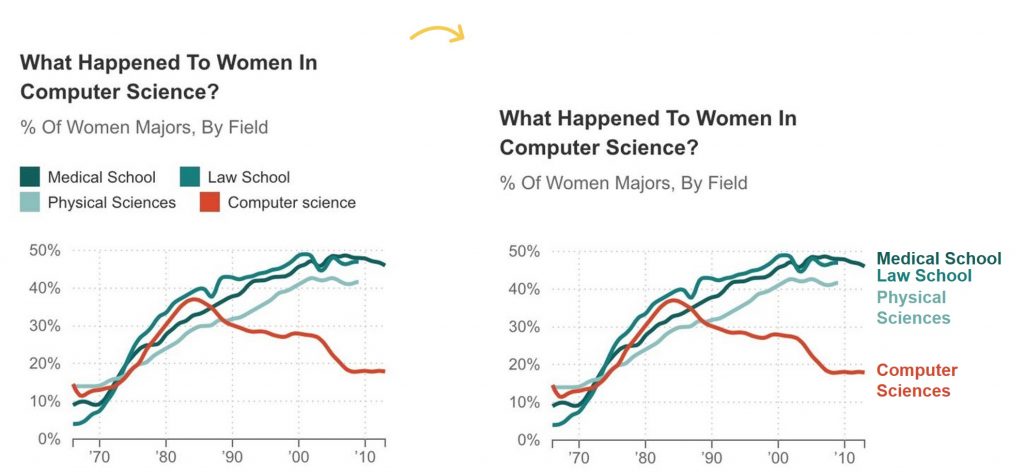
I wish I knew about the difference between a traditional graph and a storytelling graph sooner.
Go Beyond the Bar Chart
We talked about how pie charts and bar charts aren’t inherently evil. They’re just overused. And there’s so much more available to you, especially if you’re willing to hijack your software program’s default settings.
For example, I encouraged the faculty and students to try 2-slice waffles instead of million-slice pies.
We also discussed the pros and cons of regular geographic maps vs. square tile grid maps vs. hex maps vs. cartograms.
Hey check out this data viz! One of the examples @AnnKEmery shared with us! 👍 https://t.co/SraqIWOK0m
— Heather Brandt (@BlondeScientist) April 11, 2019
Use Software You Already Have
Purchasing new software won’t solve your dataviz problems.
Effective data communication is more about planning and strategizing than about googling which buttons to click.
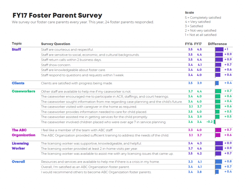
Here are some one-pagers I made entirely inside good ol’ Excel:
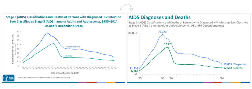
Declutter All Graphics
I wish I knew that deleting half the software’s unnecessary ink is the easiest way to improve a graph.
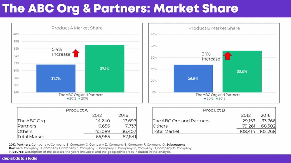
Here’s a decluttering makeover:
Brand Your Visualizations with Custom Colors and Fonts
First, find your existing brand guidelines. The University of South Carolina has a robust brand toolbox with color guidelines, font guidelines, and presentation templates that all faculty and students can use. (And should use for every presentation to remove guesswork and increase professionalism, in my opinion.)
Second, enter your color codes into Excel or Tableau.
What an easy Five Minute Fix!
Improve Your Visualization’s Accessibility
Okay, this one deserves its own blog post or book because there are so many ways to improve your visualization’s accessibility.
Accessibility is a core feature of my work. It’s woven into each and every strategy that I teach.
During the workshop for faculty and students, we focused on three techniques.
Avoid Red-Green Color Combos
Avoid red-green color combos, and then test your drafts at https://www.color-blindness.com/coblis-color-blindness-simulator/.
Avoid Colored Text on a Colored Background
Avoid colored text against a colored background, and then test your drafts for color contrast at https://webaim.org/resources/contrastchecker/.
Avoid Using Separate Legends
Avoid using separate legends/keys. Instead, directly label your data.
Apply those Branded, Accessible Colors Strategically
If you have a binary variable, then use a binary color scheme.
If you have a sequential or ordinary variable, then use a sequential color scheme.
If you have a diverging variable, then use a diverging color scheme.
If you have a categorical variable, then use a categorical color scheme.
If you want to tell a story, then use a dark/light contrast.
Measure the Reading Grade Level of Your Writing
When I worked in university research labs, terms like standard deviation and confidence interval and p-value and beta weights were part of everyday conversation.
When I teach dataviz workshops for communications, public relations, and graphic design teams, we talk about the difference between a percentage increase vs. a percentage point increase vs. a percentile. These differences are obvious to those of us who make those calculations daily. But these differences sound like gobbledygook to everyone else who has devoted their carer to a specialty other than research methods or statistics.
I was actually really surprised to learn that most people outside of university research labs don’t use these words in regular conversations. I had been living in a bubble for a few years. It took me a few more years to find accurate synonyms for research methods and statistics terms. It took me a few more years to admit that those terms counted as jargon.
Increase the Inclusivity of Your Writing
Firemen –> firefighters.
Stay-at-home moms –> stay-at-home parents.
And so on.
(Yet another technique that really deserves its own blog post. I’m adding this one to the to-do list.)
Most of these techniques apply to all settings, not just non-university settings.
For example, you can definitely follow your organization’s font and color brand guidelines now, not just later on if you decide to work outside of academia.
And you should always strive to make your visuals as accessible as possible.
Your Transition from University to Non-University Settings
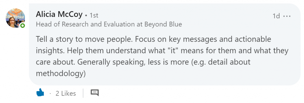
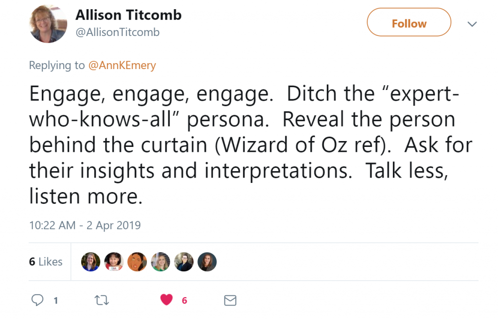
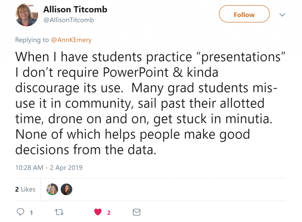
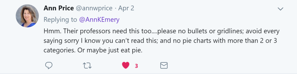
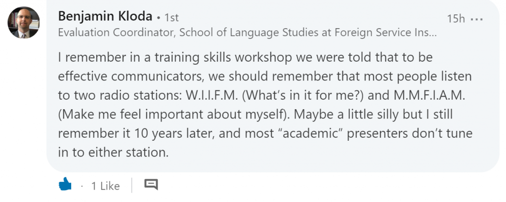
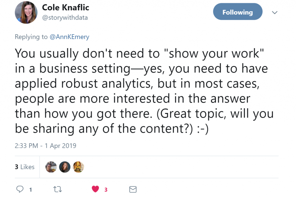
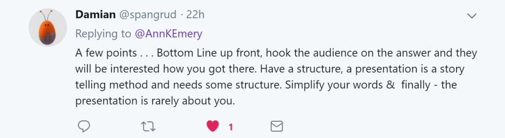
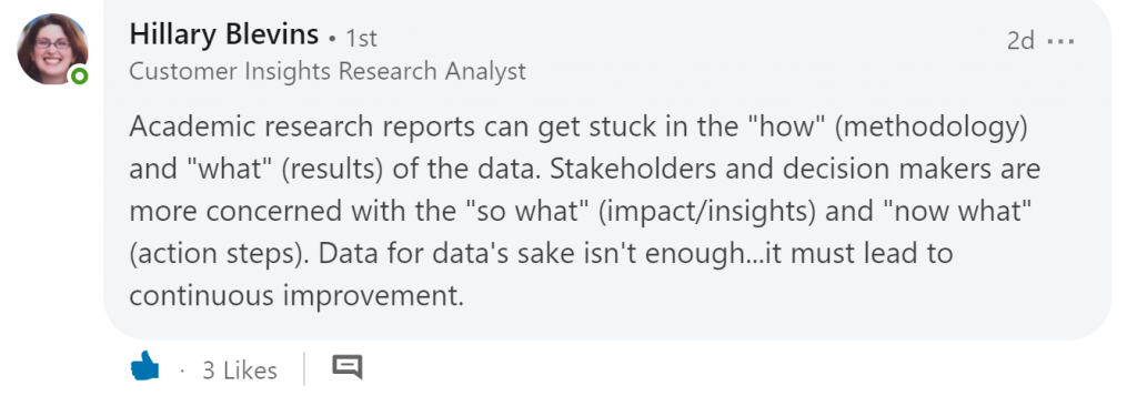
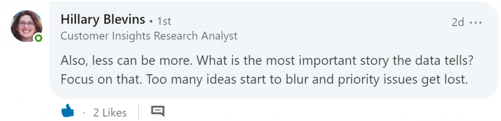
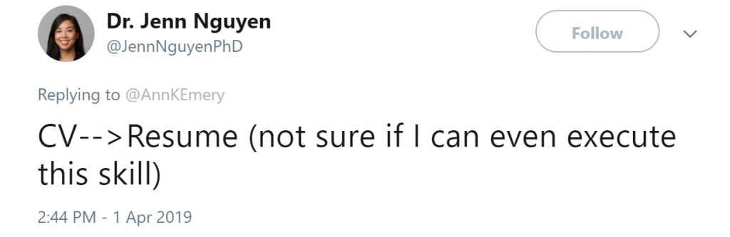
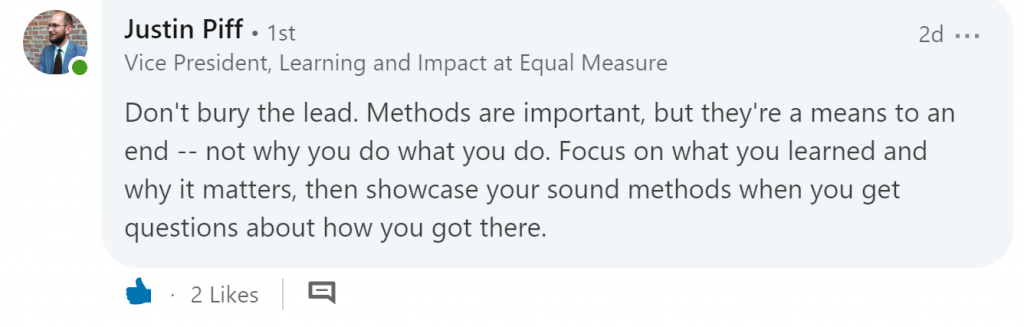
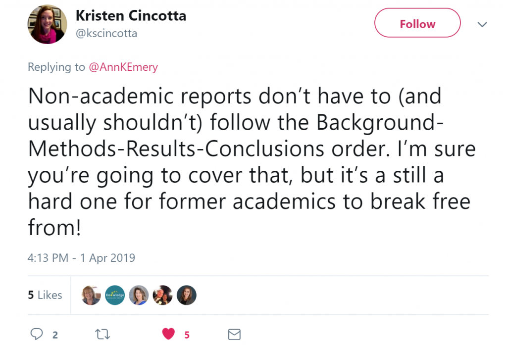
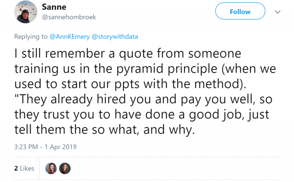
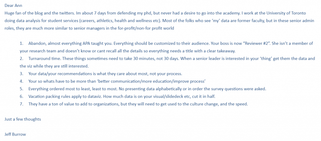
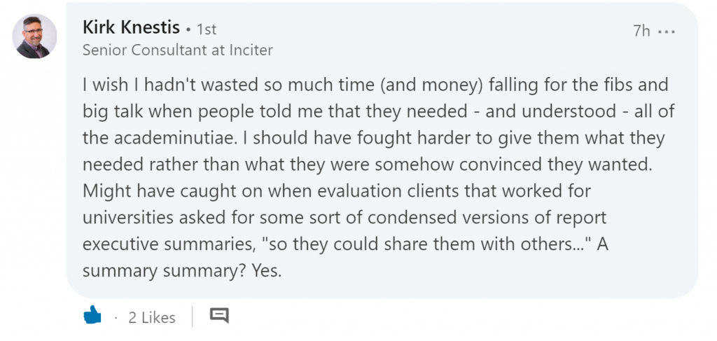
Before the workshops, I also asked you for tips on social media:
I especially wanted to hear from those of you who had a rocky transition like I did.
It turns out that a lot of us learned the hard way!
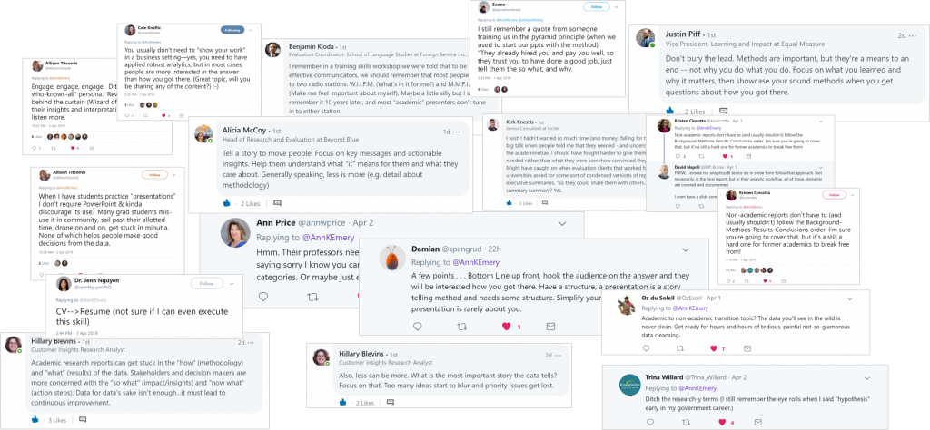
Here are some of my favorite responses.
Translating Academinutiae into a Summary Summary
Thanks, Kirk Knestis, for our favorite new vocabulary word!
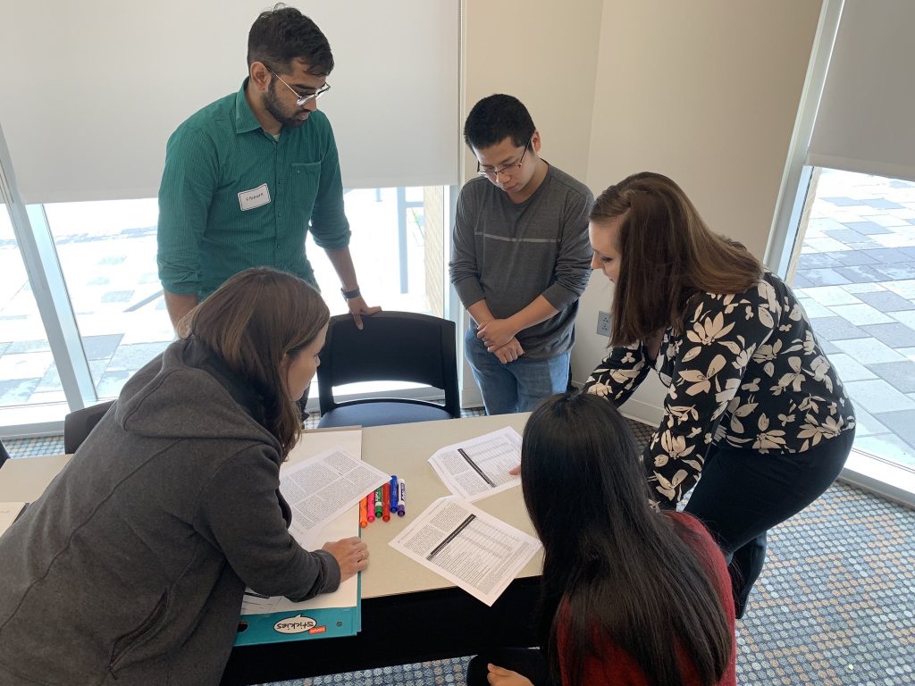
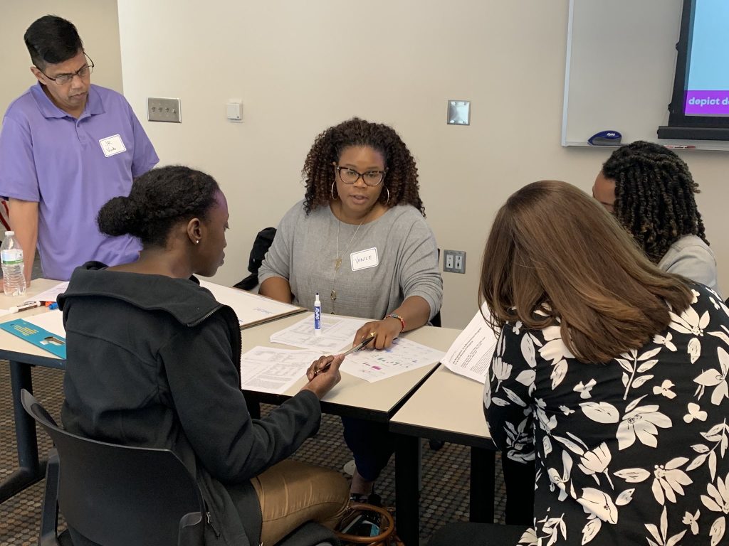
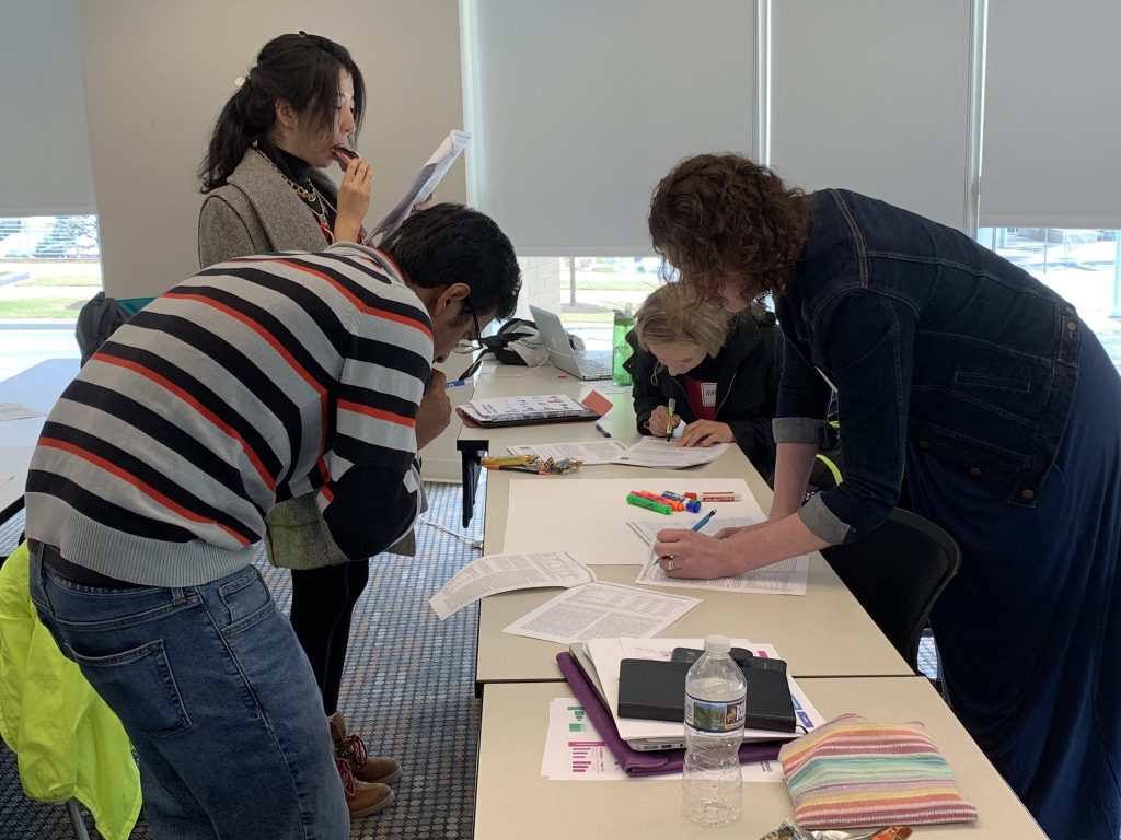
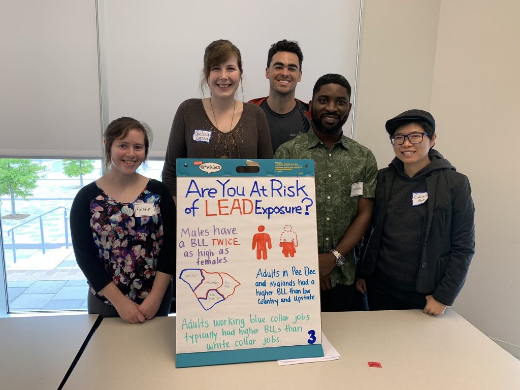
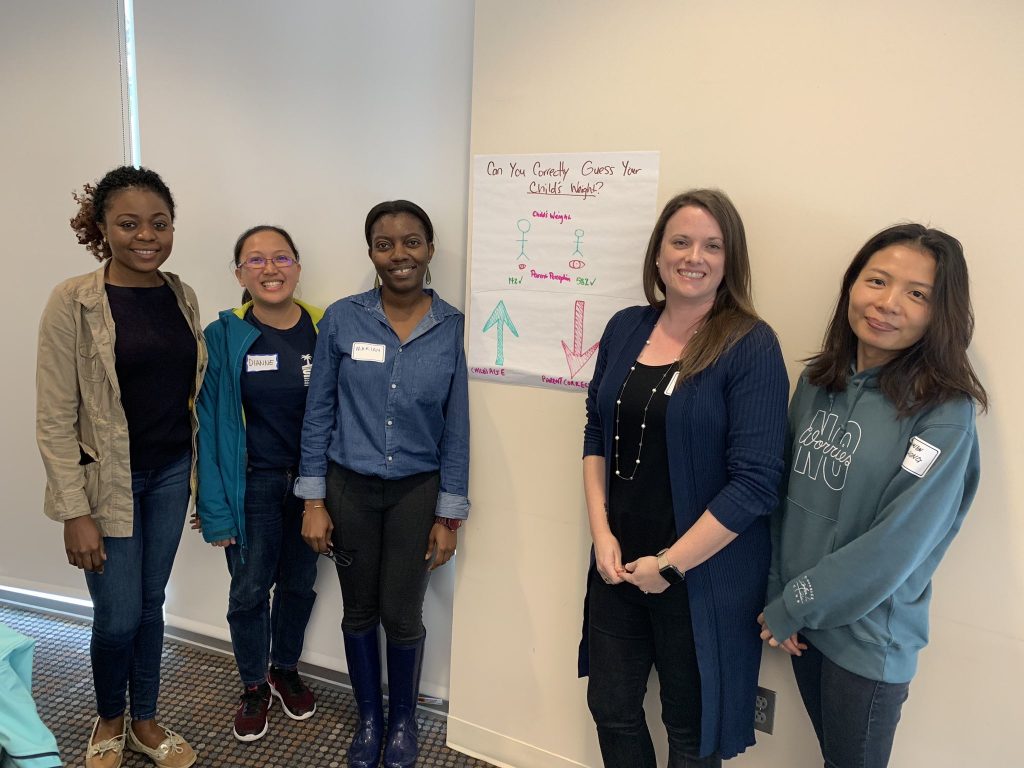
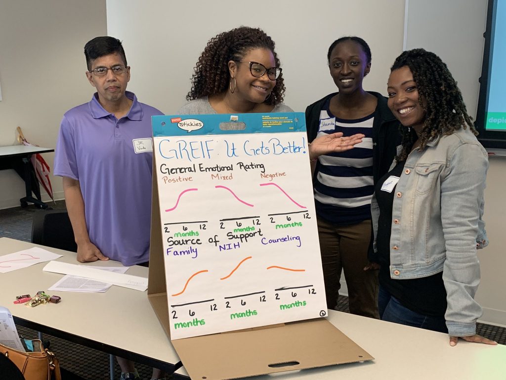
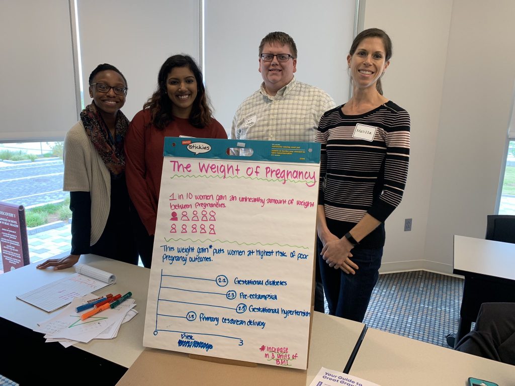
During the workshop for faculty and students at the University of South Carolina, we practiced transforming their peer-reviewed journal articles into one-pagers.
The attendees had less than an hour to:
- read a peer-reviewed journal article that one of their colleagues had written;
- come to consensus about the article’s key takeaway findings; and
- draft a one-pager to showcase those key takeaway findings.
Whoa! No small feat in less than an hour.
Coming to consensus about the article’s key takeaway findings probably took the most time. What really mattered in each article? What was so important that it deserved to go into a one-pager?
(Photo credit for all photos: @GradLifeatUSC on Twitter.)
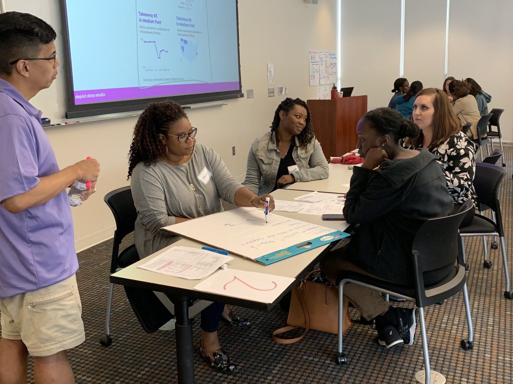
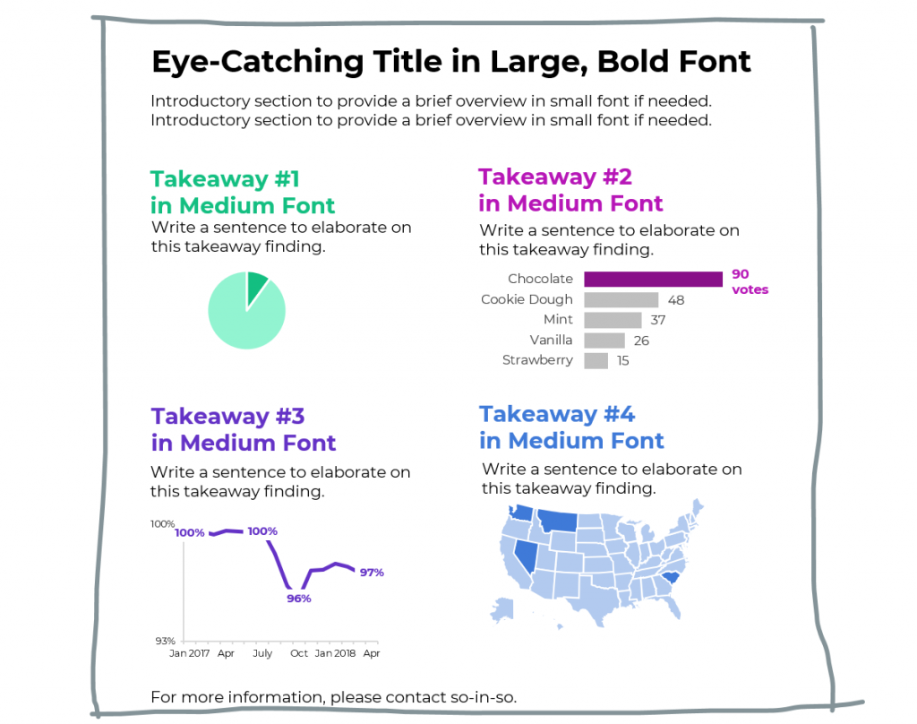
A Template for Your One-Pagers
I gave the faculty and students a rough template to follow.
I advised them to choose 3-5 key points.
Then, illustrate each key point with a visual (a chart, map, diagram, etc.) to back up their claims.
Then, arrange the visuals on the page, perhaps with a simple 2×2 grid layout.
Write storytelling subtitles for each of the visuals.
Color-code by category (e.g., the heading and the graph in the upper left corner are both green, so you instantly know that this takeaway finding is different from the fuchsia heading and the fuchsia graph in the upper right corner).
Don’t forget to add contact information and a url to the bottom.
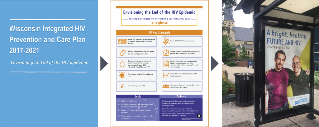
Check Out these One-Pagers!
The faculty and students had less than an hour. Here are some of their drafts. Tremendous progress for such a short amount of time! Well done.
(Photo credit for all photos: @GradLifeatUSC on Twitter.)
Many thanks to everyone who contributed their own advice to smooth the transition from university to non-university settings for these faculty members and graduate students!
If you’ve got additional advice to share, please comment below.
Leave a Reply