
I can’t be the only data designer with this problem.
My graph looks great on screen, but not when printed.
The grays blend together and I can’t tell which color is which.
Why We Should Care About Grayscale Printing
It’s easy to brush off this problem—“Just print everything in color!”
Or, “Why are you printing at all? Just tell people that your document can only be read on-screen!”
Color Printing is Expensive
First, color printing is expensive–$13 to $75 per ounce, the cost of fine champagne or perfume.
If you work for a billionaire, go for it.
The rest of us can think of better ways to spend our money.
Printing is Great! Someone Thought Your Data Visualization Was Worthy of Being Shared
Second, you should be patting yourself on the back every time your work gets printed.
Printing is a great sign!
It means someone found value in your graph and they can’t wait to print off a few copies to share with everyone else at your next meeting.
We need to anticipate that our graphs might be printed in grayscale and applaud ourselves when that happens.
How to Check Whether Your Graphs are Grayscale-Friendly
Here’s how to check whether your graphs are grayscale-friendly (without wasting ink by printing drafts on paper) and how to fix them when they’re not.
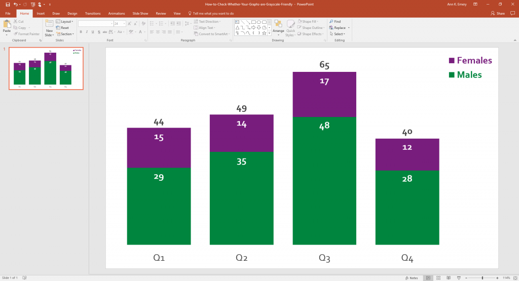
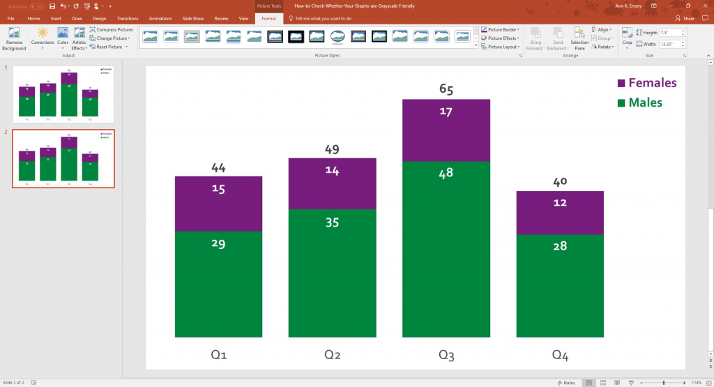
Step 1. Build Your Graph in the Software Program of Your Choosing
Make your graph.
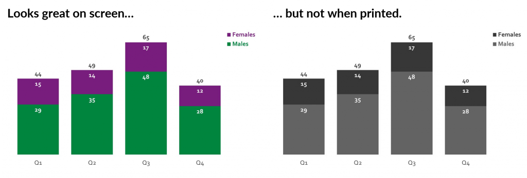
Here’s a regular ol’ stacked column chart that uses one of my client’s color schemes (this exact purple and green) and their fonts (Corbel).
I made this graph in Excel and pasted it into PowerPoint.
You can apply the same process in Word, too—make your graph in Excel and paste it into Word. You just need a software program that lets you adjust your picture’s colors (from color to grayscale).
I don’t care which software program you use to design your graph. Nobody cares what type of quill Thomas Jefferson used.
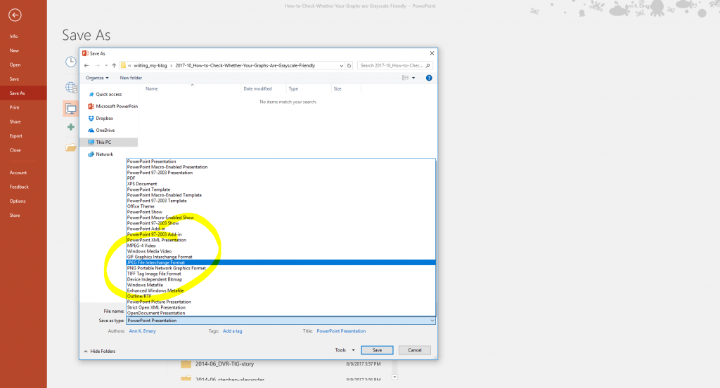
Step 2. Save Your (Draft) Graph as an Image File
Save your graph as an image file.
I often paste living, breathing graphs from Excel into PowerPoint as Microsoft Objects.
But for this grayscale-testing technique, we need to convert our graphs into image files, like a PNG or JPEG file.
In my example, I went to Save As in PowerPoint.
Then, under Save as Type, I selected a JPEG file.
It doesn’t matter which type of image file you select from this list; the graph or slide just needs to be an image.
Step 3. Insert Your Image File into a Blank Slide in PowerPoint or a Blank Page in Word
Add a new, blank slide:
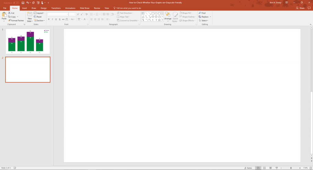
Insert that image file you created a second ago.
I went to Insert, clicked on the Pictures icon, and opened the folder where I had saved my graph as an image file.
Now, the first slide is the original graph and the second slide is the image of that slide.
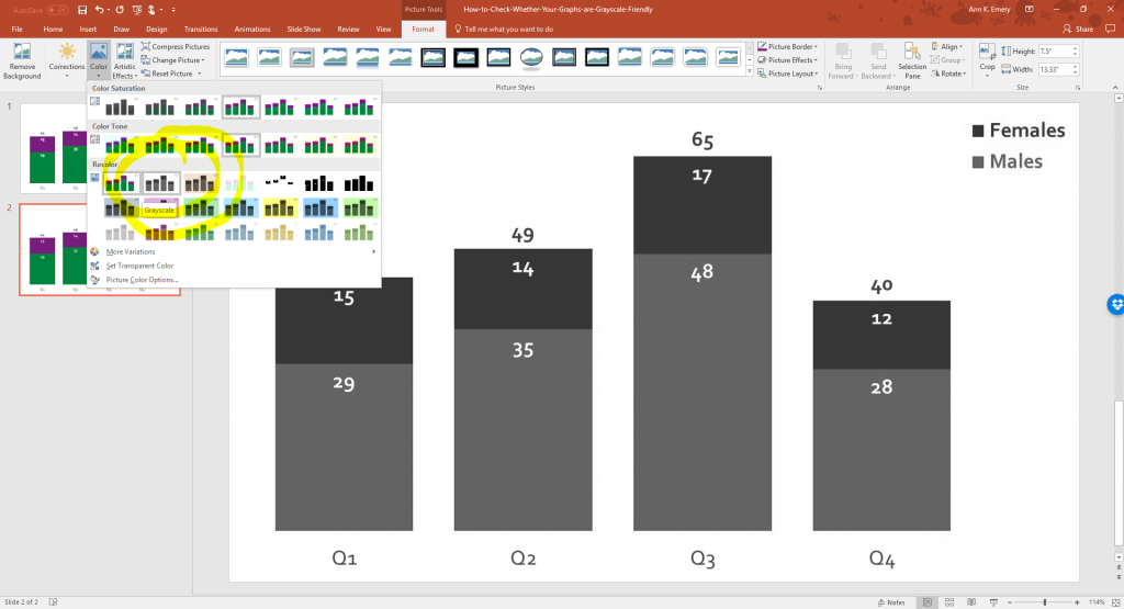
Step 4. Re-Color the Image in Grayscale
We’re going to re-format the image file a bit. Let’s see how the image would look in grayscale.
Here’s what you need to do:
- Click on the image file to activate it.
- Then, go to the Format tab.
- Select the Color icon.
- Choose the Grayscale option. There are a few grayish options. Just hover your cursor over the options until you see the one named Grayscale.
This menu is available in both PowerPoint and Word. It’s probably in non-Microsoft programs, too, but the vast majority of my clients use PowerPoint and Word, so these are the programs I need to use most often for them.
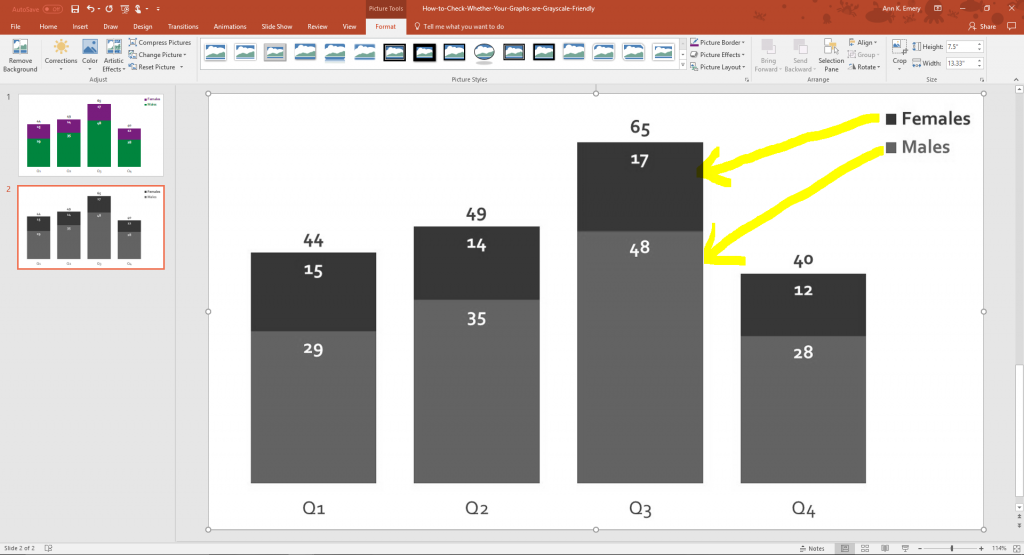
Step 5. Preview Your Graph in Grayscale: Is it Legible?
Congrats, you’ve got a sneak peek at what your graph would look like when photocopied!
Unfortunately, it’s not entirely grayscale-friendly.
I can tell that there’s a dark and a lighter segment, but I can’t tell which one is Females and which one is Males.
The legend is too hard to decipher in grayscale.
Step 6. Edit Your Graph and Increase Accessibility
There are two strategies for making your graphs more grayscale-friendly.
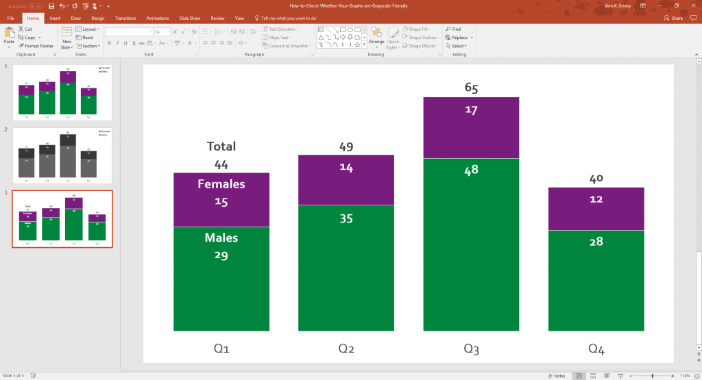
Direct Labels Make Graphs More Grayscale-Friendly
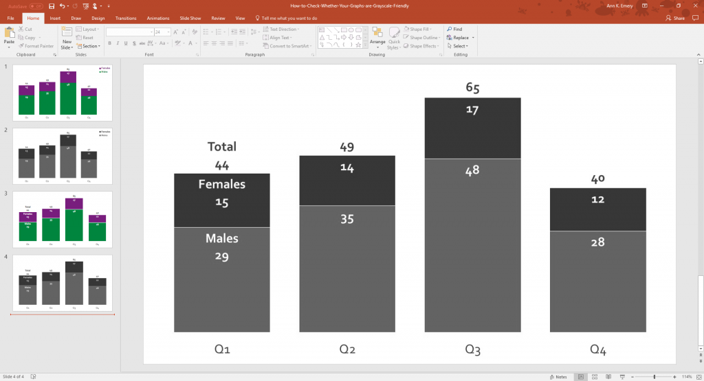
Remove the legend and place your labels as close to the data as possible, which is called direct labeling.
In this scenario, the Total, Females, and Males labels go directly on top of the columns.
Notice how I only labeled the first column for Q1. That was intentional. I teach my viewers how to interpret the graph on the left side and then they’re free to read it by themselves. Labeling every single column would add unnecessary clutter.
White Outlines Around Shapes Make Graphs More Grayscale-Friendly
I outlined the purple and green rectangles in white.
This will make it easier to distinguish between the shades of gray.
In pies, you would outline each slice in white. In waffles, you would outline each square in white. And so on.
Step 7. Test Your New Graph Again
Save your edited graph as an image file. Click on the image file to activate it. Then, go to the Format tab, select the Color icon, and choose the Grayscale option.
Here’s how my new and improved chart would fare in grayscale.
Can you see how the direct labels and white outlines make a difference?
Your Turn
Do you have additional secrets for assessing whether your graphs are grayscale-friendly?
I taught myself these tricks through a lot of trial and error (and wasted money on printing out drafts on paper).
Comment below with your own tips.
Bonus: Download the Materials
Want to explore these graphs in more detail? Download the slides used in this blog post.
Download the Slides
4 Comments
There’s an even easier way if you’re on a PC. Just go to the view tab and select “Grayscale.” Voila! (Not available on the Mac or in Excel.)
You can also copy/paste your graph as an image directly into powerpoint/word (you don’t need to go through the process of saving your graph as an image).
I’m not at my computer but I think on my Mac I have “printed” to a PDF and chose to print it in black-and-white. But I can’t remember if that actually worked so I’m definitely going to try this method! Thank you as always!
Or may be print as a PDF with black & white setting for printer properties. That should work for all programs.