If you want to look polished, then you have no other choice but to customize your visualization’s color palette. Don’t worry–customizing your colors is an easy low-hanging-fruit edit. Locate your style guide, scroll down to the color section, and decode the jargon. If you don’t have a style guide, or can’t find it, identify your color codes with an eyedropper or with Paint.
Then, enter your color codes in Excel!
Step 1: Make Your Chart
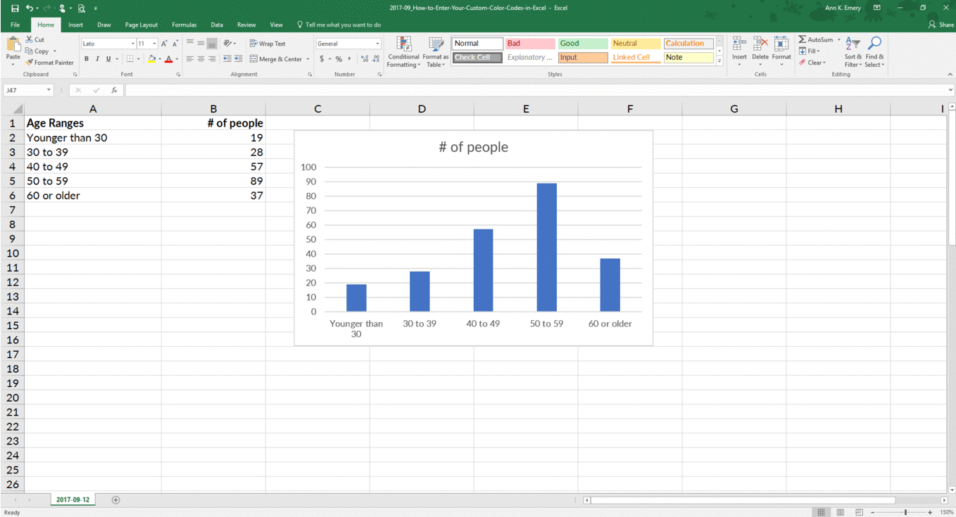
Build your graph. Here’s a histogram that displays how many people fell into each age range. The default graph has Microsoft’s blue.

Step 2: Edit Your Chart as Needed
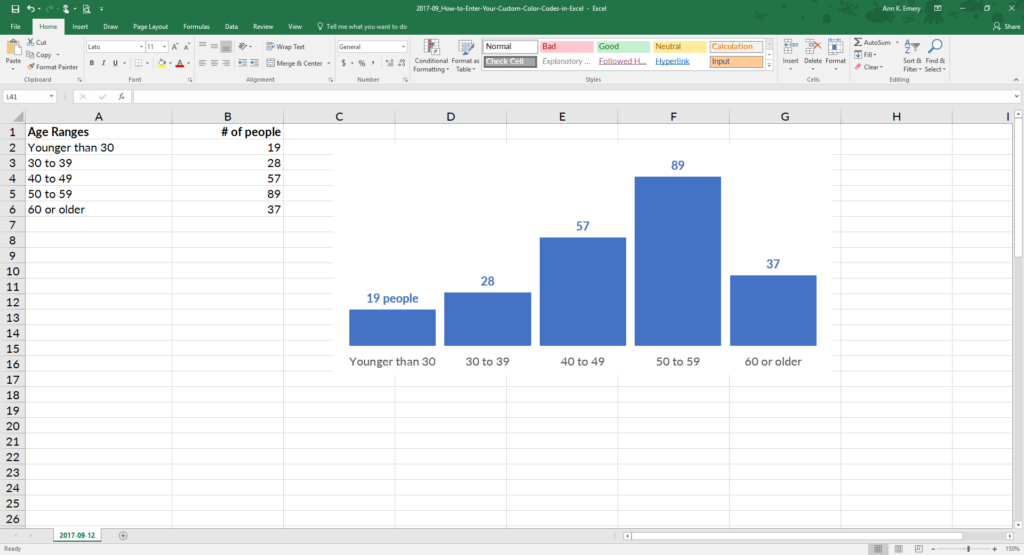
Declutter that cluttered graph. Delete the border, grid lines, title, and vertical axis. Label the columns directly. Nudge the columns closer together.
Step 3: Select Your Chart
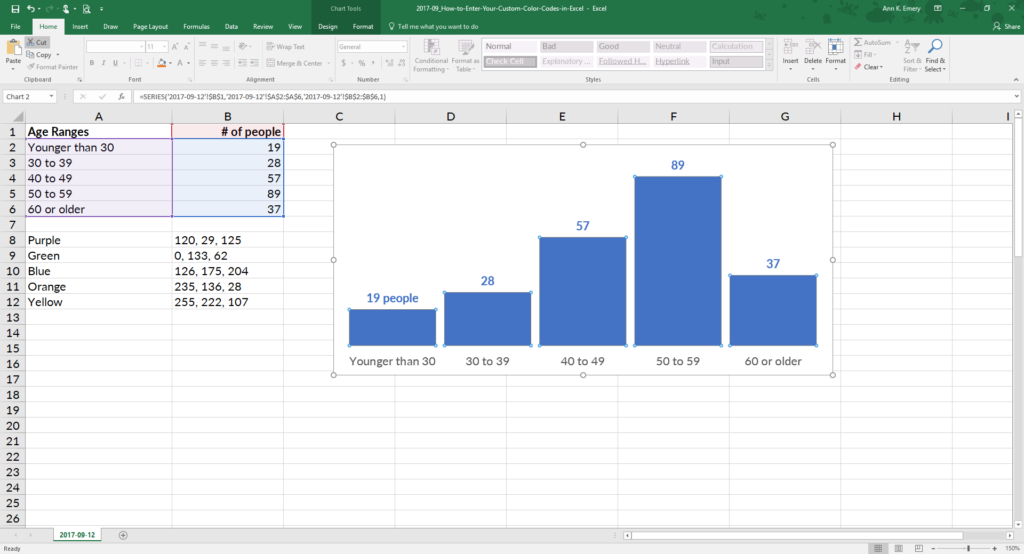
Now it’s time to customize the color. Click on the bar, line, or pie wedge that you want to adjust. Can you see that the columns are selected?
Step 4: Click on More Fill Colors
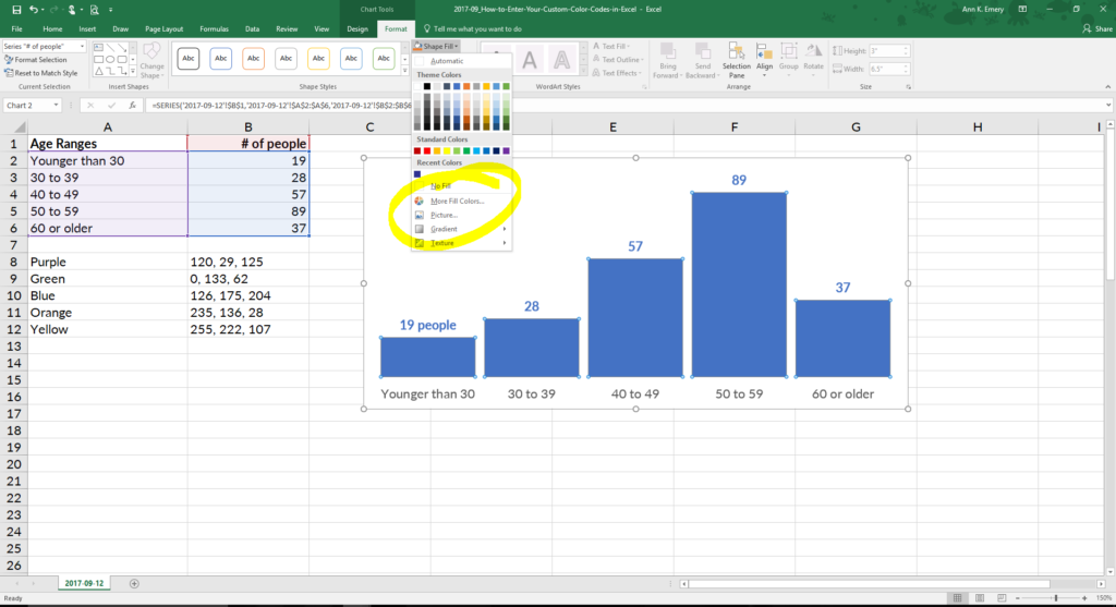
Go to Chart Tools, then Format, and then Shape Outline (line graphs) or Shape Fill (all other types of graphs, like this one). Ignore the default colors! Go to the bottom where it says More Fill Colors.
Step 5: Choose a Custom Fill
On the pop-up window, click on the Custom tab.
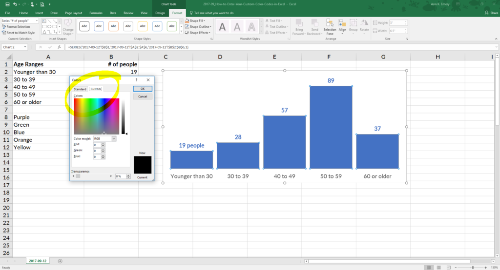
Step 6: Type Your RGB Codes
Enter your RGB code. RGB stands for red, green, and blue. This is the recipe of reds, greens, and blues that get mixed together to produce your exact shade.
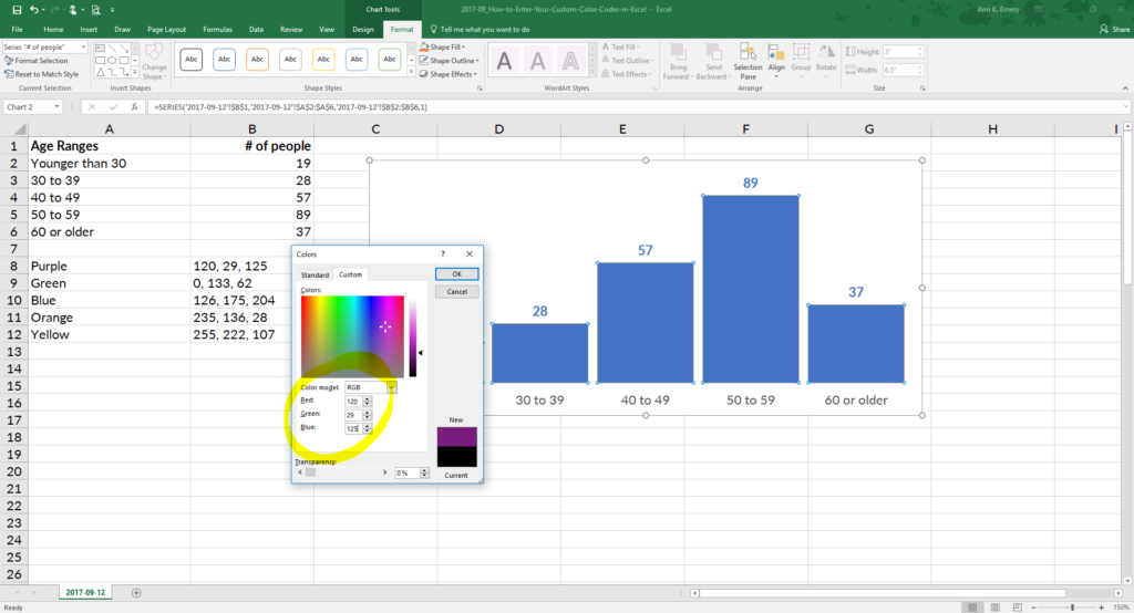
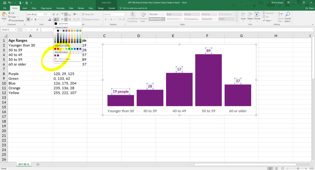
I used 120, 29, 125, which is the exact shade of purple from a client’s logo. Now I can quickly customize other pieces of the graph, like the numeric labels, because that purple is already stored under Recent Colors.
Bonus
With just a few clicks, custom colors reinforce branding and make you look professional.
7 Comments
I love doing this, but every time I turn off my computer, the RGB codes go away. I’ve become pretty good at memorizing them, but is there a way to save the RGB codes somewhere in Word or Excel so I can reuse them? Right now I keep track of them in Evernote.
Yes! Go to Page Layout –> Colors –> Customize Colors.
You just made my life soooo much easier – thank you!
I prefer to use Custom Colors as it always make the data much presentable. This is a good piece of info.
[…] locate your color codes with an eyedropper, or locate your color codes with Microsoft Paint. Then, enter your color codes in Excel or in […]
I’m using Excel version 2019 Volume 16.59 and cannot find the customize color feature. Was this added in later versions? And if so is there a work around so i can create a custom color palette?
Thank you
Are you using a Mac by any chance? If so, go into PowerPoint and try it there. Let me know if that works. Otherwise, we can keep troubleshooting. — Ann