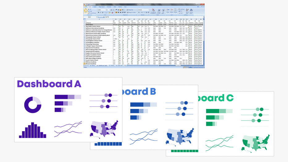
Do you need a series of matching dashboards?
One per program, school, or state?

Copying and pasting is tedious and destined for typos.
Instead, produce a series of matching dashboards through the magic of lookup functions and drop-down menus.
Save time with my automation process.
You’ll create one template and then auto-magically populate it with the rest of the data.
Want to give it a try?! Here’s how.
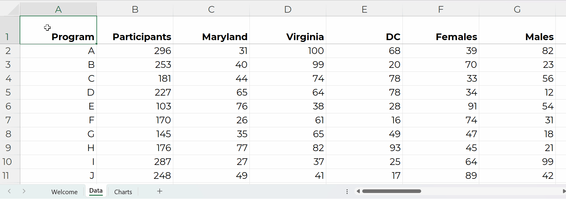
Step 0: Get Your Dataset into Excel
Let’s pretend we want one dashboard per program.
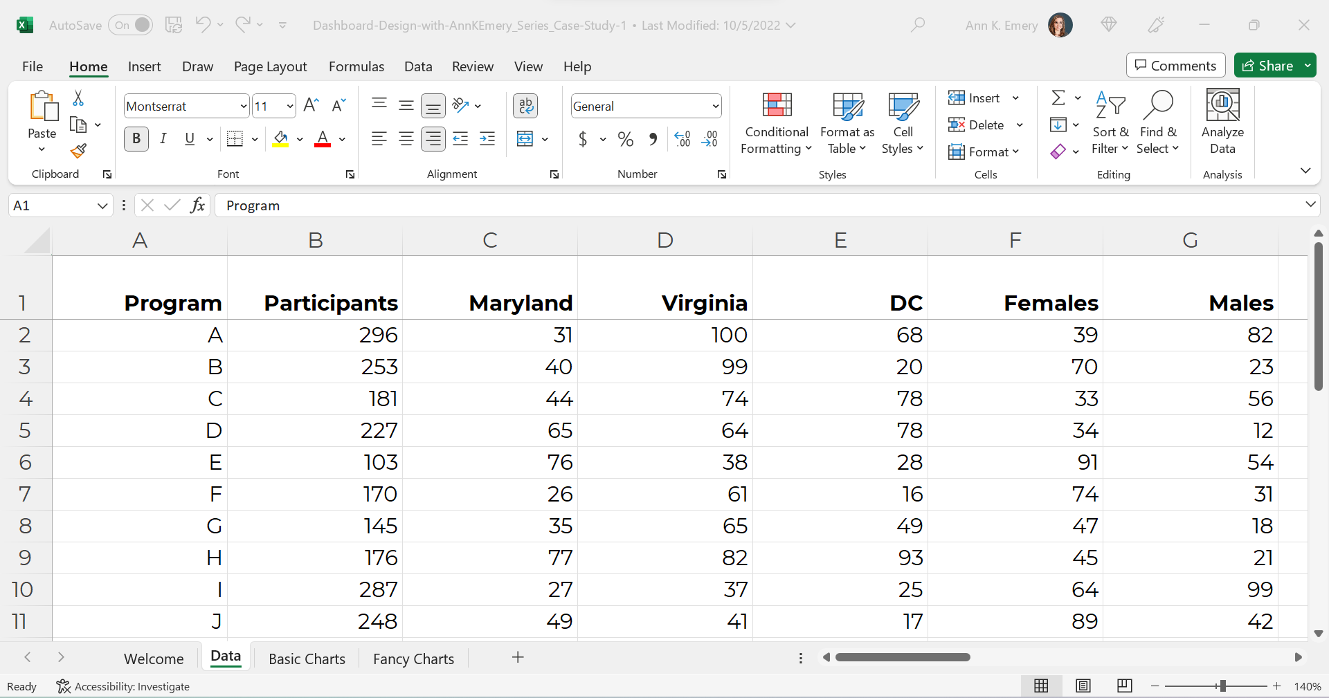
Our dataset might look something like this.
(These are fictional numbers, and they don’t add up to the correct denominators, so don’t look toooo closely, ha!)
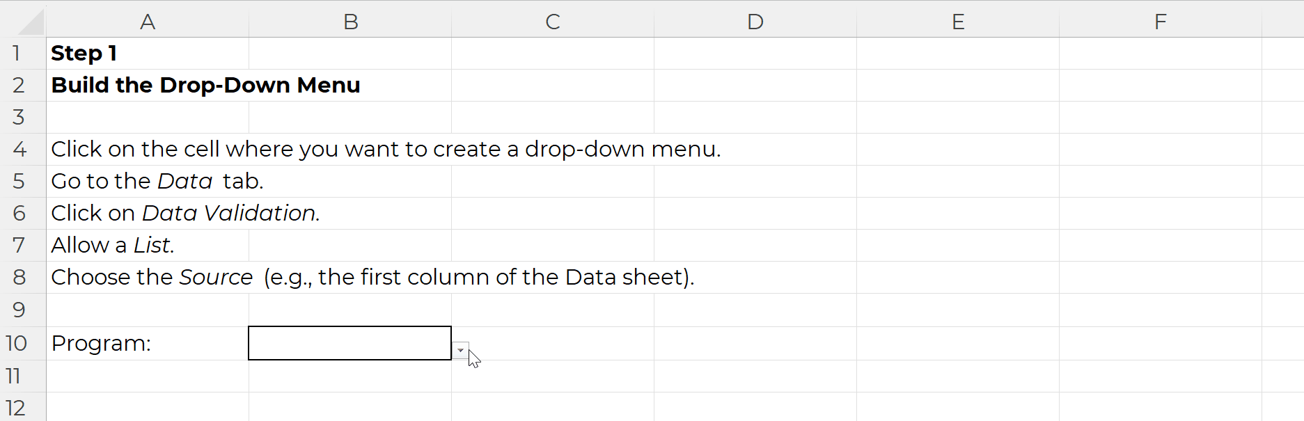
Step 1: Build the Drop-Down Menu
Click on the cell where you want to create a drop-down menu.
Go to the Data tab.
Click on Data Validation.
Allow a List.
Choose the Source (e.g., the first column of the Data sheet).
It’ll look like this:
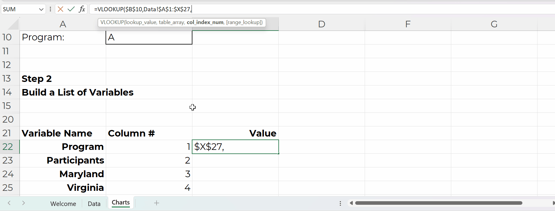
Step 2: Build the List of Variables
In the Variable Name column, use Paste Special to transpose the headers from the Data sheet into this Charts sheet:
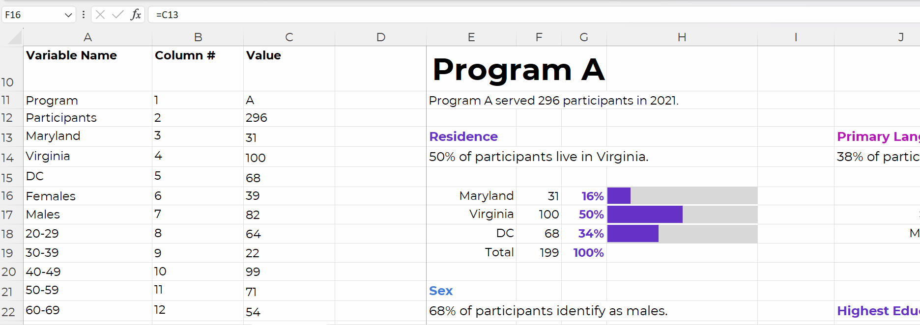
In the Column # column, tell Excel where that variable lives in the Data sheet.
For example, the Program name is in the first column of the Data sheet, so type 1.
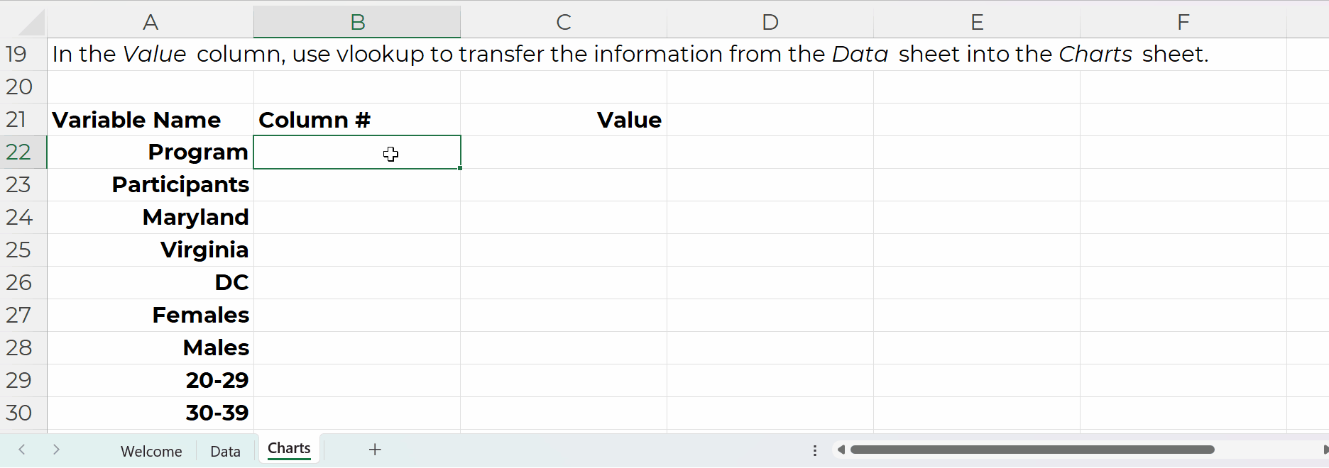
In the Value column, use vlookup to transfer the information from the Data sheet into the Charts sheet.
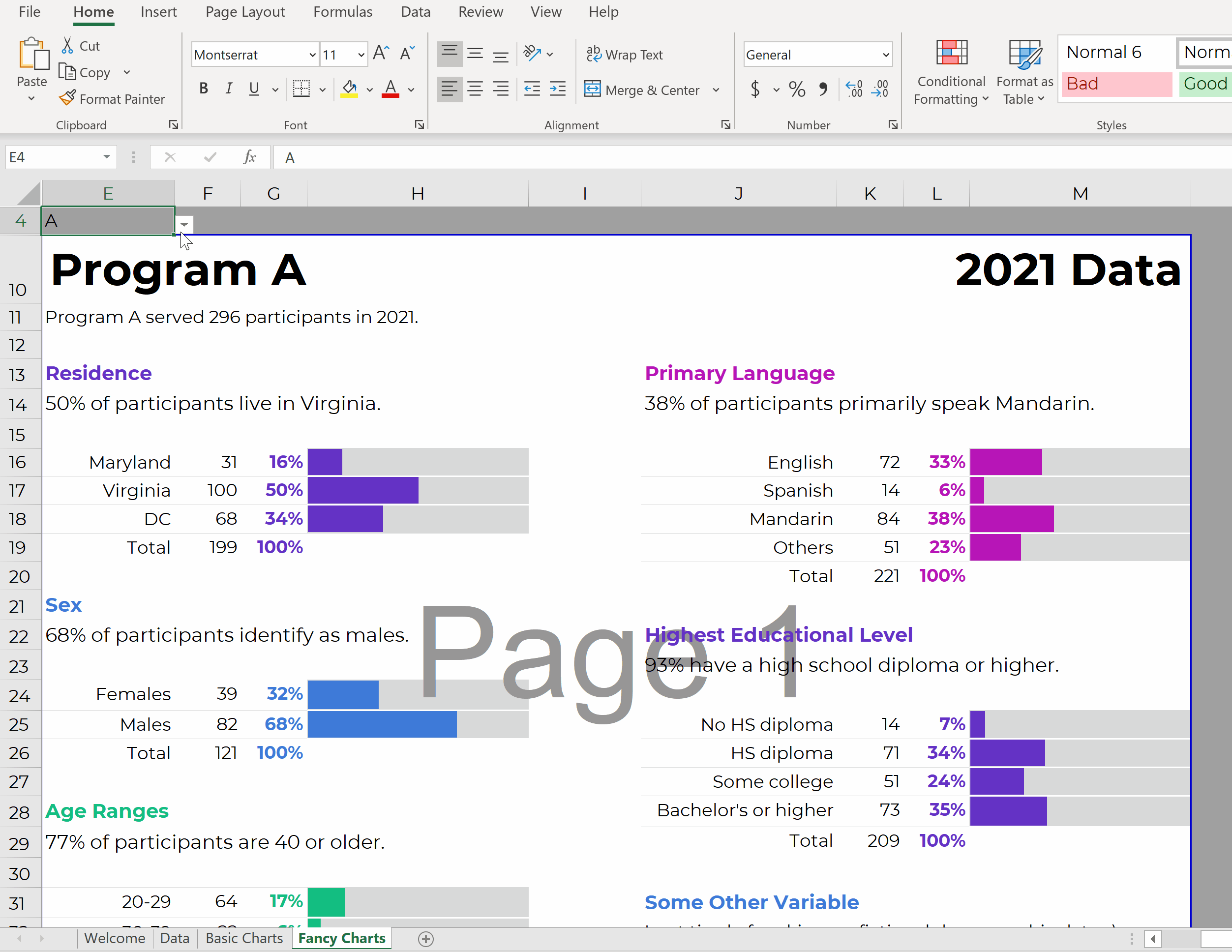
Step 3: Build the Charts
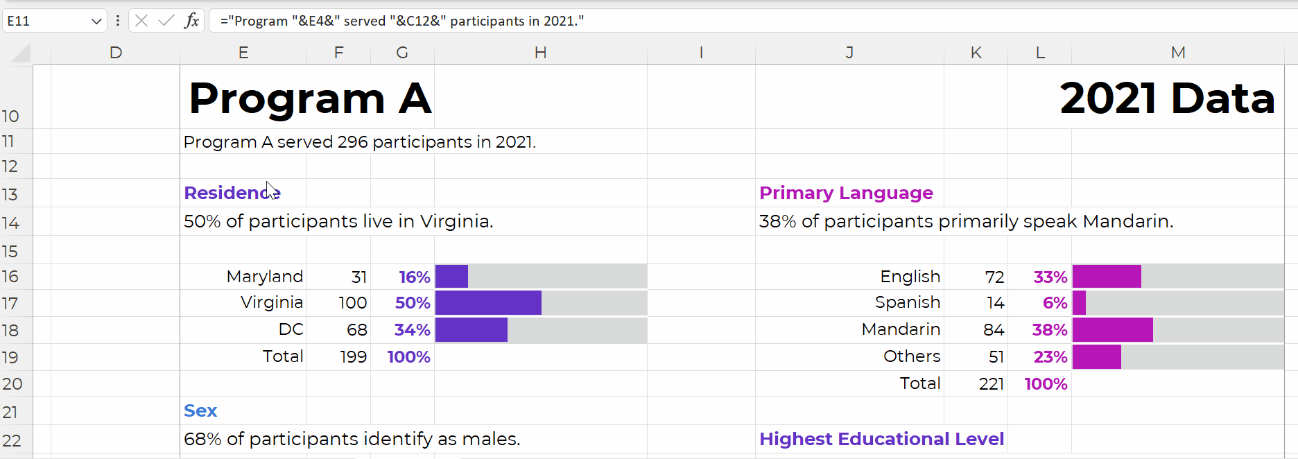
The charts are simply linked to the values off to the left, like this:
We’re obviously not limited to bar charts.
In real-life examples, I’ve used waffles, icon arrays, lines, donuts, lollipops, histograms, and choropleth maps.
I just wanted to keep the charting piece as simple as possible for this example (so your brain could focus on the links between the drop-downs, lookup formulas, and charts).
Once the charts are finished, use concatenation to write sentences, like this:
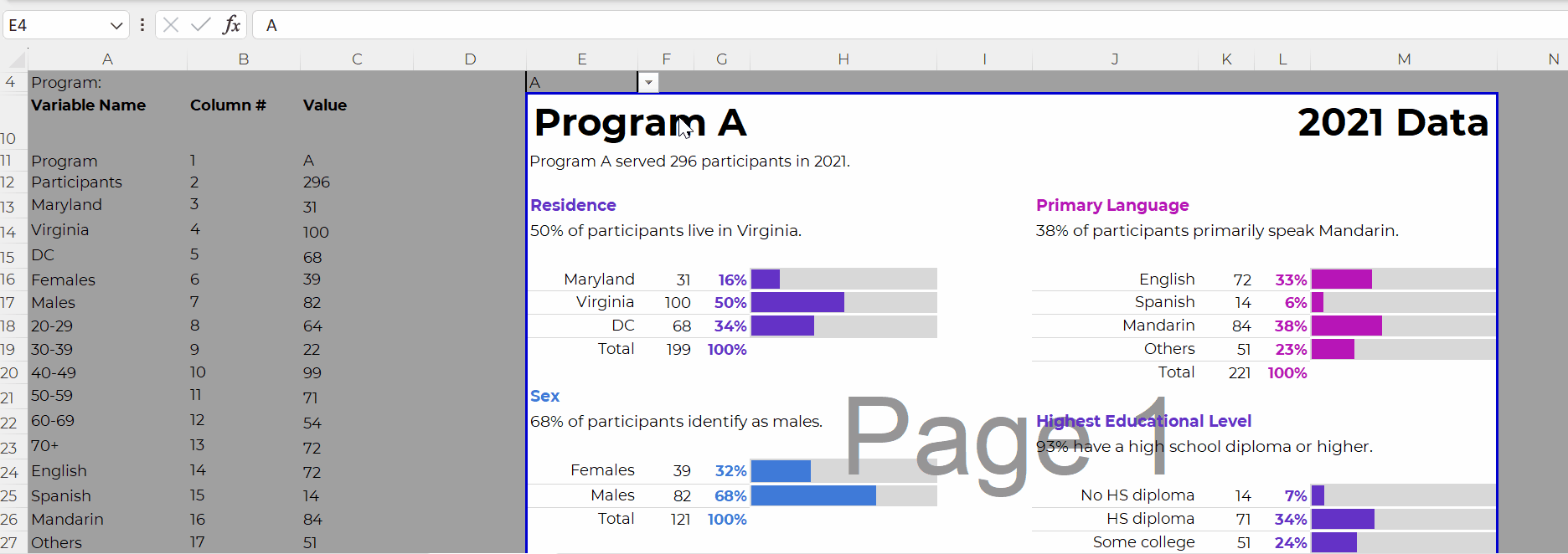
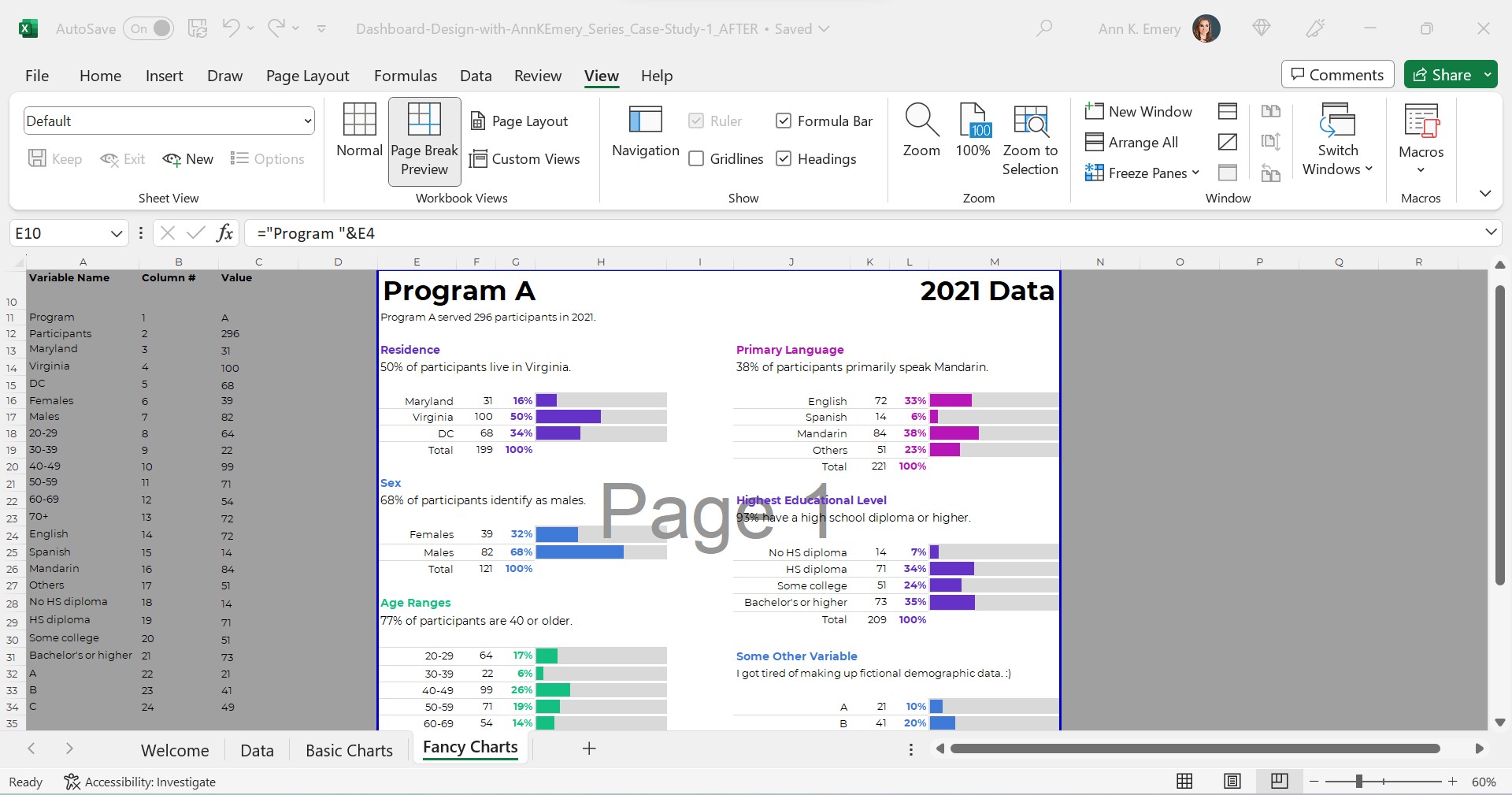
Time for the final touches. You’ll add a title and subtitles; color-code by category; and set everything to be printer-friendly and PDF-friendly, like this:
Everything is linked!
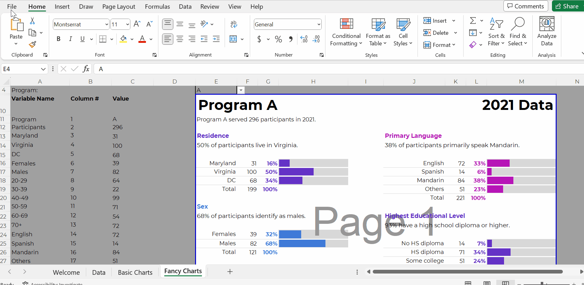
When you select the program name from the drop-down menu…
That program’s data feeds into the Values column (thanks to the lookup formula)…
And that program’s data feeds into the charts.

Don’t worry; the recipients won’t see the formulas behind the scenes. And they won’t see the Page 1 watermark-ish mess.
They’ll see their own PDF, with their own data, like this:
In real-life projects, we sometimes add all these dashboards to the appendices of technical reports (simply by using Acrobat to combine PDFs).
Work Hard Once
With this process, you can create one template and auto-magically populate dozens or hundreds of matching dashboards.
No typos!
No tedious copying-and-pasting from Excel into Word or PowerPoint!!
Work hard once!!!
Create one template, and then let the drop-down menus do the heavy-lifting.
Real-World Case Studies
I’ve used this process in consulting projects to:
- Design matching 2-pagers for every state, territory, and tribal area that offers home visiting services (State A had its own 2-pager, State B had its own 2-pager, etc.)
- Design matching 4-pagers for each grantmaking area for a foundation’s board meetings (Focus Area A had its own 4-page dashboard with key metrics, Focus Area B had its own dashboard, etc.)
- Design matching 10-page survey results tables for every university that responded to a survey (University A saw their own survey results, University B saw their own survey results, etc.)
- …and a dozen more over the past decade.
Your Turn
What sorts of how-to questions do you have for me?
Comment below and I’ll answer as many as I can.
2 Comments
This is very cool! I’m working with a sheet of contiguous data of the same 100 programs with each month’s new data. Do you have any tips for applying this set up so you can select the program and the month in independent dropdowns? Or is there a way to prevent each occurrence creating a separate entry in the dropdown? Currently I’m finding it’s displaying all the programs in the dropdown, repeating over and over for the different time frames (so if there were four programs and three lines of data for each, A B C D A B C D A B C D each of those referring to a different month). Thanks for any tips!
Hmm, I’d have to think about this one. The easiest route is probably to use slicers behind the scenes in Excel. Same end result, but with different magic to get there. Check out this blog post for an overview: https://depictdatastudio.com/how-to-make-interactive-dashboards-in-excel/ The “Dashboard Design” online course also has tutorials if you’d like to learn more.