A few weeks ago I gave the keynote speech at the Alabama Power Foundation’s Elevate conference for several hundred of their grantees and partners. What a day!
As part of the most-practical-keynote-you’ve-ever-heard emphasis, we included makeovers from the grantees’ real projects. In case it’s useful for my blog readers, I’m sharing one of those makeovers with you today.

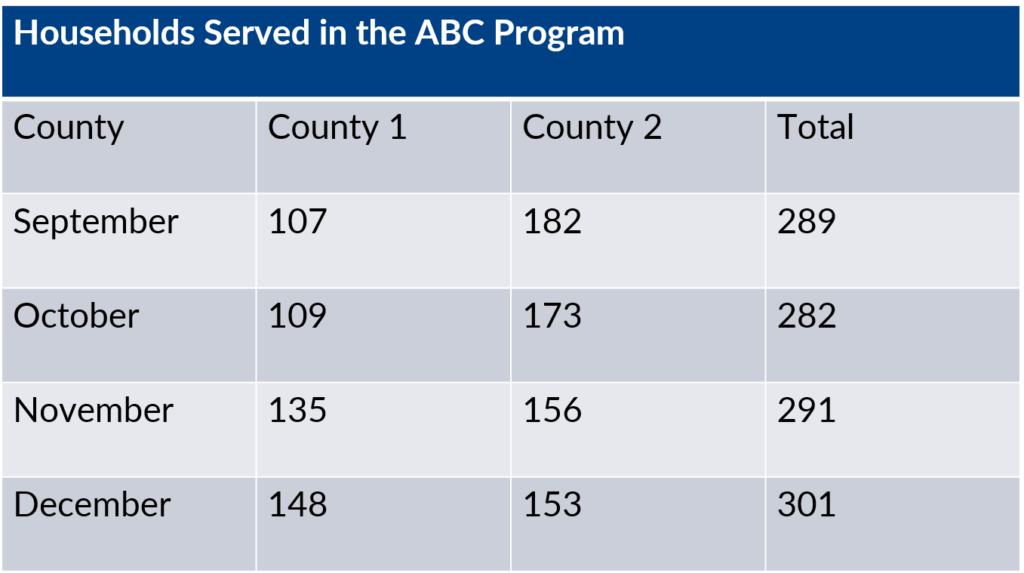
Before: A Table
This table came from a grantee’s slidedeck. I’ve anonymized the county names where the grantee was operating, hid the program’s name, and changed the numbers of families, but hopefully you can get the gist of it anyway. This group displayed four months’ worth of data at a time because they held quarterly Board of Directors meetings. They opted to display the current month’s data (December) plus the prior three months (September, October, and November). We both agreed this was the “right” amount of historical context for their Board.
After: A Better Table
At the bare minimum, I would rearrange the table. I transposed the table–rotated the table so that the columns and rows are swapped–so that the time periods go horizontally from left to right. I always display ordinal data like time periods from left to right for consistency.

Then, I would declutter the table. Removing the background fills makes the data easier to read. There’s more contrast between the black numerals and the white background. Removing the background fills also allows me to overlay a heat map later on if I choose.

Finally, at the bare minimum, I would apply this grantee’s branding. They used Calibri and this exact shade of green.

After: A Line Chart
A second option is a line chart. Here’s Microsoft’s default:

Now, declutter that default graph! Remove the border:

Declutter the vertical axis and grid lines. In a moment, I’m going to add numeric labels to individual data points, so the axis doesn’t need to demarcate 0 and 20 and 40 and 60 and 80 and 100. And with exact values labeled, the grid lines no longer have a purpose, so they’ve got to go.

Add numeric labels through the center of each line–Edward Tufte’s graph table, my favorite chart type–as demonstrated in my tutorial.

Delete the legend and place the category labels directly beside the line:

Add a title. For live presentations, I opt for short titles that describe the graph’s contents but don’t give away the story. In many sense-making presentations, that’s the whole point of the meeting–to interpret the graphs together. My voice and talking points would describe the “so what?”–that County 2’s line went down while County 1’s line went up.

For handouts, I add subtitles. When I’m not physically present to discuss the graph, I type my talking points into the text box right below the title. There are always folks with schedule conflicts who can’t attend the presentation. Subtitles ensure that they know what you highlighted from each graph.

Match the font to the organization’s branding (Calibri, in this case).

Match the colors to the organization’s branding. Rather than using my navy and orange, I matched the organization’s style guide, which used these particular shades of green and orange.

Make sure your graph’s still legible in grayscale. Don’t wait until 4:59 pm for a 5 pm deadline! Print a draft a few days ahead of time. Compare the shades of gray. Can you still tell the lines apart?

Make sure the graph’s still legible for people with color vision deficiencies. Colorblindness is pretty common. It affects roughly one in ten people so you absolutely work with people who are colorblind and you should absolutely strive to make your graph accessible for those people. Head over to www.color-blindness.com and use their Color Blindness Simulator to preview what your graphs will look like for people who are red blind, blue blind, or green blind, among other scenarios. My orange-green graph turns into an orange-brown graph for people with red-green color blindness.

After: A Clustered Column Chart
A third option is a clustered column chart. This is the go-to chart for a lot of the people I work with, and I’d like to show you why it shouldn’t be your go-to anymore.

Obviously we’re not going to keep those default settings. I decluttered the graph, wrote a title and subtitle, and applied the grantee’s branding.

Make sure your graph’s legible when printed in grayscale. This is where the clustered column chart falls short. Clustered charts often need separate legends, and it’s much too difficult to distinguish the shades of gray apart from each other.

The separate legend doesn’t help anyone with color vision deficiencies, either. The viewers with red-green colorblindness would have to spend absurd amounts of their precious attention on distinguishing those muted oranges and browns apart from each other.

In theory, we could delete that separate legend and place the category labels directly on top of the columns. But then the text is sideways, which takes longer to read. And yes, in theory, we could transpose the graph (i.e., flip the graph from columns into rows). But then our ordinal data wouldn’t flow from left to right like the rest of our slidedeck.

Yes, direct labels hold up better in grayscale.

And yes, direct labels hold up better for people with color vision deficiencies.

Both legends and sideways text take longer to read, a drawback we can’t ignore… Yet another reason I despise clustered charts.
After: A Stacked Column Chart
A fourth option is a stacked column chart in which the County 1 and County 2 numbers are stacked on top of each other. Microsoft gives us this default:

In this edited version, I decluttered the graph, added a title and subtitle, and applied the organization’s fonts and colors for a hint of branding. I also added the totals on top of each column. Software packages call this a stacked column chart.

If our viewers care about proportions, we could convert those raw numbers into percentages. Software packages call this a 100% stacked column chart.

Deleting the legend and placing labels directly on top of the columns means that our graph would do fine when photocopied in grayscale. Notice the intentional white line between the green and orange counties, which helps to distinguish the shades of gray from one another.

The directly-labeled columns also hold up for people with color vision deficiencies.

Your Choice of Charts Depends on Your Message
“But Ann, which of these choices is correct?!” They’re all correct. Yes, all of them. Your choice of charts depends on your message.
The table puts viewers in the driver’s seat. Viewers have an opportunity to interpret data for themselves and come up with their own messages. I use tables for internal audiences, e.g., when you’re bringing data to your staff meeting in which the whole purpose of the meeting is to think about what the numbers mean.
The line chart shows whether lines are going up, going down, or holding steady. If you want to focus on County 2’s decline and County 1’s upswing, then this is the chart for you.
The clustered column chart directly compares the two columns. If you want to focus on the difference between the orange column and the green column, then place them beside each other in close physical proximity.
The stacked column chart focuses on part-to-whole patterns–how the orange segment and the green segment add up to a total. If you want to focus on combined numbers (289 families) vs. on break-outs (107 in County 1 and 182 in County 2), then the stacked bar chart is for you.
It all depends on your message. Sometimes you know the message beforehand. You might be trying to sway an audience to adopt a particular course of action and need to find data that support that course of action. Other times, you brainstorm several possible charts share those drafts with a colleague, and then choose your chart (and therefore your message).

Your Turn
I brainstormed four options for visualizing this dataset. Can you come up with additional ideas?
As usual, you can purchase the templates for the table, line chart, clustered column chart, and stacked bar chart.
2 Comments
Really cool that you showed each step in the process until eventually we get a visualization that gives us something we can learn! Very reminiscent of the design process we follow when creating a data visualization. Well done!
Choosing the right way to present data is the most important thing after you analyze. Thank you for explaining it in detail as always.