Emily Rose Barter is one member of the Data, Reporting, and Evaluation team at Emerge Community Development in Minneapolis, Minnesota. Her teammates and co-learners include Britani Baker and their fearless leader, Danci Greene. Danci has been taking Ann Emery’s Great Graphs class since last October, and sharing her learnings with the team. This has multiplied the impact of the class, leveling up the data visualizations the team can produce for the entire agency.

Iteration. This is a word I’ve seen Ann use a lot in her blog posts. I mostly remember the term from my brief (and ill-fated) foray into computer science classes—it was one of those concepts that I never fully grasped. But now that I’m working with data visualization, I use an iterative process almost every time I make a visual. And I bet you do too.
To iterate with data visualizations is simply to make a starter visual, then repeatedly improve it. Then improve the improved version, then improve it once (or maybe five times) more. Each area for improvement helps to refine exactly what’s needed, and making those improvements simultaneously solves problems with the visualization and builds our skills.
How do I know when it’s ready to go? When I can’t make any more improvements. Or, sometimes, when new “improvements” start to make it worse again… And, let’s be honest, when I look at an old visualization again six months later, I’ll often think of new ways to make it better. So, for me, part of iteration is accepting that a great data visualization might never be totally “done.”
I recently used an iterative process to turn my agency’s annual goals document into a dynamic visual dashboard. I’ll walk you through the whys and hows of each step I took. You’ll be able to see the reason for each change and a mini tutorial on how to execute each data visualization strategy. All my decisions are specific to this project and this audience, so your decisions in a similar iterative process might be very different.
Starting Point: The Original Document
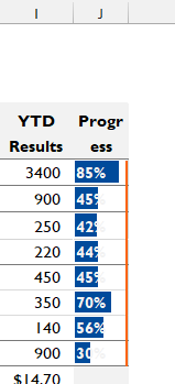
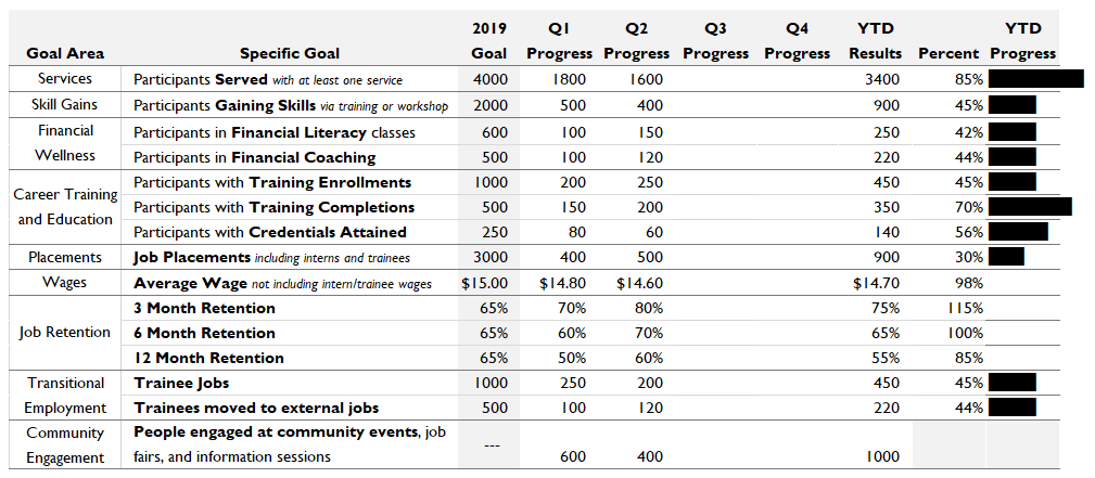
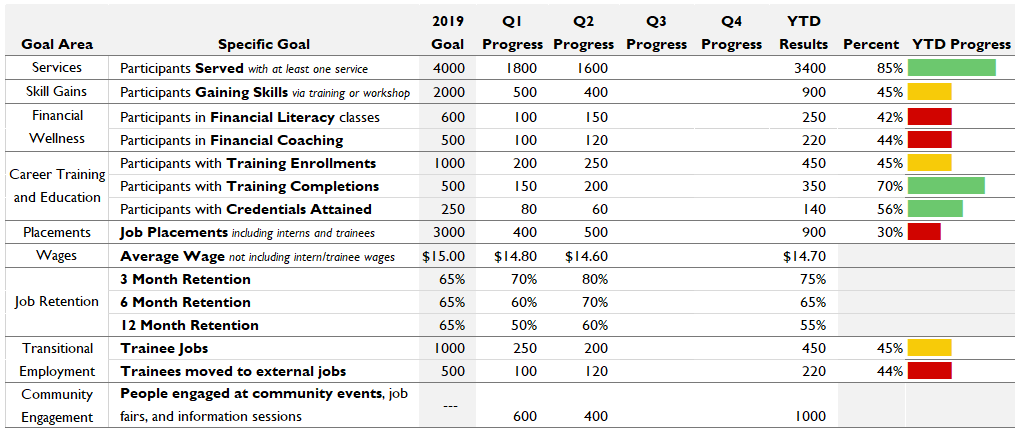
The organization I work for is a nonprofit, and we aim to significantly impact the employment and economic disparity gap in our area. The primary way we do that is by connecting community members with good jobs. Recently, we’ve developed a list of 15 agency-wide goals that can give our leadership team a quick bird’s eye view of how we’re doing at our mission. This is a first glance into the quarter’s data results, which they also review in much more depth using other tools. They take a look at these 15 goals every quarter.
The agency has been using a Word document to track those goals so far. For purposes of this blog post, we’ll be using sample numbers in place of our agency’s goals and results. After Quarter 2, here’s what the document looks like:
Strengths of the Existing Document
This document has some strengths to capitalize on in the iterative process.
One is that it takes up just one single, digestible page.
Another is that its language is tailored to the needs of the intended audience: our agency’s internal leadership. It uses terms and measurements they’re already familiar with. The intended audience knows what counts as a “job placement” versus a “transitional job,” so it’s okay if folks outside that audience don’t totally understand the difference.
Goals Moving Forward
My goal for updating this document is to make it easier for leadership to see, at a glance, where the agency is succeeding and where more work is needed.
In short, this goal-tracking document needs some dataviz magic!
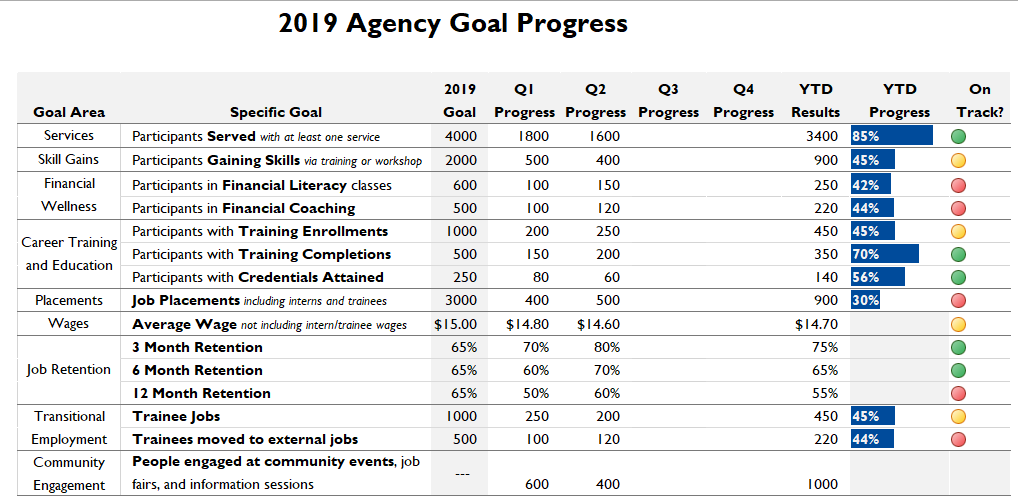
Draft #1: Moving the Table from Word to Excel
The first step is to move it from Word to Excel. Working on a repeating report or dashboard in Excel makes it dynamic—we can update the numbers every quarter and all of the visualizations will update automatically.
When I move the table to Excel, I’m going to change some of the formatting. Here are the small formatting changes that make a big difference.
To make our agency’s goals distinctly ours, I’ll switch to my agency’s preferred font and set Excel’s default color palette to our branded colors.
I have an idea that I might be using data bars (tiny charts inside a single cell) to show progress, and those look the best when every Excel row is the same height. So I’ll switch from a vertical, portrait-style layout to a horizontal, landscape-style layout. This gives me room for more words in the name of each goal. I’ll also play with the wording of every goal to make them as short as possible, so nothing has to run onto the next line.
To keep it organized but minimize unnecessary ink, I’ll use borders sparingly. Dark borders between goal areas, but only light borders within goal areas. No vertical borders at all in the body of the table. To make the most important stuff stand out, I’ll apply some bold font.
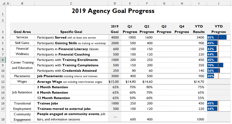
Here’s the re-formatted Excel version:
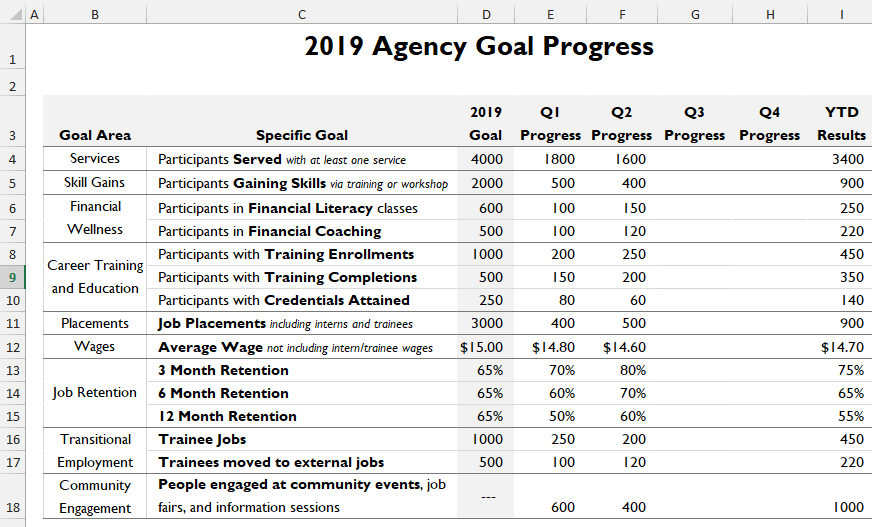
Now it visually matches our agency’s other branded materials.
More importantly, it’s about as organized and straightforward as a giant data table can be.
What it needs now is something to make the data come to life.
Draft #2: Indicator Dots Show Us the Bottom Line
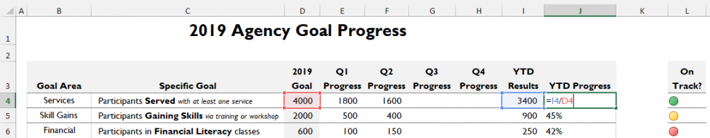
My first thought in this iterative process is to use indicator dots to show progress. These little guys use color to tell us which goals are being met (green), which are borderline (yellow), and which need more work (red).
These look slick but are super easy to use. The main thing I need is a new column next to my year-to-date (YTD) results to put the indicator dots into. In the new column, I’ll type a formula that divides the number in the YTD Progress column by the number in the 2019 Goal column. The result tells us what percent of this goal we’ve achieved so far.
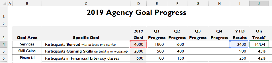
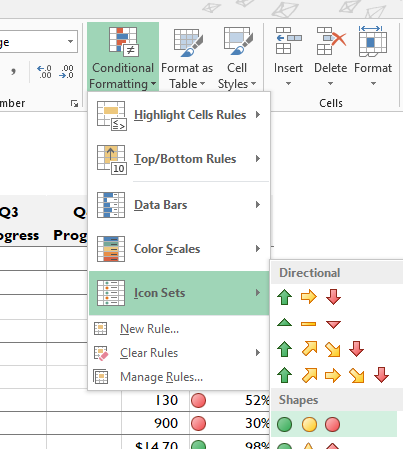
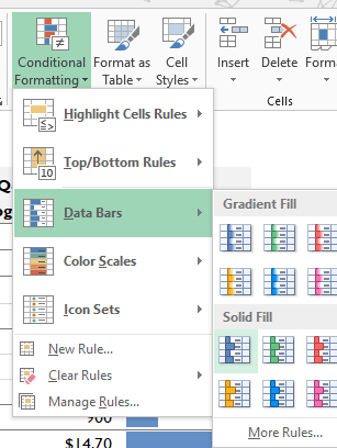
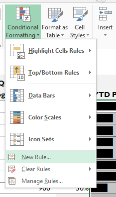
Next, I’ll highlight this whole column and go to the Conditional Formatting menu. That’s on Excel’s Home tab, in the Styles section. In that menu, I’ll choose chose Icon Sets, then the 3 Traffic Lights option. This color scheme taps into the cultural understanding that green means “good,” yellow means “iffy,” and red means “not so good.”
Now each goal has a colorful circle showing how well we’re doing. But Excel is deciding what level of progress counts as green, yellow, or red. I need to set that myself for it to be meaningful within my agency. Since this example dashboard takes place after Quarter 2, our current goal is to be at 50% of our annual goals.
I can set this up by going back to Conditional Formatting and selecting Manage Rules. I’ll highlight the rule I just made, then click Edit Rule. Now I can tweak the details. Here, I want the indicator dot to be green if the value in the cell is a number that is .5 or greater. I want it to be yellow if the value in the cell is a number between .5 and .45. For lower numbers, I want it to be red. (For the agency goals that are written in dollars or percentages, as opposed to raw numbers, I used different values but followed the same process.)
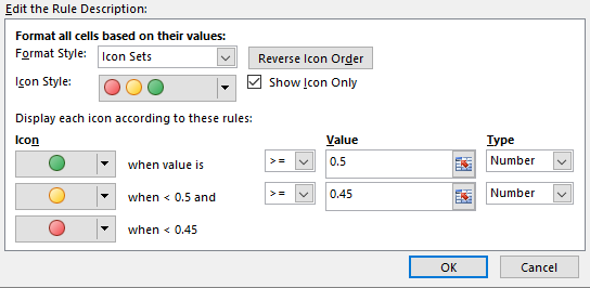
I can also check the “Show Icon Only” box so that in the dashboard my percentage values will go away, leaving just the clean-looking indicator dots.
When I click “Okay” and apply the changes, here’s what I get:
So, what has this iterative step done right? This visualization brings color and a clear visual signifier to the dashboard. It will help with the at-a-glance understanding that this dashboard is supposed to convey.
And what do I need to improve on in the next iterative step? Now that I can see this visualization in front of me, I realize that I’m reducing six months of our staff’s work to a yes/almost/no summary. That doesn’t honor the work, and it also doesn’t provide quite enough visualized information to be actionable.
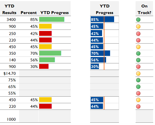
Draft #3: Data Bars with a Benchmark Line Show How Far We’ve Come
The next improvement should capture the at-a-glance yes/no clarity of the first iteration, but it also needs to represent how far ahead (or behind) our agency is on each goal. If I were making a full-size chart to answer this question, I’d probably make a bar graph with a benchmark line. So I’ll try to implement something like that in the context of this dashboard.
Data bars are cute little graphs within a single cell. They will help me get to the visualization I’m envisioning. To make them, I’ll add a new column and populate it with our percent progress so far.
If this looks familiar, it’s exactly how we started with the indicator dots. In an iterative process, it’s common to re-use steps or formulas. Since we’re already on the path to the perfect visualization, the work that got us here will probably keep being relevant. Copy and paste are great tools in this process. And on that note, I’m definitely not going to delete my indicator dots yet. I’ll just move them to the side for now.
Anyway, back to data bars. These are made inside of Conditional Formatting, just like the indicator dots were. I’ll highlight my new column, go to the Conditional Formatting menu, then choose Data Bars and the first Solid Fill option.
With the new column I just added, the dashboard now looks like this:
By looking at this, I can immediately see some areas to improve. For one thing, this visualization doesn’t work for the goal about wages. It doesn’t really make sense to say that our current average wage of $14.70 is 98% of the way to our annual goal of $15.00. It’s an average, not a sum. So next quarter that number could still go down. The same is true of our goals that are percentages. I’ll delete the numbers in these cells and fill them with light grey to indicate that this visual isn’t relevant for these rows.
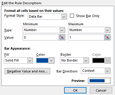
When I do that, suddenly the data bars readjust from having a maximum of 115% to a maximum of 85%. What I really want is a maximum of 100%, since I’m trying to show how close or far we are from 100% goal completion. I’ll change that with the Manage Rules tool we used before in the conditional formatting menu. I just need to set the maximum to be of type “Number” and Value “1.” (We’re using “1” here instead of “100” because the values in this column are all between 0 and 1.)
Since I set up my agency’s color palette before, I can also switch the data bars to be one of our branded colors at this point.
To make the numbers readable, I’ll go ahead and bold them, put them in a light-colored font, and left-justify them. Now these are much easier to understand:
I created these data bars so I could show progress towards a benchmark. We still need to add that part. Excel doesn’t have a built-in way to add a benchmark to data bars, so I’ll have to go off-road a little bit.
I’ll go to the Insert tab, choose Shapes (which in my version of Excel is a tiny icon with no label), and choose a straight line. Now I’ll draw a line starting from the top of my YTD Progress column. It should go down to the top of the Wages section, where there is no need for a benchmark line. I can make it a little thicker and put it into one of my organization’s branded colors by right-clicking it and choosing “Outline.”
The tricky part is putting this benchmark line into the right spot. Since this dashboard shows the end of Quarter 2, my agency should be 50% of the way to all our goals. I need to put my benchmark line 50% of the way across the column. I can do this with a bit of non-intuitive (but very easy) shuffling. What I’m going to do is figure out exactly how wide I want this column to be, shrink it down to 50% of that size, line up the benchmark line, then bring the column back to its original width. Let’s go!
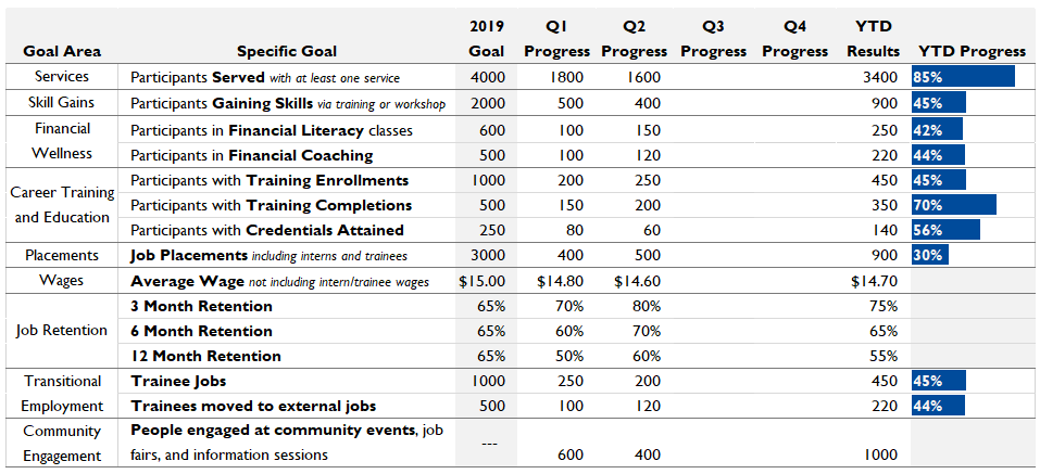
I’ll look at the very top of this column, where it’s labeled with a letter, and click on the barrier between this column heading and the next one. A little popup appears, and inside the parentheses, it tells me how wide this column is.
That seems like a pretty good width to me. If I wanted to pick a different one, I could figure that out now. Since I’m happy with 100 pixels as a width, I calculate that 50% of that is 50 pixels. (Tough math, I know.) Now I can click on that same barrier between this column and the next one and drag it in, until the popup tells me it’s 50 pixels wide. The bars all look very cramped and uncomfortable, but this is just temporary. I’ll move my benchmark bar to line up just to the left of that border between this column and the next one.
Then, without touching the benchmark bar again, I’ll just drag this column back to its original width. I can also pop in another line directly below this one to show the same 50% benchmark for the goals that are below my greyed out section. Now that this idea is fully fleshed out, here’s what the dashboard looks like:
It’s really helpful that this visualization shows how much progress the agency has made, even on goals that aren’t currently being met. It’s easy to see that we’re quite close to the target on most of the goals with a shortfall, which wasn’t at all obvious from the indicator dots.
The main drawback here is not with the bars, but with the benchmark line. There’s not a lot of room to label it, and that makes it hard for viewers to know what it is. If I make room to put in a label, viewers will still need to read the label and take a moment to interpret this visual. My main goal for this dashboard was to make it an at-a-glance resource, so this exact visualization won’t cut it. I’ll move this column off to the side too.
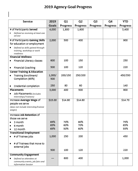
Draft #4: Color-Coded Data Bars Show Us Our Progress and its Outcome
I need something that both shows overall progress and shows whether we’re currently hitting the target. My next idea it to try to combine the color coding of the indicator dots with the length display of the data bars.
Excel doesn’t actually provide a way (that I know of) to color code data bars. So I turn to my number 1 favorite data visualization tool: Google. In a few minutes, I’ve found a formula that should get me what I want.
Just like with ideas 1 and 2, I need to start off by adding a column that calculates the percentage of goal completion achieved for each goal. Then I’ll add another new column to house the formula I found on the internet. I’ll enter that formula in every cell where I want a data bar. Which isn’t every cell in this column—we learned from the last iteration that the goals counted in dollars and percentages don’t need data bars.
Here’s what the formula looks like: =REPT(“█”, J4*10). What this will do is repeat a single character a certain number of times. The character is that blocky rectangle, which will look an awful lot like a data bar when we put a bunch of them next to each other. The number of times it will repeat is based on the value in the Percent column. When I paste that formula in, here’s what we get:
We definitely need some cosmetic changes. I’ll widen the new column so it’s the same width that 100% would be. That’s the width of exactly 10 of those blocky characters from the formula, so I might need to pop 10 of those into an empty cell, set the width based on that, then delete them. I’ll also grey out the rows with no bars in them, like we did in the previous data bars iteration.
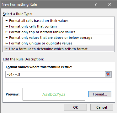
The big improvement needed here is color. I’m going to use conditional formatting once again. I’ll highlight my column and head up into the Conditional Formatting menu, then choose New Rule.
In the New Formatting Rule dialog box, I’ll choose the final rule type: “Use a formula to determine which cells to format.” With the practice we’ve gotten in previous iterations, we have everything we need to write our own conditional formatting rule.
I’ll start with the rule for green-colored bars. This is the same rule we used with the indicator dots: If the percent complete is greater than .5, make this visualization green. I’ll just type the appropriate formula into the Format Values box. I need to use the name of the first cell in the highlighted column (J4) as a stand-in for all the cells in the column. Then I’ll click Format and choose the right color font.
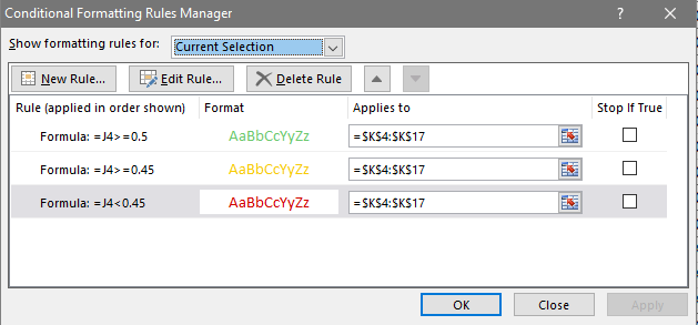
I’ll repeat this for the yellow and red colors too. Once I have all 3 rules, I should make sure they’re in the right order in the Rules Manager, so that the green rule applies first, then the yellow one, then the red one. I can drag them up or down in the list if I need to.
And voilà, here are our handmade color coded data bars:
Looking at the result, I can see that we’ve succeeded in combining a progress indicator with an indicator of goal success. But I can also see that this visual isn’t the right choice for my dashboard. For one thing, it’s rounding percentages to the nearest 10, which hides some pretty significant variance.
But there’s a more important issue too. For all of these metrics, our agency goal is to do 100% of the work and see the data bar reach 100%. The agency has made solid progress on all metrics, even if they are still below the goal level. I’ve used the color red to tap into our cultural shorthand for “this is bad,” then applied it to our positive progress on some metrics. This makes our actual progress on those metrics look like a bad thing. Sooo, let’s not use that one. The next idea will have to show that all progress is good progress.
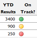
And the Winner Is… A Nuanced Combination!
So far, each of the three visualization ideas I’ve tried has had a flaw that sent me into the next iteration. Those flaws can be rephrased as rules for what we need:
- Show all the progress the agency has made.
- Be clear about which goals have been met.
- Make sure forward progress looks positive.
To figure out how to meet all of them, I’m actually going to take a step back here to look at the results of my iteration so far. I’ve been saving each new idea as I try it, so that I can recycle parts later and use past good ideas for inspiration. Here are the three ideas we’ve looked at so far:

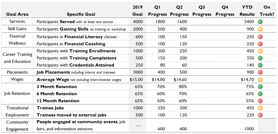
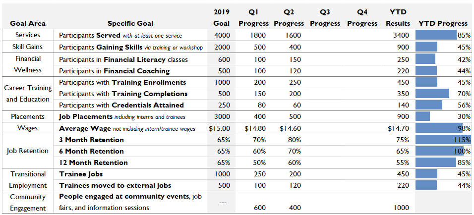
I’m noticing that if I use two of these ideas, the data bars (without a benchmark, this time) and the indicator dots, I can hit all three of the rules we just articulated. The bars would show exactly how much progress we’ve made. The indicator dots at the end would summarize the bars by showing whether we’ve hit our goals or not. And putting those two visuals next to each other gives them both enough context that it’s easy to interpret them correctly. Let’s drag and drop some columns to see what that would look like.
Now all three of the rules we developed are satisfied. We can see positive progress and at-a-glance results. When I look at this dashboard critically, no new issues are jumping out at me. That means we have (finally!) arrived at a finished product. Our iterative process has taken us all the way from a Word document to this dynamic, visual dashboard that uses length and color to bring the numbers to life.
This is the visualization that my organization’s leadership used for a high-level review of our Quarter 2 results. They’ll use it again after Quarter 3, but perhaps I’ll spot some areas for further improvement by then… And so the iteration continues.
2 Comments
Beautiful! I like the stoplight colors. However, my boss is colorblind. Is there another color scheme recommended in this case?
Avoid red-green and try red-blue instead.