
Does your organization need to track how much money you’re making and spending?
I see way too many revenue and expenses numbers gathering dust in hard-to-read pie charts.
In this blog post, you’ll see how transforming your pie charts into a dashboard–built in good ol’ Microsoft Excel–can be more useful for your organization’s leaders.
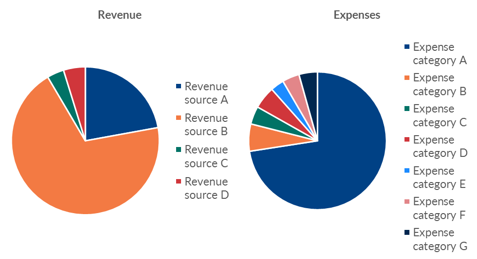
Before: Comparing Across Pies
A couple weeks ago I was in Birmingham with the Alabama Power Company’s grantees. We spent two days learning data visualization principles and producing makeovers of their graphs.
One of the grantees was presenting their revenue and expenses data like this, in two pie charts.
I changed their numbers and categories in this anonymized version, but revenue included things like grants from foundations and expenses included things like payroll.
I’m not anti-pie but I do have a long list of pie chart guidelines.
These numbers can’t stay in a pie chart because:
- there are too many slices;
- we can only show one pie at a time—not two beside each other; and
- pie charts are only useful for showing a single snapshot in time (this group needed to compare quarterly spending, and pies can’t show trends over time).
After
Let’s look at three data visualization makeovers.
They get a little more helpful each time!
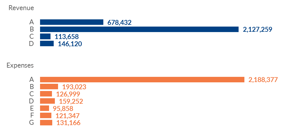
The Bare Minimum: Pies into Bars
At the very least, we need to convert the pies into bars. It’s easier for our brains to compare the lengths of bars than to compare the slices/angles/area of pies.
Yes, we could get fancy by making the expenses bars go towards the left since those are technically negative numbers.
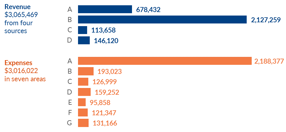
Add Context to the Bars
I try to anticipate what types of mental math the viewers will be doing.
The organization’s leaders and Board members will probably need to know the total revenue and total expenses.
Rather than making those viewers do mental math or tally the numbers in the margins of their handout, I inserted text boxes with the totals.
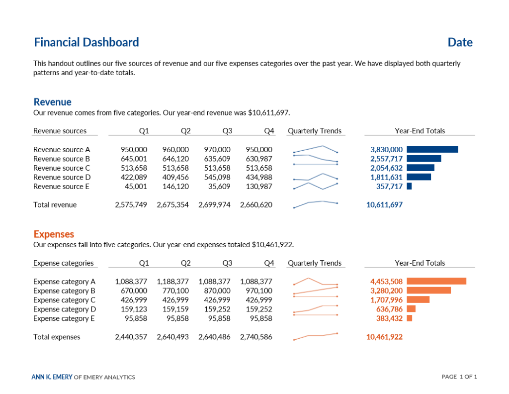
What They Really Need: A One-Page Dashboard
The pie charts and bar charts above were only giving the viewers a single snapshot in time. To manage effectively, leaders need to monitor trends over time.
Imagine what this Board meeting would look like: the attendees have a handout about the fourth quarter’s revenue and expenses. Seeing the fourth quarter’s numbers is great, but what about the third quarter? Did we spend more, less, or about the same as the prior quarter?
The attendees would have to search through the stack of papers in their folders to find the prior quarter’s handout, place the two pages next to each other on the table, and then zig-zag their eyes back and forth across the table and try to make comparisons. Viewers should never have to lay two pages beside each other or scroll through documents to make comparisons. That’s your job as the designer: to anticipate what they need to compare — quarterly spending — and place those comparisons as close as physically possible.
I designed a one-page dashboard that did just that — placed the quarterly numbers directly beside each other to make comparisons natural and easy.
I visualized quarterly patterns with spark lines so that viewers could generally see whether numbers were going up, going down, or holding steady over the course of the year. Then, I anticipated that viewers would need to know the year-end totals for each of the categories. Viewers should never have to do mental math; you should do the math for them.
I visualized the year-end totals with data bars. Yes, we could’ve gotten fancy and made the expenses bars go towards the left to reflect that expenses are negative numbers.
And yes, we could’ve added a row at the bottom that calculated the difference between each quarter’s revenue and expenses to see whether we were cash-flow positive. This group’s priority was monitoring how things changed over time, so the design reflects that priority.
Quite an improvement over the pie charts, don’t you agree?
Bonus: Watch the Video Lesson
Want more behind-the-scenes details? Here’s a 13-min video for you.
Bonus: Download the Templates
Want to design your own revenue and expenses dashboard?
Purchase the templates, register for the Dashboard Design course, bring me in for a private workshop, or borrow my brain during a consulting session.
9 Comments
Hi Ann, very interesting post!
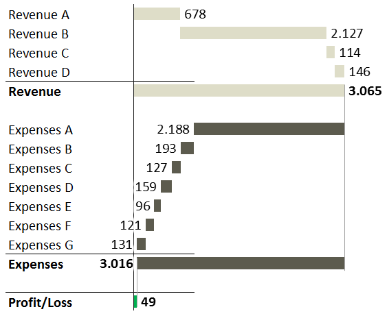
I guess a VERTICAL WATERFALL CHART would better reveal the most important fact: what is the final result after you subtract the expenses from the revenue (Profit/Loss). Here’s the picture how it can look like:
https://zebrabi.com/wp-content/uploads/2017/04/revenue-expenses-profit-loss.png
This solution shows both the STRUCTURE of revenues and expenses as well as their CONTRIBUTION to the company’s end results (profit/loss).
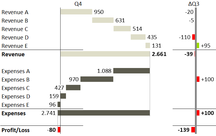
Next, for Q4 results, you can add the variance to Q3 like this:
https://zebrabi.com/wp-content/uploads/2017/04/revenue-expenses-profit-loss-with-variance.png
The sparklines in your dashboard show a wrong picture of quarterly trends, because they are not properly scaled. A small multiple of (scaled!) line charts or hills&valleys charts could work better.
Finally, can you display all numbers in thousands? That would result in slightly cleaner visualization.
Cheers!
(I created the charts with the Zebra BI Excel Add-in)
Hi Andrej,
Great ideas. I’m working with this group again in June for Day 3 of their workshop. I’ll share the waterfall versions and see what they think. In my experience, waterfalls take longer to understand at a glance than bar charts. But you never know how different charts will do until you test them, so it’s worth a try for sure.
I purposefully made sparklines with relative vs. absolute scales. In workshops I teach attendees both versions and we talk about the pros and cons of each approach. In this dashboard, the group wanted to see generally whether expenses were going up or down, and comparing Expense A to Expense B wasn’t a priority (because they knew payroll expenses would always be leaps and bounds above their electric bill, for example).
I made up the dollar amounts to anonymize their particular numbers but yes, displaying the numbers in thousands is a good idea. I often make that conversion when working with groups with really large budgets (numbers in the millions, for instance).
Great comments, keep em coming.
Ann
While I do like a good waterfall chart, to me, it is a chart type to use for ordinal events, rather than adding together categories – a progression of additions and subtractions over time.
Surely it’s not strictly confined to that arrangement, but that is where it works best, showing an actual flow of events and their impact.
In this particular case, where it is simply adding together different revenue streams, and then subtracting different expense categories, it adds a great deal of unnecessary visual clutter, IMO, making things much more difficult to follow without adding any real benefit.
I don’t think its use is justified here as a means to show the final profit/loss – that can be done in any number of ways.
In this case, I would present that measure as a large number at the top of the dashboard, where it will be seen first and clearly, and allow the dashboard to then explain the details of how the number came to be.
Hi Ann, great. Please share the feedback, I am curious how your group will comment on the waterfalls. It does take longer to comprehend them, but this depends on the intended audience. If they are finance professionals, then it might be well accepted.
I have used this solution many times, here are a few more real-world examples (anonymized):
https://zebrabi.com/gallery/
The 2nd picture (Income statement) is a similar case and the one at the bottom (“Profit and loss for five business units”) uses the same idea, but for multiple business units (10 charts, all scaled).
Cheers and good luck with your workshops!
PS. If you can share the quartely data in Excel, I’ll play around with it. It’s a very interesting challenge with huge differences in values, multiple categories and opposite KPIs…
Thanks for sharing more examples. There are certainly multiple correct ways to visualize revenue and expenses – just not the pie charts!
The audience for this graph was the organization’s top leaders (an Executive Director, Chief Operating Officer, etc.) and their Board members. These are people who have experience managing staff, designing programs to improve their communities, etc., but are not accountants or finance professionals. For example, one of the groups that attended this particular workshop is a food bank so their expertise is around collecting and distributing food to needy families.
Alright, stay tuned in a couple months to see how they respond to waterfalls.
Wow, it’s such a change to look at those side-by-side pies and then the dashboard – what an amazing transformation!
Thanks Carrie. I’m a fan of one-page dashboards because I’ve seen them make meetings more productive over and over again. I’ll probably share more examples on the blog later on. I’ve got eight more examples from recent projects that I want to share!
Love the dashboard! Question for you on its design … what guidelines or tips do you have for deciding when designers should change the vertical axis of the sparkline cell from the default to another setting (e.g., start the axis at 0)?
Make both versions side by side; discuss the pros and cons of each approach with a teammate; make an intentional choice.