
As I travel around giving data visualization workshops, I get to peek inside hundreds of attendees’ publications, slideshows, and spreadsheets (and then redesign them–the best part of my job).
Before
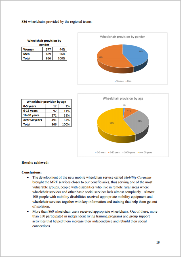
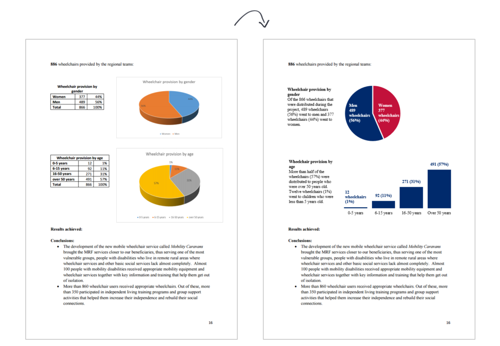
Here’s a screenshot from one group’s (public-facing) research report. The authors of the report talked about wheelchairs that were given to people in other countries. This was the demographic section of the report so there were a few graphs showing who those wheelchairs went to — men, women, kids, adults, and so on. There are 3D pie charts but I don’t fault anyone for their before graphs. We’ve all been there.
After
The first pie chart was about gender–the proportion of wheelchairs distributed to men and women. According to my seven pie chart guidelines, gender can stay in a pie chart. Gender is a nominal/categorical variable and there are only a couple slices. We just need to reformat things a bit to make the graph easier to read. The before version is 3D, so the chart’s height makes the slices look larger or smaller than they really are. 3D distorts data.
There’s a legend below the chart so viewers would have to zig-zag their eyes back and forth to figure out which color corresponds to which slice. And the viewers would literally be zig-zagging because men are on the left side of the pie and on the right side of the legend, a software oddity. The after version is 2D; has labels directly on top of the slices to avoid wasting time hunting for information in the legend; and it uses colors from the organization’s logo rather than the software program’s default color palette.
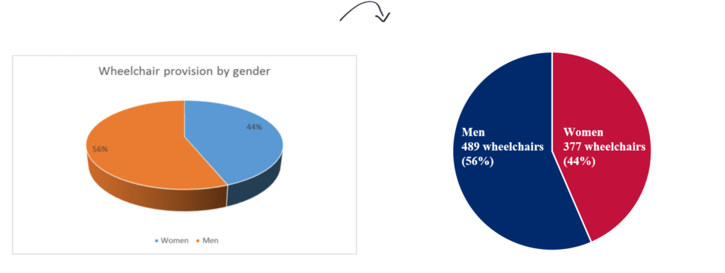
The second pie chart was about age ranges–the proportion of wheelchairs given out to younger people and older people. According to my seven pie chart guidelines, age ranges can’t stay in a pie chart because age range is an ordinal variable. There’s a natural order or progression from younger people over to older people, so we need the chart to reflect that built-in characteristic. You could display these age ranges in a stacked bar chart or in a histogram. I went with a histogram because the 0-5 years segment was tiny and nearly invisible in a stacked bar chart. It’s faster to read left to right (the histogram) than to start at 12 o’clock and read clockwise (the pie).
I never cease to be amazed how small edits lead to a big impact. This page of the report looks completely different!
No, I didn’t keep the tables. When we see tables and graphs beside each other, our brains wonder whether the table matches the graph. Is this the same thing? Or different? Wait, it’s the same, right? So why did they include both? Oh, for the raw numbers? The graph has the percentages but not the numbers? That’s the only added value of the table? Redundant tables and graphs are unnecessarily burdensome for viewers. My rule of thumb is to display raw numbers for anything below 100 (3 of 7 people, not 43%) and percentages for anything above 100. We’re talking about well over 100 units here (either 886 or 866 wheelchairs, what an unfortunate typo) so we could’ve just displayed percentages in the pie chart and left off the raw numbers altogether.
However, this report was written for a technical audience, and technical audiences love extra details like numbers and percentages, so I simply included both within the after version.
Sometimes workshop attendees are afraid that including graphs will lengthen their reports. On the contrary, data visualization often decreases your report’s length. I freed up space by deleting the redundant tables. I decided to use that space for titles and subtitles to explain each graph. Before, the graphs were just slapped into the report without any explanatory text. I’m a visual person and prefer to read graphs over paragraphs. Other people prefer to read the paragraphs over graphs. Both viewers’ preferences are met when we add explanatory text alongside graphs.
Leave a Reply