
Megan Johanson is the Data Analytics and Insights Manager at the Educational Service Center of Central Ohio. She’s also a student in Depict Data Studio’s hybrid synchronous/asynchronous training program and recently began her own data visualization blog at https://www.meganjohanson.com/. –Ann
If you’ve ever worked with publicly available government data, you probably know the headache and eye strain that comes with trying to make sense of a huge spreadsheet.
In this blog post, I’m going to explain how you can easily create a customized chart that will make your federal grant data conversations a breeze.
I’ll also provide you a look at the chart types I considered and then rejected along the way to my winning chart.
Step 1: Deciphering the Data
These were the goals for my project:
- Visualize the federal grant Allocation amounts for each school district, so the breakdown of funds can be seen at a glance.
- Additionally, I wanted to identify which grants had large Carryover amounts (funds allocated in the prior year but not used), indicating an opportunity for the district to provide more services to students with their existing funds.
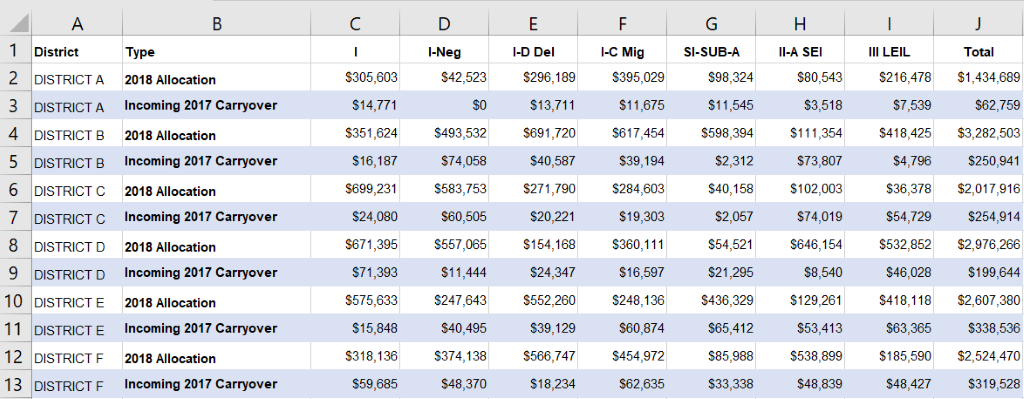
The data were stored in a table structured like the one below, with the grant type listed across the top (note: data have been changed).
Unfortunately, the table requires way too much concentration and zig-zagging across the screen to understand what is happening within each district.
I focused on each district separately by creating a new sheet for each and copying over the grant titles and relevant data. And because it’s hard to know from looking at a table what type of chart would best represent the data, I tried a few different types.
Step 2. Culling the Charts
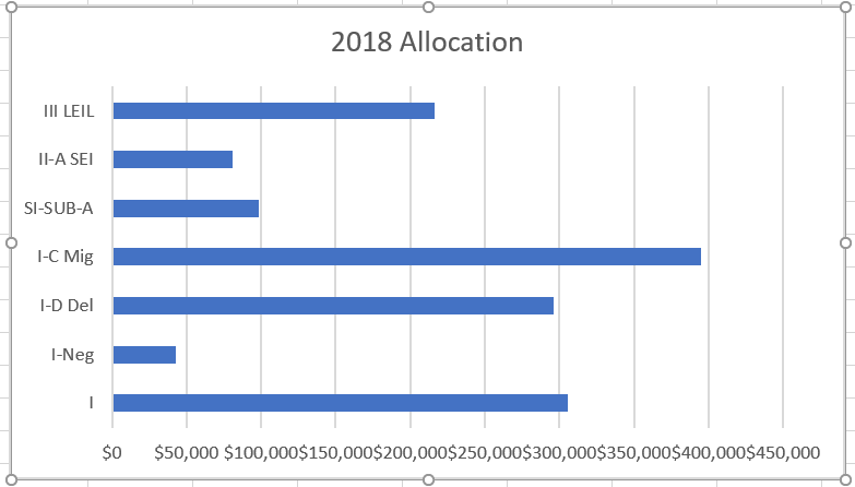
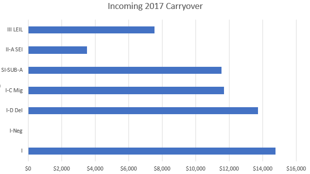
I started with separate bar charts for the grant Allocation and Carryover amounts. I didn’t spend any time formatting at this point, because I was trying to determine the best chart type to display the two sets of data for each district.
Why Bar Charts Didn’t Work
Basic bar charts for grant Allocation and Carryover worked okay, but require visual zig-zagging to compare the two types of data for the same grant.
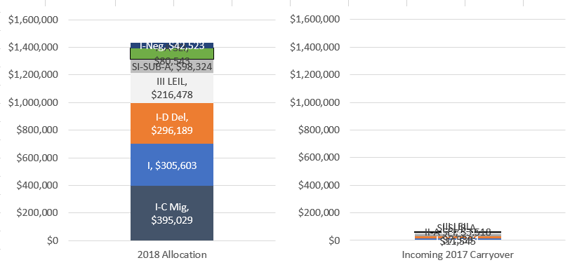
Why Stacked Column Charts Didn’t Work
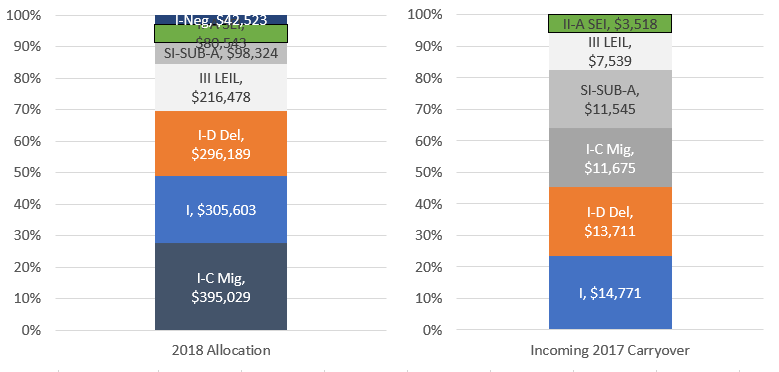
The grant Allocation and Carryover data are each a Part to Whole relationship, so I tried variations of stacked column charts next.
This worked for Allocation and Carryover separately. However, I wanted to be able to compare the Allocation and Carryover amounts for the same grant next to each other and these charts did not work for that.
This set of charts is unreadable because the grant Carryover amounts are so much smaller than the Allocation amounts.
Why 100% Stacked Column Charts Didn’t Work
This chart duo is misleading because it’s too easy to overlook that the total amounts are very different.
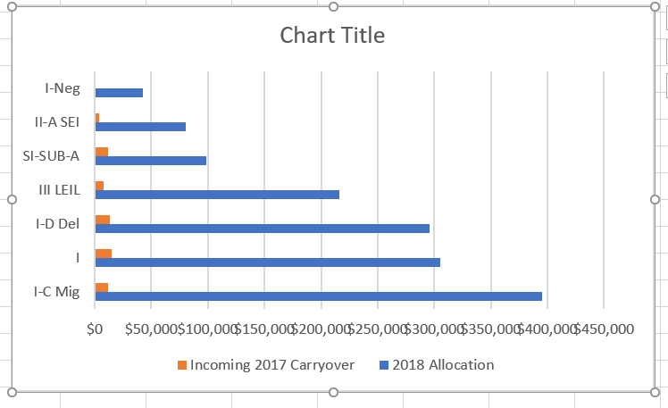
Finding the Frontrunner: Why the Clustered Bar Chart Won
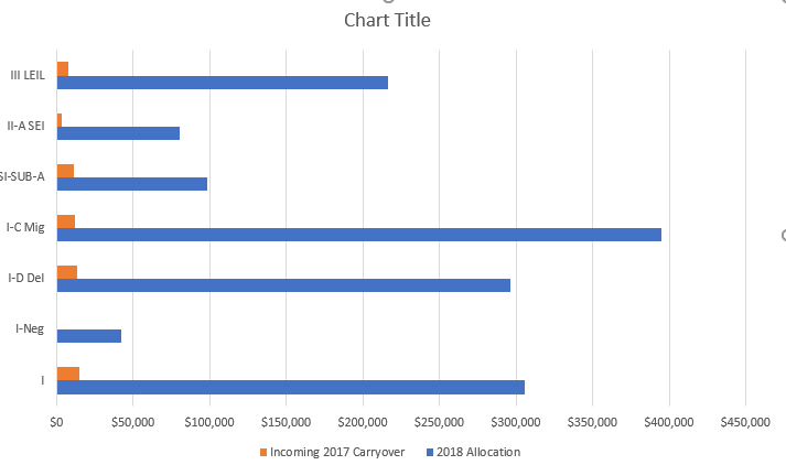
Finally, I tried a clustered bar chart.
This chart type meets all of my needs and displays the data accurately.
It allowed me to compare the Allocation and Carryover amounts for the same grant on the same scale without squishing the information.
However, the version Excel that was automatically created needs some work.
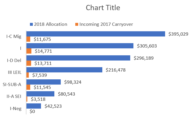
Step 3. Sorting the Data
It is easiest to read a chart when the categories are in a logical order and since the Allocation amounts were much larger than the Carryover amounts, I decided to sort the data by Allocation amount.
Here’s a tip for sorting data: You can sort numbers left to right by highlighting the relevant cells. In my case that was C1 through I3. Then go to Data – Sort – Options and select ‘Sort left to right.’
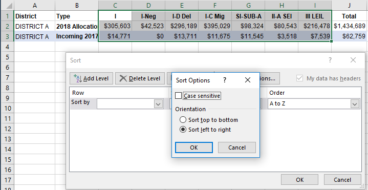
Next, in the dropdown under Sort by, I selected Row 2 to sort by 2018 Allocation. I also changed the Order option to ‘Largest to Smallest.’ Then I pressed OK.
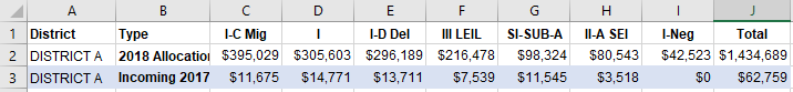
Now that my data was sorted, my chart looked like this.
Step 4. Improving Readability
Using techniques covered in Ann’s Great Graphs: Transform Spreadsheets to Stories online course, I made several small changes to increase readability:
- Reversed the order of the grants on the Y-axis
- Removed chart boarder
- Changed the gap width to 30%
- Deleted the X-axis labels
- Added data labels directly to the bars
- Removed the X-axis gridlines
- Moved the legend above the chart
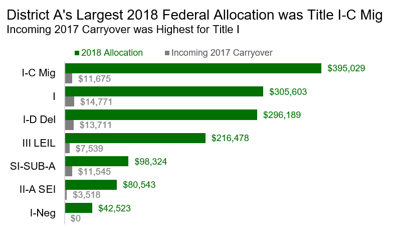
Step 5. Customizing the Chart with Colors, Fonts, and a Takeaway Title
To take the chart to the next level, I customized it by:
- Changing the default colors to branded ones.
- Changing the font colors of the data labels and legend to match the relevant bar colors.
- Deleting the Chart Title box and inserting a text box with a title and subtitle that tell a story unique to this district.
- Tweaking the font sizes to create a clear hierarchy where the category labels are larger than the data labels and legend text.
- Changing the grant type labels to black so they would stand out more than the data labels.
This is what the final chart looked like:
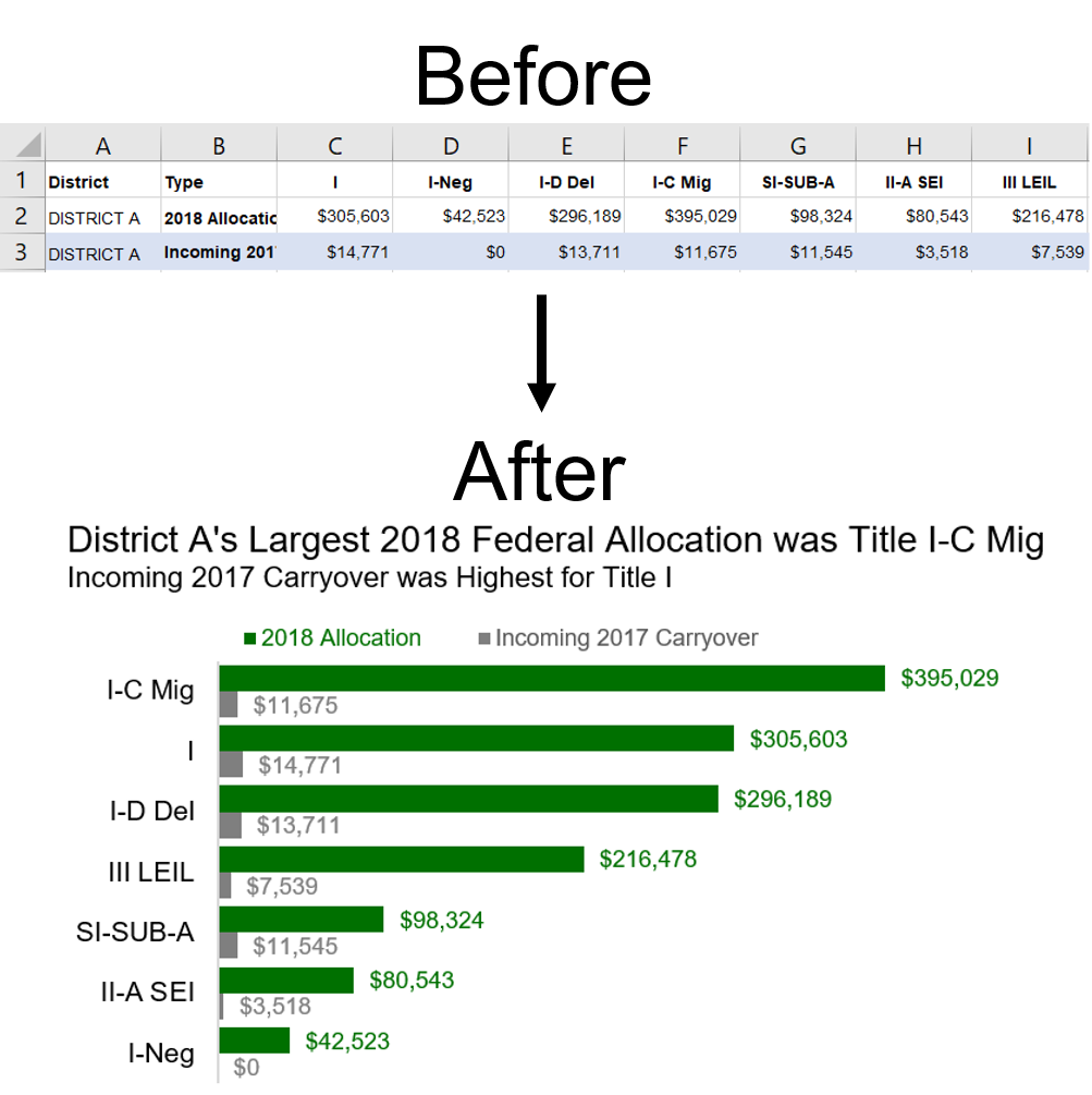
Before and After: From Raw Data to Edited Graph
Now, for a before and after comparison. Which version do you think is easier to understand?
2 Comments
I love this! Thanks for sharing your thoughts on making graphs.
Love it! Appreciate your work to visualize this data for all!!! and make it more interesting!