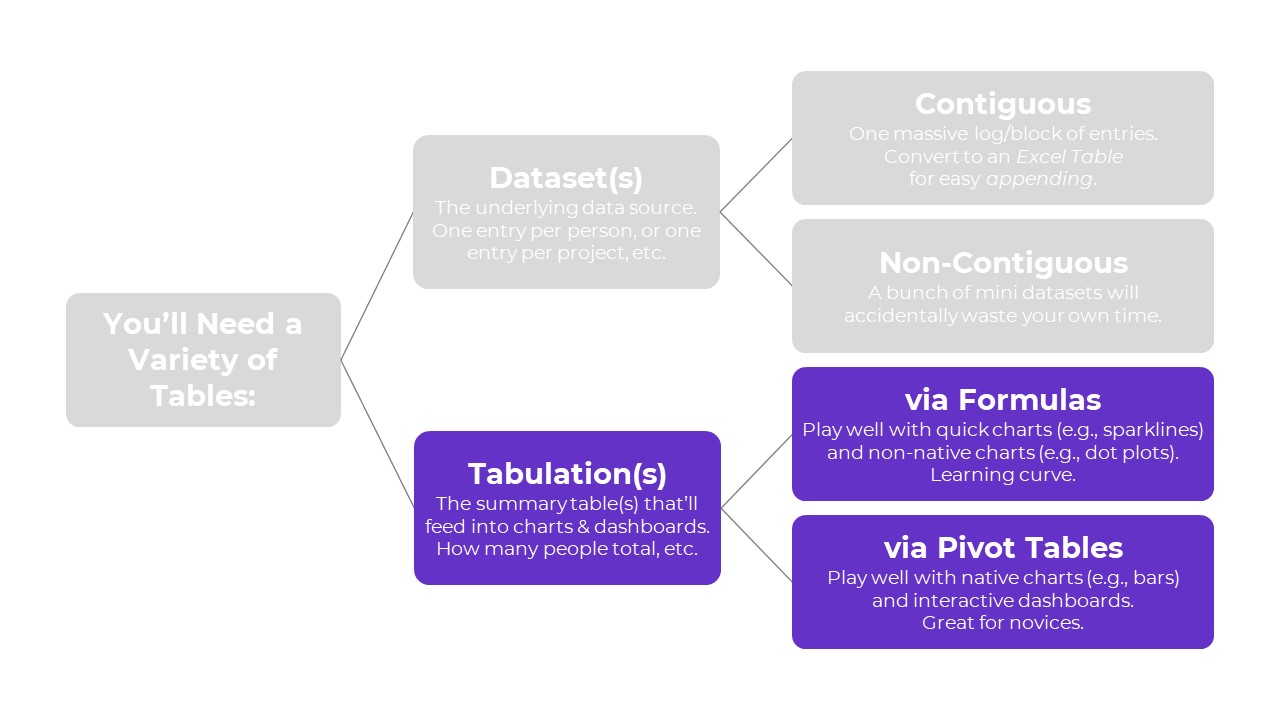
You learned about two types of tables: datasets vs. tabulations.
Then, you learned about two types of datasets: contiguous vs. non-contiguous.
Now, let’s learn about two types of tabulations: formulas vs. pivot tables.
Tabulation Option 1: Formulas
Formulas and pivot tables are both correct… in different circumstances.
Here are the pros and cons of each approach so you can figure out which one you’ll need.
Formulas:
- are necessary for tabulating numbers;
- are faster for datasets with matching columns;
- play well with quick vizzes;
- give us full control over tabulations; and
- give us full control over charts; but
- involve a learning curve.
Formulas: Necessary for Tabulating Numbers
In Simple Spreadsheets, we talk about the calculations needed for different types of variables: nominal, ordinal, interval, and ratio.
When it comes to formulas, we can put these variables into two buckets: numbers and categories.
Numbers are test scores, ages, number of people, amount of money donated, etc.
For numbers, we need to tabulate them using descriptive statistics, which often aren’t possible with pivot tables.
Descriptive statistics for numbers might include:
- Measures of central tendency (=average, =median, =mode)
- Measures of dispersion (=stdev, =var, =min, =max, and range)
- Characterizing the distribution (=skew, =kurt)
- Quartiles (=quartile)
- Percentiles (=percentile)
- Outliers (There are multiple ways to define and deal with outliers; in many projects, we use +/- 3 standard deviations different from the mean)
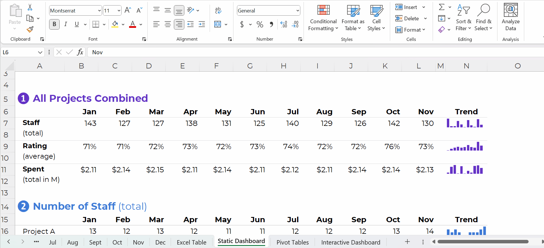
Formulas: Faster for Datasets with “Matching” Columns
Years ago, I demonstrated how to tabulate satisfaction survey data with “matching” columns.
In the fictional-but-inspired-by-real-projects dataset, each survey question was in its own column.
Every survey question had the same options: strongly agree, agree, disagree, and strongly disagree.
In other words, this dataset had matching columns.
In this 5-minute video, you’ll see how we can write one formula, and then drag it down and across to quickly tabulate matching columns.
Formulas: Play Well with Quick Vizzes
Formulas feed seamlessly into at-a-glance visualizations, like spark lines, data bars, heat tables, and symbol fonts.
(Pivot tables don’t.)
Formulas: Give Us Full Control over Tabulations
Need to compare your numbers to a target?
Need to see how much the numbers have changed over time (e.g., percent change or percentage changes from month to month)?
These tabulations can be tedious or impossible with pivot tables.
Formulas: Give Us Full Control over Charts
We can make a billion different charts in Excel. Here’s an incomplete listing of the Excel vizardry that’s possible with good ol’ Excel.
Want to make a native chart? One of the common built-in charts, like bars, columns, pies, and lines? Pivot tables will feed into native charts just fine.
Want to make a non-native chart? Population pyramids, dots, lollipops, swarms, b’arcs, tile grid maps, diverging stacked bars, etc.? Advanced vizardry is only possible with magic tables, which have formulas underneath, not pivot tables.
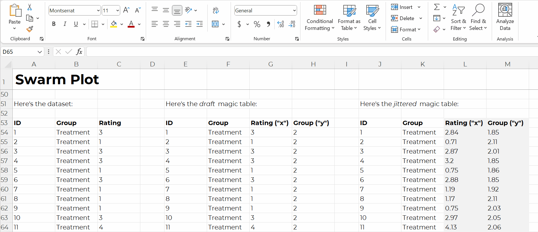
For example, if you want to make a swarm plot (a.k.a. jittered dot plot), like this:
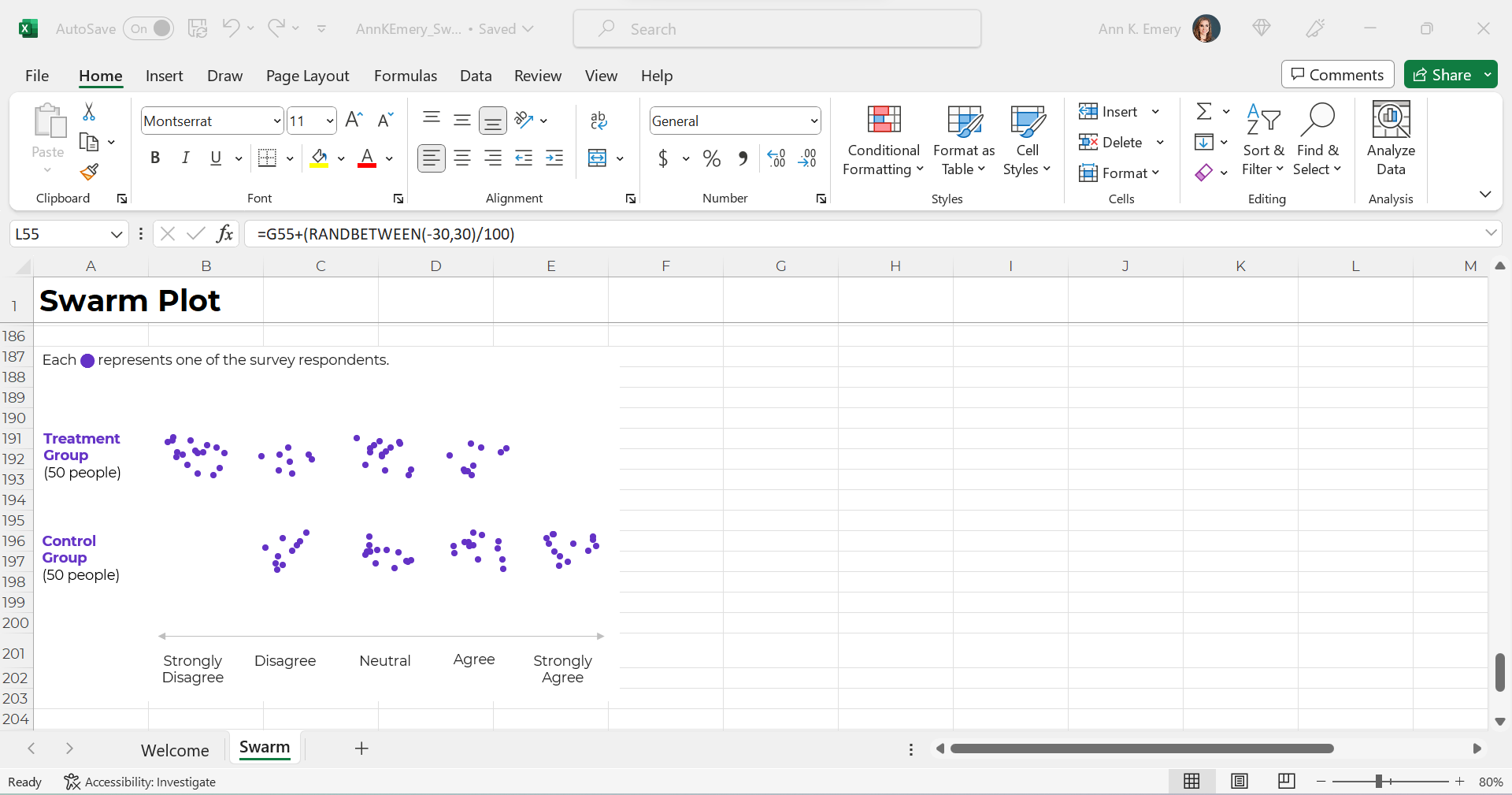
Swam plots are non-native charts, so we’ll need formulas behind the scenes to have full control over the chart’s creation and formatting, like this:
Formulas: Expect a Learning Curve
Sure, most people know the absolute basics, like sum and average.
But there are 450+ formulas and functions inside Excel.
Knowing which ones you need… at which point in the analytical process to use them… and how to use them… That takes training and practice.
Tabulation Option 2: Pivot Tables
Pivot tables are a drag-and-drop solution for tabulating our datasets.
In other words, we don’t have to write any formulas! No need to stress over jargon like “” or () or , or A1:A100.
Pivot tables are:
- great for novices;
- great for tabulating categories;
- faster for cross-tabulations;
- slightly faster for appended tables and recurring analyses;
- way faster for mismatched columns; and
- necessary for interactive dashboards.
Pivot Tables: Great for Novices
Let’s start with the biggest benefit of choosing pivot tables over formulas: there’s a minimal learning curve, so pivot tables are perfect for novices.
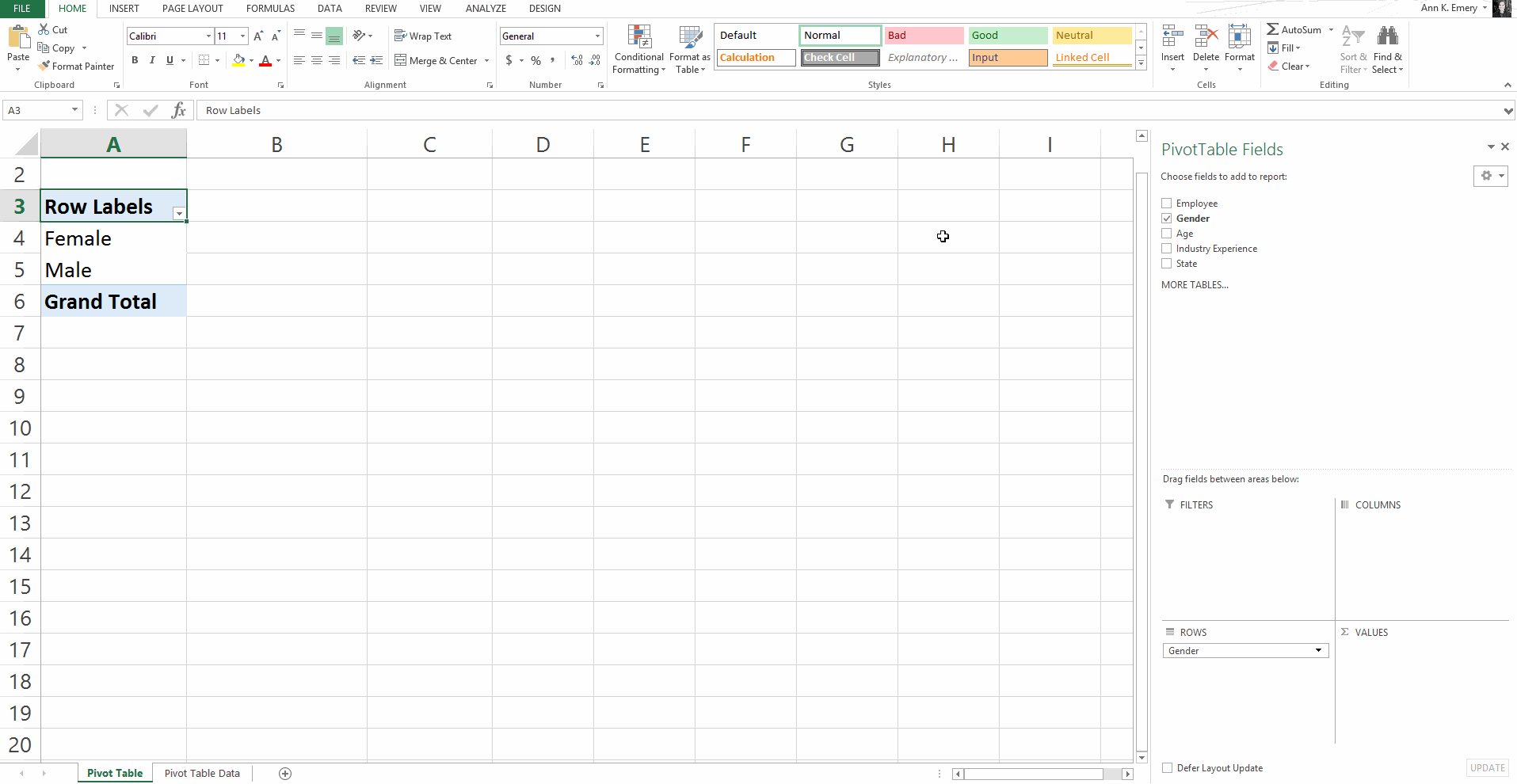
Here’s an older blog post that shows you how to get started with pivot tables within minutes. You’ll insert a brand new pivot table, and then drag and drop variables into the little boxes.
Sure, there are nuances:
- switching the units from sums and counts;
- double-clicking to explore mysterious entries and outliers;
- placing two variables in the values box (e.g., counts and their percentages); and
- refreshing the pivot table as new entries are added to the dataset.
But, anyone and everyone can learn the basics within minutes — supervisors who don’t have time to delve into the details of formulas, graphic designers who don’t need to conquer statistics, grantmakers who need to focus on the actual philanthropy and not statistical formulas, etc.
Pivot Tables: Great for Tabulating Categories
Formulas are great for numbers, because we’ll need to calculate descriptive statistics like mean, median, mode, standard deviation, variation, quartiles, percentiles, skewness, and kurtosis, among many others.
Pivot tables are great for categories, because we’ll need to calculate frequencies (like how many people).
Yes, we can also calculate frequencies with formulas (countifs, for example).
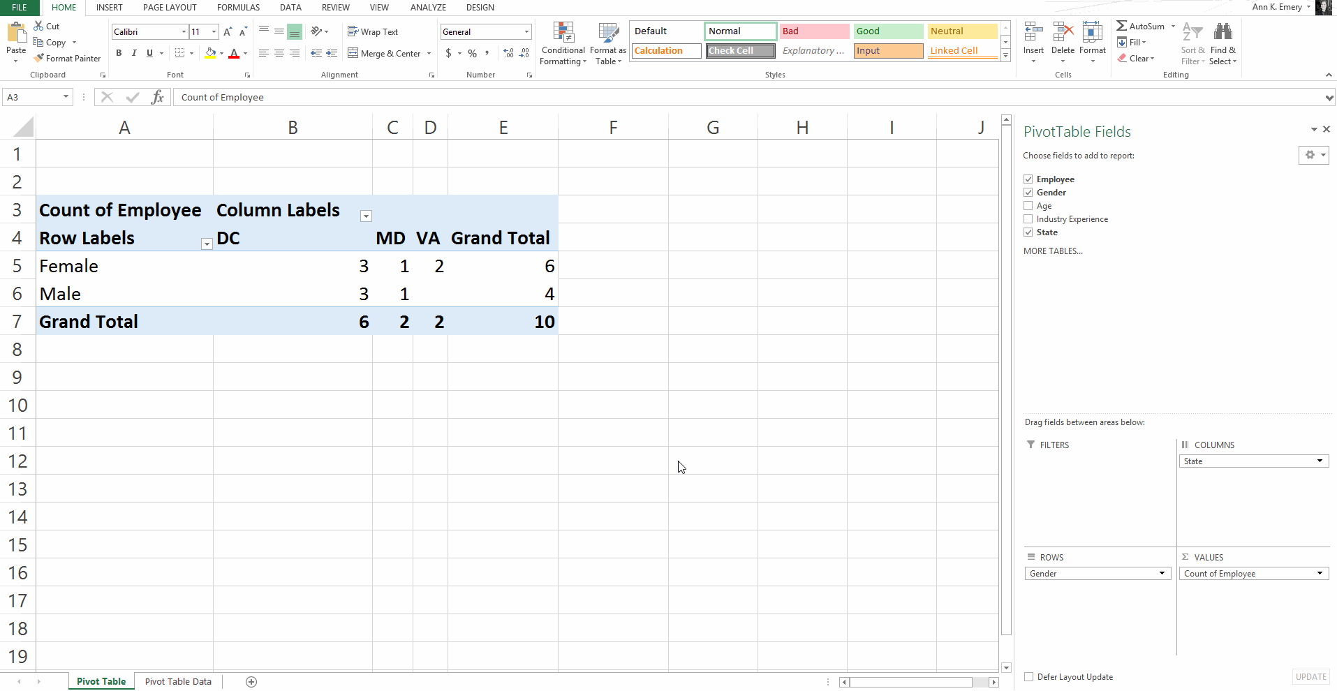
Pivot Tables: Faster for Cross-Tabulations
A regular ol’ tabulation might be the number of males and female employees.
A cross-tabulation adds another variable or two, like the number of male and female employees in each state.
Yes, we can do cross-tabulations with formulas, too (another perfect opportunity for countifs). But especially for novices, the drag-and-drop functionality is going to be faster than adding to an existing formula.
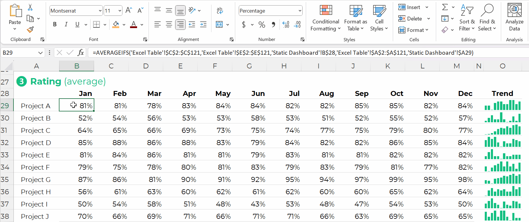
Pivot Tables: Slightly Faster for Appended Datasets with Recurring Analyses
Need to add to your dataset over time?
Maybe you collect daily outbreak data, like many public health agencies I work with.
Or, maybe you collect quarterly data from grantees, like many foundations I work with.
(Or some other time period — like weekly, or annually, or whatever.)
As you add to your dataset — your contiguous log — you can simply refresh your pivot table and it’ll incorporate the latest numbers. That means that the chart(s) linked to your pivot table will update with the latest numbers, too! Woohoo!
Yes, it’s easy to update formulas as we append datasets, too.
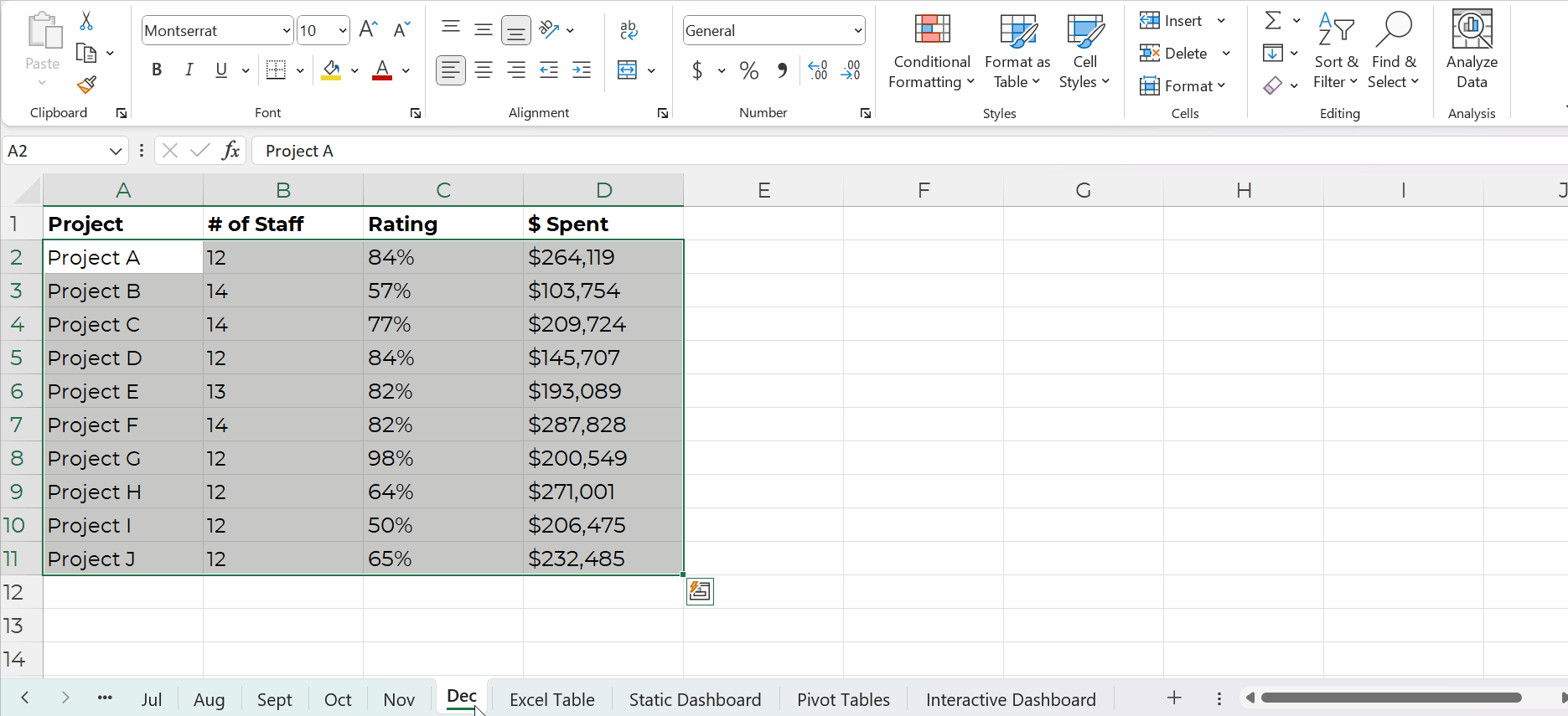
You simply create one anchor formula — the formula in the upper-left of your tabulation — and drag it across and/or downwards to fill all the cells, like this:
Pivot Tables: Way Faster for Mismatched Columns
Earlier, I said I prefer formulas for matching columns (e.g., all the columns contain agree-disagree response options).
I prefer pivot tables for mismatched columns (e.g., one column has agree-disagree options, another column has birthdates, another column has addresses, and so on).
It would be a huge pain to add so many different formulas along the bottom of my dataset! I might need countifs for one column, and sumifs for another column, and averageifs for another column… meh.
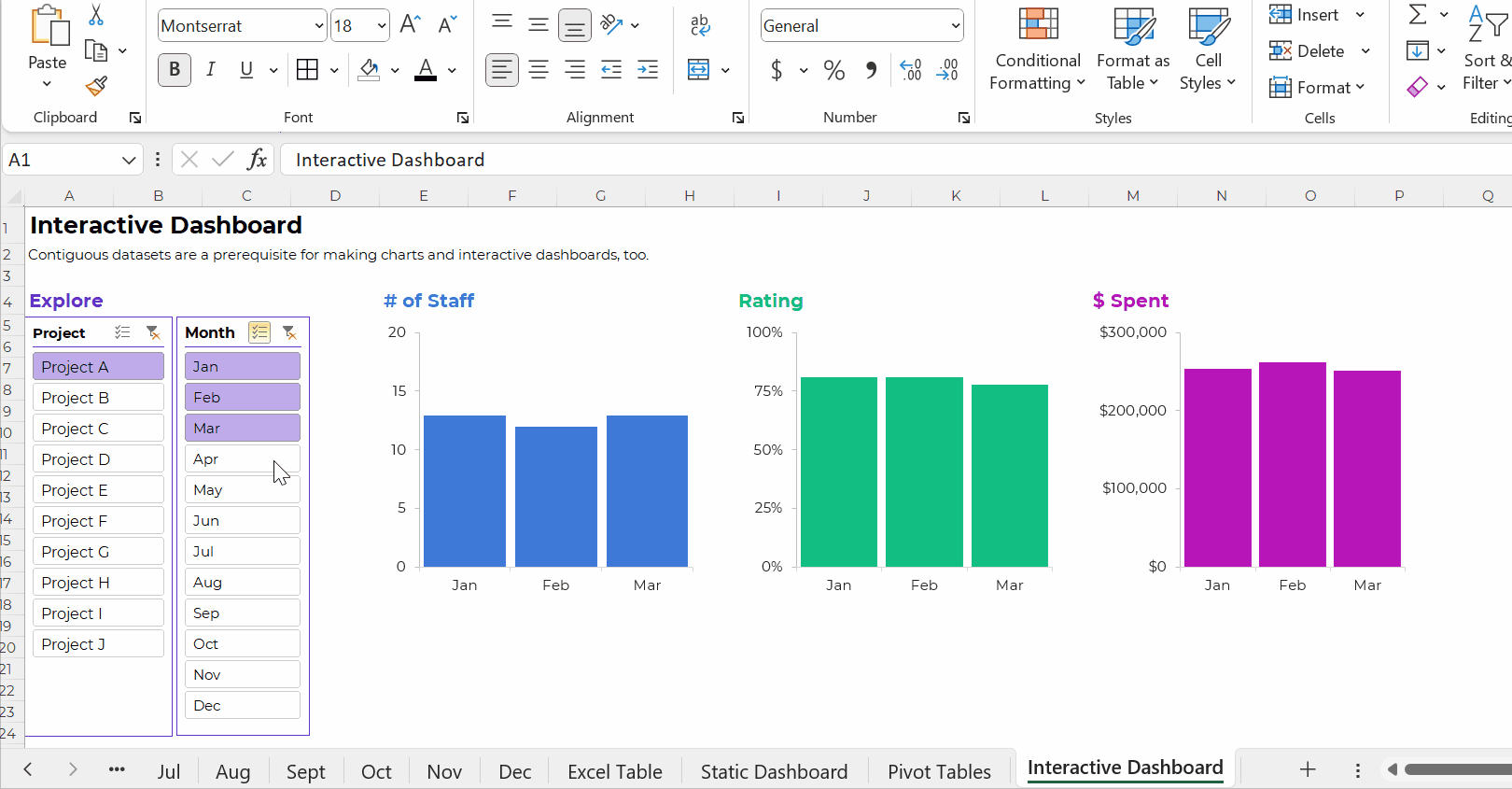
Pivot Tables: Necessary for Interactive Dashboards
To build interactive dashboards in Excel, you’ll need to create pivot tables, then pivot charts, then slicers.
To the best of my knowledge, interactive dashboards have to be built off pivot tables, not formulas.
Here’s an example of an interactive dashboard that’s linked to pivot tables:
The Bottom Line
There are two ways to tabulate your dataset: through formulas, or through pivot tables.
Formulas:
- are necessary for tabulating numbers;
- are faster for datasets with matching columns;
- play well with quick vizzes;
- give us full control over tabulations; and
- give us full control over charts; but
- involve a learning curve.
Pivot tables are:
- great for novices;
- great for tabulating categories;
- faster for cross-tabulations;
- slightly faster for appended tables and recurring analyses;
- way faster for mismatched columns; and
- necessary for interactive dashboards.
Neither option is terrible. Neither option is perfect.
As usual, there are pros and cons.
Your Turn
When do you tabulate your datasets with formulas vs. pivot tables?
This isn’t an exhaustive list of pros and cons. What am I missing??
1 Comment
You say that Pivot Tables are great for novices. The problem is that novices are scared witless of Pivot Tables. Because they can be a bit scary. Once novices get over that initial learning curve, sure.
I’m torn between formulas and Pivot Tables. With the new Dynamic Arrays, you can get a lot of Pivot Table functionality but it’s instantaneous. If you want slicers, it’s Pivot Tables.
But sometimes I make a dummy Pivot Table, to get aslicer