
I give dozens of private workshops and conference keynotes each year. Which means I receive dozens of evaluation surveys each year.
After my sessions, the clients who sponsored the workshop ask their participants to rate my session. Sometimes the satisfaction surveys are electronic. Other times, the satisfaction surveys are conducted with good ol’ paper and pencil. The paper surveys get scanned and a software program automatically compiles the results.
Survey software tools have come a long way. During college, I spent ten soul-crushing hours each week entering data from paper surveys into SPSS in exchange for course credit. I paid the university for the privilege of entering data! (And yes, I learned a ton along the way, and still use those statistics and research methods skills daily.) When I was a research assistant, the survey scanning tools hadn’t been invented yet. Nowadays, research assistants probably have more meaningful tasks than data entry. It’s a different world.
I’m grateful for this automated reporting technology. But, at the same time, survey scanning tools drive me crazy. Their designs still live in the dark ages—it’s 2018 software with a 1998-era knowledge of graphic design and brain science.
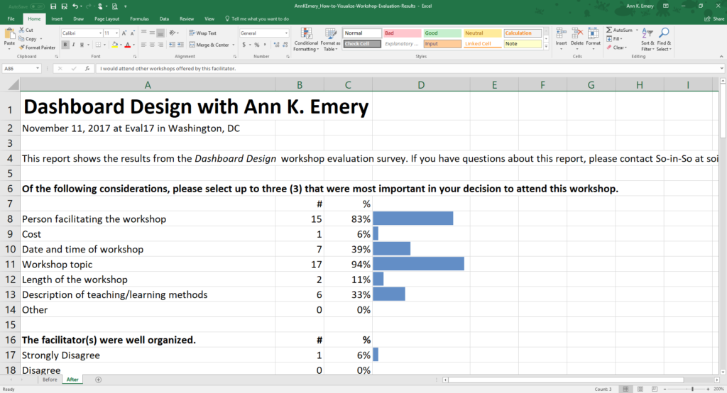
Before
Here’s the most recent survey report that I received. The four-page report comes from a Dashboard Design workshop that I led at a conference last fall.
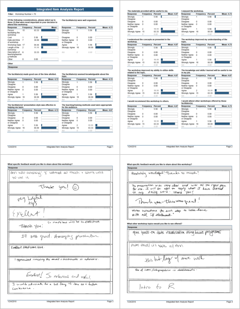
This software program’s design drives me crazy because:
- The title—Integrated Item Analysis Report—is a mouthful. Yes, I know what an item analysis is. I took an entire graduate course about psychometrics. There were dozens of workshop instructors at this conference. We came from a variety of academic backgrounds. Let’s not assume that everyone knows what an item analysis is.
- It’s dense. There are borders and outlines around everything. There are even double outlines around the open-ended comments. There’s almost no white space. The information is straightforward—here’s how people responded to each survey question—but the dense design makes it feel more complicated than it is.
- The colors and fonts are lacking a soul. The conference had its own logo, fonts, and colors. The organization that sponsored the conference had its own logo, fonts, and colors. Let’s breathe some life and identity into this report.
- So many decimal places. I would never change my workshop approach because a tool told me that 88.89% of people answered a certain way. That’s 89%. I’m the audience for this report. I know exactly what’s useful for me and what isn’t. Decimals won’t change my life.
Let’s revamp this report. Tiny edits will make a big difference. This is the step-by-step process that I teach in all of my Dashboard Design workshops, and today I’m sharing the process with you, too.
Step 1: Start with a Table
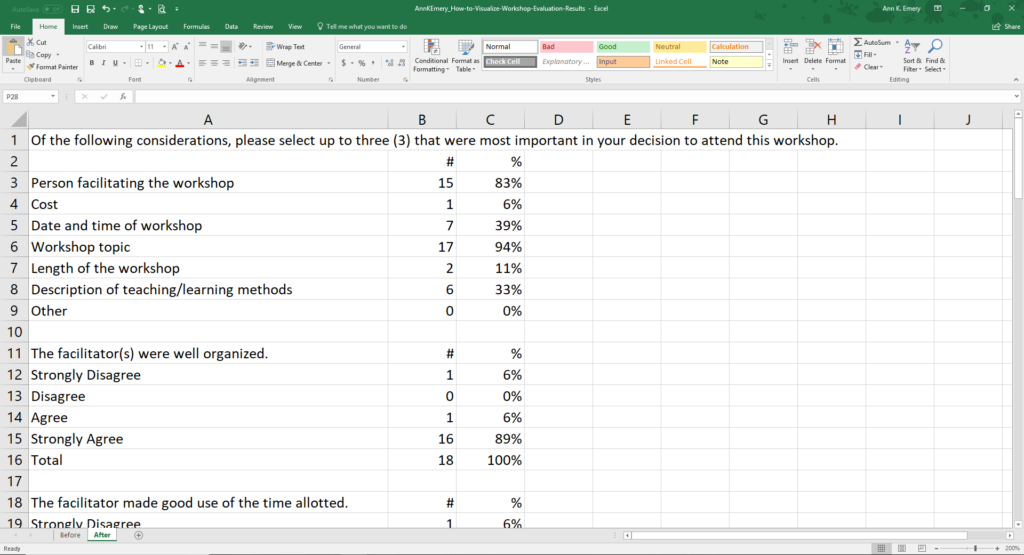
Tables are the heart of every quantitative report. We tabulate our numbers and build visuals from those tables. I re-typed the survey questions and the responses into my spreadsheet.
Make sure that you declutter your table by removing unnecessary ink. Tables rarely need all the borders, horizontal lines, and vertical lines that we’re accustomed to seeing. Sometimes I add a few horizontal lines back at the very end of the design process.
I ignored the mean values for each of the survey questions. Agree/disagree scales are ordinal. We can only calculate means for interval or ratio variables.
I also ignored the Neither Agree Or Disagree category. I’m the audience for this report. I won’t change my workshop content based on a middle category. Here’s how I read this report: “Did anyone hate the workshop? Are there disagree responses? Darn, one person disagreed with every statement. Curmudgeon Effect? A handful of people will be dissatisfied no matter what I do. Maybe that person was having a bad day. Or, maybe they accidentally checked the strongly disagree boxes instead of the strongly agree boxes? I’ll never know for sure. Okay, let’s move on. Did anyone love the workshop? Are there any strongly agree responses? Phew, that’s almost everyone. So now I need to compare the agree and the strongly agree responses. What was holding someone back from checking the strongly agree box? How can I go from good to great?” In most projects, participants tend to be satisfied, so we’re usually comparing the top two choices. The middle categories rarely matter.
Step 2: Add Visuals
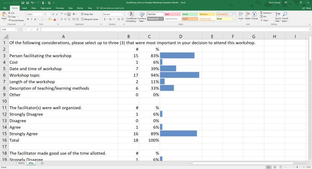
There are several ways to visualize agree/disagree scales, like stacked bar charts, diverging stacked bar charts, or even waffle charts. The existing bar charts would be easiest to automate across dozens of workshop evaluation surveys, so we’ll keep them.
This example contains miniature within-cell bar charts called data bars. You can make data bars in good ol’ Excel with just a few clicks.
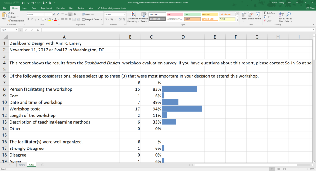
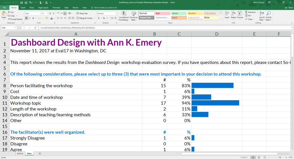
Step 3: Write a Title and Subtitle
One of the most common mistakes that I see among aspiring data visualizers is a lack of text. People get really excited about data visualization. They start churning out more (and better!) visuals than ever before. Sometimes they forget that text still plays an important role. At the top of your report, add plain language that introduces your viewers to what you’re about to show them.
For the title, I changed “Integrated Item Analysis Report” to “Dashboard Design with Ann K. Emery.” At this particular conference, there were dozens of workshops and dozens of evaluation survey reports. The title’s job is to distinguish one report from another. The contents of the report are an item analysis (a question-by-question analysis). But the title of the report needs to contain the workshop’s name and the instructor’s name.
For the subtitle, I wrote, “This report shows the results from the Dashboard Design workshop evaluation survey. If you have questions about this report, please contact So-in-So.” I typically keep my dashboard subtitles to two sentences. The first sentence tells you what you’re about to learn. The second sentence tells you who to contact if you want to learn more.
Step 4: Apply a Text Hierarchy
A text hierarchy tells your viewers which text is at the top of the food chain. The title should be large, dark, and bold so that it instantly grabs your viewers’ attention. You could also apply ALL CAPS to the title or section headers. Use ALL CAPS sparingly, please. It takes longer for our brains to read ALL CAPS than Sentence case or Title Case. We like having a mix of tall and short letters.
This is especially true for people with learning disabilities.
I also made each of the survey questions bold. Later on, I tweaked the font sizes and colors again. The idea is the same. The important information needs to stand out in large, dark, and bold text.
Step 5: Brand with Customs Colors and Fonts
Another common mistake that I see among aspiring data visualizers is when people think that adding their logo will sufficiently brand their document. Sure, you can add your logo to your report.
Just make sure to place your logo in the lower corner—not in the top—so that it doesn’t distract from the report’s contents. In addition to using logos, your fonts and can reinforce your brand.
For fonts, I’m using a combination of Lato Heavy and Lato Light. You would use your own fonts.
You would also use your own colors, not mine. Learn how to read your organization’s style guide, locate your color codes with an eyedropper, or locate your color codes with Microsoft Paint. Then, enter your color codes in Excel or in Tableau.
Step 6: Re-Arrange Until Everything Fits on the Page
This step is more of an art than a science…
I opted for a landscape layout instead of portrait layout. I reserve portrait layout for materials that are going to be printed. Are workshop facilitators printing out documents like this? I doubt it. I won’t. Landscape layout is best for documents that are going to be read on-screen because our computer monitors are already landscape-shaped. You open the document and it just fits so nicely.
No wasted space around the margins.
I adjusted row heights and column widths to get the page breaks just right.
I merged a few cells. When you’re working in spreadsheets, don’t merge cells together too early!!!!!!!!!!!!!!!!!!!!!!!!!!!!!!!!!!!!!! You’ll kick yourself. Unmerging cells is drudgery.
I added page numbers. My report was designed entirely within Excel, but it would get shared with others as a PDF. Page numbers make my “spreadsheet” feel more like a regular document.
I added horizontal lines so that readers could across the rows more easily. The lines are light gray, not black. They don’t distract from the more important information.
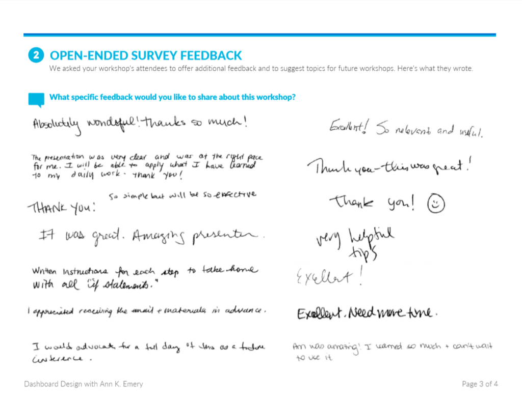
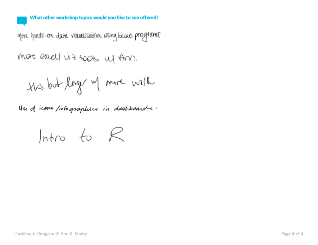
And speaking of lines… I removed the double outlines (!!!) around the open-ended responses. This is one of my favorite parts of the makeover. Now, we can actually see the comments because they aren’t competing with the outlines for attention.
I color-coded the report by category. The introductory section is purple, the closed-ended questions are blue, and the open-ended questions are turquoise. I wanted readers to know when a new topic was starting.
Finally, for bonus points, I added icons. Michelle Borkin and her team found that icons make graphs more memorable, so I add icons whenever I can. I’ll teach you how to add icons in a future post.
Here’s the full makeover. I hope you like it.
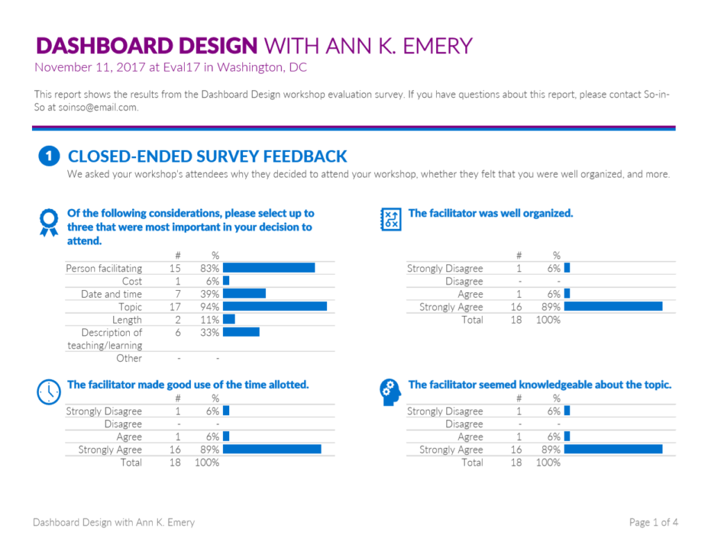
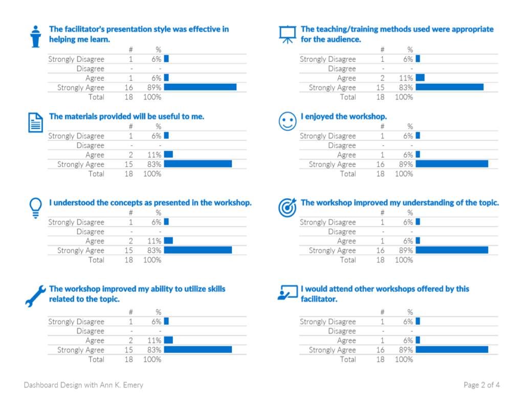
Within minutes, we’ve provided workshop facilitators with useful information without burning their eyeballs.
Learn More
Want to learn the technical how-to’s in Microsoft Excel?
Want to see additional before/after data visualization makeovers?
All these skills are covered inside Dashboard Design.
Purchase the Template
Want to explore my survey report makeover in more detail? See how I arranged the text, graphs, and icons. Or, get ideas from the template to use in your own project. You can purchase the template below.
19 Comments
Great looking rework! For the first question, would you consider re-ordering the response options from most frequently to least frequently selected for ease of reading and processing? Because the rest of the data is ordinal (agreement scale), re-ordering by magnitude isn’t an option — but that could make the first question even easier to process even if it is more of a departure from the original layout.
Hi Castle, wow, good thinking. I can’t believe I didn’t think of that. Yes, definitely order the first question by magnitude. Thanks for keeping me on my toes!
I love the use of colors and icons. This is an incredible improvement from the clunky report out from the software program. I’m excited for your future post about how to add icons — I’ve been wanting to use them more in my work 🙂
Thanks, Mia. Not every project lends itself to icons, but these survey questions and icons were a pretty good match.
Great post, thanks for sharing. I am also looking forward to your post about adding icons, that will definitely be valuable for many of us who want to spice up our excel reports. How did you get the open-ended questions into excel?
Hi Lauren,
Glad to hear that you’re interested in learning more about icons! I’ll push that blog post to the top of the pile. I recorded a few videos just yesterday about using icons, but those videos are for an online course that won’t be released for a couple more months.
I used my super fancy screenshot skills to get the open-ended comments from the original PDF into Excel. 🙂 Someday, maybe the software team that makes the scanning programs will read this post and adjust their designs. All they’d need to do is STOP ADDING THE OUTLINES AROUND EVERY RESPONSE. This probably involves one button or one line of code. Someday! A woman can dream.
Ann
I’m relatively new to evaluation, so I’m not familiar with scanning technology. How do you get people’s hand-written open-ended survey feedback responses to merge altogether onto a single sheet (without taking a ton of screen shots/snipping tool pieces)?
Hi Clara, I have no idea! That’s the magic of the scanning software. You feed the surveys into the machine and the machine’s software program scans the hand-written responses and spits them out into an auto-tallied report like this one. I’ll keep you posted if I ever learn more. This technology is relatively new (past 10-15 years I think).
I guess I’m wondering if I have to buy one of these machines or if there is software that can convert a regular scanner into doing this? How did YOU get the hand-written feedback from the old version with the boxes around them to the clean version with no lines in your new report?
Okay, now I have done this for each of 7 workshops in a conference. It looks pretty sweet. Now I want to save in pdf and make sure my fonts and colors are embedded. How do you do this in Excel 10?
Great work! Please send me a few of your designs if you’re allowed to (or anonymize them). I’d love to see how you applied my ideas to a different topic area.
To save as a PDF:
1) Highlight the portion of the screen that you want to PDF (e.g., A1 through Z100). Go to the Page Layout tab. Click on the Print Area icon and “set” the print area. You’ve just told Excel which section of your screen deserves to be printed or PDF’d.
2) On the Page Layout tab, adjust the Orientation (e.g., from Portrait to Landscape) and/or the Margins (e.g., from 1 inch to 1/2 inch) if needed.
3) Keep fiddling with the column widths and row heights until everything fits on the page(s) as you want it to. I like to go to the View tab and click on the Page Break Preview icon while I’m doing these adjustments.
4) When everything’s just right, go to File —> Save As and save the doc as a PDF. Then, distribute the completed version as a PDF through email or print copies to bring to a meeting.
I walk through these steps in detail in my Dashboard Design workshops, webinars, and course. Or, let me know if you want a one-on-one consultation on your specific project if you run into more questions.
Again, great work!!
Oh, it looks and prints out just as I want it. If I just save to pdf it will keep the font (Source Sans Pro) and not default to Calibri on someone else’s computer?
Oh good, I’m glad to hear that it already prints well! Yes, that’s the magic of PDFing–your fonts should stay intact.
Thank you for this! I was able to use a similar design for a different purpose at my job. It was well received (I think the colors in particular helped make it simpler to read).
Thanks for the template, Ann! I’m trying to change the colors of the bars and am having quite a struggle. Can you provide some guidance? Thanks again!
Hi Melissa, You’re in luck! It’s easy to change the colors of the bars. Highlight or select the bars you want to edit. Then, go to Home –> Conditional Formatting –> Manage Rules (on the very bottom of the list). You’ll see a brand new pop-up window and you’ll have to click Edit Rule again. In the second pop-up window, called Edit Formatting Rule, look for the color section. It’s towards the bottom. You can select a standard color. Or, go to More Colors and enter a custom RGB code to match your audience’s branding. (My template has custom colors in it.)
Thanks so much, Ann! That worked perfectly. You’re my data visualization hero!
You’re welcome! Don’t forget to share your “after” version as you tweak the template for your own project. Would love to see it.