
That beautiful chart is one of the last steps in the analytical process.
For most projects, it goes something like this:
- Planning. Figure out what data you need. You might get data requests from your boss. You might hold a months-long strategic planning process. You might participate in a program evaluation where the evaluator helps you brainstorm what your questions are and how to collect data to answer those questions.
- Collect the data. Design and administer surveys. Organize focus groups. Review public data sources (e.g., Census data).
- Analyze the data. Take raw, messy data from tons of different data sources and get it neat and tidy so it can feed into charts.
- Visualize the data and share the reports, one-pagers, dashboards, and slideshows with stakeholders.
Data analysis and data cleaning alone can take hours. Days. Weeks.
We’ve all got horror stories about data cleaning that took forever and ever and ever and ever. I often spend 10x more time cleaning data than creating charts.
Data analysis still takes time, but it doesn’t have to take forever.
Data analysis might not be your favorite part of the process. But it doesn’t have to be a headache, either.
In this blog post, we’ll cover 10 skills that can make your next data project easier, faster, and error-free.
10 Must-Have Analytical Skills
No matter the topic area. No matter the software program. Here are 10 must-have skills for cleaning and analyzing data.
Which skills are you already strong in? Which ones need to be developed? You can follow the links to additional tutorials.
Outliers

I recommend (1) checking every dataset for outliers, and then (2) deciding how you’re going to deal with them.
Humor me: Comment and let me know how you define the term “outlier.”
To some people, it generally means a really small or really large value.
To other people, it has a specific numeric meaning.
A million years ago, I worked on a longitudinal study in a university research lab. Here’s how the principal investigator of that study defined “outlier:”
An outlier is any value that falls more than three standard deviations outside the mean.
He taught us to calculate each variable’s mean and standard deviation. Then, we’d see which values were smaller than three standard deviations below the mean, and which values were larger than three standard deviations above the mean. Those were the outliers.
Next, we had to deal with outliers.
I’ve heard novices suggest that you should just delete outliers. NOOOOOOO. Deleting outliers will skew and affect the distribution of our dataset.
Here’s what the principal investigator taught us:
We should trim outliers—setting their value to be exactly three standard deviations above or below the mean.
For example, if three standard deviations above the mean is 150, and you’ve got an outlier of 160, you treat that 160 as 150 rather than deleting it.
This is a little jargony for a blog post, so if you’d like to learn more, let me know. I’ve got video resources in everyday language inside our Simple Spreadsheets course.
Duplicates
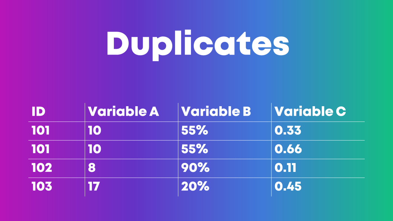
I’ve seen people identify duplicate ID numbers by scrolling through their dataset, squinting at the ID column, and hoping to spot the same ID number in there twice.
Eye-balling is fine with tiny datasets. But it’s impossible to scroll through hundreds, thousands, or tens of thousands of entries. It would take ALL DAY. And, we’d miss something.
Here’s how I like to identify duplicates:
- I use Microsoft Excel’s Conditional Formatting to make duplicate ID numbers pop out in bright red.
- Then, I re-sort my dataset so that the bright red numbers appear at the top. I go through the duplicate entries one at a time and try to figure out why those entries have appeared multiple times.
Or, I use the Remove Duplicates feature in Excel.
Or, you can even use pivot tables for data cleaning, like identifying duplicates. This blog post by Oz Du Soleil will get you started.
Missing Data
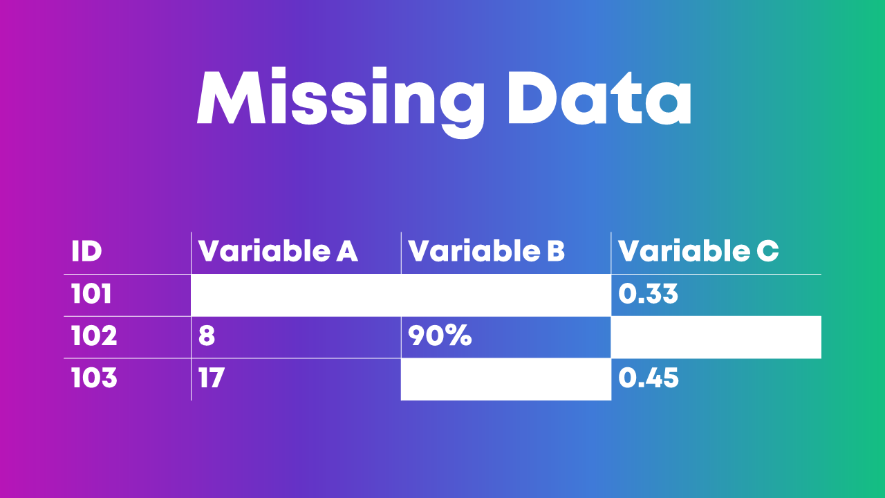
We need to check our dataset for missing data every single time.
This isn’t a once-in-a-while luxury.
This isn’t a if-I-remember-it optional step.
Checking for missing data is mandatory.
You might find patterns in your dataset: An entire row is empty. An entire column is empty. Find out why.
Let’s pretend you collected electronic surveys. You might see a mostly-empty column if your survey had a skip pattern, for example. Or, you might see a mostly-empty row if someone started the survey but didn’t finish answering all the questions. These patterns are normal and expected. The most important part is to understand all the nuances of why you might see missing data before you move on to any tabulations.
Or, you might not see a pattern in the dataset (like the image above).
This Swiss cheese pattern might mean that people skipped survey questions here and there, for example. That’s probably normal in your project. Again, the goal is to spot missing data and understand why it’s missing as early as possible in the project.
Measurement Scales
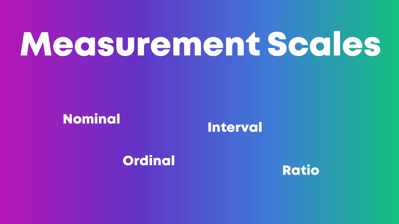
Nominal, ordinal, interval, and ratio. These are called measurement scales.
We need to understand whether each variable in our project is nominal, ordinal, interval, or ratio because that affects how we summarize that variable.
Let’s pretend you’re organizing a virtual conference, and you give attendees a survey when the event is over.
You might have a check-all-that-apply question where you ask people which part(s) of the conference they liked: the breakout sessions, and/or the keynote speaker, and/or the networking events. These categories are nominal data, which means we should be paying attention to frequencies—how many people checked the box for the breakout sessions, the keynote speaker, and the networking events.
This blog post gets you started with beginner-level formulas for numbers,like calculating the mean, median, mode, and standard deviation.
This blog post gets you started with pivot tables, which I find most helpful for categories.
Distributions
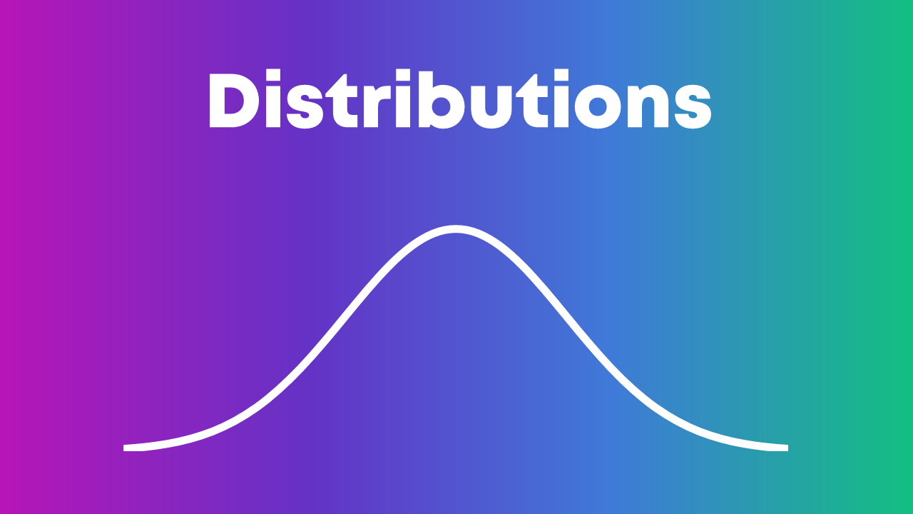
Being able to describe a dataset as left-skewed, right-skewed, or symmetrical is a must-have analytical skill.
We also need to understand how those distributions affect real-world decision making.
If academic test scores are left-skewed—now what?
If mental health assessments are right-skewed—now what?
Distributions also affect chart-choosing. For example:
- We can use a traditional histogram to show the distribution.
- We can use a unit chart or wheat plot to emphasize individual dots in the histogram.
- We can use a population pyramid to compare two groups’ distributions, side by side.
- We can use a swarm plot when the dots are overlapping and need to be jittered.
Recategorizing/Recoding Variables
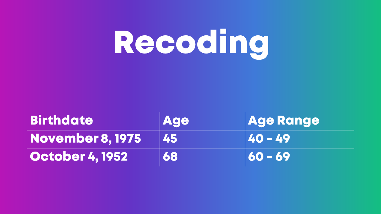
You might need to recategorize or recode values if:
- You have a list of zip codes but you really just care about the states.
- You have a list of states but you really just care about the regions where those states are located.
- You have a list of countries but you really just care about regions of the world.
- You have a list of ages (0, 1, 2, 3, 4, 5, etc.) but you really just care about age ranges (0-9, 10-19, 20-29, etc.).
- You have a list of schools but you really just care about which district the school is located within.
- You have a list of test scores (40%, 55%, 70%) but you really just want to focus on students who passed or didn’t pass the exam.
- You have a list of body mass indices (19, 24, 29, 32, etc.) but you want to categorize the raw numbers into underweight, normal weight, overweight, and obese.
- You have a list of languages spoken but you really want to divide people into those who speak Mandarin and those who don’t.
- You have a list of countries where people were born but you really just want to divide people into born in U.S. and not born in U.S.
- … and so on.
This blog post gets you started with beginner-level categorizing using =if() and =vlookup().
Merging Datasets Together
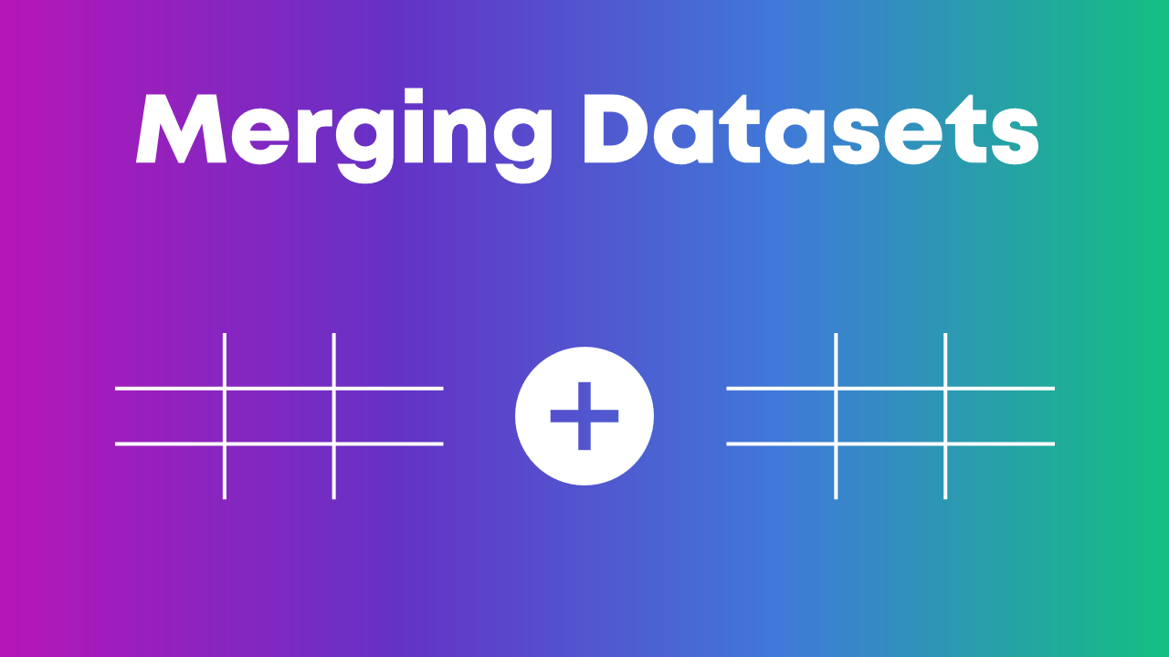
Is your student demographic data living in one spreadsheet?
And your test scores are living in another spreadsheet?
But you want to see how demographic characteristics might be related to test scores? For example, do students living in one zip code score higher than students in another zip code?
We’ll need to combine those two spreadsheets together.
In Excel, you’ll need fluency in vlookup, hlookup, index-match, and xlookup.
This blog post gets you started with =vlookup().
Merging Variables Together
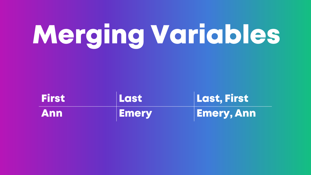
Sometimes, we need to merge entire datasets, tables, or spreadsheets together.
Other times, we need to merge individual variables together.
For example, if you have first names in one column, last names in another column, but you really want to see everything displayed in Last, First format.
Manual merging is a pain, and it’s destined for typos.
Instead, we can use use Excel’s =concatenate() formula or the & operator to merge variables.
Pulling Variables Apart
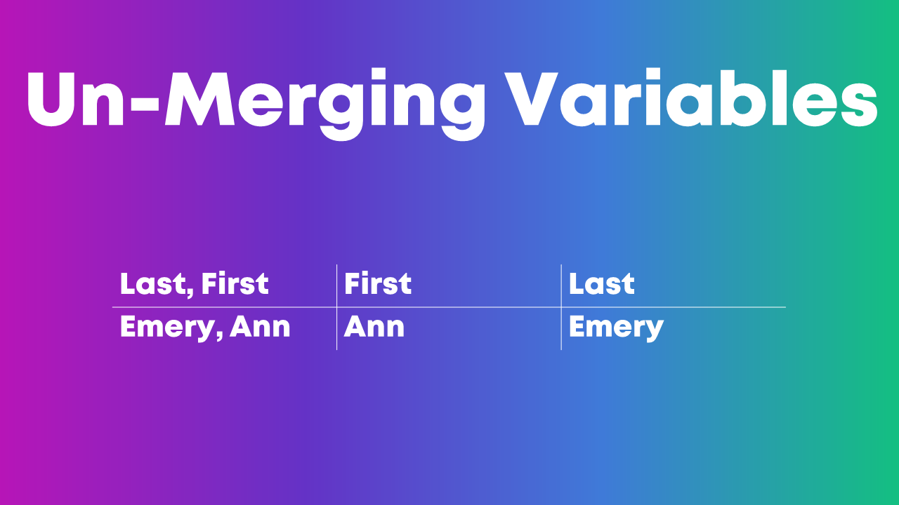
Sometimes we also need to pull variables apart, like when you’ve got Last, First but you really just want First. Or just Last.
In Excel, we can use formulas like left, right, or mid.
Excel’s text-to-columns is another game-changer.
This blog post gets you started with one of those techniques, =()left.
Exploratory Visualization
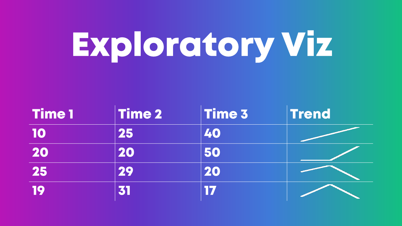
Why wait until we’re hours, days, or weeks into the analytical process before we see any charts??
Quick visuals help us scan the dataset for patterns early and often.
My favorite exploratory visualization techniques in Excel are:
- heat tables,
- data bars, and
- spark lines.
(NOT most of the Conditional Formatting options, ha! Here’s what not to do when it comes to exploratory visualization.)
Which Software Program Should I Use??
We can apply these analytical skills in any software program.
In college, I learned to use SPSS in my statistics and research methods courses.
After college, I worked in a university research lab, and we all used SAS.
After that, I worked in a consulting firm, and we all used Excel. I’ve linked to some Excel-specific resources throughout this blog post in case that’s your organization’s tool of choice, too.
Your Turn
Which must-have analytical skills would you add to this list? What types of techniques for transforming raw data into clean, tabulated data have been crucial in your own job?
I’ve linked to a few blog posts with how-to tips. Do you have additional how-to resources to share, like books, blog posts, or YouTube videos?
1 Comment
It would be interesting to know who is using what to analyze their data within your groups, my group of folks all use SPSS, as we are university based and that’s how we learned. All my graphs are made within word, since I don’t use Excel I can’t pull anything in that way either… It’s funny, when I have to do something within SPSS that’s new/different, I have to google it and find a video that doesn’t have a man who sounds like an IBM engineer speeding through the solution 🙂