It’s your brain.
A few of the million+ decisions your software program can’t make for you:
10. Which chart is best for your data. Yes, I’m well aware of Excel’s Suggested Charts feature. No, don’t even think about it. There’s no substitute for your critical thinking skills.
9. How much ink is necessary. Will your viewers benefit from light gray grid lines, or should you remove them altogether? Ask 10 different people and you’ll get 10 different opinions. You’ll have to think yourself outta this one.

8. How many decimal places are needed. One argument is that decimal places add precision – if you’ve got decimal places, why not display them? Another argument is that our datasets are rarely complete enough, cleaned enough, or generally accurate enough to warrant giving the viewers lots of decimal places (and therefore, a false sense of precision).

7. Whether you’re going to stick with a default color scheme (please, NO) or customize your color palette to match your client’s brand identity.
(And who chose Excel 2013’s color palettes, anyway? Lime green, royal blue, and orange? But that’s an article for another day.)

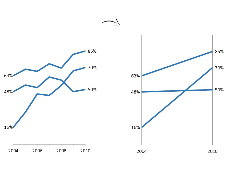
6. The extent to which you’ll label your data. Do your viewers need to see every point on the line, or just the beginning and end points? Or just the highest line? Or just the lowest line?

5. Whether your chart needs to be rotated to avoid diagonal text. In this scenario the answer is yes! rotate that chart! but your software program won’t automatically do this for you. You’ll have to determine whether your data labels need some additional space, and if so, swap your vertical bar chart for a horizontal bar chart.

4. Whether your viewers need aggregated or disaggregated data. It doesn’t matter how much you paid for your software program. Your computer doesn’t know whether your viewers would benefit from a single visual that contains aggregated information or whether your viewers need to make comparisons across four different variables simultaneously through a small multiples layout. But yes! Your brain! It knows!

3. Whether your viewers will really understand that diverging stacked bar chart, or whether you should just stick to a regular old stacked bar chart.

2. Which patterns to emphasize and which patterns to hide, like whether viewers need to see all the peaks and valleys (line) or whether you need them to focus on just two points in time (slope).

1. And in case it isn’t obvious yet, your audience is pretty darn important. Your software program will never understand your audience’s numeracy level, data visualization level, interests, time limitations, or information needs as well as you.
8 Comments
Great post! Your brain IS the best visualization tool, but only is you feed it with appropriate knowledge first.
So read this 3-step tutorial on how to choose the right chart, it will help your brain decide: http://zebra.bi/blog/2014/10/23/how-to-choose-the-right-chart/
This is a fantastic post. With systems like Watson Analytics promising much more automation do you think that’s a sign of steps being taken to make machines more intelligent? How do you think those technologies will impact the points you make in this post?
I think we’re still a few years away from HAL 9000. 🙂
Thanks Ann for this post. There´s so much theoretical stuff out there from Few, Tufte and Hichert about this topic. I think “it depends”! 🙂 So you have to try what fits best for your reports users, quickly deliver a 0.9 version of the report or dashboard and then iterate it together with the users!
Great post Ann, This is what students often ask, what to change to make it look better. Another post to add to the list.
[…] ABER: Welches Visualisierungswerkzeug ist das Beste EVER? Dein Gehirn. Warum? Weil es einfach Fragen gibt, die nur du beantworten kannst. […]
[…] One day soon, we’ll stop arguing about which software program is best, and we’ll agree that our brains are the best visualization tools of all time. […]
[…] whose salespeople pretend that their software is a magic bullet for dataviz. I believe that the best data visualization tool of all time is your brain, and the second best is sketching with paper and pencil… or even Play-Doh! When I discovered […]