
Visualizing data in charts, graphs, dashboards, and infographics is one of the most powerful strategies for getting your numbers out of your spreadsheets and into real-world conversations.
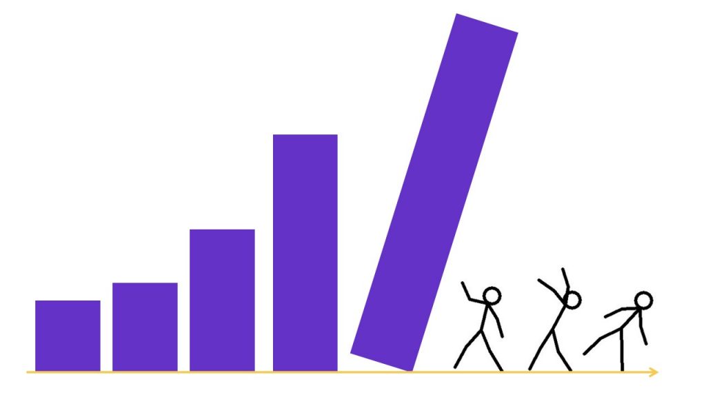
But it can be overwhelming to get started with data visualization. Does data visualization leave you feeling like the numbers are about to topple over on you??
If so, this step-by-step data visualization guide is for you!
I’ll walk you through the data visualization design process so you know what to do first, second, and third as you transform your spreadsheets into data stories.

Step 1: Understand Your Audience
Wait! Don’t start making graphs on your computer! First, we have to do some planning. A little bit of up-front planning will save you hours of blood, sweat, and tears in the long run.
First, we need to consider our audience and context. Who, exactly, is going to be using the data to make decisions?
Here are some discussion-starter questions to talk about with your colleagues.
Who is Your Audience?
A chart designed for a group of foundation program officers will not be appropriate for a group of high school principals, and vice versa.
List all your audience types on a piece of paper, or a whiteboard, or in a spreadsheet, or even on the back of a napkin. Share the list with your colleagues and make sure you’re on the same page.
Have you reached consensus about who you’re targeting with your data?
What’s Your Audience’s Numeracy Level?
Do they enjoy or fear data? Unless you’re designing charts for a group of economists or statisticians, you can usually leave out details like the effect size, power analysis, and margin of error. Laypeople are often more interested in practical significance (the “so what?” and implications of findings) than in statistical significance.
What’s Your Audience’s Data Visualization Familiarity Level?
If they’re brand new to dataviz, stick with the traditional charts like pie charts, bar charts, and line charts—otherwise they’ll spend more timing ooh-ing and aah-ing over the chart’s novelty than paying attention to the information contained in the chart.
How Much Time Does Your Audience Have?
Little time or interest: Simple static chart.
Lots of time and interest: Interactive charts.
What Types of Decisions Does Your Audience Make?
What information do they need? What information do they already have? What information are they expecting? How will your chart(s) add value for them?
If you can’t think of how your chart will add value for the readers, don’t make one. Every chart needs a purpose and so what?
How Much Precision is Necessary?
As the data visualization designer, you have the freedom (and responsibility) to select how much precision is necessary. Your selection should be well thought-out and intentional. Your decision plays out in two ways: the chart type you select, and how you label the data points.
When selecting chart types, remember that some charts are better than others in displaying precision. For example, charts that rely on angles and area to show differences, like pie charts, are for communicating general patterns. Charts that rely on length to show differences, like bar charts, are for communicating specific details.
How Many Decimal Places Are Necessary?
A related decision is how exact your data labels will be. Will you include decimal places? How many?
In most scenarios, you can safely round your decimal places to the nearest whole number. Your audience is rarely using the tenths, hundredths, or thousandths place to make decisions.
Are My Viewers Expecting a Story?
Think about whether your audience is expecting a traditional or storytelling graph.
You’ll learn about the distinctions in this video:

Step 2: Choose the Right Chart
It takes a while to understand all the different chart types and to pick the best one for your desired takeaway message. There are tons of great graphs to choose from!
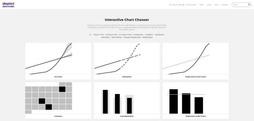
Consult a Chart Chooser
My interactive Chart Chooser includes dozens of chart types, resources, tutorials, and templates.
New to Dataviz? Start with Classic Chart Types
If you’re not sure which chart to use, stick with classics like the bar chart to compare categories and the line chart to visualize how things change over time.
These charts will be “right” most of the time, so they’re a safe bet.
Use Pie Charts Sparingly
Contrary to popular belief, pie charts are not evil and don’t have to be avoided altogether. I have seven guidelines for using pie charts and donuts. In this pie chart makeover, I show you how to transform a 3D pie chart with way too many slices into a storytelling bar chart with icons:
Getting Comfortable with Dataviz? Branch Out and Try Other Chart Types
Once you’ve mastered the classic chart types, you can play around with less-familiar chart types like bubble charts, bullet charts, dot plots, heat maps, scatter plots, slope graphs, social network maps, tree maps, waterfall charts, and more.
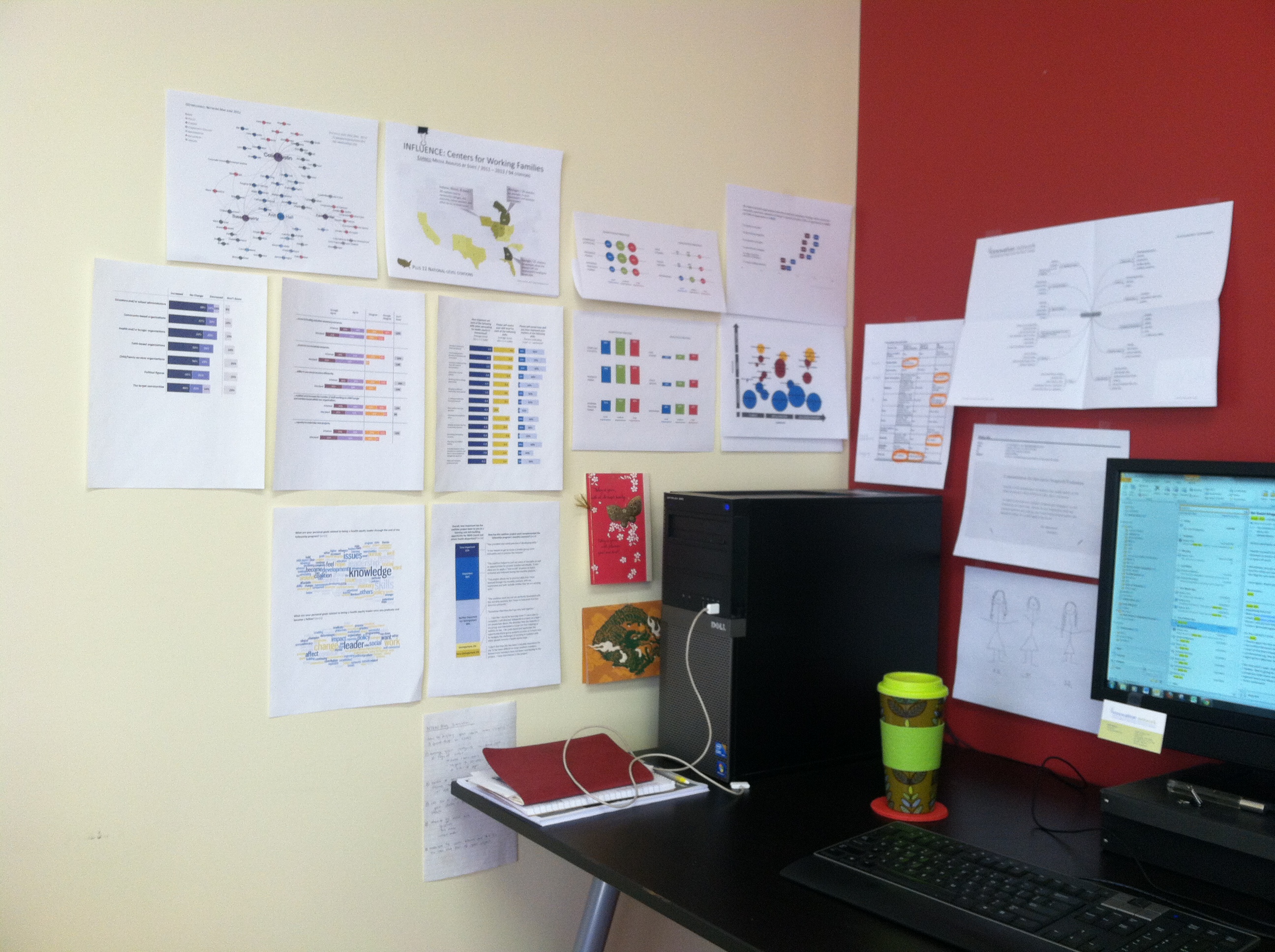
Surround Yourself with Positive Inspiration
Surround yourself with great graphs so you can expand your worldview of what’s possible with data visualization. I suggest following top-notch data journalism teams like @PostGraphics, @NYTgraphics, and @WSJgraphics.
You can even create a physical or digital library of great graphs. For example, you might print full-page, full-color charts and tape them near your desk. Surrounding myself with a variety of chart types, all of which have been used in different reports and for different groups of people, helps me create brand new charts easily. All I do is glance up at my gallery, and then I quickly figure out which chart is best for my new situation.
Dive Into Your Dataset with Exploratory Data Visualization Techniques
I also use exploratory computer strategies, like Microsoft Excel’s spark lines, data bars, and conditional formatting, to help me narrow down the focus of my charts.
Spark Lines
Here’s a tutorial that shows you how to get started with spark lines:
Data Bars
And here’s a tutorial that shows you how to get started with data bars:
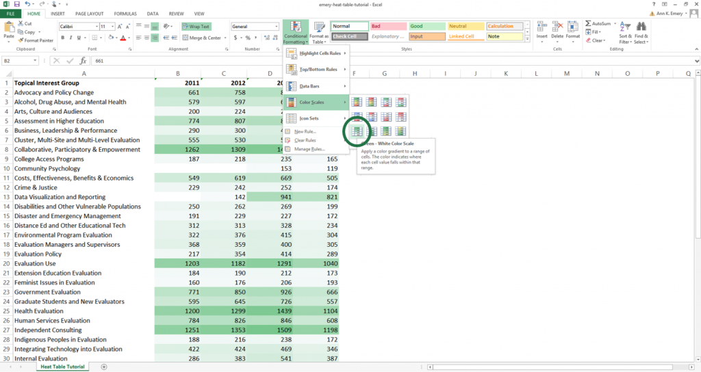
Conditional Formatting
You can set up rules in your spreadsheet that automatically change the color of certain cells based on their values. I regularly use heat tables to scan my dataset for patterns. You can follow my step-by-step tutorial to make heat tables for your data.
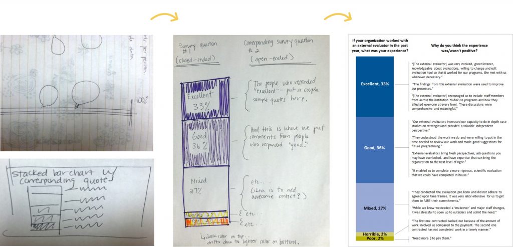
Sketch Rough Drafts on Paper
Step back from your software program. This is especially crucial if you’re using Excel or R (versus Tableau) where you usually need a solid idea of your chart’s design before implementing that design on the computer.
I sketch, draw, and doodle plenty of drafts before I create anything on the computer.
Here’s how it works: First, sketch plenty of rough drafts on paper. Give yourself permission to doodle as many drafts as you need. Share drafts with colleagues early and often. Gather as much feedback as you can. Next, create one or two of those promising drafts on the computer. Finally, edit, edit, edit! Put your easiest-to-follow chart in your final presentation or report. You might sketch five or more drafts. Only the single best chart will survive the editing process.

Step 3: Select a Software Program
Once you’ve got a rough mental idea of what your visualization might look like, sit down and build the first draft of your visualization on the computer.
There are dozens of software programs available for building data visualizations. Some are free. Others are low-cost. And others are quite costly, at least for smaller organizations.
I’m software-agnostic at my core, meaning that I don’t care which program you use. You can create great — or terrible — graphs in any software program.
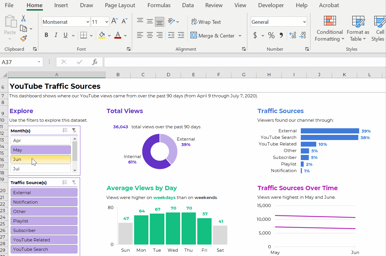
That being said, 99% of my data visualization consulting is done in Microsoft products: Excel, Word, and PowerPoint. Those are the common denominator for the companies that hire me. I’d never create a dashboard in a specialty software program… if you don’t also have access to it and know how to use it. It would be useless!
Here’s an example of an interactive dashboard made in good ol’ Excel. You can learn how to make these, and many other types, inside my Dashboard Design online course.

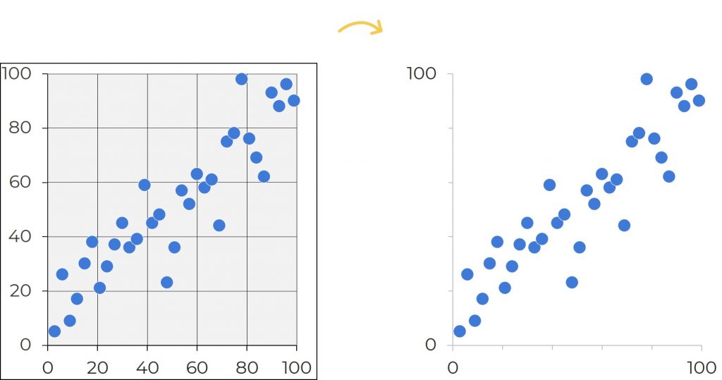
Step 4: Declutter
After you’ve got the first draft of your data visualization created on the computer, it’s time to refine your visualization and make your message shine. No computer program is perfect. You’ll have to roll up your sleeves and make intentional edits no matter which software program you’re using. The very first edit I make is to declutter my visualization. Software programs come with way too many borders, lines, and unnecessary ink. Examine each and every speck of ink on the chart. Does it have a specific purpose? If you can’t articulate a reason for that ink, you don’t need it.
Apply the Squint Test
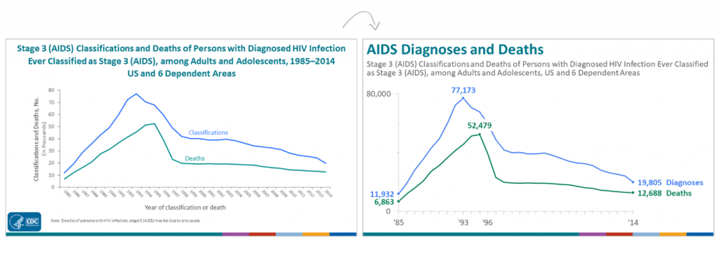
In these before scatter plot on the left, the cluttered appearance distracts us from the data. All these extra lines make the charts look overly scientific—and outdated. In the after version on the right, I removed the background shading and borders. I kept the x and y axes and some of the grid lines, but I intentionally changed the black ink to gray ink.
How do you know when you’re done decluttering? Apply the Squint Test. Here’s how it works: Squint your eyes so that you’re peering at the chart through your eyelashes. Everything should look a little blurry. Can you see the overall shape of the data? For example, you should be able to tell if a line chart is jutting upwards or downwards over time. If not, try removing more clutter.
Outline Shapes in White
You’ve got the gist of decluttering. Now, let’s fine-tune!
Sometimes reducing clutter means outlining shapes in white, rather than black, so that they match the chart’s background color.

Step 5: Clarify Your Message with Color
There are three goals for color:
- Branding (Using your company’s colors, which saves time and helps you look professional)
- Accessibility (Making sure your colors pass official guidelines so they’re legible for people with disabilities, like ADA/508 compliance in the United States)
- accessibility (Using colors to make the graph feel intuitive)
Brand Your Visuals with Custom Colors
I’m begging you! Do not use the default colors from Excel, Tableau, or Google Charts. Nothing screams novice! or 2002! more than default color schemes. If you’re designing charts for a report, handout, or presentation for a client, use their color scheme. Consultants, this means the report will look like it came from the client. It will not have your firm’s look and feel.
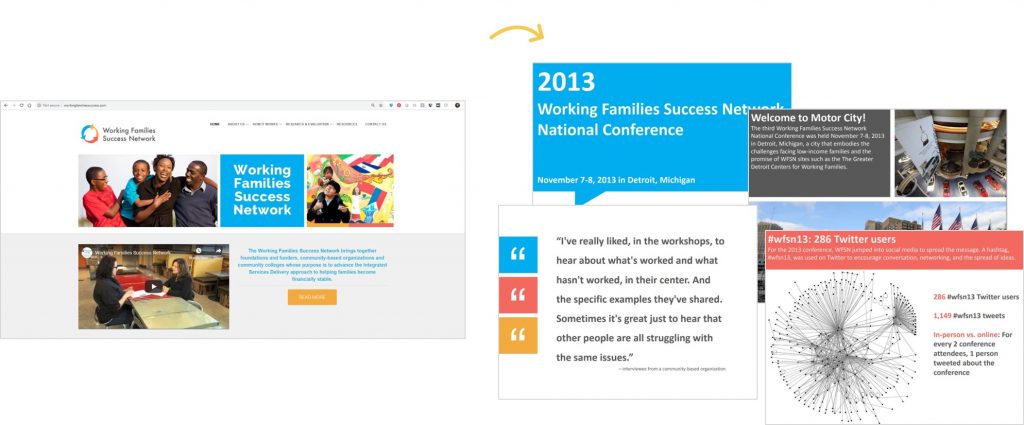
In this example, Johanna Morariu and I were designing a slidedoc for the Working Families Success Network. We began by investigating the Working Families Success Network’s logo, website, and publications. Their logo has a distinctive blue, orange, and pink and their publications use dark gray text rather than black. Throughout their website they use color blocks with white text and white outlines. Next, we adapted that layout and color scheme for our slidedoc. The images on the right are separate slides (pages) of the report.
You can locate custom color codes in style guides, with a free eyedropper tool, or even with Microsoft Paint. Then, enter your custom color codes in Microsoft Excel or in Tableau.
Make Sure Your Colors Are Legible for People with Color Vision Deficiencies
Here’s how:
- First, by proactive and avoid using red-green color combos.
- Second, make sure you directly label your data.
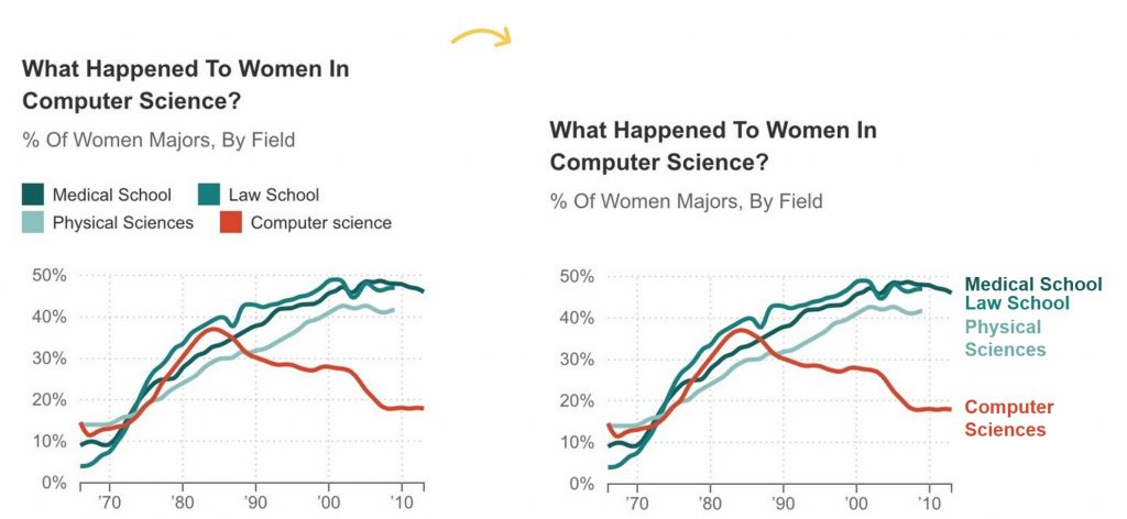
Although we’re used to seeing legends, we rarely need them. Legends can lead to unnecessary zig-zagging around the screen or page, and legends can also be difficult to interpret if your graph is printed in grayscale.
Instead of using legends, directly label the data. Direct labels mean that you add labels as close as possible to the data. For example, in a line graph, you would delete the separate legend and place the category labels off to the right of each line. For bonus points, color-code the text in the labels to match the line.
This is what direct labels look like:
Then, you can upload your draft to www.color-blindness.com’s Color Vision Deficiency Simulator to get a preview of what it’ll look like for people with protanopia and deuteranopia.
Emphasize the Takeaway Message with the Action Color
When you want to tell a story with data, you can guide your viewer’s attention to your desired takeaway finding by creating a dark/light contrast. This example comes from one of my graduate school projects a decade ago, so I used the exact shade of green from my university’s logo. Then, I used dark green to draw my audience’s attention to a couple key parts of the slide. This slide comes from the fourth section or chapter of the presentation, the Limitations section, so that tab was highlighted in dark green so that it contrasted with the other tabs, which are in gray. The topic of this particular slide was Brevity of open-ended survey responses, so that text is in green so that it stands out against the rest of the text. And the box-and-whisker plot itself also uses dark green.

Step 6: Clarify Your Message with Text
It’s hard to get wording just right, so I usually save my titles, subtitles, and annotations for the end.
Brand Visuals with Custom Fonts
Rather than using Microsoft’s plain ol’ Calibri, make sure your visualization’s fonts match the project’s branding.
Write the Takeaway Finding in the Graph’s Title
Need to tell a story with data? Rather than using a generic title (“Figure 1” or “Number of youth served”), state the takeaway message in the title.
I first learned about this technique through Cole Nussbaumer’s Storytelling with Data workshop back in 2012—but geez, was it tough to apply! This is one of the hardest practices for social scientists to learn because we’re so comfortable with APA formatting and its generic figure titles.
Think Twitter-like and aim for six- to eight-word titles. Look to newspaper articles for inspiration; journalists know how to include the “so what?” in their title. You may or may not read the full newspaper story for additional details. Same thing with charts: your audience may or may not read your full chart, so your title must give them the gist of your findings.
Add Context with Annotations
Annotations are call-out boxes that provide important contextual details. In PowerPoint, Word, or Excel, you can easily create annotations by inserting a text box. No fancy software required!
Here’s a great example from Mother Jones. A generic title would’ve been “Number of children living in poverty” or “Relationship between poverty and geographic location.” This 6-word title, “In Climbing Income Ladder, Location Matters,” ensures that readers grasp the chart’s message instantly. A 2-line caption adds more details underneath the title, and a few cities are annotated. The tweet’s text also reinforces this message.
This is how likely poor kids are to grow up and move out of poverty based on where they live http://t.co/5A5VIZkLBN pic.twitter.com/7BBZQJ9bdg — Mother Jones (@MotherJones) January 31, 2014
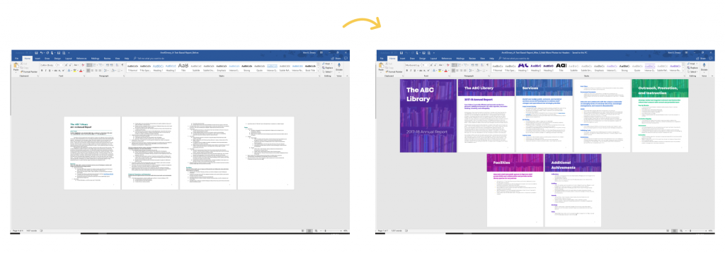
Establish a Text Hierarchy
Size your fonts according to their importance. A text hierarchy tells your viewers which information is most important (headings) and which information is least important (the regular ol’ paragraphs). In this example, I transformed a university’s annual report simply by adding an intentional text hierarchy. I call this makeover a two-hour turnaround because these are changes that anyone can make in two hours or less. Before, all the font was the same size, so the headings didn’t stand out. The report looked like a sea of words. After, we made the headings stand out by with larger fonts and by overlaying the text on top of a photograph. We also used a different color for each section to break up the sea of words into manageable chunks.
Lower the Reading Level
The vast majority of reports, handouts, infographics, dashboards, and slideshows that I review with clients are written at a reading grade level that’s so high that reading the documents feels like homework. In this example, we assessed our draft’s reading grade level with a free tool called readable.io. Then, we re-worded the title so that it was a closer match for our intended audience.
Finally, go share your chart!
You’ll need to edit it slightly depending on the medium — a chart for a presentation should look different than a chart for a dashboard. You can learn about presentation-specific, dashboard-specific, and report-specific techniques.
Learn More
Sign up for my free online course called Soar Beyond the Dusty Shelf Report. There are several quick lessons that help you get started with data storytelling.
Or, contact me about online courses, private workshops, and conference keynotes.
33 Comments
This is fantastic Ann, thanks so so much for sharing. This is one of the clearest process pieces I’ve seen regarding dataviz design. I use a list when teaching that parallels this, but with less detail and less gorgeous graphics. The only addition I can think of is to encourage a step on checking for logical ordering of response categories when needed (alpha, %, geographic, category, etc.).
I appreciate your being so wonderfully giving with your knowledge and expertise.
Thank you Susan! I agree, the logical ordering is crucial–it’s one of the easiest edits to make, and can really help audience comprehension. This post is more big-picture/critical thinking/discussion questions/process. Stay tuned for next week’s post, a collaboration from Stephanie Evergreen and I, that gets at the details. Taken together, hopefully the posts will serve as a strong guide for researchers and evaluators. To be continued!
…ditto to what Susan said!
Thank you, Ann, so much for sharing this. From time to time I consider a blog and find myself wondering — why would I do that. Then I see this. Not only is it a treasure trove for evaluators and their clients, but you have done almost all the work for a training/presentation. It makes me think if I pick blog topics right AND make them highly visual like you did here, then I can prepare material that can go directly into a slidedeck for various talks with clients…. Previously, I have known blogs to just be story-telling, advice-sharing, narrative-constructing texts. This is inspiring! So, thanks again.
Sharon, thank you! I hope you feel inspired to begin or continue blogging. And you’re right, similar material (especially visual content) can be presented in a number of formats–conference presentations, blog posts, white papers, client meetings, etc. There’s no reason to limit your ideas to a single communications mode.
Wow! This is great – it really demystifies the data visualization design process so anyone can at least try it. Thanks for all of your insight!
Amy
Thanks Amy! Keep me posted on how that sankey diagram turns out for you.
[…] The Dataviz Design Process: 7 Steps for Beginners: Steps 2, 3, 4, 5 in this post discuss various issues in the design of a visualization, e.g., reduce clutter, use color to emphasize key findings, write takeaway message in the title, etc. […]
I just bookmarked this post! This should be in every evaluator’s toolbox. My strength in evaluation is definitely not in making my data more visually appealing and to-the-point to my target audience, so this helps TONS! Thank you so much, Ann!
Thanks Nicole! Please keep me posted as you revise your charts. I’d love to see your remakes.
[…] The Dataviz Design Process: 7 Steps for Beginners | Ann K. Emery […]
Highly insightful post. I actually have done things like adding white boarders, adapting to client color schemes, etc…. and this just further validates those practices. Definitely something that will serve as a “primer” for years to come.
R.S., thanks! Are any examples from your work posted online? I’d be interested in seeing examples of how you’ve used white borders and client color schemes in your work.
I love your posts! I’ve bookmarked this post. I work with tribal communities so dataviz is so important. I try to be creative and meet the needs of the client and will definitely put these steps into practice. Thank you so much for sharing in detail and providing examples.
Sindy, thanks! I checked out your work and it looks great. Are you attending Eval14 in Denver this fall? Let’s grab coffee or something.
thanks ann! just love your posts!!
Thanks so much Cathy.
Many thanks to Caleb Worm for publishing a guide about sizing images for each social media outlet. As of July 2014, Twitter displays images as 880 x 440, so a 2:1 ratio. That means your charts need to be twice as wide as they are tall for them to show fully (aka not cut off your title on the top or anything important on the bottom) in your followers’ feeds. Here’s Caleb’s full article: http://mediumblast.com/social-media/social-media-image-dimensions-sizing-guide-cheat-sheet/
[…] http://annkemery.com/ […]
[…] Version H1: Isn’t it incredible what a little tweaking can do? First, I went through my Data Visualization Design Process article and made sure I covered all the big-picture aspects of the chart. Then, I went through […]
[…] here to read more about each step and begin editing your own charts. You can use this Data Visualisation […]
[…] The Dataviz Design Process: 7 Steps for Beginners | Ann K. Emery […]
[…] The Dataviz Design Process: 7 Steps for Beginners | Ann K. Emery […]
[…] The data viz design process – 7 steps for beginners […]
[…] http://annkemery.com/dataviz-design-process/ […]
[…] Source : http://annkemery.com/dataviz-design-process/ […]
Amazing all tools of data visualization explained very nicely.
this is one of the best articles i read for beginners about data visualization and analysis
Thank you
Thank you for sharing this post.
Data Visualization plays very important role in the technology fied.
It is a nice post to keep sharing valuable information like this.
Thanks for sharing! This website is very informative. I appreciate this website. What are steps in the data visualization process?
I read through your website as a requirement for my one of Masters in Public Health course. And I loved it! The tips and tricks are so useful, I had no idea excel was able to display Mini Bars and Charts in one cell!!!
This was nothing short of an amazing read. Thank you for all your help.
read through your website as a requirement for my one of Masters in Public Health course. And I loved it! The tips and tricks are so useful, I had no idea excel was able to display Mini Bars and Charts in one cell!!!
This was nothing short of an amazing read. Thank you for all your help.