1 Comment

  • […] Now you’ve got some fonts that aren’t basic, how about some custom colors? I really like matching my visualizations to my report, which is almost always based on the color scheme of the organization I’m working with. Let me tell you though, this can be a bit of a beast, so let’s get started. […]

  • Leave a Reply

    Your email address will not be published. Required fields are marked *

    Giving Your Tableau Visualizations a Makeover: Custom Fonts

    Updated on: Nov 7th, 2017
    Dashboards
    , , , , , , ,

    Whether you are using Tableau, Excel, or any other visualization tool, you will come across defaults. The problem with using something right out of the can is that it often does not speak directly to your audience. Your investment in a visualization speaks to your investment in conveying the story of your data.

    By now, you may know tips and tricks to de-clutter and minimize the amount of ‘out-of-the-box’ stuff in your Excel charts, but I want to share how to tackle the same problem in Tableau. It doesn’t take long to spot a Tableau visualization. Is that a bad thing? It depends (does that give anyone else grad school flashbacks?). Instead of being recognized for the font (Tableau Book) and colors that Tableau pumps out, have your Tableau visualizations recognized for their utility and story.

    I’m going to share how to customize your fonts and colors within Tableau. And, make your life a lot easier (i.e. not changing one component of the visualization at a time.). Repeat after me: “I am better than the defaults.”

    Let’s start with fonts, the easier change of the two.

    Instead of having to change your fonts as you go, you can change the entire workbook. If you enjoy clicking on every area of your chart and changing the fonts, go ahead… but, I bet you’d rather spend that time on something else. You will also miss one or two! This way the entire book is the same font. You can adjust sizing as needed!

    First, open your workbook.

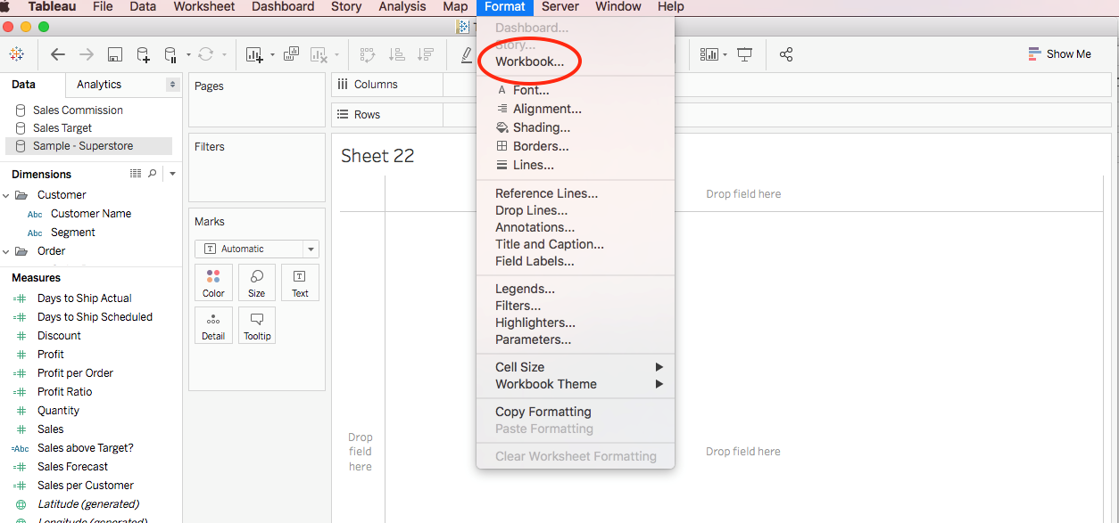
    Go to Format in the top, right-hand corner and click Workbook.

    Whether you are using Tableau, Excel, or any other visualization tool, you will come across defaults. The problem with using something right out of the can is that it often does not speak directly to your audience. Your investment in a visualization speaks to your investment in conveying the story of your data. By now, you may know tips and tricks to de-clutter and minimize the amount of ‘out-of-the-box’ stuff in your Excel charts, but I want to share how to tackle the same problem in Tableau. It doesn’t take long to spot a Tableau visualization. Is that a bad thing? It depends (does that give anyone else grad school flashbacks?). Instead of being recognized for the font (Tableau Book) and colors that Tableau pumps out, have your Tableau visualizations recognized for their utility and story. I’m going to share how to customize your fonts and colors within Tableau. And, make your life a lot easier (i.e. not changing one component of the visualization at a time.). Repeat after me: “I am better than the defaults.” Let’s start with fonts, the easier change of the two. Instead of having to change your fonts as you go, you can change the entire workbook. If you enjoy clicking on every area of your chart and changing the fonts, go ahead… but, I bet you’d rather spend that time on something else. You will also miss one or two! This way the entire book is the same font. You can adjust sizing as needed! First, open your workbook. Go to Format in the top, right-hand corner and click Workbook.

    On the right-hand side, you’ll have a formatting pane, which includes fonts, colors, and lines. Choose your font (I suggest a nice sans serif), and you’re ready to rumble!

    On the right-hand side, you’ll have a formatting pane, which includes fonts, colors, and lines. Choose your font (I suggest a nice sans serif), and you’re ready to rumble!
    More about Deven Wisner
    Working with Deven is like working with an old friend. He looks out for your best interests, helps guide you toward good decisions, and sometimes—when you need it—lets you know when you’re wrong. He has the ability to make everyone around him feel comfortable, which makes partnering with him effortless and collaboration more than just easy, but fun. He believes building real relationships with clients is the secret ingredient to generating inspiration and action, and he pairs this belief with his background in evaluation, industrial-organizational psychology, and senior-level management experience to help both non and for-profits leverage data to make decisions that can change their organizations for the better. Outside of Viable Insights, Deven teaches Organizational Behavior and Psychology of Leadership at the University of Arizona, is a board member of the Arizona Evaluation Network, an active member in the American Evaluation Association, and co-founder of the Tucson Tableau User Group.

    1 Comment

  • […] Now you’ve got some fonts that aren’t basic, how about some custom colors? I really like matching my visualizations to my report, which is almost always based on the color scheme of the organization I’m working with. Let me tell you though, this can be a bit of a beast, so let’s get started. […]

  • Leave a Reply

    Your email address will not be published. Required fields are marked *

    You Might Like

    Our complimentary mini course for beginners to dataviz. Takes 45 minutes to complete.

    Enroll

    How to Apply Your Brand Colors in Dataviz (Ordinal, Diverging, Categorical, and More)

    Colors can make or break a chart. Colors direct our eye movements, and therefore our brains and attention. It’s up to you: will you help or hinder your reader’s understanding? Here are some simple strategies for communicating clearly with chart color.

    More »

    Want to wow your boss with a dynamic dashboard? Or, how about a one-pager of key findings? Our 4-course bundle provides all the how-to’s.

    Enroll

    Subscribe

    Not another fluffy newsletter. Get actionable tips, videos and strategies from Ann in your inbox.