
Deven Wisner is a frequent Depict Data Studio collaborator, a personal friend, and an all-around awesome data nerd. Check out his additional articles about getting started with Tableau, customizing fonts, and customizing colors. –Ann
—–
If you’re like me, you were probably inspired to revise some of your charts after reading Ann’s How to Visualize Age/Sex Patterns with Population Pyramids. Too often when I storyboard demographic information I default to separating out this demographic information (you know, for the sake of keeping things simple). Unfortunately, this is sometimes a missed opportunity to provide a more comprehensive picture. These things combined inspired me to recreate the Pyramid Chart in Tableau — Let’s get started!
The Data
The dataset we’ll be using is from the Arizona Office of Economic Opportunity, which you will see consists of age groups, sex (male/female), and population. If you receive disaggregated data, that wouldn’t be a problem — that’s Tableau’s specialty!
The Hack
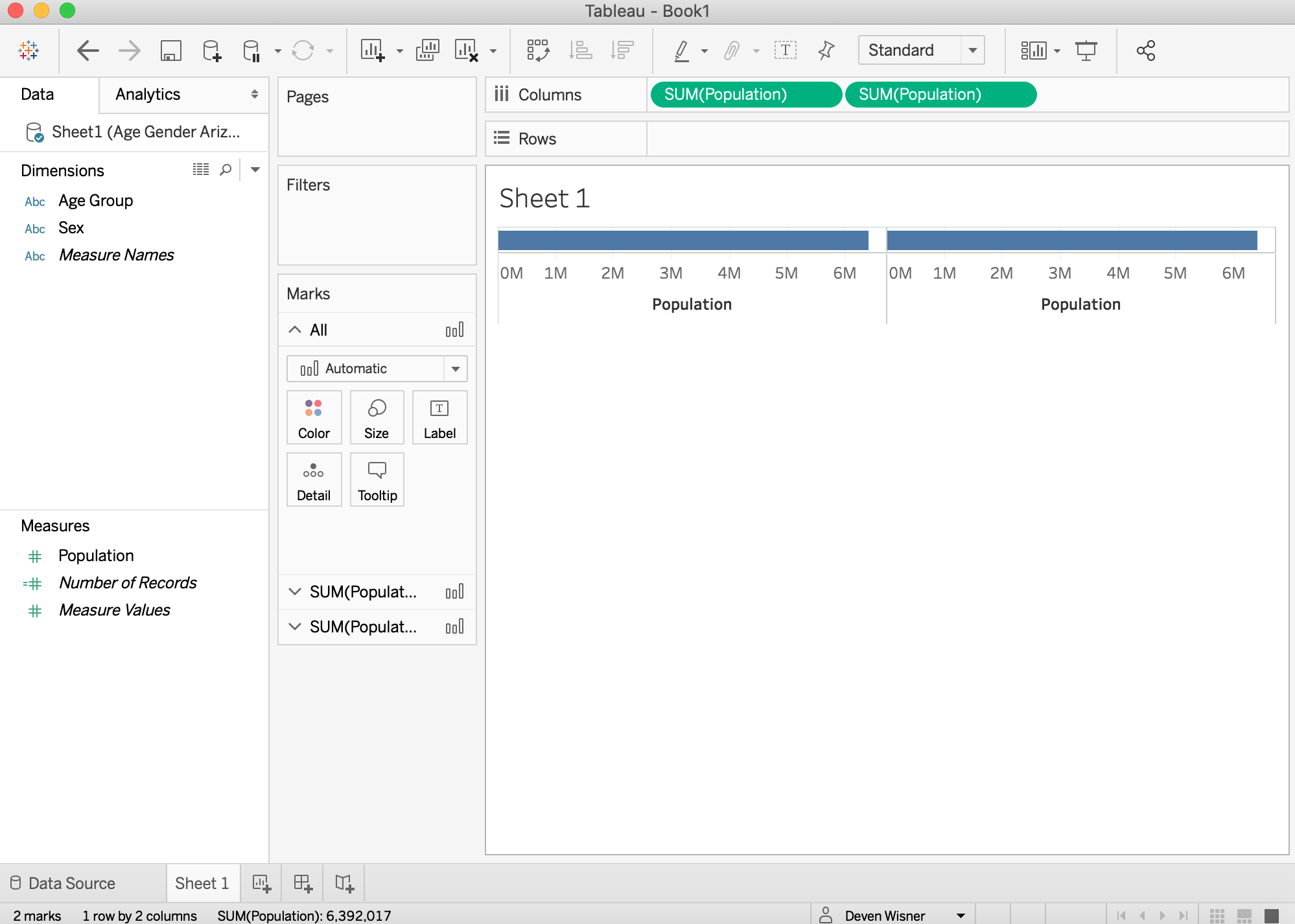
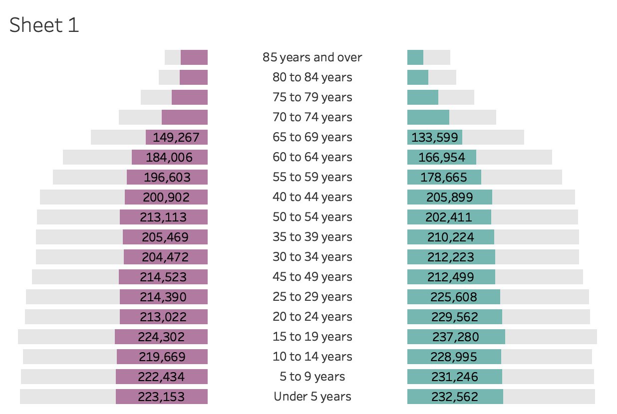
We want to load our data source, review that our variables came in correctly, and add a new sheet. Next, we’ll drag two Population pills to Columns.
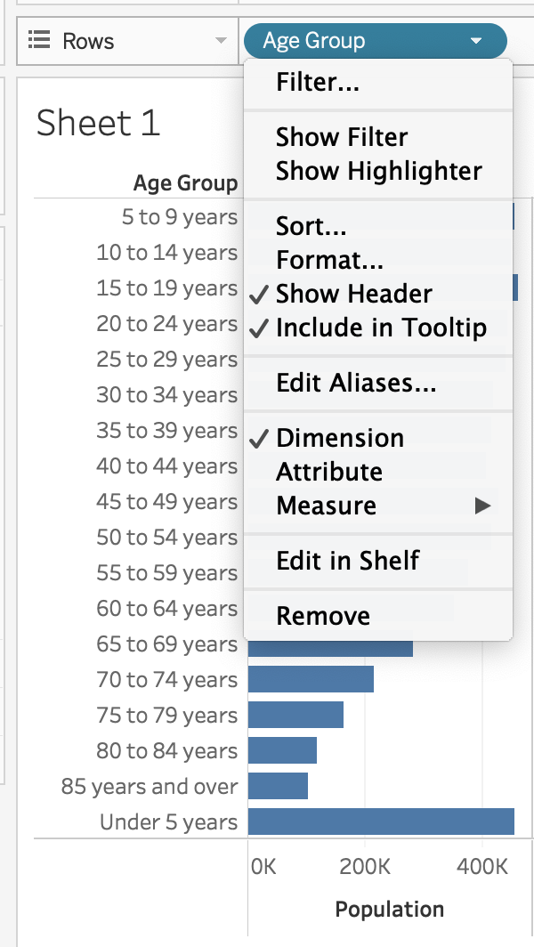
Now drag Age Group to Rows. You will want to click the arrow and uncheck Show Header.
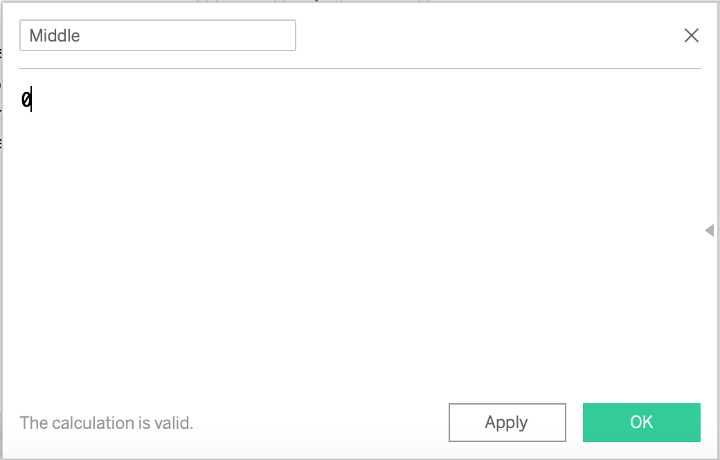
To get our Age Groups in the middle, we need to hack Tableau a bit. Start by creating a Middle calculated field — all you’re doing is entering “0” and saving. Next, drag the Middle pill between your Populations. On the Marks Card, add Age Groups as a text item and change the type to text.
Okay, we’re making progress! Realizing our pyramid (or butterfly) is dabbing, we need to reverse the axis of our population on the left.
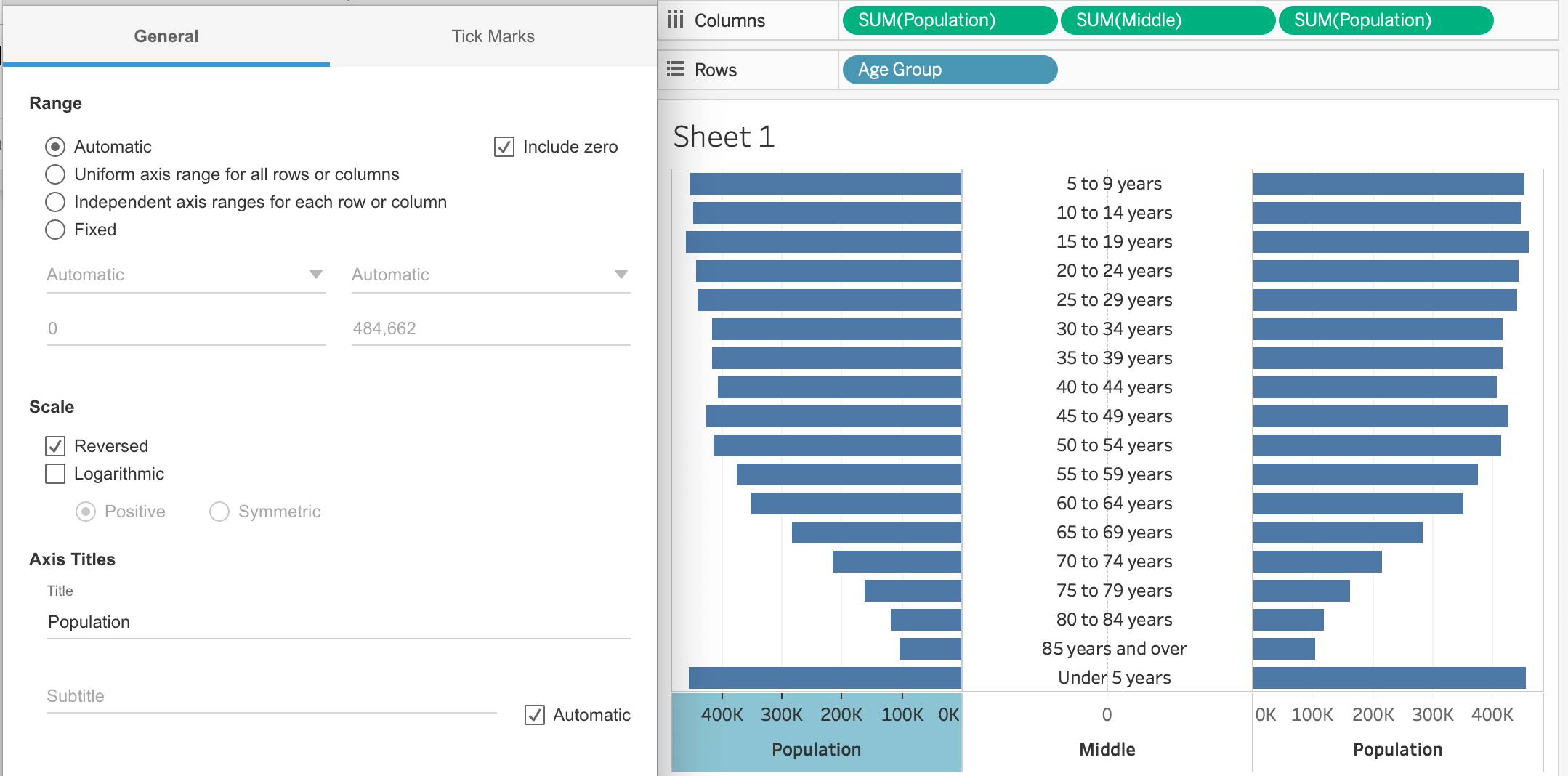
Note: You might need to sort Age Groups, as I did (see above where Under 5 years is after 85 years and over).
In order to highlight females on one side and males on the other, we need to create a couple calculated fields.
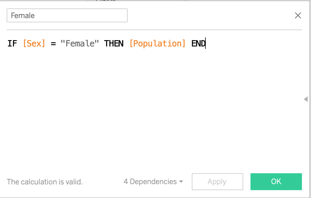
On the Marks Card, add Female as a text item to one population and Male to the other. Now we have the shape of something, but you probably noticed that the comparison is about as helpful as a table.
To change that, we’re going to get crafty with colors and create a calculated field for each. This will allow us to control the colors independent of one another while still maintaining the same x-axis (i.e. Population).
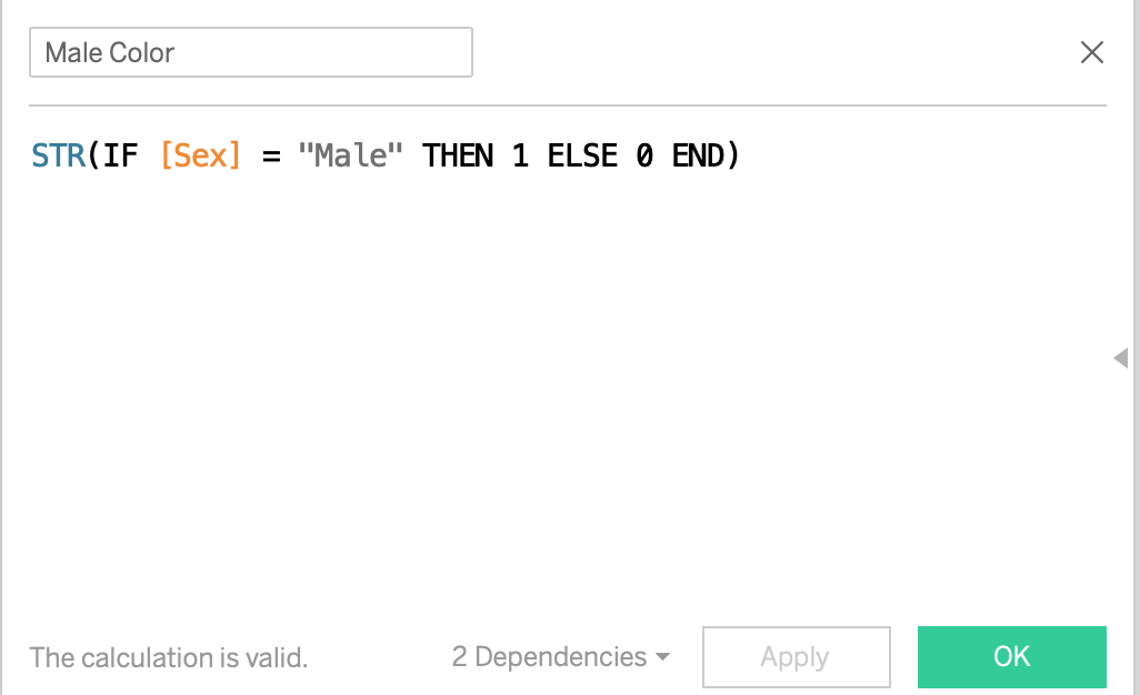
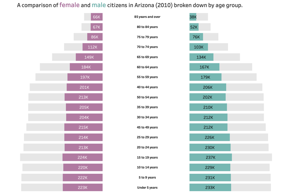
After creating your Female/Male Color calculated fields, you’ll want to drag them to their respective Color Marks Card. Next, edit the colors and be sure the “0” (i.e. the sex you don’t want to call out) is something very light.
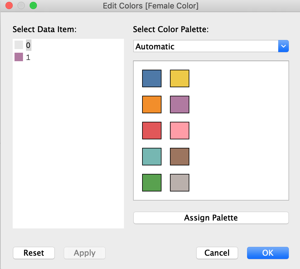
Additional color tips: You’re better than basic — use something other than the default blue and orange Tableau gives you. You should also avoid using traditional blue and pink to represent male/female (this is 2018, after all!).
Our final steps will be cleaning up our visual. First, I want to get rid of unnecessary borders and lines across the entire sheet (they’re just a distraction). I would also hide my axes, as I have labels on my bars.
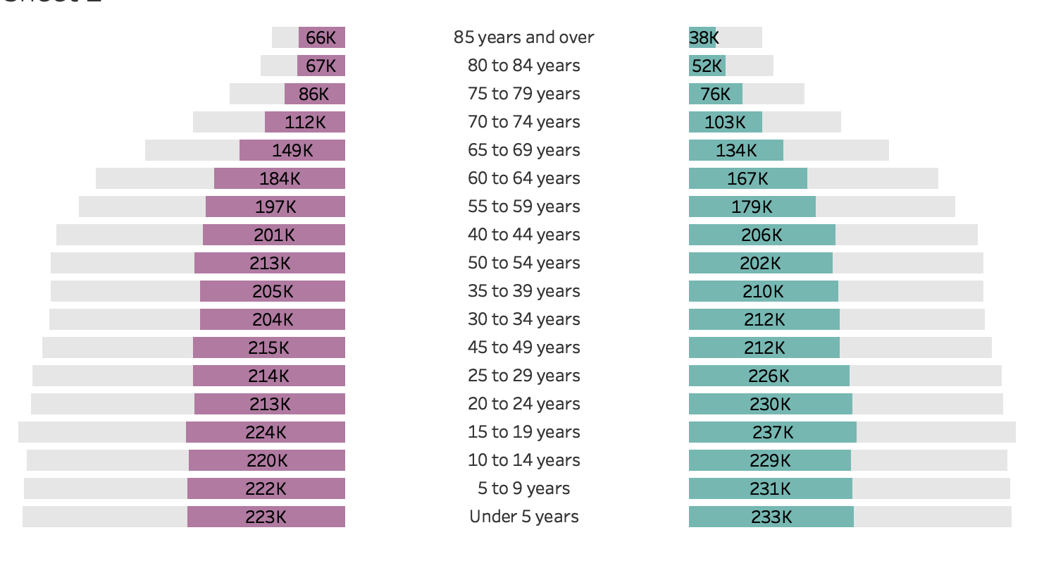
Speaking of the labels, I want to format (SUM)Female/(SUM)Male to be a nice round number and change my units to thousands (K). You should use your discretion when doing this but for the purpose of this chart, I know my readers aren’t actually distinguishing between 200,010 and 200,500.
Last but definitely not least, I want a descriptive title that pulls readers in. You’ll notice that I also leveraged colors in my title to differentiate between each side of the pyramid.
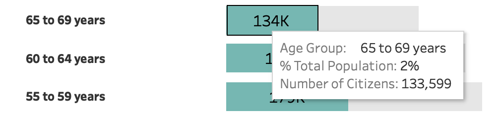
Bonus: You can go the extra mile and include some great information in your tooltips, too. Often, percentage of an entire population is a really important piece of information. The tooltip is a great way to provide that without adding distractions to the visualization.
4 Comments
The measures of central tendency, mean, median, and mode, should be considered when assessing a population pyramid. since the data is not completely accurate. For example, the average age could be used to determine the type of population in a particular region. A population with an average age of 15 would have a young population compared to a population that has an average age of 55, which would be considered an older population. It is also important to consider these measures because the collected data is not completely accurate. The mid-year population is often used in calculations to account for the number of births and deaths that occur.
Hi Kiara, I totally agree that a population pyramid is just part of the picture (it’s frequencies). But that’s not the same as being “not completely accurate.”
Hi!
This is super helpful! Thanks for sharing.
Is there a way to adjust the width of the middle section where you have age group categories? I want to use this as the viz in the tooltip and want to make the middle part narrower by removing the blank space. Thank you!
Hi I am working on a butterfly pyramid and I am not able to adjust the space in the middle bar. Can someone help ? I tried changing the axis but its not working.