I was recently working with an online course student to visualize data for her country’s government officials.
These aren’t her real categories or real numbers, but you get the idea.
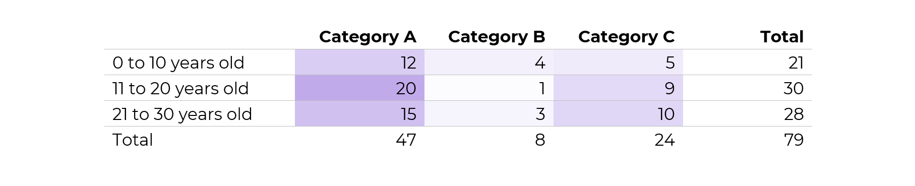
Before: Reading Numbers
Her “before” version looked something like this:
She had small n’s — a unique situation!
My definition of a “small” number is less than 100 — an arbitrary cut-off point that I learned from a past supervisor, and I’ve stuck with for years.
Not only was the total under 100, but each of the cells was under 100, too.
After: Skimming Visuals
There are several ways to bring the table to life.
During a 1:1 consultation, we talked through a few ideas together.
Idea 1: Heat Table
This easy visual — made via Excel’s Conditional Formatting — would be a great addition to the appendix.
If you’re familiar with the 30-3-1 approach to reporting, then you know I put allllll the tables in the appendix.
In other words, I aim for zero or few tables within the body of the report. The report’s body should focus on key findings with graphs, not dilute the data with eeeeeeverything in a table.
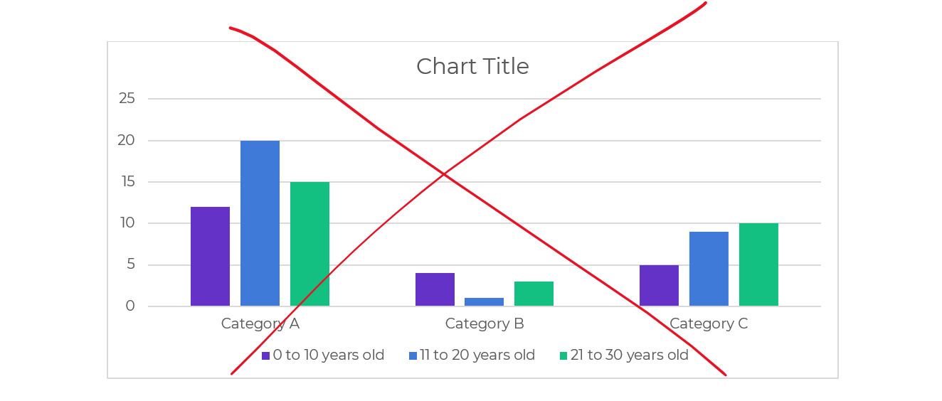
Idea 2: Clustered Columns
This is Ann K. Emery’s least favorite chart of all time. I’ll never let any of my students use one of these bad graphs!!!!
It’s the default option — we simply highlight the summary table in Excel, and insert a chart — and we get this lazy chart.
There’s too much going on, so it doesn’t tell us anything.
The color-coding by category is off.
There’s a separate legend, which is an accessibility no-no.
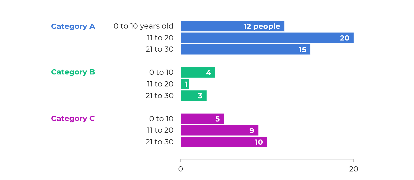
Idea 3: Small Multiples Histograms
With a re-orientation and re-coloring, it’s easy to build small multiples histograms.
But, the vertical columns didn’t fit her portrait Word doc:
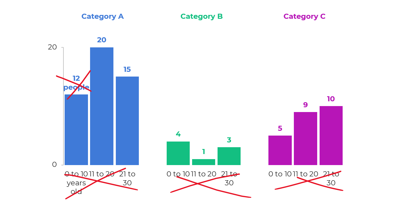
The horizontal bars would be totally fine.
My only hesitation was that bar charts are… boring.
I’ll never let my students have only bar charts in their reports, slides, dashboards, or infographics. Our viewers deserve variety.
Plus, this was a unique small n situation. Let’s capitalize on that!
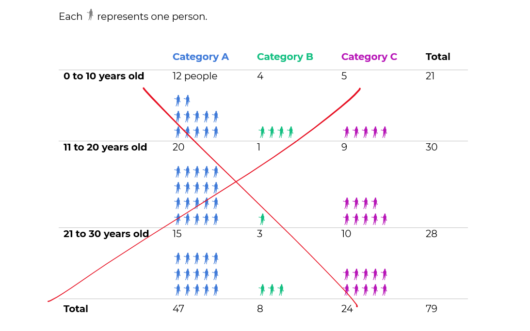
Idea 4: Icon Arrays
To bring the small n to life, we tried an icon array.
The student liked this option because:
- It’s very, very, very fast to create — much faster than creating and formatting a chart.
- It was similar to her original table — the same rows and columns.
- Right away, she could see how much bigger Category A was than the other categories.
Yes, I realize the irony…
I just wrote a blog post asking you to humanize your data with realistic people icons, which would be a step above shapes like circles and squares.
We tried realistic people icons, too.
They look fine close-up.
But they simply didn’t fit. In other words, there would have to be fewer icons, and/or they’d have to be much larger, to even be legible.
They just look like chicken scratch, sigh.
Behind the Scenes
I’ve written and spoken about symbol fonts a million times.
Webdings, StateFace, and WeePeople are personal favorites.
Yep, these are simply Webdings n’s!
Never, ever add a bajillion individual circles to your Word doc or PowerPoint slide. What a waste of our own time. Just use symbol fonts.
Made Within Minutes
Can you type n’s into your table?
And change the font into Webdings?
Even if you’re the slowest typer in the world… I promise it won’t take long to type some n’s.
Then, simply adjust the font colors, so that you’re using one brand color per category.
Bonus: Download the Materials
Want to see the Excel file and Word doc used in the blog post? Download them here.
4 Comments
If you want to expand the shapes you use in this type of visual, check out the Segoe UI Symbol font. You can insert a shape as a character and then do a simple copy and paste to create more of them. This can be helpful if you want to use different symbols to represent the different categories, such as circle for A, squares for B and diamonds for C.
That’s new info for me. Thanks for the tip!
Hmm. When I try the Segoi UI symbol font, I just get normal letters. Any trick I’m missing?
That’s incredible Ann!