
Today’s guest blog post comes from Ann Webb Price. Ann has been a program evaluator for more than 20 years and President of Community Evaluation Solutions. She is committed to creating usable reports that accurately report evaluation findings in a way that engages clients, supports program improvement, and promotes organizational learning. –Ann K. Emery
I’m not sure about you, but sometimes when I look at my early reports, I cringe.
They are just plain awful.
When I founded Community Evaluation Solutions (CES), I told myself it was:
- okay to make mistakes, and
- I never wanted to stop learning.
I’ve learned a lot through data viz thought leaders, especially Ann. I took her Soar Beyond the Dusty Shelf Report mini course and I am now working through her Simple Spreadsheets data analysis course.
Our Organization’s Transformation
Over the years, CES has intentionally moved away from overly long written reports and began creating reports that maximize data viz as a means of communicating information.
In the past two years, we’ve pushed the envelope even farther and Ann’s tutorials and blogs, including her guest blogs, provided the information we needed to take our work to the next level. I appreciate her generosity in sharing the work of others, like Sara DeLong and Nick Visscher.
Writing Reports in PowerPoint Instead of Word
We’ve been so inspired in the past two years that we’ve written several reports using PowerPoint instead of Word.
To tell you the truth, I wasn’t sure how our clients would receive this new format.
The first time we wrote a report in PowerPoint, I was terrified the client would hate it and ask us to create a whole new traditional, text-heavy report.
Luckily, that didn’t happen.
Instead, the Foundation President told us it was the best evaluation report he had seen in 17 years!
I’ll count that as a blog win.
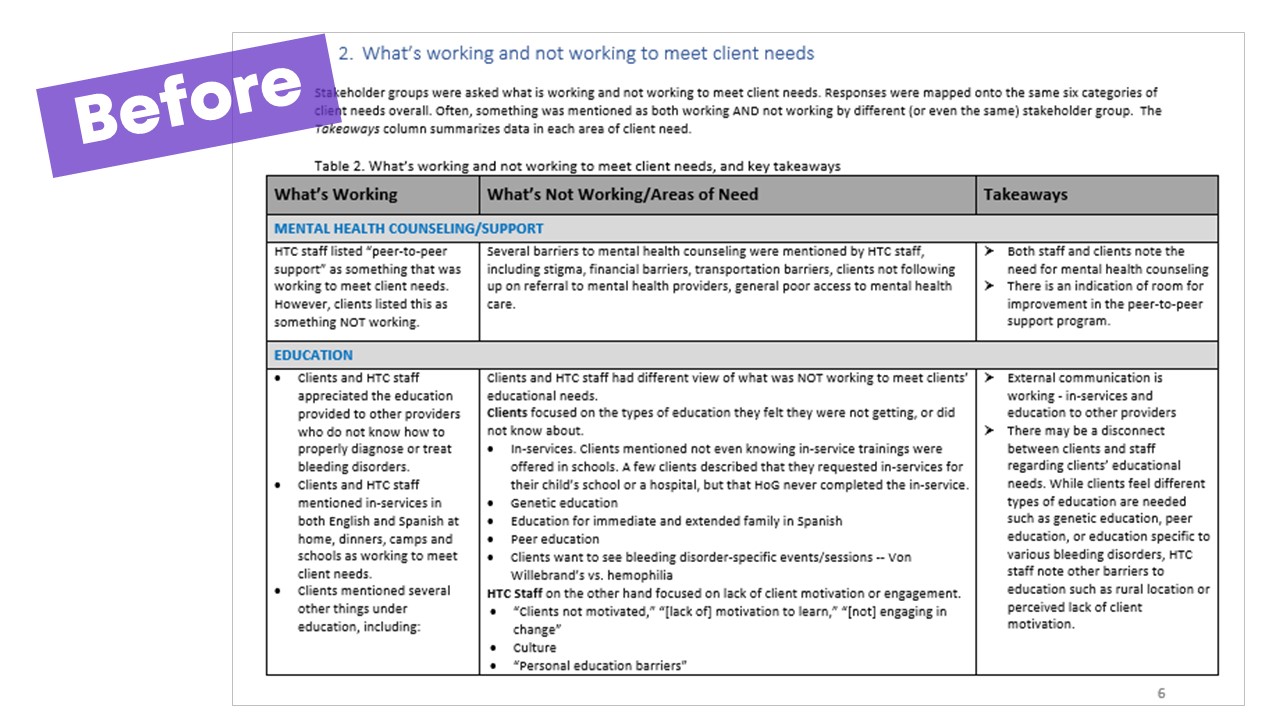
Before: Default Formatting and Zero Visuals
Here is a pic of a “before” report.
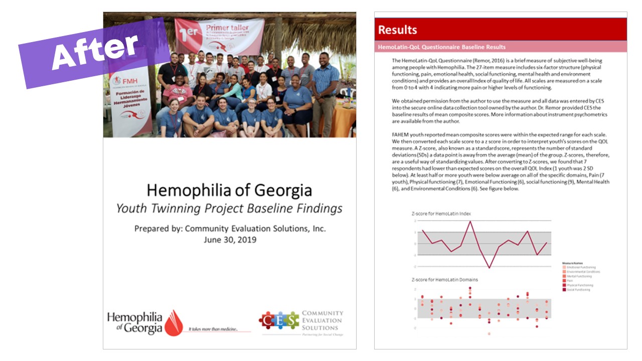
After: Intentional Formatting and a Variety of Visuals
And here is a sample from the latest report we did for the same client using PowerPoint then saving as a PDF.
The amazing thing is that once you PDF the PowerPoint report, it looks just like a traditional Word report, only better!
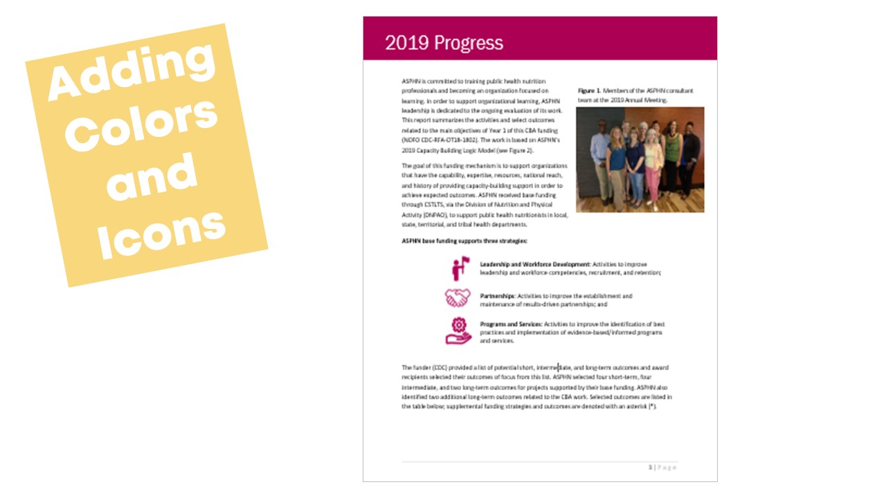
Improving Our Traditional Reports
We’ve also been able to put Ann’s advice to good use when a traditional report is needed. Here’s an example of a traditional report we’re currently working on.

I think our newer reports are a big improvement and so do our clients.
Lessons Learned
Here are some of our lessons learned:
- Taking the time to learn something new is worth it. You’ll gain skills and your clients will be more engaged in their data and results. That’s the point, right?
- Use your client’s brand colors to design the report.
- Use great data viz. If needed, use words.
- Break up sections using colors and icons. We learned about the Noun Project from Ann and love using icons in our reports and presentations.
Training the Next Generation
Not only have we put Ann’s advice to good use to improve our work, but I’m most thankful that we’ve passed the learning on to the practicum students I host each summer. The practicum students, in turn, have taken their new skills back to their university colleagues. We truly appreciate that Ann shares her knowledge and supports and shares the work of other professionals.
6 Comments
This sounds interesting but would have been helpful to see more examples of what report pages from PowerPoint look like.
Hi Jenni, Here are some examples from another guest author, Nick Visscher: https://depictdatastudio.com/how-to-write-your-reports-in-powerpoint/ Hope this gives you inspiration for your own projects.
We started trying to put our annual report in PPT this year, but got frustrated with the text and line spacing auto-sizing. We had to turn off that function in each text box, unless there is some way to do it across the board?
We were using a 2-column format and needed the text lines to be the same. I couldn’t find an option for continuous text flow from one page (slide) to another, so our narrative was a trial and error to get it to fit. Although it was much better for our visuals, we still ended up putting it in Word and bringing in our PPT visuals as images.
Are there any specific PPT resources for using it in this manner?
Great post! How do you deal with table of contents and page numbering? Do you have to do in and manually create these after the whole report is finalized?
Hi Pam, You can still make a Table of Contents in PowerPoint, but yes, it would be manual as far as I know. I usually create a simplified/condensed Table of Contents with just the key topics. I make it at the end and insert hyperlinks within PowerPoint. Here’s an example: https://www.eval.org/aeain2020. Click on the link for “The American Evaluation Association in 2020” at the bottom, which links to a PowerPoint-based report. The third page is a Table of Contents.
Good information you shared. keep posting.
ai training in aurangabad