
Monthly reports that are consistent and easy to read can help your organisation track their progress towards targets.
Benefits of Monthly Reports in Large Organisations
Why not just stick with annual reports? Or quarterly reports?
Monthly reports have at least eight advantages over quarterly and annual reports that outweigh the initial costs of automating them.
Data Literacy
Regular, consistently presented monthly reports enable people to become familiar with the terms and parameters used to produce metrics, thereby enhancing their understanding of where an organisation is heading in relation to its targets.
Everyone is on the Same Page
When the same parameters are used for each report the metrics are directly comparable, and everyone is on the same page.
Advanced Warning of Issues that Require Attention
Monthly reports enable potential problems to be detected and addressed early.
Progress Towards Targets
Monthly reports show readers progress towards targets throughout the year. If metrics are falling behind targets, action can be taken to address the issue. Moreover, if a particular metric is meeting targets, resources can be diverted to prioritising areas that need attention.
Familiarity with Ebbs and Flows of the Year
Monthly reports can inform general patterns throughout the year.
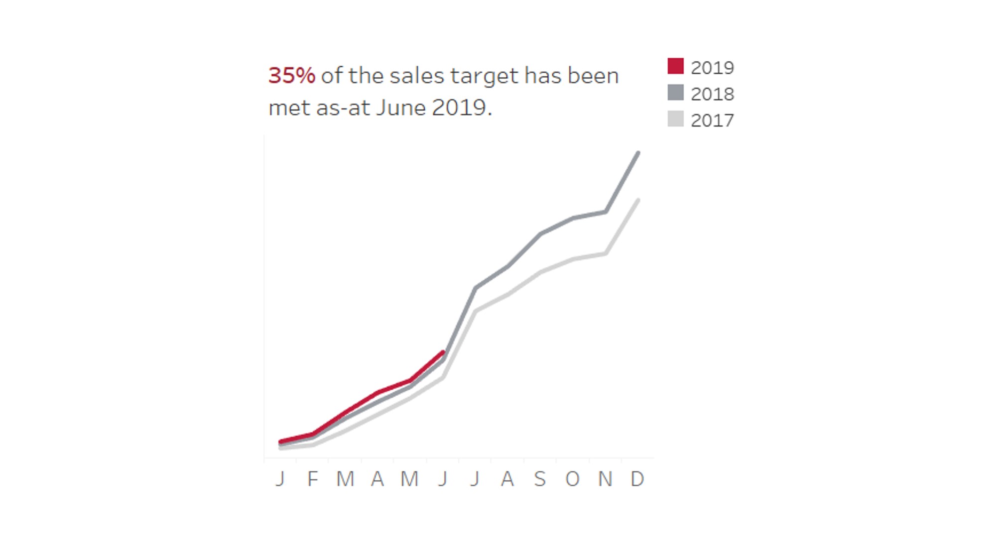
In the example below, the organisation makes most of its sales in the month of July (around 25%) and in December (around 20%).
Generating reports on a monthly basis enables this organisation to estimate that if they haven’t made 50% of their sales by June (i.e. half way through the year) then there is no need to panic until they see the July report when a large peak in sales is expected based on prior years’ data.
Efficiency
In large organisations there are often multiple committees and multiple analysts talking about the same data.
In some cases, producing a report for one department or area of an organisation can require a similar workload to producing the same report across the organisation.
Monthly reports produced for the organisation results in fewer requests for standard metrics from multiple departments. I’ve also received fewer urgent requests as people often refer to the last month’s report if they are in a pinch for data.
Data Integrity
With many eyes looking at the data on a regular basis, data integrity issues can be picked up early.
It’s a Way To Celebrate Successes
If an area of an organisation has done particularly well during a month it will show up in the visualisations and be a cause for immediate celebration (rather than waiting a whole year).
Similarly, monthly reports provide a timely way to determine if a strategic initiative, such as a new marketing campaign, is working.
How to Choose the Right Metrics for Monthly Reports
You’re ready to make a monthly report! Now what?
It’s important to select metrics that are relevant over monthly time scales when producing monthly reports.
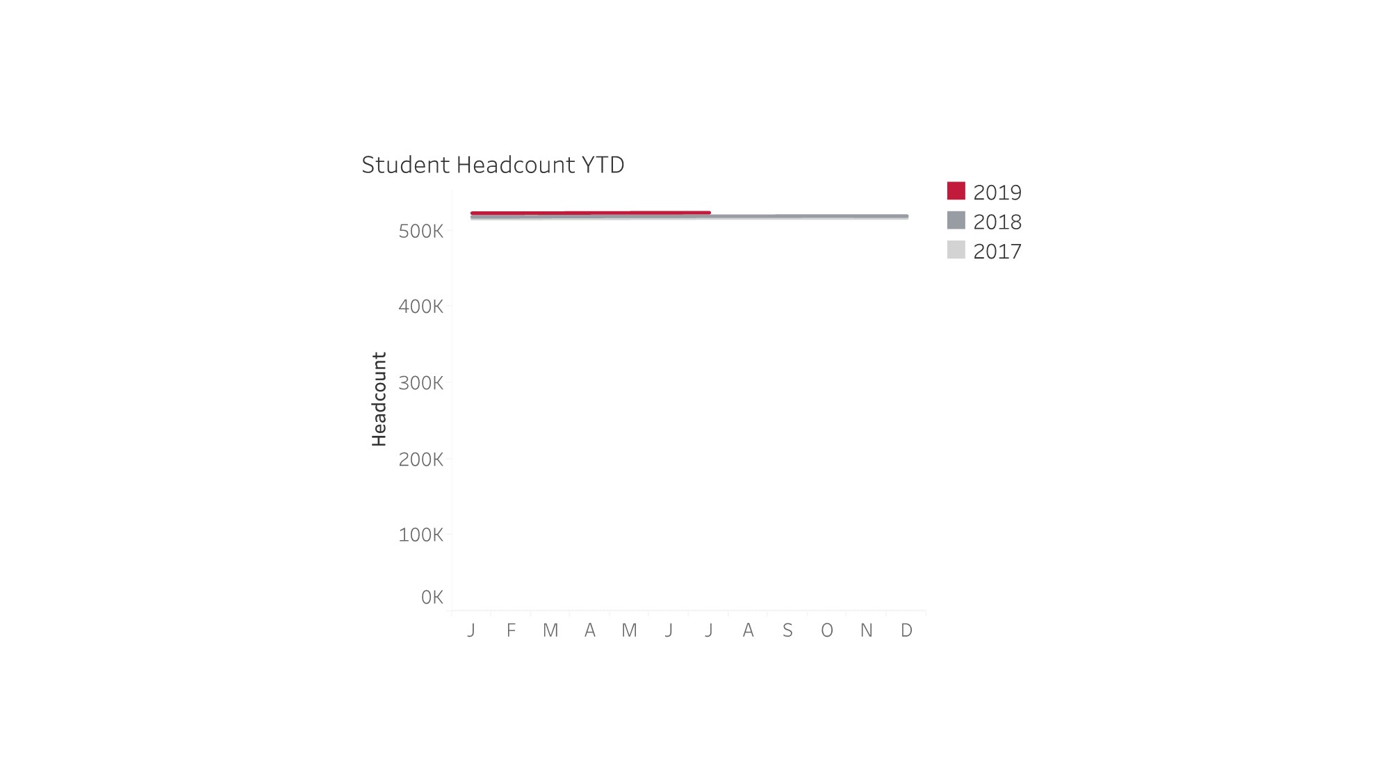
Using student numbers at a fictional educational institution as an example, the student headcount may not change monthly, but the number of student commencements and student completions likely fluctuate as the year progresses.
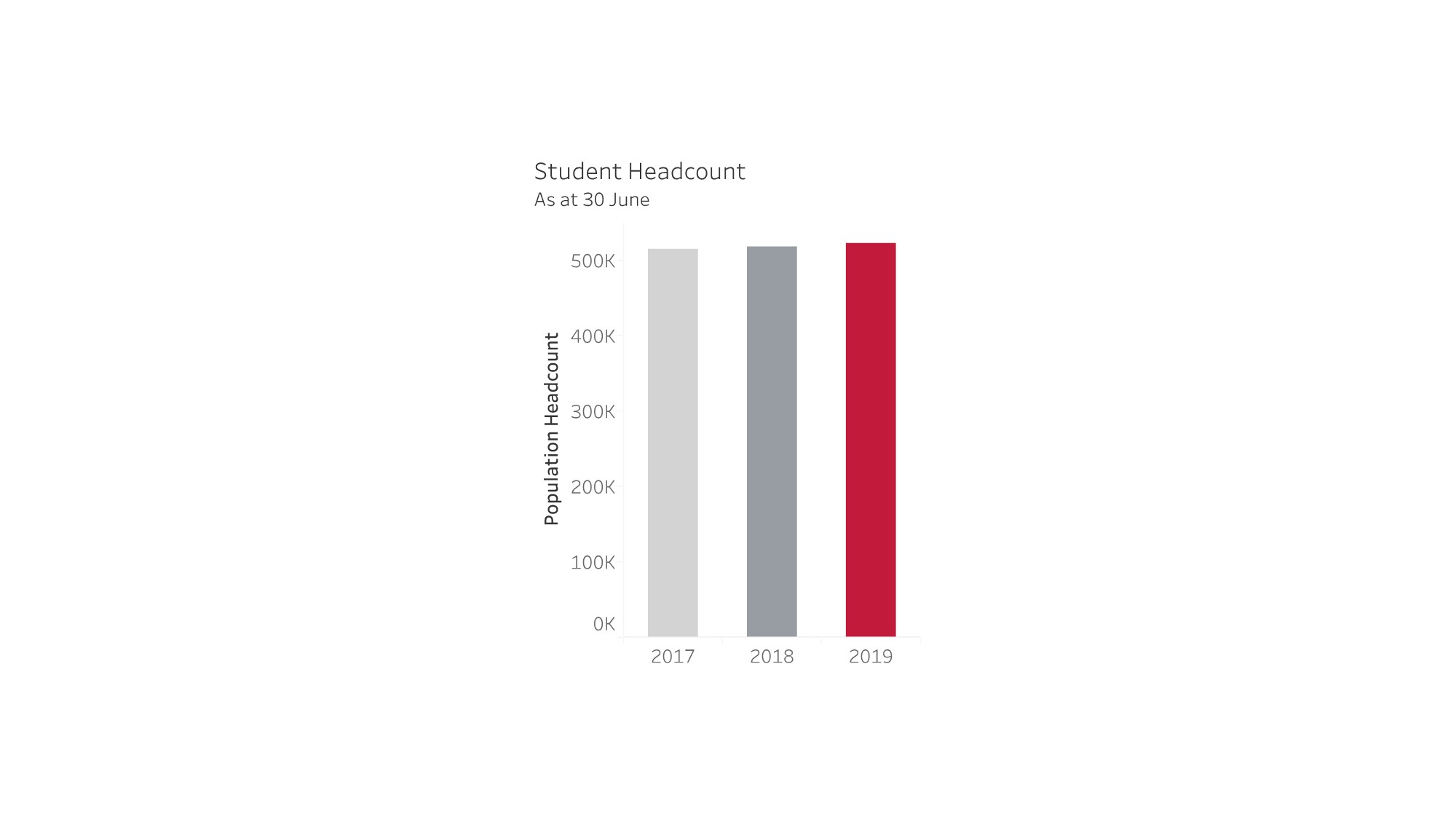
In this instance, it would be more informative to present information on the number of student commencements and completions in the monthly reports, and then in the annual report present the headcount of the student population.
An organisation’s annual report should include the metrics that are important but don’t fluctuate throughout the year.
Good Metrics for Monthly Reports: Metrics that Fluctuate Throughout the Year
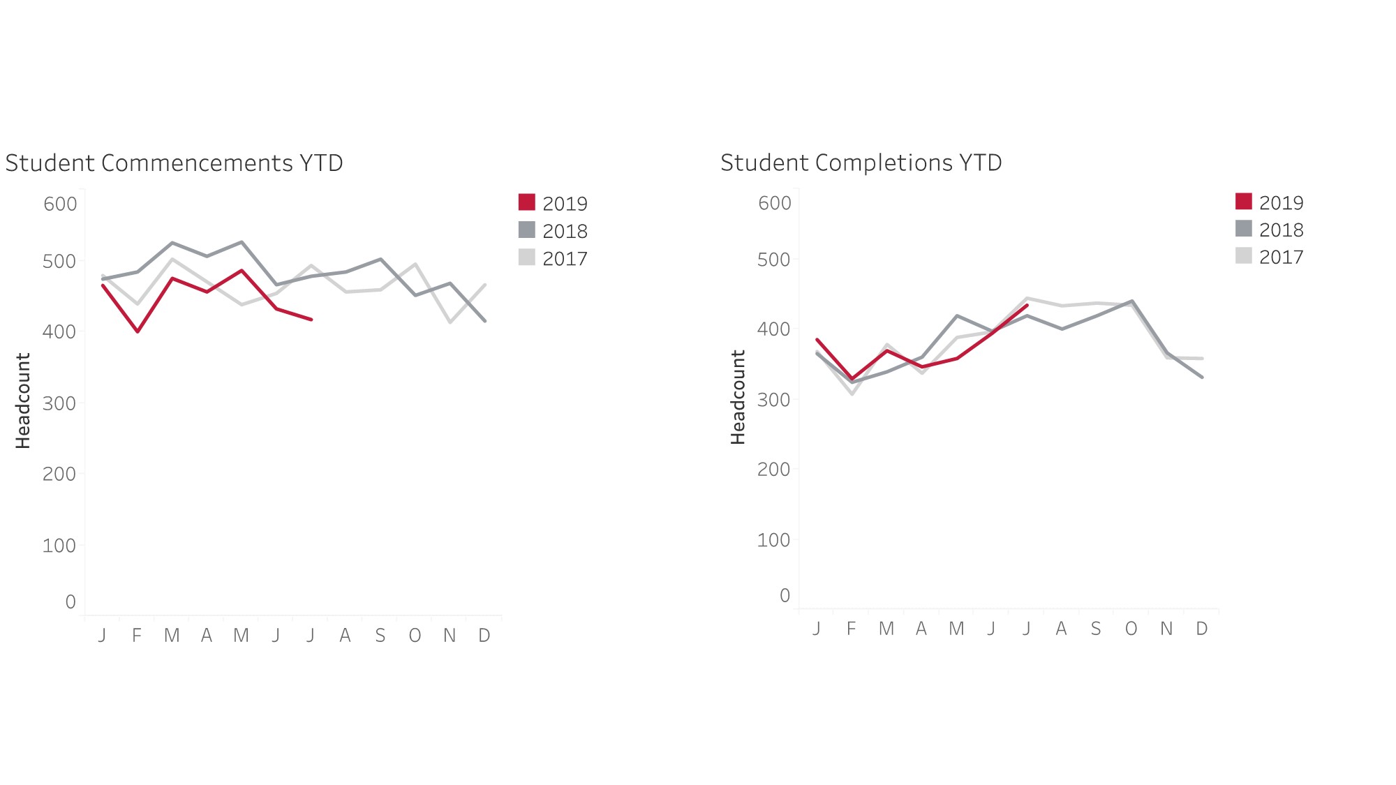
Not Good for Monthly Reports: Metrics that Don’t Fluctuate Throughout the Year
Good for Annual Reports: Metrics that are Important But Don’t Fluctuate Throughout the Year
Reducing Your Own Workload through Automation
One of the purposes of monthly reports is to reduce your workload.
You don’t want the monthly reports to take days to produce every month, so I recommend choosing metrics that you can automate and have easy access to that do not require a lot of manual processing to produce results, but are still informative.
How to Choose the Right Visualisations for Monthly Reports
Combining data from multiple areas within organisations can produce complex and highly dynamic data sets.
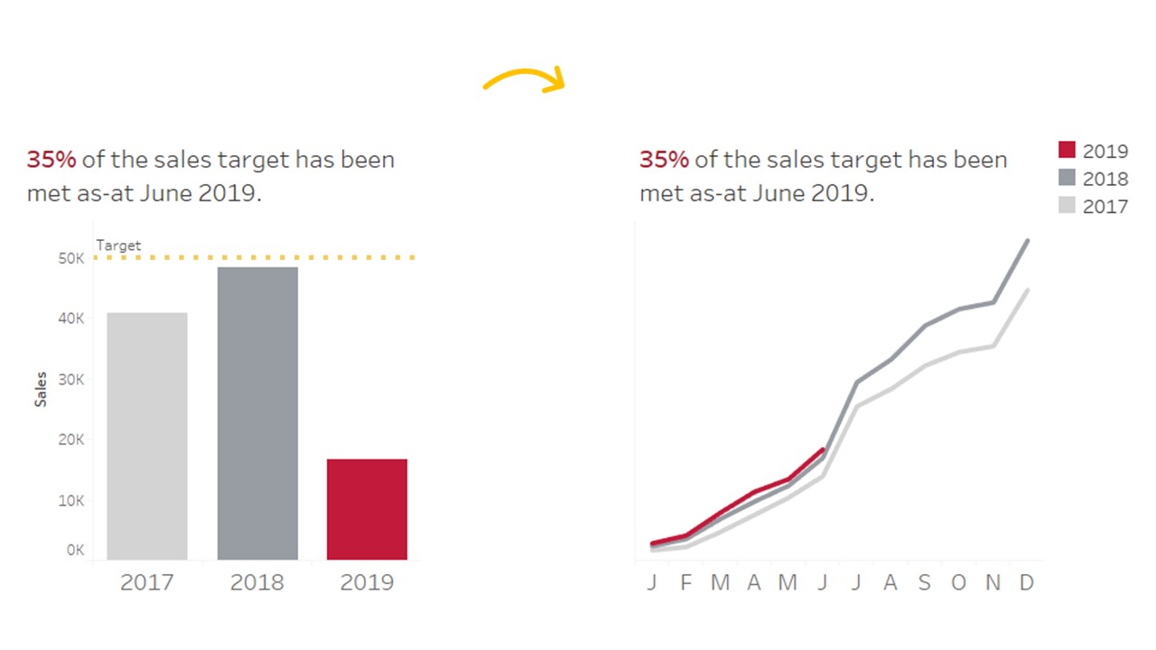
Provide Enough Context: Compare to a Target and/or Compare to the Same Time in Previous Years
It is therefore important to choose types of data visualisation that give readers enough information and context.
This will enable readers to determine whether the organisation or a department is performing better or worse in relation to a target compared to the same time in previous years.
Cumulative Line Charts: My Preferred Method
Cumulative line charts are my preferred method of data visualisation.
These charts enable readers to easily relate previous years data without having to compare among bar charts.
Cumulative line charts also allow readers to easily see troughs and peaks in previous years and how these influence the results.
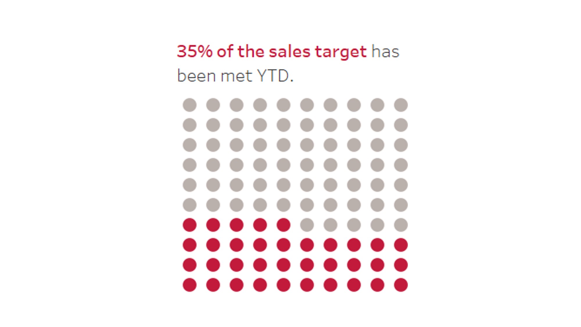
Visualising Progress Towards Targets
It is useful to include organisational targets to enable readers to easily compare them to the data.
Progress towards targets can be visualised in several ways.
Pie and donut charts are probably familiar to most readers or reports and can be used in certain circumstances.
See Ann’s post on the seven guidelines for using pie and donut charts and for alternatives to pie charts.
Below is a waffle chart as an example of an alternative to a pie chart.
Ask for Feedback from Your End-Users
I’ve received great feedback, tips and ideas from the end-users of the data. End-users are coming at your report with fresh eyes and they are the ones that have to use the information at the end of the day, so it’s worth incorporating their feedback if you can.
Better yet, take the Great Graphs online course and find out more. I did, and I haven’t looked back.
Share Your Tips for Monthly Reports
Have you got any tips for monthly reports? Does your organisation use them? Share your thoughts below!
Leave a Reply