
“Ann, should my bar charts be horizontal or vertical?” The vertical-column-chart-or-horizontal-bar-chart question is one of the most common questions I receive about bar charts. My answer: It depends on what type of variable you’re graphing. If you took a research methods or statistics class back in college, then you might remember learning about terms like nominal, ordinal, interval, or ratio variables. Some of these variables are better suited to vertical column charts while other variables are better suited to horizontal bar charts. Let’s look at a few examples.
Use Horizontal Bar Charts When You’re Graphing Nominal Variables
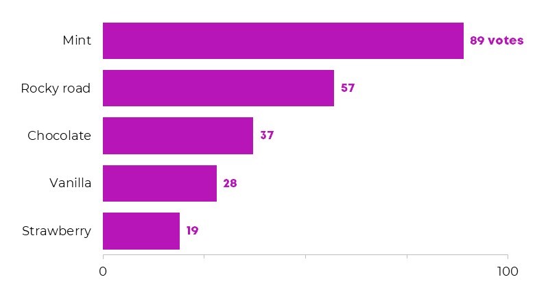
Nominal variables—favorite ice cream flavors, types of organizations where conference attendees are employed—can be arranged in any order. I arrange nominal variables in a list from top to bottom, which means their bars are horizontal. You can sort nominal variables from greatest to least or from least to greatest. Both are correct. My advice: Sort the data so that the item that warrants attention is displayed first—a high number deserving a celebration, or a lower-than-hoped-for number that needs to be turned around.
Use horizontal bar charts to display nominal variables like favorite ice cream flavors or employment settings.

Use Vertical Column Charts When You’re Graphing Ordinal Variables
Ordinal variables follow a natural progression—an order. Another name for ordinal variables is sequential variables because the subcategories have a natural sequence. I arrange ordinal categories from left to right so my viewers can view the sequence across the page, which means their bars are vertical.
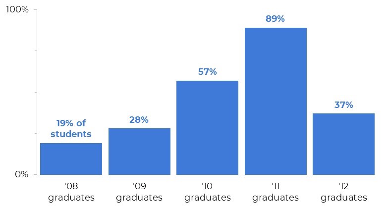
Use vertical column charts to display ordinal variables like age ranges, salary ranges, and even cohorts or graduating classes (e.g., the percentage of students from each graduating class who achieved x outcome).


Real-Life Examples
Okay, you’ve seen some fictional, generic examples. Let’s look at a few examples of horizontal bar charts and vertical column charts from real projects.
Compare Age Ranges with Vertical Histograms
While working with a museum, we wanted to display some key demographic characteristics about people who had responded to the museum’s survey. Age ranges are ordinal, so we used vertical column charts to visualize how many people fell into each age bracket.

While working with public health researchers, we needed to visualize how many males and females in each age range were diagnosed with x disease. We built stacked column charts with vertical columns. We also used a population pyramid to compare the distributions of males and females.

Compare Cohorts of Survey Respondents with Vertical Column Charts
In the State of Grantseeking project, an organization called GrantStation sends out surveys a couple times a year, in the spring and fall. We wanted to compare how different iterations or cohorts of survey takers responded. In other words, we wanted to see whether people who responded to the spring 2016 survey were any different from people who responded to the fall 2016 survey or the spring 2017 survey. Cohorts are ordinal, so we used vertical stacked column charts to depict the proportion of survey respondents who are employed in nonprofits.

Compare Patterns Over Time with Vertical Charts
While working with a hospital’s analytics team, we needed to display the proportion of hospital procedures (“Product A” and “Product B”) that were performed by this hospital (“the ABC Org”). We wanted to compare two points in time, 2012 and 2016. Time is ordinal, so we used vertical columns.

Visualize Agree-Disagree Scales with Horizontal Stacked Bars
While working with a museum, we needed to display how many people agreed or disagreed with each statement on a survey. Agree/disagree scales are ordinal. (Well, technically, agree/disagree scales are a special type of ordinal variable called a diverging variable.) We wanted our readers to see the natural progression from agree to disagree, so we used horizontal bars to show that progression from left to right across the page.

Compare Before-After Survey Responses with Vertical Column Charts
In this example, we needed to make a one-page handout that summarized whether program participants were more knowledgeable about New England history, Martha’s Vineyard, or whaling after completing an educational program at a museum. The museum administered the survey twice, at the beginning of the program (pre) and at the end of the program (post). Pre-post comparisons are comparisons over time… and time is an ordinal variable… so we selected vertical columns. But wait! There’s more! We were graphing two sets of ordinal variables: 1) the timeframe (pre or post survey administration) and 2) the scaled survey responses (very, moderate, somewhat, slightly, or not at all). We chose to give the timeframe more weight than the scaled survey responses. In other words, we decided that the pre-post timeframe was the most important, and used vertical columns first and foremost. Then, within those columns, we displayed the ordinal survey responses.

These are guidelines, not rules. If you can explain the logic for going against this guidance, then your graph is probably going to be alright. My goal is to develop critical thinking masterminds, not robots.
Bonus: Download the Materials
Download the Excel spreadsheet that I used to make the generic bar and column charts at the top of this article.
16 Comments
So logical. So helpful! Thanks, Ann.
Great, logical way to think about it. My only consideration, in the past, had been the length of the labels. If the labels were short, then I went vertical. If they were long, I went horizontal for readability. This approach is another, great consideration.
I also like your method of placing the descriptor (votes, people, students) on the first value and then dropping it on the remaining. Makes it much easier to read/understand the data in the chart.
One question: Do you have a reason for including the axis/scale on all of these charts, in addition to the data values presented with each bar/column? I definitely understand including a scale/axis when you have a known, maximum value (like 100% on the 3rd chart, percent of graduates). But, when dealing with hard counts (like votes or people), and the max isn’t necessarily 100, I tend to remove the axis/scale in favor of the data labels. What are your thoughts?
Label length matters of course (you know the ones – the long labels on vertical bar charts where the text gets twisted diagonally, gross). Graphs exist to showcase our numbers so I want graphs to subtly remind viewers whether numbers are ordinal, categorical, etc. It’s a small detail that gets viewers a bit closer to the numbers.
Re: including the axis/scale: I used to teach workshop attendees that they could pick one or the other — label each of the bars directly with its exact percentage, or, label the axis so that viewers focus on big-picture patterns and don’t get lost on the individual values of each bar. I primarily work with technical/researcher types whose pre-workshop graphs are packed to the gills with details so I wanted them to focus viewers’ attention by selecting either the axis labels or the numeric labels but not both. But, nowadays, I encourage workshop attendees to label the starting point and ending point of each axis. There are still a handful of people in the world who intentionally screw with the axes to skew our judgment so I include the minimum and maximum values for transparency. I’m also *not* in the camp that says that every axis has to start at zero or 0% (you wouldn’t start a graph about adult weight or height at zero), so when you’re not beginning at zero, then labeling the minimum value is the transparent thing to do.
[…] I read your latest post, and I accidentally made a horizontal bar chart when it should’ve been a vertical bar chart! Am […]
[…] A is a stacked bar chart. I chose horizontal bars over vertical bars because I arrange ordinal variables from left to right across the page. I also chose to display […]
[…] At the bare minimum, I would rearrange the table. I transposed the table–rotated the table so that the columns and rows are swapped–so that the time periods go horizontally from left to right. I always display ordinal data like time periods from left to right for consistency. […]
[…] I display patterns over time from left to right across the page. Before results go on the left and after results go on the right, so they get vertical columns (not horizontal rows). […]
[…] the totals. They’re also easy to label (compared to, say, a stacked area chart). We used vertical bars because time is […]
[…] Horizontal & Vertical Bar Graphs […]
[…] read my prior post about using horizontal bar charts for nominal variables like favorite fruits. My toddler is eating two! bananas a day so bananas are the winner in this […]
[…] how far you’ll stretch your scale, whether you’ll use a regular or stacked chart, and whether your chart will be oriented vertically or horizontally. Today, let’s check out how lots of small edits–small deletions, in this case–add […]
If all other decision factors were equal, which is easier for the user to read at a glance from a UX point of view? Horizontal or vertical?
Ah, great question!
I see a lot of vertical column charts where the labels are so close together that the text gets twisted diagonally (http://annkemery.com/avoiding-diagonal-text/), which takes our brains longer to read than plain ol’ horizontal text. Or, worse, sometimes the labels are so close together that the phrases get cut off altogether. In those cases, swapping the vertical columns for horizontal bars to improve legibility is a must.
I also see a lot of inconsistency within documents. For example, I’ll see an ordinal variable like age ranges in a column chart on page one. And then I’ll see another ordinal variable in a bar chart on page two. The inconsistency drives me crazy. That’s why I follow my own guidelines (from this post). More consistency means readers spent less time interpreting the graph (and therefore have more mental energy left to actually think about the implications of the data and act on it).
I also see a LOT of personal preferences driving vertical vs. horizontal decisions. Some people swear that columns look better. I tend to prefer bars, probably because I’ve seen too many smushed columns with diagonal text.
I don’t know whether any researchers have tested this yet. Let me know if you find any good studies.
How about scores? What type of bar graph should I use?
Tell me more. What type of scores? Let’s pretend they’re scores on an academic exam that range from 0% to 100% correct. In that case, the variable is ordinal a.k.a. sequential so I’d recommend using vertical columns.
How do I declutter the scale to only show 0% and 100%?