
6,000 total participants in our dataviz training academy so far (with 5 cohorts going through our Full Courses in 2021 alone).
28 blog posts.
14 YouTube videos.
1 new baby.
What a year.
Top 21 Dataviz Resources of 2021
Want to do some year-end learning as 2021 winds down?
Here are our favorite 21 data visualization resources from the past year.
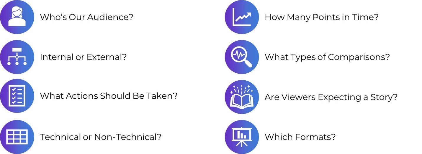
Why “Know Your Audience” is Terrible Dataviz Advice—and What to Do Instead
Every time I scroll through social media, someone’s post is telling me: “Want to know the secret to great dataviz?! Know your audience!” I mean… duh. “Knowing your audience” is terrible data visualization advice. What’s the alternative? Not know my audience? Of course not.
In this blog post, you’ll learn 8 specific, nuanced, advanced ways of “knowing our audience.”
The Inside Scoop on Excel with Bill Jelen (Mr. Excel)
This year I had the honor of speaking with Bill Jelen, a.k.a. Mr. Excel. He was a guest speaker inside our data analysis course, Simple Spreadsheets, and is a big, big deal in the Excel community! I’ve internet-stalked him for years on his website and his popular YouTube channel. Frankly, I’m still shocked he agreed to come speak with us.
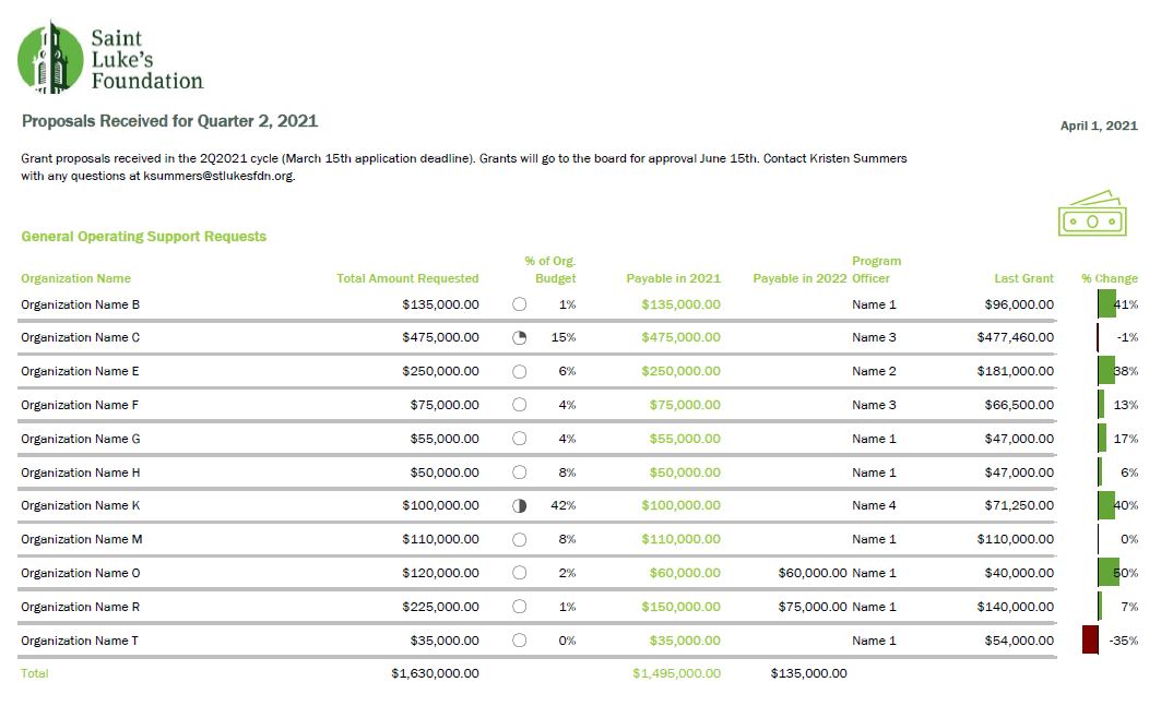
Better Storytelling with the Same Data: Upgrade that Board Packet!
“A lot of information and a bit overwhelming to take in.” That’s how Kristen Summers described her old grants docket. She emailed me an example of how she’s revamped her organization’s grants docket and I knew I had to showcase her hard work (keep it up, Kristen!).
In this guest blog post, Kristen walks us through the steps she took to remake her organization’s grants docket and budget visualizations.
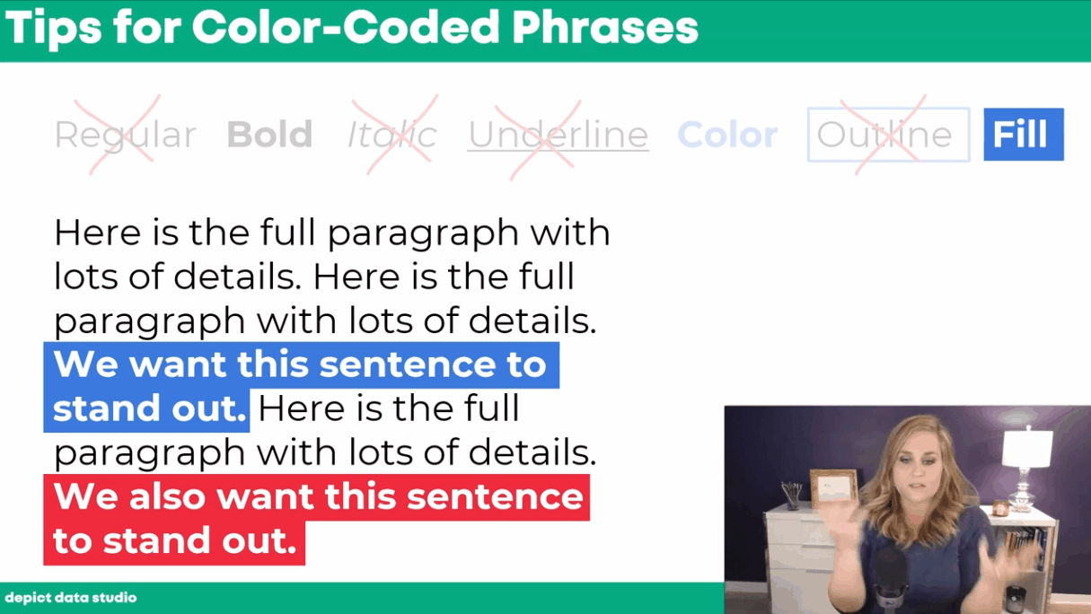
How to Visualize Qualitative Data with Colored Phrases
When my friend Jon Schwabish asked me to partner on his One Chart at a Time project, it was an easy “yes.” For the project, I created a tutorial on using colored phrases to visualize qualitative data.
You’ll learn about the first time I ever used colored phrases to visualize qualitative data, my favorite examples of colored phrases, and practical tips for using colored phrases in your project.
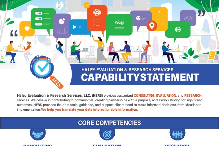
Applying Data Visualization Principles to Your Business: A Before/After One-Pager Makeover
Talk about a before/after makeover! Lillian Haley, Ph.D., MSW, ChFC® said, “Enrolling in courses at Depict Data Studio is one of the best professional developments I have ever made.”
In this guest blog post she shared how she originally based her capability statement on an example she found on the U.S. Department of Health and Human Services website and then transformed it using skills she learned in our courses.
Escaping the Bar Chart
Ready to escape the bar chart? Bar charts aren’t evil. But they’re overused.
In this blog post and video tutorial, you’ll learn about my 3 favorite exploratory vizzes (sparklines, data bars, and heat tables) and the pros and cons of choropleth maps, square tile grid maps, and hex maps.
Dashboard Design and “The Big Picture” in Dataviz: A Conversation with Steve Wexler
Are you familiar with The Big Book of Dashboards?? It’s THE reference book with dozens of real-life case studies. The author, Steve Wexler, joined our Dashboard Design course as a guest speaker where we talked about his career, his books, the goal of data visualization, why he loves collaboration and a lot more.
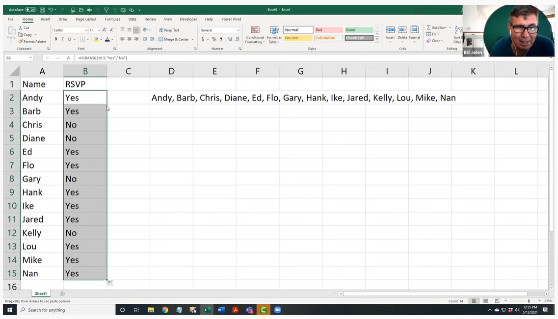
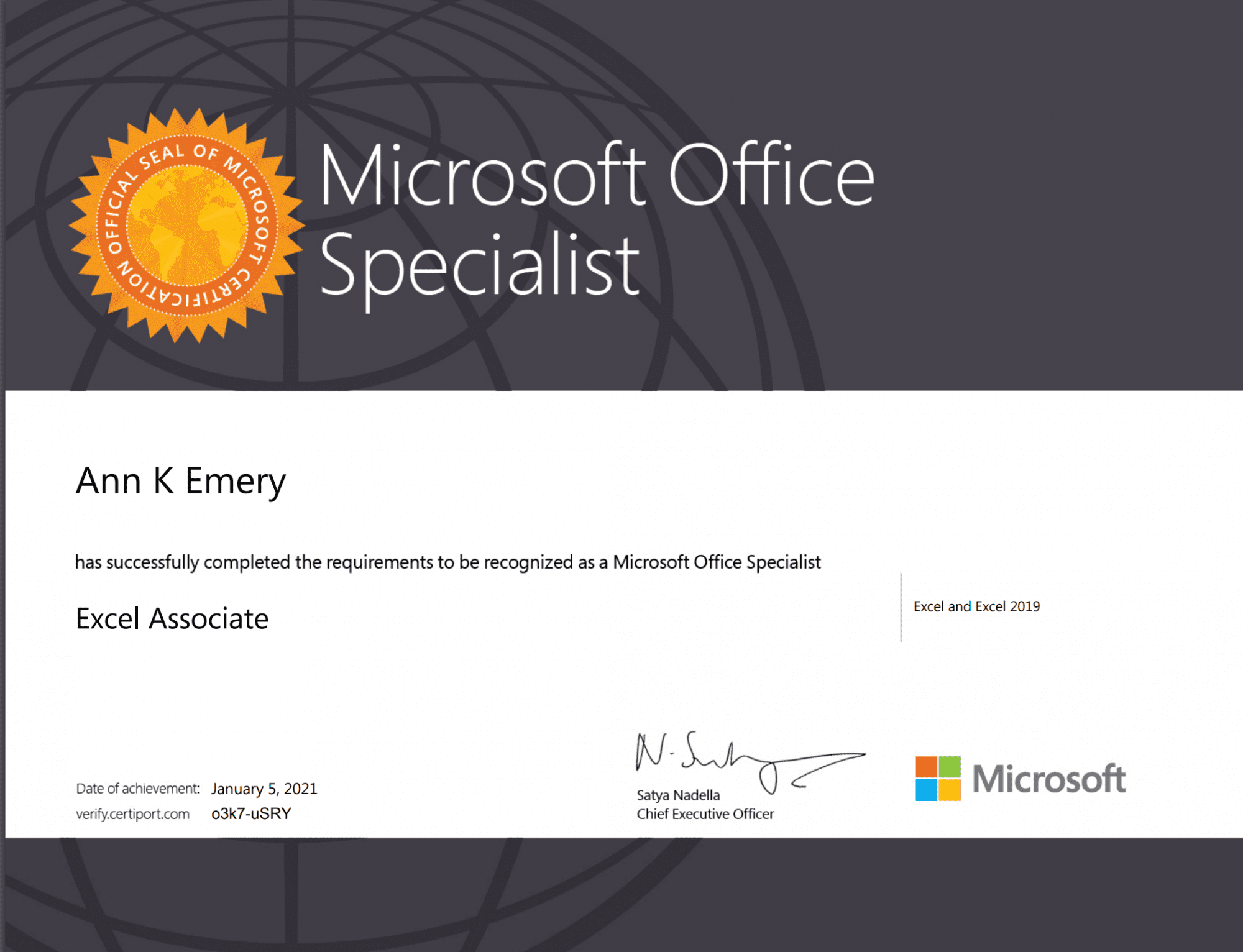
How to Pass the Excel Certification Exam
Want to pass the Excel certification exam? Maybe you want proof that you can rock Excel for your resume? For your boss? In this blog post, I’ll share behind-the-scenes tips for registering for and pacing the MOS-200 exam.
Designing a Prettier and More Effective Dashboard with Excel
Has using a dashboard has been central to your work? In this blog post, you’ll see Shawna Rohrman’s before/after dashboard makeover.
Shawna wrote, “Even with just these few changes (and using a program nearly everyone can access!), our new performance monitoring dashboard has made it so much easier for our team to review quarterly progress in one place and visualize how our system of early childhood programs are working for children and families in the county.”
How to Engage Your Audience with “Choose Your Own Adventure” Presentations
Ready for an advanced presentation technique? Want to make sure your audience is engaged?
In this blog post, you’ll learn about the “Choose Your Own Adventure” method for engaging our audiences during presentations. This style puts our audience in the driver’s seat. We prepare lots of topics in advance, but they vote on which topics they want to cover.
Dashboards for 10-Year-Olds: Connecting Data to Students’ Lived Experience
Who are your datavizzes for? For your Board members? Other staff members? The general public? But what about for kids?
Bob Coulter has been “developing dashboards to support students’ understanding of local ecology and equip them to use that local understanding as a baseline to explore the rest of the world.” In this blog post, you’ll learn how Bob Coulter designed visualizations that personalize the experience for kids, too.
Creating a Powerful Presentation: 3 Easy Changes to Revamp your PowerPoint
“Over the past few years, I have given a number of presentations across the country. I’ve learned the importance of presenting a creative topic rather than just ‘Hey, here’s my program. Let me throw some stats at you…’ I realized my slides needed some quick but major changes,” said Kelsey Watterson.
In this guest blog post she shared how she transformed her text-heavy presentations with her three favorite tips: color coding, increasing readability, and storyboarding.
3 Common Reporting Hurdles—and How to Overcome Them
I was a guest on Alli Torban’s podcast, Data Viz Today.
In this episode, you’ll learn how to overcome common reporting challenges like:
- Figuring out how to incorporate a variety of formats. Not just slideshows, not just reports, not just dashboards, and not just infographics. A different format for each of our different audiences.
- Trying to pack a lot of dense, technical information into each format — without overwhelming our readers. This is a tough one, even for me. And 3)
- Incorporating a variety of visuals. Not just graphs. Not just tables. Not just photographs.
Communicating with Your Audience More Effectively: Using One-Pagers Internally
Need a skimmable one-pager?
Guest blogger Juan DeJesus needed a one-pager that his team of 100+ people could read in 2 minutes or less.
“Instead of dense and text-heavy presentations, I minimize the text to include only the main points and actions I need from my team,” he wrote.
How to Use Vlookup in Microsoft Excel: Two Step-by-Step Examples for Beginners
Have you conquered the lookup functions yet? (vlookup, hlookup, index-match, and xlookup?)
In this blog post, you’ll learn:
- what vlookup is used for,
- why vlookup can be tricky, and
- how to fill in the four pieces of the formula.
Navigating Tableau’s Resources with Zach Bowders
Curious about Tableau? Want to get started for the first time? Maybe you’re already using Tableau… but want to use it even better?
Zach Bowders, Tableau Zen Master and Tableau Ambassador, was a guest speaker during a Dashboard Design live session and he helped us navigate the Tableau community’s resources.
A Trick, a Tip and a Thing to Try in Your Next Presentation
Are you using visual frameworks to explain your data?
This is an advanced technique, and it definitely requires more up-front planning time than usual. (But, it’s time well spent! More planning = better comprehension for our audience.)
“The effort to pick the right visual metaphor transformed the way I understood my own content,” explained Elizabeth Dove, guest blogger who shared her tips and tricks for presentations.

Creating a Community through Graphs
Do I selfishly hold Office Hours every week just so I can talk with you about data? Maybe. Wink.
Guest blogger Maddison Staszkiewicz shared how she transformed her data visualizations after getting feedback from our community during Office Hours.
Getting Started with Sketchnoting: A Conversation with Emily Mills
Most of us were trained to write formal, academic reports.
Transitioning into infographics, dashboards, slidedocs… or even landscape orientation… yikes! It’s a big difference from what we’re used to.
To ease that transition, I invited professional illustrator Emily Mills to lead a sketchnoting session for our Report Redesign Full Course.
If we can get comfortable drawing graphics by hand, I thought, then adding a few more graphs to our reports won’t feel so daunting. Grab a pencil and paper to follow along.

Why Nonprofits Shouldn’t Use Statistics
Overwhelmed by fancy statistics? Does that make you feel like a wimp?? What if statistics weren’t necessary for some organizations???
Drs. Maryfrances Porter & Alison Nagel were guest speakers in our Simple Spreadsheets course, and they explained why nonprofits shouldn’t use statistics.
Don’t miss this one if you work at a nonprofit!
Speeding Up Your Data Viz (& Preventing Future Injuries) Using Custom Commands in Dragon
Ever feel like Microsoft Office wasn’t designed with data viz in mind? Do you have actions that need to be repeated over and over and over again?
In this blog post, Lauren Fox shared how “a voice command and dictation software called Dragon can help overcome some of Office’s limitations.”
While I’m a big believer in everyday software, I love learning how new software can save us time and effort so we can focus on creating great data viz.
Here’s to 2022!
Leave a Reply